The Data that Speaks – Continued

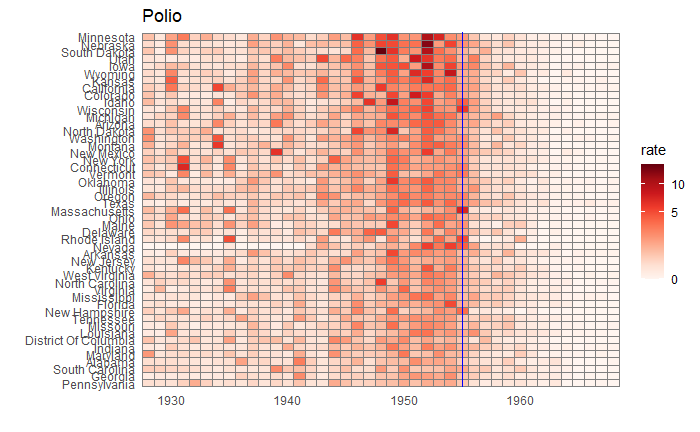
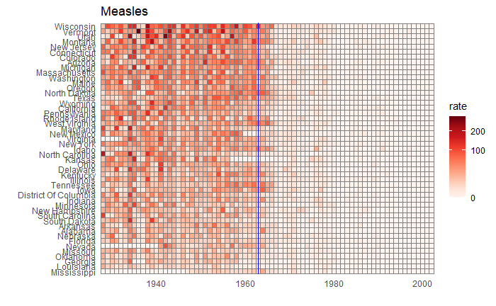
We have seen how good visualisation helps communicate the impact of vaccination in combating contagious diseases. We went for the ’tiles’ format with the intensity of colour showing the infection counts. This time we will use traditional line plots but with modifications to highlight the impact. But first, the data.

library(dslabs)
library(tidyverse)

vac_data <- us_contagious_diseases
as_tibble(vac_data)

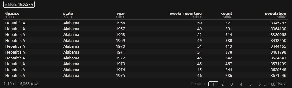
‘count’ represents the weekly reported number of the disease, and ‘weeks_reporting’ indicates how many weeks of the year the data was reported.
The total number of cases = count * 52 / weeks_reporting. After correcting for the state’s population, inf_rate = (total number of cases * 10000 / population) in the unit of infection rate per 10000. As an example, a plot of measles in California is,

vac_data %>% filter(disease == "Measles") %>% filter(state == "California") %>% 
  ggplot(aes(year, inf_rate)) +
  geom_line()

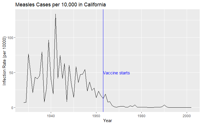
Extending to all states,


vac_data %>% filter(disease == "Measles") %>% ggplot() + 
  geom_line(aes(year, inf_rate, group = state)) 

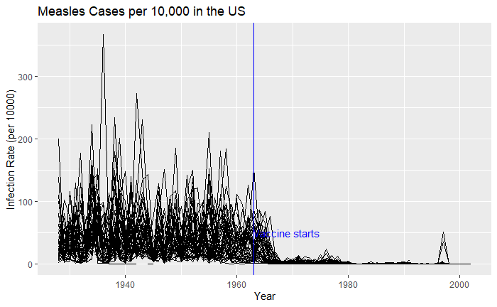
Nice, but messy, and therefore, we will work on the aesthetic a bit. First, let’s exaggerate the y-axis to give more prominence to the infection rate changes. So, transform the axis to “pseudo_log”. Then we reduce the intensity of the lines by making them grey and reducing alpha to make it semi-transparent.


vac_data %>% filter(disease == "Measles") %>% ggplot() + 
  geom_line(aes(year, inf_rate, group = state), color = "grey", alpha = 0.4, size = 1) +
  xlab("Year") + ylab("Infection Rate (per 10000)") + ggtitle("Measles Cases per 10,000 in the US") +
  geom_vline(xintercept = 1963, col ="blue") +
  geom_text(data = data.frame(x = 1969, y = 50), mapping = aes(x, y, label="Vaccine starts"), color="blue") + 
  scale_y_continuous(trans = "pseudo_log", breaks = c(5, 25, 125, 300)) 

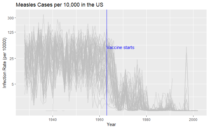
What about providing guidance with a line on the country average?

avg <- vac_data %>% filter(disease == "Measles") %>% group_by(year)  %>% summarize(us_rate = sum(count, na.rm = TRUE) / sum(population, na.rm = TRUE) * 10000)

geom_line(aes(year, us_rate),  data = avg, size = 1)

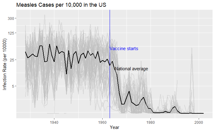
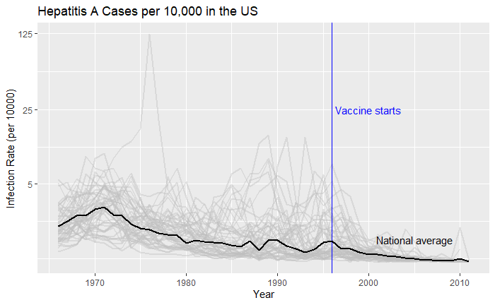
Doesn’t it look cool? The same thing for Hepatitis A is:

The Data that Speaks – Continued Read More »

The Data that Speaks

Vaccination is a cheap and effective way of combating many infectious diseases. While it has saved millions of people around the world, vaccine sceptics also emerged, often using unscientific claims or conspiracy theories. This calls for extra efforts from the scientific community in fighting against misinformation. Today, we use a few R-based visualisation techniques to communicate the impact of vaccination programs in the US in the fight against diseases.

We use data compiled by the Tycho project on the US states available with the dslabs package.


library(dslabs)
library(tidyverse)
library(RColorBrewer)

vac_data <- us_contagious_diseases

the_disease = "Polio"
vac_data <- vac_data %>%  filter(disease == the_disease & !state%in%c("Hawaii","Alaska")) %>% 
  mutate(rate = count / population * 10000) %>% 
  mutate(state = reorder(state, rate))


vac_data %>% ggplot(aes(year, state, fill = rate)) + 
  geom_tile(color = "grey50") + 
  scale_x_continuous(expand=c(0,0)) + 
  scale_fill_gradientn(colors = brewer.pal(9, "Reds"), trans = "sqrt") + 
  geom_vline(xintercept = 1955, col ="blue") +
  theme_minimal() + 
  theme(panel.grid = element_blank()) + 
  ggtitle(the_disease) + 
  ylab("") + 
  xlab("")

Now, changing the disease to measles and the start of vaccination to 1963, we get the following plot.

The Data that Speaks Read More »

Speed Matters

Another example to trouble your system 1, a.k.a. intuitive thinking and a version of the mileage paradox. It seems even Einstein found this riddle interesting!

I have to cover a distance of 2 kilometres. I did the first kilometre at 15 km/h (km. per hour). What speed should I maintain in the next one kilometre to cover the total distance at an average speed of 30 km/h?  

System 2 thinking

You may require a pen a paper to solve this puzzle. Take the first part: how much time does it take to cover one km at 15 km/h? The answer is 60/15 = 4 min. The second part, time to cover two km at 30 km/h: 60 mins for 30 km, 2 mins for 1 km or 4 mins for 2 km. But you already consumed 4 mins in the first one km!

So I can’t achieve the target; was it obvious the first time you heard the problem?

Speed Matters Read More »

Why Most Published Results are Wrong

It is the title of a famous analysis paper published by Ioannidis in 2005. While the article goes a bit deeper in its commentary, we check the basic understanding behind the claim – through Bayesian thinking.

Positive predictive value, the ability of analysis to predict the positive outcome correctly, is the posterior probability of an event based on prior knowledge and the likelihood. The definition of PPV in the language of Bayes’ theorem is,

P(T|C_T) = \frac{P(C_T|T) P(T) }{P(C_T|T) P(T) + P(C_T|nT) P(nT)}

P(T|CT) – The probability that the hypothesis is true given it is claimed to be true (in a publication)
P(CT|T) – The probability that the claim is true given it is true (true hypothesis proven correct)
P(T) – The prior probability of a true hypothesis
P(CT|nT) – The probability that the claim is true given it is not true (false hypothesis not rejected = 1 – false hypothesis rejected)
P(nT) – The prior probability of an incorrect hypothesis (1 – P(T))

Deluge of data

The last few years have seen an exponential growth of correlations due to a flurry of information and technology breakthroughs. For example, the US government issues data of ca. 45000 economic statistics and an imaginative economist can find out several millions of correlations among those, most of which are just wrong. In other words, the proportion of causal relationships in these millions of correlations is declining with more data. In the language of our equation, the prior (P(T)) drops.

Suppose the researcher can rightly identify a true hypothesis 80% of the time (which is quite impressive) and rightly reject an incorrect one at 90% accuracy. Yet, the overall success, PPV, is only 47% if the prior probability of a true relationship is only 1 in 10.

P(T|C_T) = \frac{0.8 * 0.1}{0.8 * 0.1 + 0.1 * 0.9} = 0.47

References

Why Most Published Research Findings Are False: John P. A. Ioannidis; PLoS Medicine, 2005, 2(8)

The Signal and the Noise: Nate Silver

Why Most Published Results are Wrong Read More »

Precision, Accuracy and Errors – Continued

We have seen what precision is – it says something about the quality of the measurements. And we saw the following as an example of high-precision data collection: the fluctuations are closer to the average.

Accuracy

But what about if the true value – unfortunately, something the measurer would never know – of the unknown was 30 instead of 25?

So there is a clear offset between the mean and the true value. In other words, the accuracy of the measurements is low. If precision is related to the presence of random errors, accuracy is compromised by systematic bias.  This may have been caused by mistakes in the instrumental settings or by poor methodology.

The other potential reason for poor accuracy is the presence of outliers.

By the way, both systematic bias and outliers are deterministic errors.

Precision, Accuracy and Errors – Continued Read More »

Precision, Accuracy and Errors

Let’s revisit something that we touched upon some time ago – the topic of observation theory. For those who don’t know what it is, the observation theory is about estimating the unknowns through measurements.

While the unknowns, the parameters of interest could be deterministic, such as the height of a mountain, or the temperature rise, the measured values are random or stochastic variables. And two terms that represent the quality of the observations are precision and accuracy.

Precision

Precision means how close repeated measurements are to each other. As an illustration, the following are 100 data points from a measurement campaign.

The dotted red line represents the mean (= 25). The fluctuation around the mean can be calculated by subtracting 25 from each observation. Here is how the fluctuations are distributed.

Now, look at another example.

A comparison of the two examples shows that the first one has a narrower distribution of errors (higher precision), and the second one has broader (lower precision). But they both follow a sort of normal distribution around mean zero.

We’ll discuss accuracy in the next post.

Precision, Accuracy and Errors Read More »

Looking for Rules that Don’t Exists

The following is a riddle that used to make rounds on the internet: I have 50, then I spend it in the following way.

SpendBalance
2030
1515
96
60
Total spend
= 50
Total balance
= 51

The total spend is 50, and the total balance is 51 – how to explain the extra 1?

The riddle has intrigued a lot of people. But the answer is: no rule requires matching the sum of spend with the sum of the balance! Take this extreme example: I have 50, and I spent it fully.

SpendBalance
500
Total spend
= 50
Total balance
= 0

This time there is not much effort required for the mind to get convinced.

Looking for Rules that Don’t Exists Read More »

The Great wall and the moon

Seeing the great wall of China from the moon is an example of an urban myth. Interestingly, the story goes back to a 1932 cartoon that proclaimed “the only one that would be visible to the human eye from the moon”. Yes, 37 years before the first human landing on the moon happened!

As per the NASA website, the wall is generally not visible to the unaided eye even in low Earth orbit, let alone from the moon’s surface. At the same time, some of the other human-made landmarks are visible from low orbits. A key reason for this invisibility is that the texture of the material used to build the wall is similar to the surrounding landscape.

The Great wall and the moon Read More »

Earthquakes – Where Do They Occur?

We saw the empirical rule – Gutenberg-Richter relationship – in the last post. Today, we use the wealth of data from the ANSS Composite Catalog to demonstrate a super cool feature of R – the mapview(). To remind you, this is how the data frame appears.

Now, let’s ask: where did the biggest, say, 9 and above magnitude quakes occur? To answer that, we need two packages, “sf” and “mapview”.

library(sf)
library(mapview)

Then run the following commands,

quake_data_big <- quake_data %>% filter(Magnitude >= 9)
mapview(quake_data_big, xcol = "Longitude", ycol = "Latitude", crs = 4269, grid = FALSE)

And then magic happens,

extending it further, i.e., magnitude 8 and above,

And greater than 7

Earthquakes – Where Do They Occur? Read More »

Gutenberg-Richter Relationship

Charles Francis Richter and Beno Gutenberg, in 1944, found some interesting empirical statistics about earthquakes. It was about how the magnitude of earthquakes related to their frequencies. Today, we revisit the topics using data downloaded from ANSS Composite Catalog (364,368 data from 1900 – 2012).

A histogram of the magnitude is below.

The next step is to generate annual frequency from this. Since the data is from 1900-2012, we will divide the frequency by 112 to get the desired parameter. The following R codes provide the steps till the plot is generated. Note that the Y-axis is in the log scale.

quake_data <- read.csv("./earth_quake.csv")
hist_quake <- hist(quake_data$Magnitude, breaks = 50)
plot(hist_quake$mids, (hist_quake$counts/112), log='y', ylim = c(0.001,1000), xlab = "Magnitude", ylab = "Annual frequency")

Add an extra line to make a linear fit.

abline(lm(log10(hist_quake$counts/112) ~ hist_quake$mids), col = "red", lty = 2, lwd = 3)

Gutenberg-Richter Relationship Read More »