Heartbreaking Covid – The Conclusion
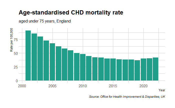
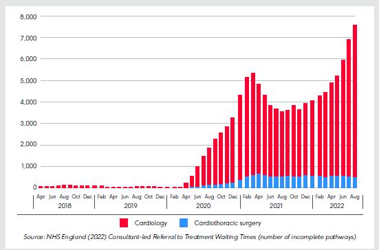
In the last post, we saw how CVD incident rates have increased since the start of the pandemic and the possible reasons for this. Today, we examine why the vaccine—and not COVID itself—has become the principal offender in the common belief.
Chemophobia
Blame it on the ‘silent spring’, the Bhopal tragedy, or Chornobyl; chemophobia, or the fear of chemicals, is real. We have seen how heuristics or mental shortcuts play a role in decision-making. Studies found that most of us, the non-experts of toxicology, tend to rely on heuristics when judging chemical safety. The public leans on three ‘rules of thumb’ when evaluating chemicals.
Natural-is-better heuristics: People associate better confidence in dealing with natural substances than synthetic ones. It may sound incredible, but people find it more comfortable trusting a herb containing 10,000 unknown molecules than a well-researched single compound drug when dealing with a medical condition. The reason? – one is natural, and the other is made. It goes to such an extent that in one study, Siegrist and Bearth found that only 18% of the people surveyed thought the chemical structures of synthetically prepared and naturally occurring NaCl were identical.
Contagion heuristics: These come from a lack of knowledge of the concept of dose. People view a chemical as either safe or toxic while missing out on the quantity. For the decision maker (the brain), this keeps the decisions simple. In the same survey, three-quarters of the people believed that a toxic substance is always dangerous irrespective of its dose.
Trust heuristics: States that people rely on their trust (or lack thereof) in key stakeholders, such as chemical industries and governmental and non-governmental organisations, to evaluate the associated risk.
For ordinary people, the leading COVID-19 vaccines—Moderna, Pfizer, and Oxford—were all human-made. Therefore, they are dangerous. On top of this, thanks to the ever-vigilant regulators in the EU and the US, the side effects of vaccines—that they could cause severe blood clots or myocarditis in a few in a million people—were public within a few months of their introduction.
Affirming the consequent
Irwin, the hypochondriac: “I’m sure I have liver disease.”
Rationality by Steven Pinker
“That’s impossible”, replied the doctor. “If you have liver disease you’d never know it.”
Irwin replies: “Those are my symptoms exactly.”
Affirming the consequent is a formal logical fallacy of the following type.
IF P, THEN Q.
Q.
Therefore, P.
In the case of the vaccine, the logical fallacy works this way:
A. Vaccines cause myocarditis and pericarditis in some.
B. The patient had a heart attack.
C. It must be the vaccine.
Not familiar with the risk-benefit trade-off
No decision is risk-free, and medication is no exception. The important thing is to evaluate the risk caused by an action compared to a situation without that action. That is the core of the risk-benefit trade-off in decision-making. And the risks due to vaccination must be viewed that way. I will end with the scheme we developed at the peak of the pandemic.

References
[1] Siegrist, M., Bearth, A. Chemophobia in Europe and reasons for biased risk perceptions. Nat. Chem. 11, 1071–1072 (2019). https://doi.org/10.1038/s41557-019-0377-8
[2] Steven Pinker, Rationality, Penguin Random House
Heartbreaking Covid – The Conclusion Read More »