Endogeneity is one assumption that we make while performing regression using the OLS method. But what is endogeneity? Let’s go back to regression. In mathematical language:
observation = deterministic model + residual error Y = (a + b X) + e
The term residual error represents all the things unknown to the observer but may have contributed towards the observation. But for linear regression, there is a condition, Gauss–Markov condition, that requires the error term to be uncorrelated to the independent variable. If this is not true, it is a case of endogeneity.
The first reason for endogeneity is called an omitted variable. An example is a cause that results in the variation of X or Y (or both).
The second cause is simultaneity or bidirectional; X causes Y, and Y causes X. It is also called reciprocal causation.
The third cause is selection bias, which means the sampling itself is not randomised.
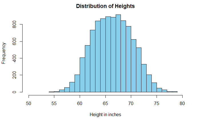
Histograms are a powerful means of understanding the spread of data. Sometimes the shape of the plot can mislead the analysis. A well-known example is the distribution of heights of adults.
The data is taken from Kaggle, but I suspect it comes from simulations and not actual measurements. A casual look at the data suggests a broad dispersion of heights in the centre, with a mean of 66.4 inches (168.6 cm) and a standard deviation of 3.9 inches (9.8 cm).
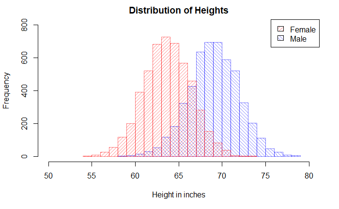
But look what happens when we replace the single plot with two sub-plots based on the key categorical variable, gender.
Pop_data_male <- Pop_data %>% filter(Gender == "Male")
Pop_data_female <- Pop_data %>% filter(Gender == "Female")

hist(Pop_data_male$Height, breaks = 20, col = rgb(0,0,1,1/2), xlim = c(50,80), ylim = c(0,800), density = 20, angle = 135, main = "Distribution of Heights", xlab = "Height in inches", ylab = "Frequency")

hist(Pop_data_female$Height, breaks = 20, add = T, col = rgb(1,0,0,1/2), density = 20,angle = 45)

legend("topright", c("Female", "Male"), fill = c(rgb(1,0,0,1/2), rgb(0,0,1,1/2)),  density = 20, angle = c(45, 135))
I have an apple weighing 150 g. and an orange weighing 145 g. Which fruit is unusually heavier? One would argue that, based on the absolute weight of the fruits, the apple is heavier. But then you are comparing apples with oranges!
A proper comparison is only possible if you standardise the weights and bring them to the same page. In other words, we use Z-score and compare them on a standard normal distribution. If X is the measurement, mu is the mean of the population where the sample belongs, and sigma is the standard deviation.
Once the Z-scores are estimated, one can place it over a standard normal distribution. Note that we have made the assumption that the weights of apples and oranges follow normal distributions.
Suppose the following are the parameters of those fruits.
Can a smoker advise another one about the benefits of quitting smoking? Or can a leader insist on masking without wearing a mask?
It is the essence of the Tu Quoque (“you too”) fallacy. It involves treating an argument as invalid because you retort that the person who made the affirmation herself doesn’t follow it.
You may recognise the well-known idiom, “practice what you preach.” Hypocrisy may indeed be called out, but that does not make facts incorrect.
Another logical fallacy that is closer to this is Whataboutism. The key difference here is that the person who receives the criticism points to someone else who is not necessarily the person who delivered the original criticism. It is like saying, ” But the other group also did something similar” to justify one’s own mistake.
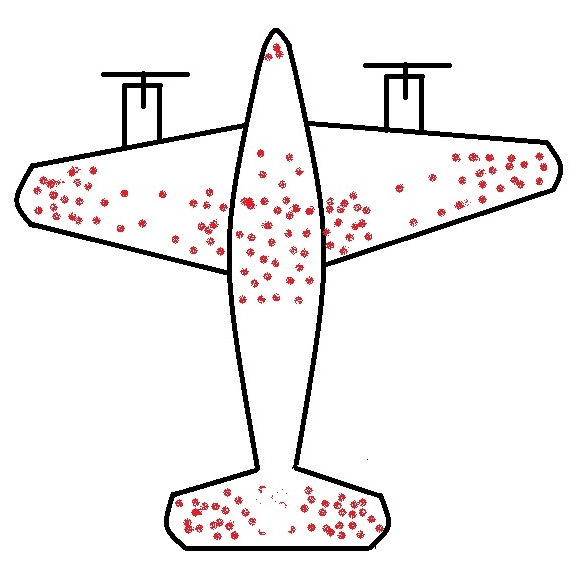
The story of returning warplanes from world war II presents the finest example of understanding survivorship bias. Here it goes.
When the US military had a chance to look at the fighter planes that came back from the battlefield, they observed some patterns. They found that the bullet marks on the planes were not uniform. Instead, it had denser patches on the fuselage and fewer spots on, say, engines, cockpit or some of the weaker parts – roughly what you see on the sketch below.
The idea was to use the data to optimise armouring the planes to sufficiently make the aircraft safer without adding too much weight that reduces the range.
So the statistical Research Group (SRG) was assembled to devise the strategy. Abraham Wald was the leading statistician who came up with this counterintuitive advice: the armour will not be where the holes are, but it will be where there are none. Because the planes with holes in those spots were shot down and never came back!
Survivors will mislead you
This is the classical survivorship bias. In the field, the planes were shot all over. The surviving ones presented one pattern; the unlucky ones would have shown the opposite.
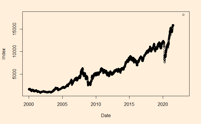
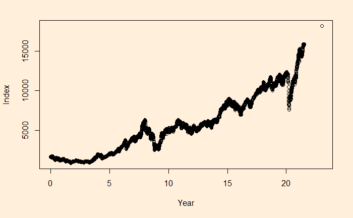
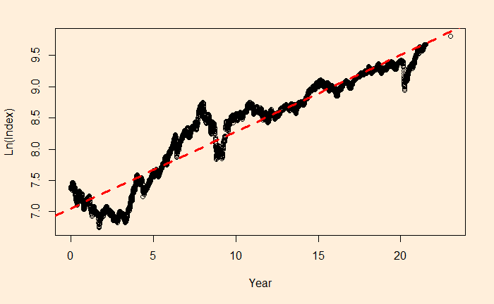
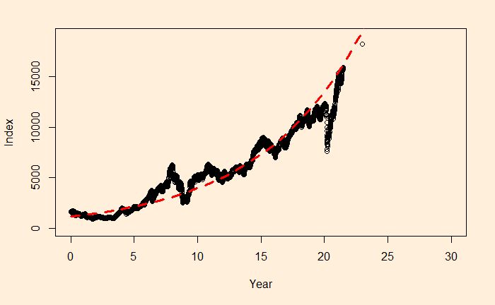
We will continue the regression, and this time, we’ll apply it to stock market performance. Below is the weighted average performance of the top 50 stocks listed in India’s National Stock Exchange, known as the NIFTY 50 benchmark index.
We want to perform regression of the data using a power law approximation of the following form.
There is a reason to write the function in the above format, as the constant r value can represent the underlying stocks’ average CAGR (compound annual growth rate). Before we proceed, let’s convert the x-axis to time (in years) using the following R code.
The main reason for such a discrepancy (a 2% difference is a big deal for long-term compounding) between the two estimates is the less accurate intercept of regression. The actual intercept or index0 is 1592.20, which is so different from the estimated value of 1150.181.
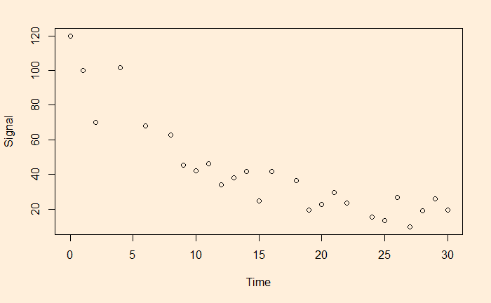
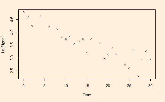
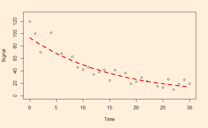
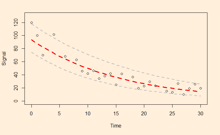
We have seen linear and non-linear regressions in the past. One type of non-linear function is exponential. A familiar example is the decay of a signal with time.
The easy way to perform the curve-fitting is to convert the exponential function to linear and perform an ordinary least square (OLS).
This is a linear function with slope = b and intercept = ln(a).
Let’s run a regression with these transformed variables.
df$ln <- log(df$Signal)
fit <- lm(ln ~ Time, data=df)
summary(fit)
Gives the output as
Call:
lm(formula = ln ~ Time, data = df)

Residuals:
     Min       1Q   Median       3Q      Max
-0.55119 -0.17134  0.03271  0.19116  0.54713

Coefficients:
             Estimate Std. Error t value Pr(>|t|)
(Intercept)  4.540757   0.110923   40.94  < 2e-16 ***
Time        -0.063229   0.006115  -10.34 2.55e-10 ***
---
Signif. codes:  0 ‘***’ 0.001 ‘**’ 0.01 ‘*’ 0.05 ‘.’ 0.1 ‘ ’ 1

Residual standard error: 0.2795 on 24 degrees of freedom
Multiple R-squared:  0.8167,	Adjusted R-squared:  0.809
F-statistic: 106.9 on 1 and 24 DF,  p-value: 2.552e-10
a = e4.540757 and b = -0.063229 and here is the plot of data along with the fitted curve.
Following are the grades (out of 10) of five students in three exams they did in a year.
Exam 1 (Jan)
Exam 2 (May)
Exam 3 (Sept)
Student 1
4
5
7
Student 2
3
4
5
Student 3
6
3
6
Student 4
5
7
6
Student 5
7
5
3
Here are some of the reasons why they performed in that fashion.
The analysis
Student 1 is the star of the class. She comes from a middle-class family and is very hard-working and strategic. She had to overcome a series of adverse events in the year, but her perseverance earned her good grades.
Student 2 is an average one who comes from a financially average family, often distracted due to his habit of playing video games. Despite the backlashes, his hard work helped him to overcome the final hurdle.
Student 3 is the most confident young man, but at times overconfident, and that proved his downfall in the middle of the year. But he bounced back toward the end to show his true talent. Form may be temporary, but class is permanent.
Student 4 is intelligent but inconsistent. He was a bit unlucky earlier this year due to family issues, but he overcame those and became a decent performer.
Student 5 comes from an average family, and he lost his focus due to various family issues, including a breakup.
The narrative fallacy
The situation mentioned above is an example of what is known as the narrative fallacy. In reality, the scores you have seen above are the outcome of a coin-flipping exercise, and the points scored are the number of heads in the game. You may observe a few standard things within all those narratives that followed. They each present a compelling story. You will never see mentions of randomness or luck in it. They satisfy the audience’s thirst for the cause and effect of the event, i.e., the exam results. They all ignore things that didn’t fall into the storyline. The following table lists each student’s circumstances, and the highlighted words denote what has been cherry-picked by the author to tell her tale.
Student 1
Confident, Financially OK, Video games, Hard working, Break up, Strategic, Inconsistent, Average
Student 2
Confident, Financially OK, Video games, Hard working, Break up, Strategic, Inconsistent, Average
Student 3
Confident, Financially OK, Video games, Hard working, Break up, Strategic, Inconsistent, Average
Student 4
Confident, Financially OK, Video games, Hard working, Break up, Strategic, Inconsistent, Average
Student 5
Confident, Financially OK, Video games, Hard working, Break up, Strategic, Inconsistent, Average
The investment gurus
The media is full of examples of narrative fallacies. Two classes of experts lead the table, namely the financial analysts and sports pundits.
Yesterday was a disastrous night for Leicester City’s Wout Faes, who scored not one, but two own goals for the opponents, Liverpool, that too at a time when his team was leading!
What is the probability?
A quick search online suggests that based on the last five seasons of the English Premier League for football, there is about a 9% chance of scoring an own goal in a match. Assuming the own-goals spread randomly as a Poisson distribution with an expected value (lambda) of 0.09 (9%), we can write down the following code a get a feel of how they distribute in e year. Note that there are 380 matches in a season.
plot(rpois(380,0.09), ylim = c(0,2), xlim = c(0,400), xlab = "Match Number", ylab = "Number of Own Goals", pch = 1)
The plot is just one realisation, and because the process is random, there are several possibilities of having own goals (0, 1, 2 or > 2) in a season.
1000th own goal last year
The following calculations are for the average number of own goals in the history of the premier league (the completed 30 seasons).
The expected value of having two own goals in a match is ca. 1.3 per season; for reference, the 2019-20 season had one occurrence.
Next, what is the expected value for two-own goals committed by one team?
epl <- rpois(380*2,0.09/2)
Extending it further: the probability of both goals being scored by the same player in a match becomes 0.09/20 (excluding the goalkeeper). The following code brings out the expected number of instances that a player scores two own goals in a match until the end of last season, i.e., 428 x 3 + 380 x 27 matches.
The answer is 2.3. The actual number stood at 3 at the end of last season (Jamie Carragher (1999, Liverpool vs Manchester United), Michael Proctor (2003, Sunderland vs Charlton) and Jonathan Walters (2013, Stoke vs Chelsea)).
20% of mushrooms in a forest are red, 50% are brown, and 30% are white. A red mushroom has a 20% chance of being poisonous, whereas, for a non-red, it is 5%. What is the probability that a poisonous mushroom is red?
We have applied Bayes’ rule several times previously to solve similar problems. So straight to the equation.
P(R|P) = Probability of red mushroom given that it is poisonous P(P|R) = Probability of poisonous mushroom given that it is red = 0.2 P(R) = Prior probability of finding a red mushroom = 0.2 P(P|nR) = Probability of poisonous mushroom given that it is not red = 0.05 P(nR) = 0.5 + 0.3 = 0.8