September 2022

Back to Roulette

We are back in the game of chances, the roulette – not the Vegas one, but the Russian. Imagine two rounds are put in a revolver that has six cartridges. You don’t know the order in which they are kept, i.e. next to each other, or there are gaps between them. What is the probability you get hit by the bullet?

It is pretty straightforward: there are two in six chances to get hit (2/6 = 33.3%), and four in six you survive (4/6 = 66.7%). OK, you survive the first round. If there is a second round and you have two choices. Pull the trigger straight away, or spin it again before pulling. Which one do you choose?

3 types of arrangements

The number of arrangements possible for two bullets to be placed inside six possible cartridges is 6C2 = 6!/(4!2!) = 6 x 5 / 1 x 2 = 15. Those 15 fall into three categories as below:

Next to each other

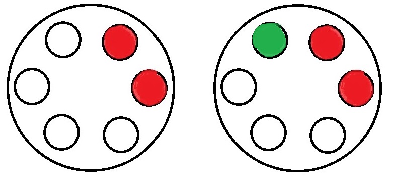
There are six such arrangements that are possible ({1,2}, {{2,3}, {3,4}, {4,5}, {5,6}, {6,1}). In the above figure, the left one with two reds represents one such. In such an arrangement, the number of empty spots that follows a bullet is just one (marked as green on the above right). Since there are four empty cartridges, the probability of the second one hitting is (1/4).

With one gap

Six arrangements are possible with one gap between them ({1,3}, {{2,4}, {3,5}, {4,6}, {5,1}, {6,2}). The chance of the second one hitting, in this case, is (2/4).

With two gaps

Three are are possible with two gaps between them ({1,4}, {{2,5}, {3,6}). The chance of hitting is again (2/4).

To spin or not to spin?

So what is the probability of surviving if you prefer to spin again? That will be the same as the first time = 66.7%. If not, you calculate the chances in the following manner.

6/15 (probability to get arrangements of type 1) x 3/4 (chance of survival) + 6/15 (probability to get arrangements of type 2) x 2/4 (chance of survival) + 3/15 (probability to get arrangements of type 3) x 2/4 (chance of survival) = 6/15 x 3/4 + 6/15 x 2/4 + 3/15 x 2/4 = (9/2 + 6/2 + 3/2)/15 = 9/15 = 0.6 = 60%.

The bottom line is: you better ask to spin again and increase the probability of survival by 6.7%!

Back to Roulette Read More »

Collider Bias and Confounding

We saw what collider bias is. It happens when two variables, e.g., risk factor and outcome, influence a third, namely, the likelihood of being sampled. Graphical representations of such associations are often achieved with the help of directed acyclic graphs (CAG) or causal diagrams. If B is a common effect or collider of A and C, the situation is represented as:

An example is the famous “admission rate bias” (Sackett, 1979) when he analysed hospitalised patients with locomotor and respiratory disease and found an association. He found no such relationships when he repeated the same experiment in the general public. The presence of a collider, ‘hospitalisation’, distorted the analysis.

Look at the following case: Does it remind you of something?

The arrows are pointing away from a common cause, B. It is confounding, and we have seen this before.

Since gender is associated with heart attack and preference for taking the drug, unless the study estimates are gender-adjusted, deriving conclusions has a high chance of leading to incorrect associations between drug and heart attack.

Collider Bias and Confounding Read More »

Covid and Smoking

A paper was published in April 2020 on the open science platform, Qeios. The topic was the potential benefit of tobacco smoking to protect against Covid-19.

The conclusions in the article were based on data from observational studies and not randomised clinical trials. We have already discovered issues which arise from observational studies, collider bias being one of them.

Collider bias happens when two variables, e.g., risk factor and outcome, influence a third, namely, the likelihood of being sampled. In our case, the sampling occurred on or before April 2020, in the earlier part of the pandemic. As you may recall, testing was in the developing stages, and the focus was on front-line health workers and patients with severe symptoms. In technical terms, the sample was not random or representative.

Therefore, the data space has narrowed down to health workers, and within those, there are smokers and non-smokers. As a consequence of the testing strategy, the survey censored out the smokers who had no symptoms. And this exaggerated proportion of non-smokers who had symptoms in the sample.

References

Low incidence of daily active tobacco smoking in patients with symptomatic COVID-19: Qeios, CC-BY 4.0 · Article, April 21, 2020

Collider bias undermines our understanding of COVID-19 disease risk and severity: Nature Communications, 2020, 11:5749

Randomised Controlled Trials: BMJ

Covid and Smoking Read More »

Collider Bias

Do you know: the students who skip classes regularly get better grades? Attractive people are more likely to be mean, and nonsmokers have more chance of getting Covid!

The instances described above are examples of what is known as collider bias or Berkson’s paradox. These typically happen in empirical studies, such as surveys. And it happens when we derive conclusions from a dataset that over-represents some groups or under-represents others.

Take the case of grades. There are four possible categories: students, 1) who attend classes and get good grades, 2) who attend and get bad grades, 3) who do not attend and get good grades, and 4) who do not attend and get bad grades. The question here is: who are those pupils less likely to participate in a survey? The last group. And the result is a bias of the sample in which, among non-attenders, the percentage of good graders dominates.

Attraction is the second example. Assume that people are classified as attractive vs not attractive, kind vs mean. Of the four possible combinations, the chances of having a date, for example, with a not attractive and mean are low, suggesting an under-representation of that combination from the list.

Collider Bias Read More »

LCA of carrier Bags

I’m sure this has bothered most of us at some point. It is about the use of plastic bags. Plastic consumption and its environmental effect due to poor biodegradability frequently come under the public discourse. And here is an interesting research report based on the Life Cycle Analysis (LCA) of a few commonly used carrier bags in the UK, published by the Environment Agency (2011).

LCA is a standard methodology to estimate the material, energy usage, and environmental impact throughout a product’s lifecycle (‘cradle to grave’). The study covered only the carriers available from the UK. The material in focus was conventional HDPE, HDPE with pro-degradant additive, starch-polyester (biopolymer), paper, heavy-duty LDPE, non-woven PP and cotton bag.

The end-of-life processes for the different materials included landfill and incineration (for all) and mechanical recycling and composting, where applicable.

The following table contains the energy use and waste generation from 1000 bags of each material.

Bag TypeElectricity
(kWh)
Heat
(from
NG)
(kWh)
Heat
(from
Fuel oil)
(kWh)
Waste
(g)
Conventional HDPE6.151418.4
HDPE + additive6.392426.1
biopolymer17.2494.8
LDPE32.5813.953171.2
Non-woven PP87.755,850
Cotton111,800

The study assumed the reuse of about 40% of all lightweight carrier bags as bin liners.

The next one up was the global warming potential. GWP (excluding primary reuse) for the cotton bag (250 kg CO2 eq.) was more than ten times that of any other bag! It was followed by PP (22), LDPE (7), paper (6), biopolymer (5), HDPE (2.1) with additive and HDPE (2), in descending order. In other words, a cotton bag requires to be used 173 times to match HDPE and PP 14 times.

Here is a summary:

Bag typeSensitivityGWP
(kg CO2 eq)
HDPEBaseline1.578
HDPERecycling1.400
HDPERecycling
(no reuse)
1.785
HDPE
prodegradant
Baseline1.750
biopolymer Baseline4.184
biopolymer Composting2.895
biopolymer Composting
(no reuse)
3.329
Paper bag
(4 uses)
Baseline1.381
Paper bag
(4 uses)
Recycling1.090
Paper bag
(4 uses)
Composting1.256
LDPE
(5 uses)
Baseline1.385
LDPE
(5 uses)
100%
Recycling
1.196
PP
(14 uses)
Baseline1.536
PP
(14 uses)
100%
Recycling
1.292
Cotton bag
(172 uses)
Baseline1.579

To conclude

HDPE bags have the lowest environmental impact among lightweight bags on 8 out of 9 counts.
The starch-polyester (biopolymer) bag has the highest impact in 7 out of 9.
The paper bag needs to be used four times to match HDPE’s global warming potential.
The cotton bag has a greater impact than the HDPE bag in 7 out of 9 categories, even when used 173 times.
The key to reducing the impact is to reuse as much as possible.

Reference

Life cycle assessment of supermarket carrier bags: a review of the bags available in 2006

LCA of carrier Bags Read More »

The Trouble with Evolution

With millions of pieces of evidence, the theory of evolution is as factual as, say, Newton’s laws of motion! Yet, how it’s taught in schools requires a reexamination before it can achieve its intended goals of education. Some items need attention before introducing the subject to the interested parties.

Lamarck’s theory

The theory that says evolution is the adaptation of organisms to their environment has only historical relevance. It is not how evolution works. People are stuck to Lamarck’s theory, partly because it was taught before Darwin’s and also because it fits our fantasy of conversion and purpose. We will address these two terms soon. To repeat: individual organisms don’t evolve or pass their aspirations to offspring through genes.

Metaphors taken literally

We already know that nature doesn’t select anybody. Also, physical strength and superiority have nothing to do with the survival probability of a species. Yet, we carry the burden of natural selection and survival of the fittest in their literal meaning. These terms are strictly metaphors to communicate, perhaps wrong choices from people who lived a hundred years ago!

Another common feature in science communication is to say genes want to copy and spread. It creates a false notion of purpose in listeners’ minds. Again, a gene has no brain to decide anything, unlike humans, who are involved in designing artefacts for their use. You know, this purpose is not that purpose!

It goes in branches

This one came from a cartoonist – the money to the man. It is not a conversion process that works linearly. Once a species passes the baton, it doesn’t exit the scene. Evolution steps are random branching processes. So monkeys may survive, and so do apes or the great apes. Some may perish as well.

In summary

The features we see in today’s organisms are not part of any plans for perfection but simply a collection of clues about our past.

The Trouble with Evolution Read More »

Darwin’s moth for Darwin’s Orchid

Remember the story of Tiktaalik, the missing piece in the evolution that connected fishes and four-legged animals? Here is another equally exciting example. And how Darwin predicted the existence of a species after seeing a flower!

In 1862, Charles Darwin received a box of orchids from a well-known grower of his time. Among them was Angraecum Sesquipedale. Check the link to see how it appears. Look at the long spur or nectary, the nectar-secreting organ in the flower. Seeing the extraordinarily long nectary, Darwin wondered about the existence of moths with long tongues. As nectar-liking moths are crucial agents for pollination, such an orchid would not have evolved without the help of a moth with fitting organs.

In 1907, years after Darwin’s death in 1892, the culprit was found – Xanthopan Morganii Praedicta, from Madagascar!

To conclude this story, in the 1990s, biologists made direct observations of the meeting of the two. See the cover page of the Botanica Acta of 1997.

Reference

Arditti et al., ‘Good Heavens what insect can suck it’– Charles Darwin, Angraecum sesquipedale and Xanthopan morganii praedicta, Botanical Journal of the Linnean Society, 2012, 169, 403–432.

Darwin’s moth for Darwin’s Orchid Read More »

Mileage Paradox

Andy owns a car with 20 km/L mileage and Becky has one with 8. They both purchased new cars to tackle the rising fuel price. Andy’s new car is now 30 km/L, and Becky’s is 10. If they both drive similar kilometres, who will save more money?

A quick glance at the problem tells you a 50% improvement for Andy (20 to 30), whereas only 25% for Becky (8 to 10). So Andy, right? Not so fast. Because you are dealing with a compound unit (kilometre per litre) with the actual quantity, we are after (litre), which is in the denominator. So our intuition based on simple numbers goes for a toss.

Imagine they both drive 2000 kilometres this year. Andy consumed 2000 (km) / 20 (km/L) = 100 L in the past, but will consume 2000/30 = 66.7 L this year. On the other hand, Becky’s consumption will reduce from 2000/8 = 250 to 2000/10 = 200. So Becky saves 17 L more than Andy.

Speed paradox

A similar problem of averaging denominators exists in the famous challenge of average speeds: Cathy travelled from A to B at 30 km/h and returned (B to A) at 60 km/h. What was Cathy’s average speed? Needless to say, the intuitive answer (30+60)/2 = 45 is wrong. It is easy to solve if you assume a fixed distance (magnitude doesn’t matter), say, 100 km. For A to B, she took 100 (km)/30 (km/h) = 3.33 h and for the return 100 (km)/60 (km/h) = 1.67 h. So she travelled 200 km in 5 hours. The average speed is 200 (km) / 5 (h) = 40 km/h.

Mileage Paradox Read More »

The Truth that Exists in Mathematical Models

The concept of comparative advantage is something we saw when we analysed international trade as beneficial to both participating countries. Yet, the notion remains highly challenged by the common public. Trade, in their mind, remains a zero-sum game. If I go and sell goods in a foreign country, they lose, and I win.

Similarly, the role that the climate models play in understanding global warming. No matter how hard one tries to prove the fact using charts and equations, the public still requires to hear stories of hardships of extreme weather events to move their views. Mathematical models are inevitable as we are dealing with a complex problem with many factors that are not related linearly to the climate.

Part of the blame for this situation falls on the economists and scientists themselves. Most often, they assume the concepts they develop are simple and intuitive, and those who don’t understand are some less intelligent type.

On the other hand, people grow up hearing exaggerated stories about common sense and simple narratives. Models and equations are too difficult to understand and, therefore, some form of a trick played by the proponent.

The Truth that Exists in Mathematical Models Read More »

Drake Equation – The Probability of ET

If you recall, we had used the concept of joint probability to explain the swiss cheese models of viral infection. That the probability of someone getting infected by a virus is a joint probability of several independent events.

In 1961, Frank Drake made the following equation to invoke some thoughts on estimating the probability of life outside earth.

N = R* x fp x ne x fl x fi x fc x L

  • N: number of civilisations in the galaxy with which communication might be possible
  • R*: average rate of star formation in the galaxy
  • fraction of those stars having planets
  • fraction of those planets that could support life per star
  • fraction of those that could go on to make intelligent life
  • fraction of that civilisation that could develop technologies
  • the length of time they could release detectable signals into space

Choice of parameters

The choice of the parameters is the difficult part and what invited criticisms of the equation.

Drake Equation – The Probability of ET Read More »