October 2023

The sign test

We have seen the definition of a non-parametric hypothesis test. The sign test is an example. We want to test the effectiveness of a drug from 12 observations. The data is the number of hours that the drug relieves pain. The null hypothesis is that the difference between paired medians equals zero.

Case #Drug ADrug B
12.03.5
23.65.7
32.62.9
42.62.4
57.39.9
63.43.3
714.916.7
86.66.0
92.33.8
1024.0
116.89.1
128.520.9

The paired differences (Drug B – Drug A) are:

data <- c(1.5, 2.1, 0.3, -0.2, 2.6, -0.1, 1.8, -0.6, 1.5, 2.0, 2.3, 12.4)

Let’s order them in the increasing magnitude.

sort(data) 
-0.6 -0.2 -0.1  0.3  1.5  1.5  1.8  2.0  2.1  2.3  2.6 12.4

Under the null hypothesis, we expect half the numbers to be above zero (median) and half below. Suppose r+ observations are > 0 and r < 0, then under the null hypothesis, r+ and r follow a binomial distribution with p = 1/2.

In our case, three cases are below zero (r), and nine are above (r+). So, we estimate the p-value in a binomial test with 9 successes out of 12, but the expected probability is 0.5 under the null hypothesis.

binom.test(9, 12,  p = 0.5, alternative = "two.sided") 
	Exact binomial test

data:  9 and 12
number of successes = 9, number of trials = 12, p-value = 0.146
alternative hypothesis: true probability of success is not equal to 0.5
95 percent confidence interval:
 0.4281415 0.9451394
sample estimates:
probability of success 
                  0.75 

Since the p-value is 0.156, we would conclude that there is no evidence of a difference between the two treatments.

The sign test Read More »

Parametric vs Non-Parametric Tests

In many statistical inference tests, you may have noticed an inherent assumption that the sample has been taken from a distribution (e.g. normal distribution). Well, those people are performing a parametric test. A non-parametric test doesn’t assume any distribution for its sample (means).

The parametric tests for means include t-tests (1-sample, 2-sample, paired), ANOVA, etc. On the other hand, the sign test is an example of a non-parametric test. A sign test can test a population median against a hypothesised value.

A few advantages of non-parametric tests include:

  1. Assumptions about the population are not necessary.
  2. It is more intuitive and does not require much statistical knowledge.
  3. It can analyse ordinal data, ranked data, and outliers
  4. It can be used even for small samples.
  5. Ideal type, if the median is a better measure.

Following are the typical parametric tests and the analogous non-parametric ones.

Parametric testsNonparametric tests
One sampleOne sample tSign test
Wilcoxon’s signed rank
Two samplePaired t Sign test
Wilcoxon’s signed rank 
Unpaired tMann-Whitney test
Kolmorogov-Smirnov test
K-sampleANOVAKruskal-Wallis test
Jonckheer test
2-way ANOVAFriedman test

References

Nonparametric Tests vs. Parametric Tests: Statistics By Jim

Non-parametric tests: zedstatistics

Nonparametric statistical tests for the continuous data: Korean J Anesthesiol

Parametric vs Non-Parametric Tests Read More »

2D Density Plots – Iris Dataset

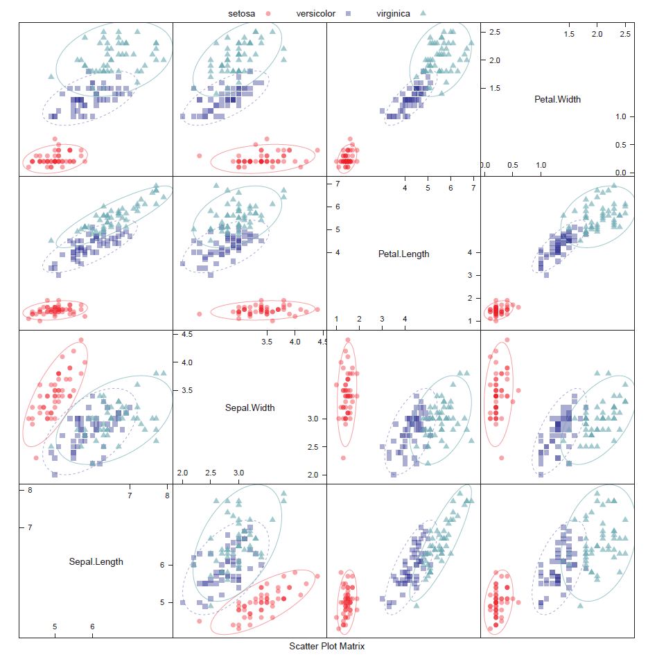
We have seen the Iris dataset before. It consists of 150 samples, 50 each from three species of Iris (Iris Setosa, Iris Virginica and Iris Versicolor). Four features, the length and the width of the sepals and petals (in cm), are available in the set.

These parameters can then be used to make predictive models to distinguish the species from each other.

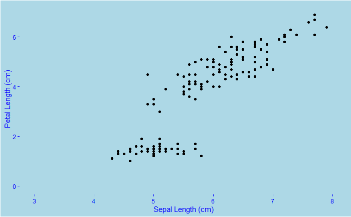
As we did before, we make a scatter plot between two features, Petal length versus Sepal length, followed by a 2D density plot.

You may already find Setosa is easily identifiable based on its short petal and sepal. In the last plot, we used the colour palette, ‘Spectral’.

library(tidyverse)
library(ggExtra)
plot <- iris %>% ggplot(aes(x = Sepal.Length, y=Petal.Length) ) +   
geom_point(aes(colour = Species)) +
  stat_density_2d(aes(fill = ..density..), geom = "raster", contour = FALSE) +
  scale_fill_distiller(palette= "Spectral", direction=1) +

  xlim(3, 8) +
  ylim(0, 7) +
  xlab("Sepal Length (cm)") + 
  ylab("Petal Length (cm)") +
  theme(text = element_text(color = "blue"), 
        panel.background = element_rect(fill = "lightblue"), 
        plot.background = element_rect(fill = "lightblue"),
        panel.grid = element_blank(),
        axis.text = element_text(color = "blue"),
        axis.ticks = element_line(color = "blue")) 

ggMarginal(plot, type="density",groupColour = TRUE, groupFill = TRUE)

Let’s change the plot type at the margins from density to boxplot.

Another noticeable feature of Setosa is it has a wider sepal than the other two.

2D Density Plots – Iris Dataset Read More »

2D Density Plots

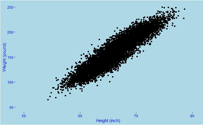
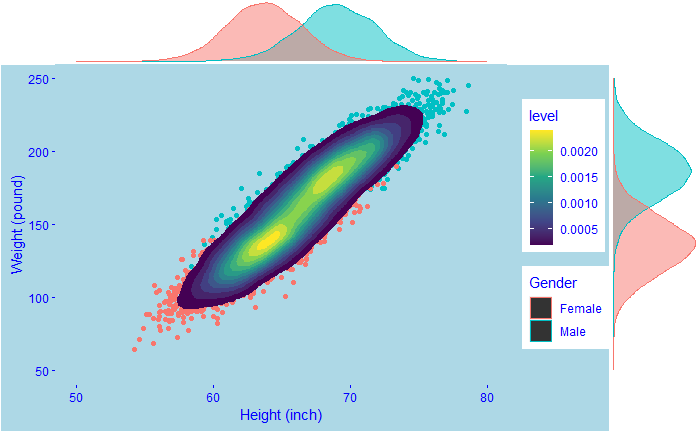
We know about scatter plots and line plots. The idea is to show the relationship between two variables. We have seen in the past the human height vs weight relationships. And also how the data is distributed. Note these are typically simulated data based on past surveys such as the Growth Survey of 1993. Let’s look at one such relationship.

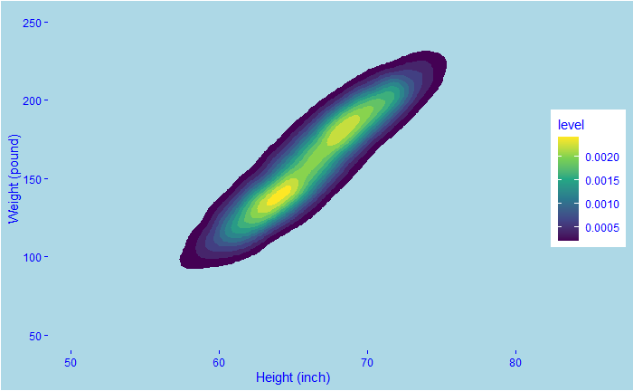
You see a clear relationship between weight and height. But nothing further than that. For instance, there could be different intensities in how they are distributed; that is lost inside the multitudes of dots. Density plots come in handy in such cases. Here is a 2D density plot.

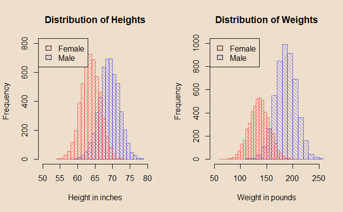
The contours represent the intensity; the yellow colour means heavy traffic. Therefore, the 2D density plot has combined two things: the X-Y scatter (the one on top) and the two distributions (shown below).

The R code for creating the 2D density plot is:

h_data %>% ggplot(aes(x = Height, y=Weight) ) +   
  stat_density_2d(aes(fill = ..level..), geom = "polygon") +
    scale_fill_viridis_c() 

Or a real fancy plot like the following that combines everything!

library(tidyverse)
library(ggExtra)

plot <- h_data %>% ggplot(aes(x = Height, y=Weight ) ) +   
geom_point(aes(colour = Gender)) +
stat_density_2d(aes(fill = ..level..), geom = "polygon") +
  xlim(50, 80) +
  ylim(50, 250) +
  xlab("Height (inch)") + 
  ylab("Weight (pound)") +
  theme(text = element_text(color = "blue"), 
        panel.background = element_rect(fill = "lightblue"), 
        plot.background = element_rect(fill = "lightblue"),
        panel.grid = element_blank(),
        axis.text = element_text(color = "blue"),
        axis.ticks = element_line(color = "blue")) +
  scale_fill_viridis_c() 

  ggMarginal(plot, type="density",groupColour = TRUE, groupFill = TRUE)

2D Density Plots Read More »

Naive Bayes

Naive Bayes is a technique for building classifiers to distinguish one group from another. A simple example is to identify spam emails. It uses Bayes’ theorem to perform the job, hence the name.

What is the probability that the email I received is spam, given it has the words ‘money’ and ‘buy’?

Let’s build a spam detector from previous data. I have 100 emails, of which 75 are normal, and 25 are spam. 8 of the 75 normal emails contain the word ‘buy’, whereas 15 spam emails have the word. On the other hand, ‘money’ is present in 5 normal emails and 20 spam emails.

The probability that the email is normal, given it contains the words ‘buy’ and ‘money’, is proportional to the probability of seeing buy and money in a normal message x the probability of having a normal message. By the way, as you may have noticed, it appears like Bayes’ theorem.

P(N|B&M) α P(B&M|N) x P(N)

We know P(B&M|N) is (8/75) x (5/75) and P(N) is 75/100.

Extending the same logic, the probably that the email is spam given B&M is:

P(S|B&M) α P(B&M|S) x P(S)

P(B&M|S) is (15/25) x (20/25) and P(N) is 25/100.

P(B&M|N) x P(N) = 0.0053; P(B&M|S) x P(S) = 0.12

The email is more likely spam; the answer to the original question is obtained by applying Bayes’ theorem.

P(S|B&M) = P(B&M|S) x P(S) /[P(B&M|S) x P(S) + P(B&M|N) x P(N)] = 0.12/(0.12 +0.0053 ) = 96%

Naive Bayes Read More »

Confusion Matrix – Iris Dataset

The Iris dataset includes three species with 50 samples each and a few properties of each flower.

Confusion Matrix and Statistics

            Reference
Prediction   setosa versicolor virginica
  setosa         10          0         0
  versicolor      0          9         0
  virginica       0          1        10

Overall Statistics
                                          
               Accuracy : 0.9667          
                 95% CI : (0.8278, 0.9992)
    No Information Rate : 0.3333          
    P-Value [Acc > NIR] : 2.963e-13       
                                          
                  Kappa : 0.95            
                                          
 Mcnemar's Test P-Value : NA              

Statistics by Class:

                     Class: setosa Class: versicolor Class: virginica
Sensitivity                 1.0000            0.9000           1.0000
Specificity                 1.0000            1.0000           0.9500
Pos Pred Value              1.0000            1.0000           0.9091
Neg Pred Value              1.0000            0.9524           1.0000
Prevalence                  0.3333            0.3333           0.3333
Detection Rate              0.3333            0.3000           0.3333
Detection Prevalence        0.3333            0.3000           0.3667
Balanced Accuracy           1.0000            0.9500           0.9750

Confusion Matrix – Iris Dataset Read More »

Confusion Matrix – The Prevalence Problem

So, do you think the machine learning algorithm developed in the previous post is useful for predicting the sex of a person their height? In other words, what is the precision of the method?

The precision means the probability of the person being a female, given the prediction was for a female.

P(Y = 1 | \hat{Y} = 1)

Based on Bayes’ theorem

P(Y = 1 | \hat{Y} = 1) = P( \hat{Y} = 1 | Y = 1) \frac{P(Y = 1)}{P(\hat{Y} = 1)}

Note that P(Y = 1) is the prior probability of females in the system and not in the dataset. It is likely to be close to 0.5. Whereas we know the prevalence of females in the dataset is 0.23 (P( Y^ = 1)). This implies the ratio, actual vs the dataset, is 0.23/0.5 = 0.46; precision is less than 1 in 2.

Confusion Matrix – The Prevalence Problem Read More »

Confusion Matrix – Accuracy vs Sensitivity

Confusion Matrix and Statistics

          Reference
Prediction Female Male
    Female     55   24
    Male       64  383
                                         
               Accuracy : 0.8327         
                 95% CI : (0.798, 0.8636)
    No Information Rate : 0.7738         
    P-Value [Acc > NIR] : 0.0005217      
                                         
                  Kappa : 0.4576         
                                         
 Mcnemar's Test P-Value : 3.219e-05      
                                         
            Sensitivity : 0.4622         
            Specificity : 0.9410         
         Pos Pred Value : 0.6962         
         Neg Pred Value : 0.8568         
             Prevalence : 0.2262         
         Detection Rate : 0.1046         
   Detection Prevalence : 0.1502         
      Balanced Accuracy : 0.7016         
                                         
       'Positive' Class : Female         
                                    

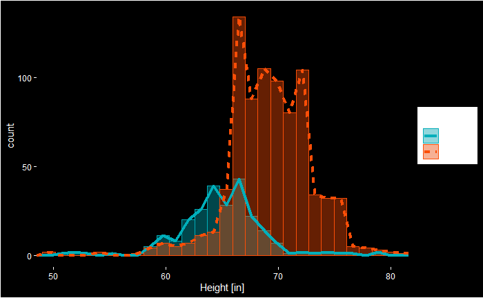
We see the prediction we did had high overall accuracy. At the same time, we see it had a low sensitivity. It happened because of the low prevalence (proportion of females), 23%. That means failing to call actual females as females (low sensitivity) does not lower the accuracy as much as it would have by incorrectly calling males as females.

Here is the R code behind this fancy plot!

heights %>% 
  ggplot(aes(x = height)) +
geom_histogram(aes(color = sex, fill = sex), alpha = 0.4, position = "identity") + 
  geom_freqpoly( aes(color = sex, linetype = sex), bins = 30, size = 1.5) +
    scale_fill_manual(values = c("#00AFBB", "#FC4E07")) +
  scale_color_manual(values = c("#00AFBB", "#FC4E07")) +
  coord_cartesian(xlim = c(50, 80)) +  
  scale_x_continuous(breaks = seq(50, 80, 10), name = "Height [in]") +
  theme(text = element_text(color = "white"), 
        panel.background = element_rect(fill = "black"), 
        plot.background = element_rect(fill = "black"),
        panel.grid = element_blank(),
        axis.text = element_text(color = "white"),
        axis.ticks = element_line(color = "white")) 

Looking at the plot, we see that the cut-off we used, 64 inches, misses a significant proportion of females. Let’s re-run the simulations after adding two more points (66 inches) to the cut-off.

Confusion Matrix and Statistics

          Reference
Prediction Female Male
    Female     82   66
    Male       33  345
                                          
               Accuracy : 0.8118          
                 95% CI : (0.7757, 0.8443)
    No Information Rate : 0.7814          
    P-Value [Acc > NIR] : 0.049151        
                                          
                  Kappa : 0.5007          
                                          
 Mcnemar's Test P-Value : 0.001299        
                                          
            Sensitivity : 0.7130          
            Specificity : 0.8394          
         Pos Pred Value : 0.5541          
         Neg Pred Value : 0.9127          
             Prevalence : 0.2186          
         Detection Rate : 0.1559          
   Detection Prevalence : 0.2814          
      Balanced Accuracy : 0.7762          
                                          
       'Positive' Class : Female  

Confusion Matrix – Accuracy vs Sensitivity Read More »

Confusion Matrix – Continued

We have seen output from the ‘confusionMatrix’ command in the ‘caret’ package.

Confusion Matrix and Statistics

          Reference
Prediction Female Male
    Female     55   24
    Male       64  383
                                         
               Accuracy : 0.8327         
                 95% CI : (0.798, 0.8636)
    No Information Rate : 0.7738         
    P-Value [Acc > NIR] : 0.0005217      
                                         
                  Kappa : 0.4576         
                                         
 Mcnemar's Test P-Value : 3.219e-05      
                                         
            Sensitivity : 0.4622         
            Specificity : 0.9410         
         Pos Pred Value : 0.6962         
         Neg Pred Value : 0.8568         
             Prevalence : 0.2262         
         Detection Rate : 0.1046         
   Detection Prevalence : 0.1502         
      Balanced Accuracy : 0.7016         
                                         
       'Positive' Class : Female         
                                    
Female
(Actual)
Male
(Actual)
Female
(Predicted)
55
(TP)
24
(FP)
Male
(Predicted)
64
(FN)
383
(TN)
TP – true positive, FP – false positive, FN – false negative, TN – true negative

Accuracy is the proportion of cases where the model correctly predicted the outcome.
(TP + TN) / Total
(55+383)/(55+64+24+383) = 0.8327

Sensitivity is the proportion of females the model correctly predicted.
TP/(TP + FN)
55/(55+64) = 0.4622

Specificity is the proportion of males the model correctly predicted.
TN/(TN + FP)
383/(24+383) = 0.9410

Positive predictive value (PPV)
TP/(TP + FP)
55/(55+24) = 0.6962

Negative predictive value (NPV)
TN/(TN + FN)
383/(383 + 64) = 0.8568

Prevalence is the proportion of females in the total sample set.
(TP + FN) / (TP + FN + FP + TN)
(55+64)/(55+64+24+383) = 0.2262

Detection rate is the proportion of females in total.
TP/(TP + FN + FP + TN)
55/(55+64 + 24+383) = 0.1046

Detection Prevalence is the proportion of predicted females in total.
(TP+FP)/(TP + FN + FP + TN)
(55+24)/(55+64 + 24+383) = 0.1502

Balanced Accuracy is (sensitivity+specificity)/2
(0.4622 + 0.9410)/2 = 0.7016

Confusion Matrix – Continued Read More »

Confusion Matrix

Machine learning is a technique to train a model (algorithm) using a dataset for which we know the outcome and then use the algorithm, making predictions where we don’t have the outcome. The confusion matrix is the summary in a tabular form, highlighting the model performance.

Height data

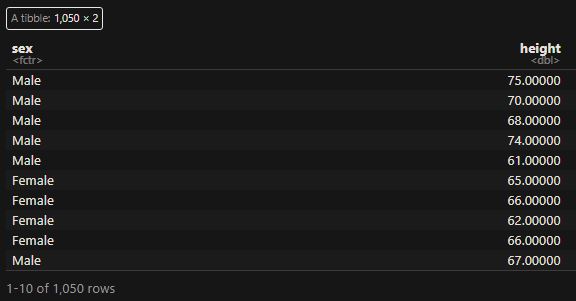
We develop a simple machine learning algorithm predicting the sex of a person from the height data. The R package to help here is ‘caret’. Here are the first ten entries of the dataset that contains 1050 members.

The first thing is to check whether we can distinguish between the heights of males and females. The following command summarises the mean and standard deviation of heights.

heights %>% group_by(sex) %>% summarize(Mean = mean(height), SD = sd(height))

Yes, the males are a little taller than the females, and we use this property to make decisions. I.e., assign the output as male if the height is greater than 64 inches and female otherwise. But before getting into the calculations, we divide the dataset randomly into two halves – training set and test set – using the ‘createDataPartition’ in the ‘caret’ package.

test_index <- createDataPartition(heights$height, times = 1, p = 0.5, list = FALSE)
train_set <- heights[-test_index,]
test_set <- heights[test_index,]

Now, we have two sets with 526 members each. We apply the algorithm to the training set and see the results.

y_hat <- ifelse(train_set$height > 64, "Male", "Female") %>%  factor(levels = levels(train_set$sex))
mean(y_hat == train_set$sex)

We apply the formulation to the test set and get the confusion matrix.

y_hat <- ifelse(test_set$height > 64, "Male", "Female") %>% 
  factor(levels = levels(test_set$sex))

confusionMatrix(data = y_hat, reference = test_set$sex)
Confusion Matrix and Statistics

          Reference
Prediction Female Male
    Female     55   24
    Male       64  383
                                         
               Accuracy : 0.8327         
                 95% CI : (0.798, 0.8636)
    No Information Rate : 0.7738         
    P-Value [Acc > NIR] : 0.0005217      
                                         
                  Kappa : 0.4576         
                                         
 Mcnemar's Test P-Value : 3.219e-05      
                                         
            Sensitivity : 0.4622         
            Specificity : 0.9410         
         Pos Pred Value : 0.6962         
         Neg Pred Value : 0.8568         
             Prevalence : 0.2262         
         Detection Rate : 0.1046         
   Detection Prevalence : 0.1502         
      Balanced Accuracy : 0.7016         
                                         
       'Positive' Class : Female         
                                    

In the tabular form,

Actual
FemaleMale
PredictedFemale5524
Male64383

The rows on the confusion matrix present what the algorithm predicted, and the columns correspond to the known truth. The output provides a bunch of other metrics. That is next.

Confusion Matrix Read More »