We know what is the tragedy of the commons. Any resource that has too few owners leads to overuse. Examples of this are overfishing of oceans and pollution of the environment, to name a few. A solution to the tragedy of the commons is private ownership. It assumes that the owner manages consumption and conserves a scarce resource.
Privatisation as a solution to the commons also has problems. In anticommons, there are too many owners, and each can exclude others from using, leading to underuse. It becomes a coordination failure. In other words, some resources don’t get invented or don’t reach the market.
The world is experiencing another El Niño episode. El Niño is a climate pattern of more than usual warming surface waters in the eastern Pacific Ocean. It is defined as a phenomenon in the equatorial Pacific Ocean (Niño 3.4 region) marked by a positive departure for five consecutive three-month running mean sea surface temperature (SST = 28°C) by +0.5°C.
Cap and trade is amethod of regulatory intervention to reduce carbon emissions. Here, the system sets a maximum value for the emissions (cap). It also provides allowances, in emission permits, to firms to cover each unit of CO2 (or any other pollutant) produced. The company can redeem one for every emission unit or trade it to another party, who can then use it.
The regulator can issue permits to the firm in two ways. It can give away permits for free (based on some criteria) or auction them. Allocating permits based on past emissions is called grandfathering.
Mathematically, economists proved that the fee of permits has no impact on the price of the product. If p is the price, q is the output, c(q) is the cost of production, pp is the permit cost, and A is the free permit.
1) For zero free permit profit = p q – C(q) – ppq The firm maximises its profit with respect to quantity, d(profit)/dq = p – C'(q) – pp = 0 price of the product, p = C'(q) + pp
2) For ‘A’ free permits profit = p q – C(q) – (ppq – A) The firm maximises its profit with respect to quantity, d(profit)/dq = p – C'(q) – pp = 0; A is a constant and its derivative is zero. price of the product, p = C'(q) + pp
So, in both cases, the product’s price is the marginal cost + the price of the permit. The auction, at least, gives the government some money that can be used to support the people who are the worst affected by the price rise.
We have seen the carbon intensity of the various national electric grids in the previous post. India is one of the countries with a reasonable growth of renewables – 40% installed power of non-fossil fuel-based electricity – yet with one of the higher carbon intensities in the group with 632 gCO2/kWh. We use that example to explain the difference between power and energy.
Power vs Energy
Power, defined as W, kW, MW etc., is the capacity of the generator to deliver the electric energy. And energy is what is delivered by the machine to do work. For example, if a one MW system runs for one hour, it produces 1 MWh of energy. In other words, a 1 MW system delivers 8.76 GWh of energy a year if it works full-time (1 x 24 x 365). But, if the same generator works only 10% of the time, it produces 876 MWh.
Capacity factor
We have encountered it before. It is the actual amount of energy obtained (in MWh) in an average hour of the year if you install a one MW plant. You can get it by dividing the exact electricity output by the maximum possible.
Let’s look at India’s electricity production (excluding utility and captive Power).
And the installed power,
You can see the issue: the installed power from non-fossil-fuel-based electricity production is in the 40s, whereas the energy contribution is only in the 20s. The capacity factors are estimated by dividing the power with the corresponding energy for a 24-running generator.
Note the low capacity factor for the gas generators. It is not an inherent problem of gas turbines but is likely due to controlled production as a flexible means to manage the peak load requirements.
The global emissions of CO2, which is about three-quarters of all greenhouse gases, stood at 36.8 Gt in 2022. A third of the CO2 comes from power production. Reduction of CO2 intensity, therefore, is crucial for a few reasons. First, it reduces the present emissions. More importantly, a cleaner grid catalyses future decarbonisation of other industries via electrification.
The carbon intensity of electric grids, expressed as grams of CO2 per kWh of electricity produced, is presented below.
You can see in the plot that the global average is ca. 436.34 gCO2/kWh. Coupled that with 28,528 Terrawat-hour (TWh) of electricity production in 2022, you get 436.34 (gCO2/kWh)* 28528 (TWh) /1e6 = 12.45 Gt CO2.
There are two commonly used units for the power production of an area – energy produced and the installed power. And they often cause some confusion. That is next.
We have seen how the cap and trade works. The regulator sets a maximum value for the emissions (cap). It provides allowances, in emission permits, to firms to cover each unit of CO2 (or a pollutant) produced. The company can redeem one for every emission unit or trade it to another party, who can then use it.
Additionality is a term that is closely associated with this. By trading, an emitter can buy offset rather than reduce the emission. A quality offset must mean that GHG reduction has happened by the seller as a result of a project which otherwise would not have been possible. The additionality is a positive intervention that reduces GHG. In other words, it is not additional if the reductions would have happened anyway.
An infamous example is a company that declares offset by buying credits from a project that claims to conserve a forest which was already conserved!
Well, I don’t think there is anything wrong with it! They are like the carbon tax and the cap and trade – means to charge the emitter their share of the social cost of carbon.
But what are fuel standards? These are regulations set by the government targeting to cut down CO2 emissions. For example, the US CAFE standards (corporate average fuel economy) required each manufacturer to meet two specified fleet average fuel economy levels for cars and light trucks, respectively. California pioneered the low carbon fuel standard that regulates the average carbon content per gallon of gasoline. If the former controls the amount one can burn, the latter focuses on capping the CO2 in the given amount of fuel.
Let’s understand how a fuel efficiency standard operates.
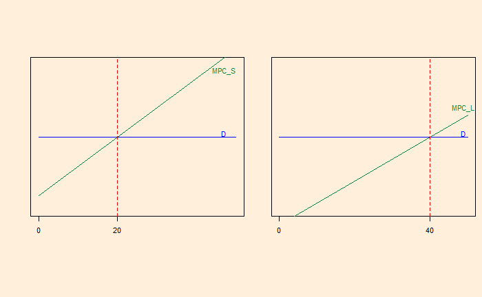
Suppose a manufacturer sells 20 small cars (S) and 40 large cars (L). Let the economies of these cards be 30 miles per gallon (mpg) for S and 10 mpg for L. The administration requires the average mpg (of the car sold) to be 20 mpg. On a simplistic level, this allows the company to sell one S for every L [(30 + 10) / 2 = 20 mpg]. Let’s look at a simplified supply-demand curve.
MPC = Marginal Private Cost or the change in the producer’s total cost brought about by the production of an additional unit. The flat demand curve means it is perfectly competitive.
Naturally, this must change as per regulation because the average mpg is (20 x 30 + 40 x 10) / 60 = 16.7; less than 20. One solution is to reduce L production to 20 and bring the mpg to the compliance level.
The shaded triangle on the right is the amount of profit that is forfeited in this exercise. What happens if I sell five more Ls? It would mean the company must sell five more Ss at a loss.
This process can go on until the red-shaded area on the left matches with the green-shaded area on the right. That means the S car sales increase.
So, a performance standard subsidises the product, which makes the standard easier. In other words, the firm taxes the poor-performing car by subsidising the better performer. The plot will tell you that L is sold at a price higher than its marginal cost, whereas S is sold below its marginal cost.
So, what is wrong with fuel standards? There is a possibility that the firm ends up selling more cars than it would do otherwise. There is also a possibility for the Jevons paradox, where people end up driving the fuel-efficient car more (rebound).
The Stern Review has been one of the most influential economic reports on climate change. It is an independent review commissioned by the chancellor of the exchequer of the UK to assess climate change and its economics.
The report acknowledges the urgency required to control climate change. According to the report, the loss due to climate change is about 5% of GDP each year. He recommends carbon taxes, about 1% of the GDP, as the way to finance mitigation strategies.
If you have noticed the McKinsey curve, and I’m sure you have, one thing that surprises me is why a significant portion of the graph has abatement cost in negative, yet haven’t happened yet! Simple economics can’t explain that. So why does it remain a resource untapped?
One possible explanation can be a lack of information.