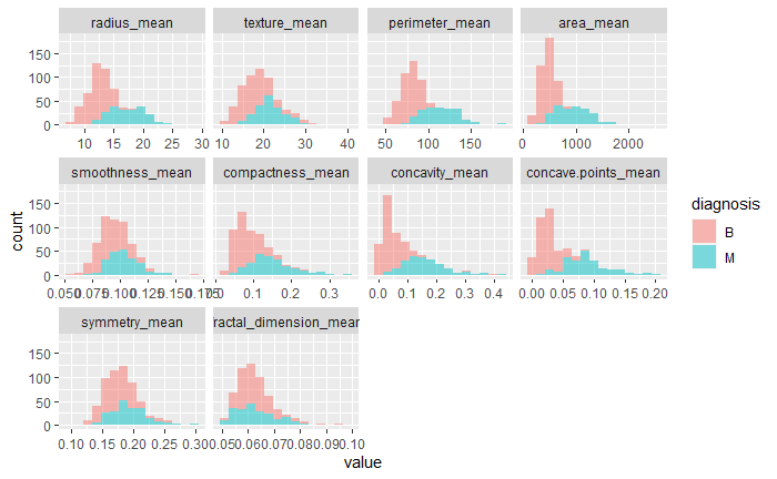
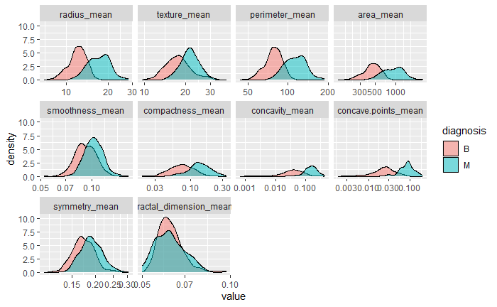
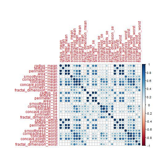
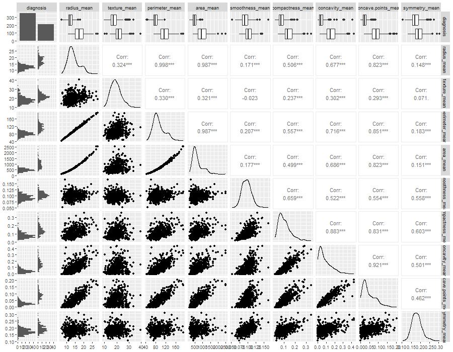
The dataset, known as the Breast Cancer Wisconsin (Diagnostic) Dataset, was obtained from Kaggle. It was built by Dr Wolberg, who used fluid samples from patients with solid breast masses. It provides ten features of cells from each sample – the mean value, extreme value and standard error of 10 features for the image returning 30 variables. Those ten components are:
radius
texture
perimeter
area
smoothness
compactness
concavity
concave points
symmetry
fractal dimension
The objective is to match the outcome, and diagnosis, which takes two values vz benign (B) or malignant (M). The following plot gives the overall summary of how the various features compare between benign (B) and malignant (M)
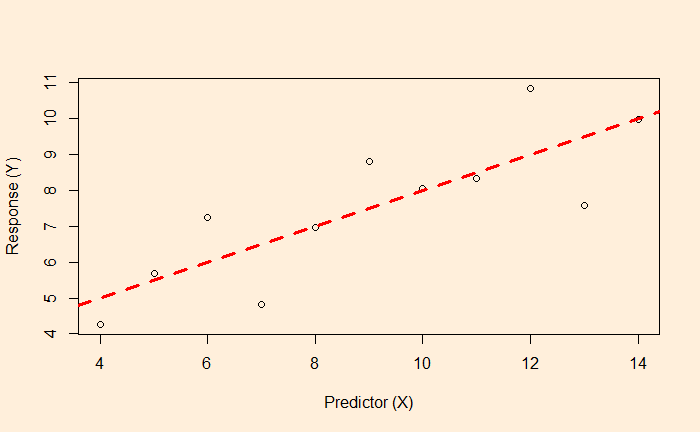
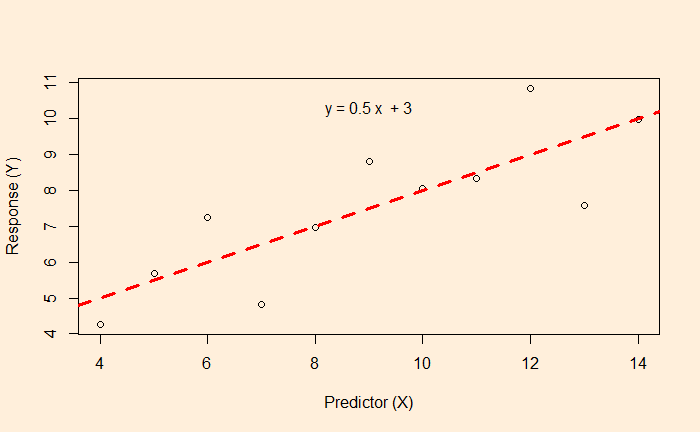
We know linear regression, which allows us to find the relationship between two variables and let us predict a dependent variable from an independent variable.
In this example, the function associated with the red dotted line lets us estimate the fat% if a BMI value is known.
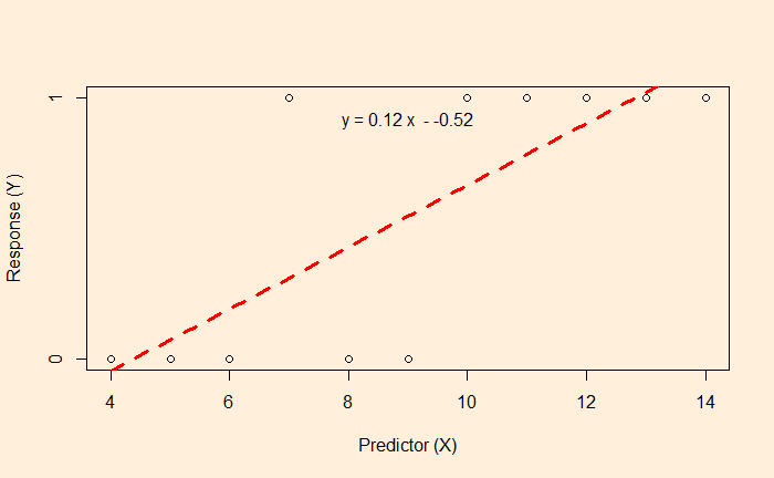
But what happens if the data is available, like the following?
Here, the survey gives either a YES or NO as the answer (1 = YES, 0 = NO). The linear regression and the subsequent equation are meaningless here. In such cases, we resort to logistic regression.
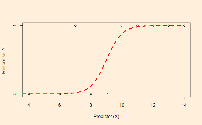
The objective of the logistic regression is not to get the value of Y but the probability. E.g., if the X value is 9, there is a 50% chance of getting a YES. On the other hand, X = 2 has a higher probability of getting a NO.
The plot tells you that the data is best suited for classification. Ys with < 50% chance to occur will be classified as the YES category, and < 50% is in NO.
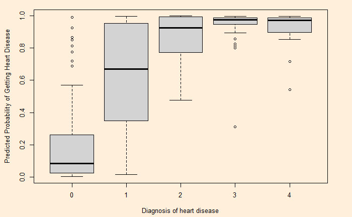
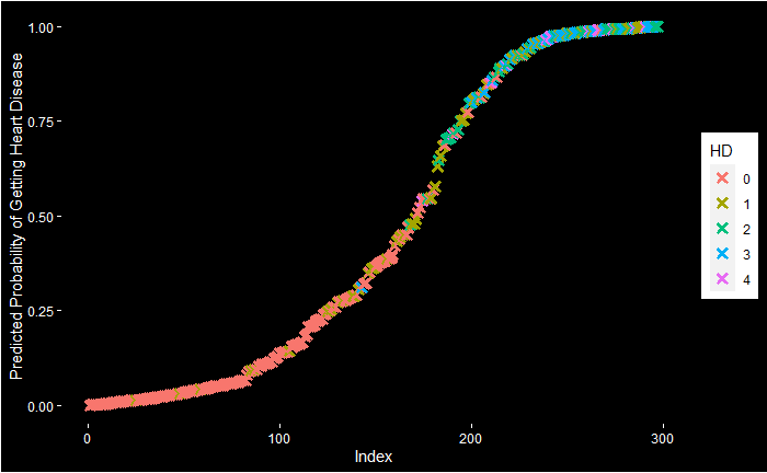
Let’s do a logistic regression of health data. Experiments with the Cleveland database focused on distinguishing the presence (value: 1,2,3,4) from the absence (value 0). The featured health parameters are
Age Sex CP: chest pain Trestbps: resting blood pressure (mm Hg) Chol: serum cholesterol (mg/dl) Fbs: fasting blood sugar > 120 mg/dl Restecg: Rest ECG Thalach: maximum heart rate achieved during the thallium stress test Exang: exercise-induced angina Oldpeak: ST depression induced by exercise relative to rest Slope: the slope of the peak exercise ST segment Ca: number of major vessels (0-3) coloured by fluoroscopy Thal: Hd: diagnosis of heart disease
After cleaning up and conditioning, the data looks like this:
We saw cognitive reflection problems, where our mind (brain) wants us to lock in – what it believes to be – a ‘timely’ answer which it gets via mental shortcuts. Here is one such question
Road
Major Accidents
Minor Accidents
Road 1
2000
16
Road 2
1000
?
Fill the box with the question mark to make the accidents in two roads equivalent.
Studies have shown a high proportion of people answered 8. Their attempt was perhaps to maintain the same ratio (2000:16 == 1000:8). But the question was to estimate the number of minor incidents required for a road with fewer major accidents to make it equivalent to the one with more major accidents. Naturally, it should be much more than 1000 (the shortfall of major accidents on Road 2 vs Road 1).
Cars and workers
Another famous trick puzzle has the following form:
It takes 7 workers to make 7 cars in 7 days. How many days would it take 5 workers to make 5 cars?
Park your instincts to answer 5 (so that 5-5-5 matches with 7-7-7!) for a while. Try this first, If 7 workers can build 4 cars in 3 days, how many days would it take 8 workers to build 6 cars?? I assume more people answer the second one correctly because it shows fewer visible patterns and may slow you down.
Answer: car per worker per day = (4/7)/3 = 4/21. So, 8 workers can make 32/21 cars in a day. But we want 6 cars => (32/21) x X (days) = 6. X = (21 x 6)/32 = 3.9 days.
In the same way, the first question is answered as follows: (7/7)/7 = 1/7 car per worker per day. 5 workers can make 5/7 cars in a day. For making 5 cars, one needs (5/7) x X (days) = 5 or X = 35/5 = 7 days.
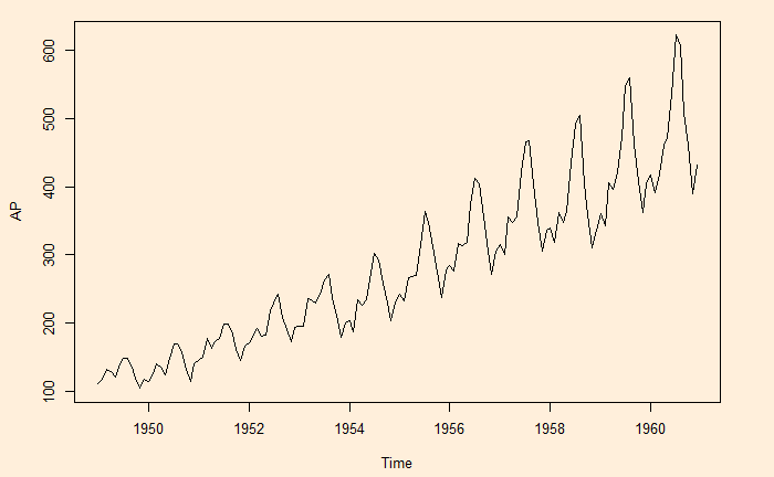
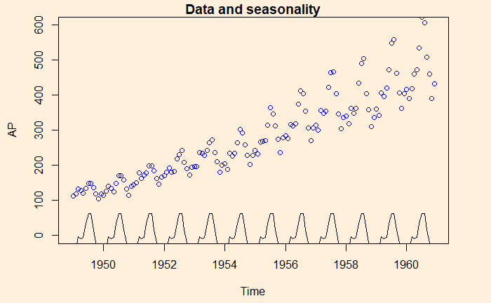
Here is another time series, namely, the air passengers.
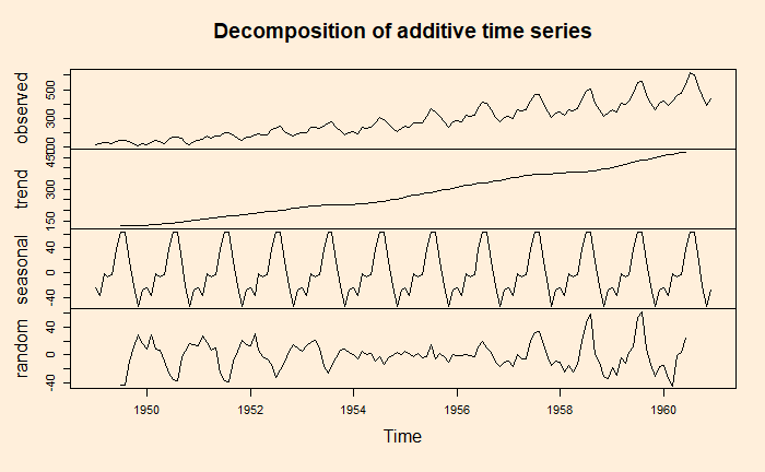
A key task of the time series analysis is to break down the data into signal and noise. In R, there is a function called decompose to do the job.
decom_AP <- decompose(AP, type = "additive")
plot(decom_AP)
Note that the data is already in a time series format. If it is a regular data frame, use function ‘ts’ first before attempting the decompose function.
Here is the illustration – the data (blue circle), compared with the seasonality.
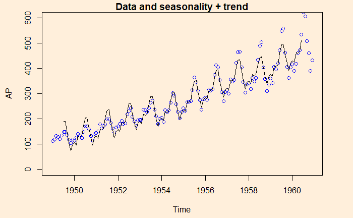
Here is data with seasonality + trend
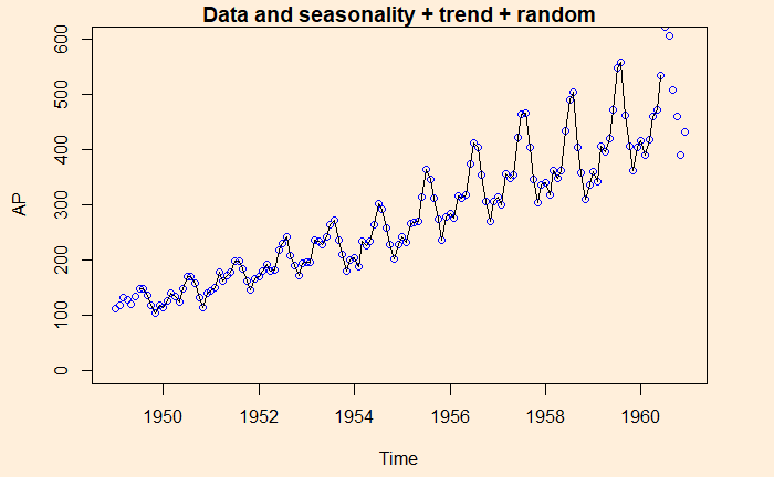
And finally, data is compared with the sum of all three, seasonality + trend + random
Time series is data of the same entity collected at regular intervals. And the analysis of this is a time series analysis. Here, the time is the independent variable (typically the X-axis), and a characteristic is measured, which forms the dependent variable. The objective of the time series analysis is to understand the pattern of changes over time. And to make projections about the future.
Components of time series analysis
The long-term tendencies of the data are called trends.
The repeating feature of the pattern is called seasonality
The repeating but non-seasonal patterns are called cycles.
The unpredictable ups and downs of the data is the last component, which is variation.
We saw Galton’s “wisdom of the crowd” before. It says that a crowd’s judgement is more accurate than an individual’s. The near-accurate estimate of the weight of a prize-winning ox by the common public became famous after Galton. But what happens if the mass is wrong?
These are questions on specialised subjects that a knowledgeable minority knows. When such questions are asked, unsurprisingly, the wrong answers get the majority.
Surprisingly popular algorithm
To deal with this problem, researchers from Princeton and MIT have developed a solution that involves two questions instead of one (What do they think the right answer is, and how popular do they think each answer will be?). Take this example.
1) Is Philadelphia the capital of Pennsylvania (Y/N)? 2) What do you think is the prevalent answer (Y/N)?
Philadelphia is not the correct answer (it’s Harrisburg), and only the minority knows that. The majority will say YES to the first; of those, most will respond YES about the others. On the other hand, the minority will answer NO, and since they know it’s specialised information, they also expect most others to say YES. Thus, the ‘YES’ will be more, or the ‘NO’ will be lower in the second case.
Take the difference between the first question and the ‘popular’ question. ‘Yes’ will be negative (first YES < second YES), and ‘NO’ will be positive (first NO > second NO). Therefore, No is surprisingly popular and the correct answer.
I found this cool Binomial Probability Calculator from Stat Trek. Plug in the probability of success, the number of trials and the number of successes, and you get a set of probabilities ranging from exact to cumulative.
Here is one problem to try: In a city, it has been estimated that the probability of drivers not wearing seat belts is 10% and driving under the influence of alcohol is 5%. If the police check five people at random, what is the probability of catching at least one person who has committed at least one offence?
The first step is to estimate the probability of success of a single trial (person). Probability of not wearing a seat belt (SB) or drink and drive (DD) = P(SB U DD) = P(SB) + P(DD) – P(SB & DD) = 0.05 + 0.1 – 0.05 x 0.1 = 0.145. The rest is simple, # trials = 5; # success (x) = 1.
The answer we are looking for is the probability of at least one person committing a crime, which is = P(X >/= x) = 0.543 (the last entry in the results).
Now, try this one: The probability of failure (on demand) for a safety instrument is 1 in 10000. A plant has 1000 such instruments. What is the chance that there is at least one (x = 1) failed instrument? The answer P(X >/= x) = 0.095 or about 10%.