Life

The Trouble with Evolution

With millions of pieces of evidence, the theory of evolution is as factual as, say, Newton’s laws of motion! Yet, how it’s taught in schools requires a reexamination before it can achieve its intended goals of education. Some items need attention before introducing the subject to the interested parties.

Lamarck’s theory

The theory that says evolution is the adaptation of organisms to their environment has only historical relevance. It is not how evolution works. People are stuck to Lamarck’s theory, partly because it was taught before Darwin’s and also because it fits our fantasy of conversion and purpose. We will address these two terms soon. To repeat: individual organisms don’t evolve or pass their aspirations to offspring through genes.

Metaphors taken literally

We already know that nature doesn’t select anybody. Also, physical strength and superiority have nothing to do with the survival probability of a species. Yet, we carry the burden of natural selection and survival of the fittest in their literal meaning. These terms are strictly metaphors to communicate, perhaps wrong choices from people who lived a hundred years ago!

Another common feature in science communication is to say genes want to copy and spread. It creates a false notion of purpose in listeners’ minds. Again, a gene has no brain to decide anything, unlike humans, who are involved in designing artefacts for their use. You know, this purpose is not that purpose!
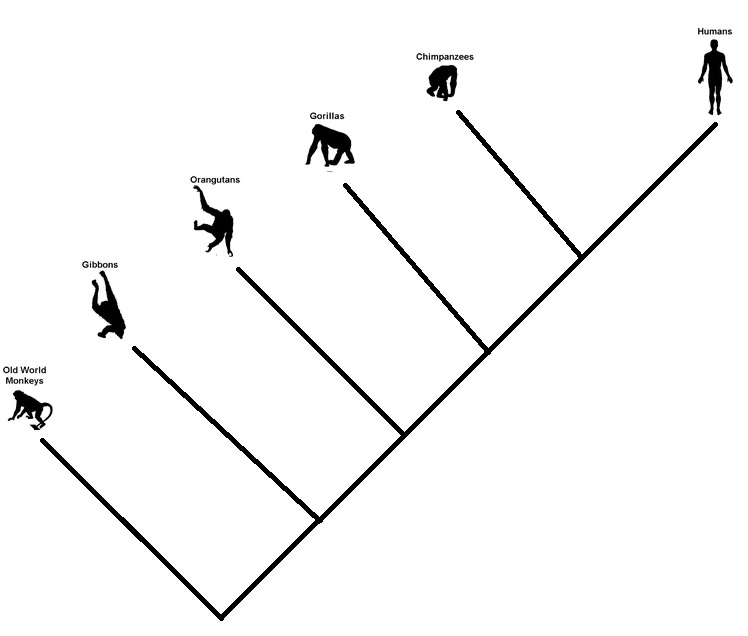
It goes in branches

This one came from a cartoonist – the money to the man. It is not a conversion process that works linearly. Once a species passes the baton, it doesn’t exit the scene. Evolution steps are random branching processes. So monkeys may survive, and so do apes or the great apes. Some may perish as well.

In summary

The features we see in today’s organisms are not part of any plans for perfection but simply a collection of clues about our past.

The Trouble with Evolution Read More »

Darwin’s moth for Darwin’s Orchid

Remember the story of Tiktaalik, the missing piece in the evolution that connected fishes and four-legged animals? Here is another equally exciting example. And how Darwin predicted the existence of a species after seeing a flower!

In 1862, Charles Darwin received a box of orchids from a well-known grower of his time. Among them was Angraecum Sesquipedale. Check the link to see how it appears. Look at the long spur or nectary, the nectar-secreting organ in the flower. Seeing the extraordinarily long nectary, Darwin wondered about the existence of moths with long tongues. As nectar-liking moths are crucial agents for pollination, such an orchid would not have evolved without the help of a moth with fitting organs.

In 1907, years after Darwin’s death in 1892, the culprit was found – Xanthopan Morganii Praedicta, from Madagascar!

To conclude this story, in the 1990s, biologists made direct observations of the meeting of the two. See the cover page of the Botanica Acta of 1997.

Reference

Arditti et al., ‘Good Heavens what insect can suck it’– Charles Darwin, Angraecum sesquipedale and Xanthopan morganii praedicta, Botanical Journal of the Linnean Society, 2012, 169, 403–432.

Darwin’s moth for Darwin’s Orchid Read More »

Mileage Paradox

Andy owns a car with 20 km/L mileage and Becky has one with 8. They both purchased new cars to tackle the rising fuel price. Andy’s new car is now 30 km/L, and Becky’s is 10. If they both drive similar kilometres, who will save more money?

A quick glance at the problem tells you a 50% improvement for Andy (20 to 30), whereas only 25% for Becky (8 to 10). So Andy, right? Not so fast. Because you are dealing with a compound unit (kilometre per litre) with the actual quantity, we are after (litre), which is in the denominator. So our intuition based on simple numbers goes for a toss.

Imagine they both drive 2000 kilometres this year. Andy consumed 2000 (km) / 20 (km/L) = 100 L in the past, but will consume 2000/30 = 66.7 L this year. On the other hand, Becky’s consumption will reduce from 2000/8 = 250 to 2000/10 = 200. So Becky saves 17 L more than Andy.

Speed paradox

A similar problem of averaging denominators exists in the famous challenge of average speeds: Cathy travelled from A to B at 30 km/h and returned (B to A) at 60 km/h. What was Cathy’s average speed? Needless to say, the intuitive answer (30+60)/2 = 45 is wrong. It is easy to solve if you assume a fixed distance (magnitude doesn’t matter), say, 100 km. For A to B, she took 100 (km)/30 (km/h) = 3.33 h and for the return 100 (km)/60 (km/h) = 1.67 h. So she travelled 200 km in 5 hours. The average speed is 200 (km) / 5 (h) = 40 km/h.

Mileage Paradox Read More »

Evolution vs Conversion

Misconceptions about evolution exist due to humans’ inability to comprehend the enormousness of time. That leads to common misconceptions such as, “I haven’t seen a monkey giving birth to a human”, “if humans evolved from monkeys, why do monkeys still exist?” etc.

Firstly, monkeys did not evolve into humans. In the evolution tree (remember: it’s a tree and not a line), monkeys are not our ancestors; they are cousins. In other words, the common ancestors of monkeys and humans (apes) existed about 30 million years ago. The monkeys we see today had a trajectory from that time to the present, just like their distant cousin, humans, in that period.

The same goes for chimpanzees and humans. Chimpanzees are our closest cousins, and that branch goes back 5-7 million years ago. A rough sketch of the branching business is shown below.

Understanding Evolutionary Trees: Evo Edu Outreach (2008) 1:121–137

Evolution vs Conversion Read More »

Survival Data – Sankey Diagram

We have learned survival analysis in the last few posts, using a dataset involving 42 data points from an efficacy for an experimental drug. The data set was in the following format.

groupgenderrelapse
Treatment FemaleTRUE
Treatment MaleTRUE
Treatment FemaleFALSE
Treatment FemaleTRUE
ControlMaleTRUE
ControlFemaleTRUE
ControlFemaleTRUE
ControlMaleTRUE
ControlFemaleTRUE

Sankey diagram

A Sankey diagram is a visualisation technique for showing the flow of energy, material, or, in this case, events. The simplest example is visualising the flow of how the treatment and control groups responded to the illness’s relapse.

It is noticeable that all the participants in the control group had relapses of the disease, whereas it was mixed in the treatment group.

The plot was created by executing the following R code:

library(ggsankey)
library(tidyverse)
df1 <- ill_data %>% make_long(group1, relapse)

san_plot <- ggplot(df1, aes(x = x
                            , next_x = next_x
                            , node = node
                            , next_node = next_node
                            , fill = factor(node)
                            , label = node))
san_plot <- san_plot + geom_sankey(flow.alpha = 0.5
                                   , node.color = "black"
                                   , show.legend = FALSE)
san_plot <- san_plot + geom_sankey_label(size = 3, color = "black", fill = "white", hjust = 0.0)
san_plot <- san_plot + theme_bw()

san_plot

Note that the package ‘ggsankey’ may not be available from your usual repository, CRAN. You may be required to run the following two lines to get it.

install.packages("remotes")
remotes::install_github("davidsjoberg/ggsankey")

Let’s add another node to the Sankey, the gender.

df1 <- ill_data %>% make_long(group1, relapse, gender)

san_plot <- ggplot(df1, aes(x = x
                            , next_x = next_x
                            , node = node
                            , next_node = next_node
                            , fill = factor(node)
                            , label = node))
san_plot <- san_plot + geom_sankey(flow.alpha = 0.5
                                   , node.color = "black"
                                   , show.legend = FALSE)
san_plot <- san_plot + geom_sankey_label(size = 3, color = "black", fill = "white", hjust = 0.0)
san_plot <- san_plot + theme_bw()

san_plot

Further resources

World Energy Flow 2019: IEA

Survival Data – Sankey Diagram Read More »

Weibull distribution

The Weibull distribution is a continuous probability distribution. Its speciality is that it can fit different distribution shapes and is a favourite for time-to-failure data, a vital parameter of interest in reliability analysis. It is related to the exponential distribution. The distribution has two parameters: shape (k) and scale (lambda).

Because of the flexibility to change the shape probability distribution function by varying its key parameters, k and lambda, Weibull finds several applications. Notable among them is modelling the distribution of wind velocities.

Weibull distribution Read More »

Survival Plots – Cox proportional hazards model

Here is where we stopped last time. The next step is quantifying the difference between the treatment and the control groups. Now refresh your memory or hazard ratio, efficacy – all those stuff.

Cox proportional hazards model

The main idea is to find out if the survival time depends on one or more variables or predictors. In our case, there is only one variable with two values – treatment or placebo. Cox model does regression (curve fitting or history matching) of the survival curve using the predictor. The model has an exponential relationship between the observed hazard to the effect of the predictor.

h(t) = h_0(t) e^{B_1X_1}

h(t) is the observed hazard (a function of time), and h0(t) is the baseline hazard. The exponential term is the effect of the condition (treatment or not). Note that the exponential term is not a function of time, and eB1 is the hazard ratio. We know we have two conditions for X1, i.e. X1 = 1 (treatment) and X1 = 0 (control).

\frac{h(t|X_1=1)}{h(t|X_1=0} = \frac{h_0(t) e^{B1}}{h_0(t)} = e^{B1}

The above is the ratio between the hazard when the treatment is present and the hazard when the treatment is absent.

Note the regression can be performed using a combination of variables, e.g. age, sex etc.

\frac{h_{X1}(t)}{h_{X2}(t)} =  \frac{h_{0}(t) e^{\sum\limits_1^n BX1}}{h_{0}(t) e^{\sum\limits_1^n BX2}} =  \frac{e^{\sum\limits_1^n BX1}}{e^{\sum\limits_1^n BX2}}

Significance

The following R commands do all the job and spit out the hazard ratio and the significance or p-value.

ill_cox_fit <- coxph(Surv(weeks, illness) ~ group, data = ill_data1)

The output is:

Call:
coxph(formula = Surv(weeks, illness) ~ group, data = ill_data1)

  n= 42, number of events= 30 

                  coef exp(coef) se(coef)      z Pr(>|z|)    
groupTreatment -1.5721    0.2076   0.4124 -3.812 0.000138 ***
---
Signif. codes:  0 ‘***’ 0.001 ‘**’ 0.01 ‘*’ 0.05 ‘.’ 0.1 ‘ ’ 1

               exp(coef) exp(-coef) lower .95 upper .95
groupTreatment    0.2076      4.817   0.09251    0.4659

Concordance= 0.69  (se = 0.041 )
Likelihood ratio test= 16.35  on 1 df,   p=5e-05
Wald test            = 14.53  on 1 df,   p=1e-04
Score (logrank) test = 17.25  on 1 df,   p=3e-05

The ‘exp(coef)’ value is nothing but the hazard ratio. And we know that the efficacy is (1 – hazard ratio), and in our case, it is about 80%. The p-value is low, and therefore the difference in survival time between the treatment and control is statistically significant.

Survival Plots – Cox proportional hazards model Read More »

Survival Plots – R Simulations

We continue from where we stopped last time and develop an R code for survival analysis.

We need to code 1 for people who experienced the event, and the censored ones (who haven’t experienced or left the group) get 0. Note that you can substitute indicator 2 for 1 and 1 for 0. The following are the first ten entries of the data frame.

groupweeksIllness
Treatment 61
Treatment 61
Treatment 61
Treatment 60
Treatment 71
Treatment 90
Treatment 101
Treatment 100
Treatment 110
Treatment 131

The survival package

The first thing we want is the ‘survival’ package. After installing the package, type the following commands.

ill_fit <- survfit(Surv(weeks, illness) ~ group, data = ill_data1, type = "kaplan-meier")
summary(ill_fit)

par(bg = "antiquewhite1")
plot(ill_fit, col = c("blue", "red"), xlim = c(0,35), xlab = "Time in weeks", ylab = "Survival Probability")
legend("topright", legend = c("Control", "Drug"), col = c("blue", "red"), lty = c(1,2))

And the output is:

Call: survfit(formula = Surv(weeks, illness) ~ group, data = ill_data1, 
    type = "kaplan-meier")

                group=Control 
 time n.risk n.event survival std.err lower 95% CI upper 95% CI
    1     21       2   0.9048  0.0641      0.78754        1.000
    2     19       2   0.8095  0.0857      0.65785        0.996
    3     17       1   0.7619  0.0929      0.59988        0.968
    4     16       2   0.6667  0.1029      0.49268        0.902
    5     14       2   0.5714  0.1080      0.39455        0.828
    8     12       4   0.3810  0.1060      0.22085        0.657
   11      8       2   0.2857  0.0986      0.14529        0.562
   12      6       2   0.1905  0.0857      0.07887        0.460
   15      4       1   0.1429  0.0764      0.05011        0.407
   17      3       1   0.0952  0.0641      0.02549        0.356
   22      2       1   0.0476  0.0465      0.00703        0.322
   23      1       1   0.0000     NaN           NA           NA

                group=Treatment 
 time n.risk n.event survival std.err lower 95% CI upper 95% CI
    6     21       3    0.857  0.0764        0.720        1.000
    7     17       1    0.807  0.0869        0.653        0.996
   10     15       1    0.753  0.0963        0.586        0.968
   13     12       1    0.690  0.1068        0.510        0.935
   16     11       1    0.627  0.1141        0.439        0.896
   22      7       1    0.538  0.1282        0.337        0.858
   23      6       1    0.448  0.1346        0.249        0.807

We can see the difference in survival chances for people who had undergone treatment vs those who had not. Is this significant, and if so, how much is the difference? We will see next.

Survival Plots – R Simulations Read More »

Survival Plots – Kaplan-Meier Analysis

We will see how to make survival plots using the Kaplan-Meier (KM) method. The KM method is the cumulative probability of survival at regular intervals or whenever data is collected. Let’s go step by step to understand this. First, look at a data-collection table and familiarise yourself with a few terms.

The table describes the first few rows of 42 data points collected over 35 weeks (Data courtesy: reference 1). Week number represents the time, and the group describes if the person is treated with the drug or part of the control (placebo).

Week #GroupIllHealthy
6Treated31
7Treated10
9Treated01
10Treated11
11Treated01
13Treated10
16Treated10
1Control20
2Control20
3Control10
4Control20
5Control20

Time

In our case, it is the week number. We have a start of the study and an end of the study. Also, there are specific points in time for collecting data.

Event

The event, in this case, is the occurrence of illness.

Censoring

From the point of view of the study, there are people who have not yet experienced the event, i.e. remained healthy or were somehow left out of it at the time of data collection. These are people who are considered censored.

Survival plot

Here is the survival plot we obtained based on the Kaplan-Meier analysis. As you can see below, the graph shows the number of people who escaped the event (illness) at the end of the time frame. We’ll see how we got it using R next.

References

1) Generalized Linear Models: Germán Rodríguez
2) Kaplan–Meier estimator: Wiki
3) The Kaplan-Meier Method: karger

Survival Plots – Kaplan-Meier Analysis Read More »

Survival Plots

Survival analysis is used in many fields to understand certain events occurring as a function of time. Examples are patients surviving illness after treatments, employee turnover of companies, etc.

Survival plots are representations where the X-axis gives time, and the Y-axis gives the percentage (or proportion) of survivors or the portion that did not experience the event. Kaplan-Meier estimator is typically used to generate survival plots from experimental data.

Survival Plots Read More »