We have learned survival analysis in the last few posts, using a dataset involving 42 data points from an efficacy for an experimental drug. The data set was in the following format.
| group | gender | relapse |
| Treatment | Female | TRUE |
| Treatment | Female | TRUE |
| Treatment | Male | TRUE |
| Treatment | Female | FALSE |
| Treatment | Female | TRUE |
| — | — | — |
| Control | Male | TRUE |
| Control | Female | TRUE |
| Control | Female | TRUE |
| Control | Male | TRUE |
| Control | Female | TRUE |
Sankey diagram
A Sankey diagram is a visualisation technique for showing the flow of energy, material, or, in this case, events. The simplest example is visualising the flow of how the treatment and control groups responded to the illness’s relapse.
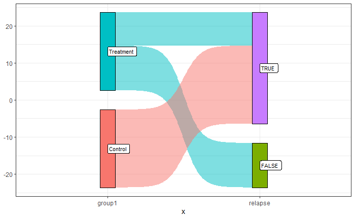
It is noticeable that all the participants in the control group had relapses of the disease, whereas it was mixed in the treatment group.
The plot was created by executing the following R code:
library(ggsankey)
library(tidyverse)
df1 <- ill_data %>% make_long(group1, relapse)

san_plot <- ggplot(df1, aes(x = x
                            , next_x = next_x
                            , node = node
                            , next_node = next_node
                            , fill = factor(node)
                            , label = node))
san_plot <- san_plot + geom_sankey(flow.alpha = 0.5
                                   , node.color = "black"
                                   , show.legend = FALSE)
san_plot <- san_plot + geom_sankey_label(size = 3, color = "black", fill = "white", hjust = 0.0)
san_plot <- san_plot + theme_bw()

san_plot
Note that the package ‘ggsankey’ may not be available from your usual repository, CRAN. You may be required to run the following two lines to get it.
install.packages("remotes")
remotes::install_github("davidsjoberg/ggsankey")
Let’s add another node to the Sankey, the gender.
df1 <- ill_data %>% make_long(group1, relapse, gender)

san_plot <- ggplot(df1, aes(x = x
                            , next_x = next_x
                            , node = node
                            , next_node = next_node
                            , fill = factor(node)
                            , label = node))
san_plot <- san_plot + geom_sankey(flow.alpha = 0.5
                                   , node.color = "black"
                                   , show.legend = FALSE)
san_plot <- san_plot + geom_sankey_label(size = 3, color = "black", fill = "white", hjust = 0.0)
san_plot <- san_plot + theme_bw()

san_plot
Further resources
World Energy Flow 2019: IEA