We have seen how samples from almost any distribution, provided you collected enough for the average, eventually make Gaussian, which is the Central Limit Theorem (CLT). We also see the futility of that assumption when dealing with asymmetric distributions such as the Pareto; ‘enough for the average‘ never happens with any practical numbers of sampling.
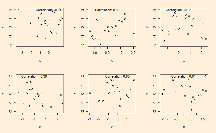
Once we assume that all samples obey CLT (which is already not a correct assumption), we start collecting data and finding out relationships. One of the pitfalls many researchers fall into is inadequate quality assurance and mistaking randomness as correlations. Here is an example. Following are six plots obtained by running two sets of standard normal distributions for random numbers (20 each) and plotting them on each other.
The plots are generated by running the following codes a few times.
x <- rnorm(20)
y <- rnorm(20)
plot(x,y, ylim = c(-2,2))
text(paste("Correlation:", round(cor(x, y), 2)), x = 0, y = 2)
A nice video on this topic by Nassim Taleb is in the reference. Note that I do not support his views on sociologists and psychologists, but I do acknowledge the fact that a lot of results generated by investigators are dubious.
Pareto is an asymmetric distribution; useful in describing practical applications such as uncertainties in business and economics. An example is the 80:20 rule, which suggests that 80% of the outcome (wealth) is caused (controlled) by 20%. It’s a special case of Pareto distribution with a shape factor = 1.16.
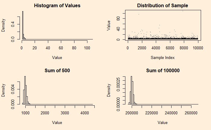
Let’s see how they appear for shape factor = 2.
Even after 100,000 additions, the distribution has not become a Gaussian. Recall that a coin with a 95% bias is close to a bell curve after 500 additions.
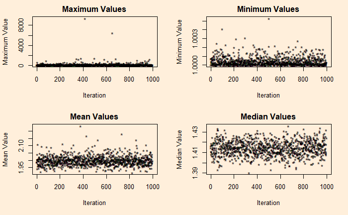
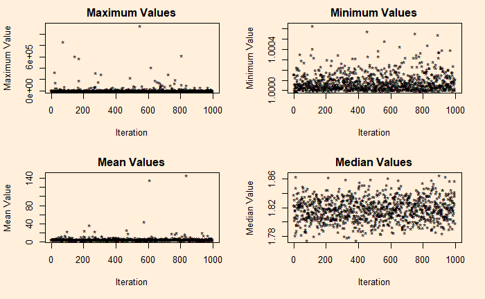
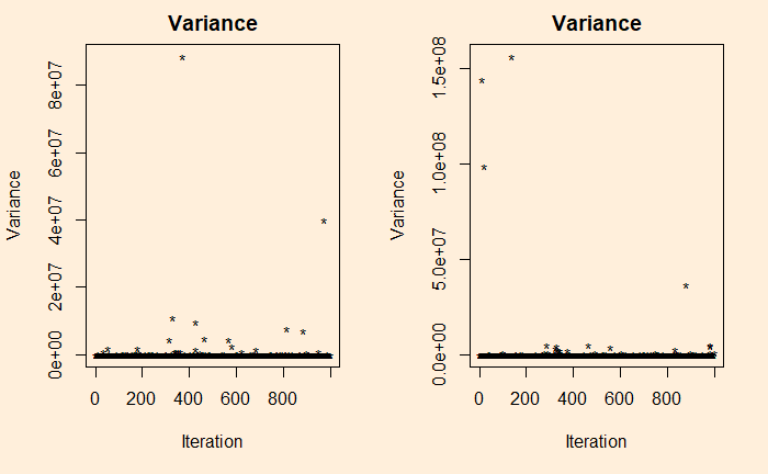
If you want to understand the asymmetry of Pareto, see the following four plots describing the maximum, minimum, mean and median of 10,000 samples collected from the distribution, repeated about 1000 times (Monte Carlo) for the plot.
It’s a total terror for shape factor = 1.16 (the 80:20) – a median of 1.8 and a maximum close to a million!
We have seen a demonstration of CLT using uniform distribution as the underlying scheme. But a uniform distribution is symmetric, so what about nonsymmetric?
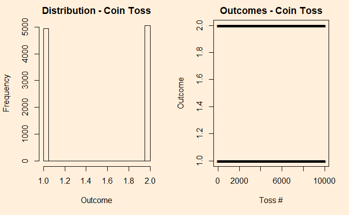
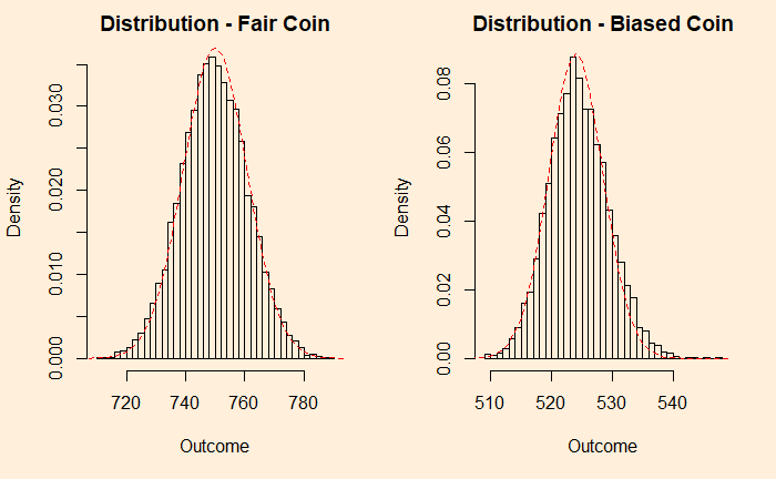
It is more intuitive, to begin with, discrete before getting into continuous. So, let’s build the case from a simple experiment set – the tossing of coins. We start with the fair coin, toss it 10000 times and collect the distribution.
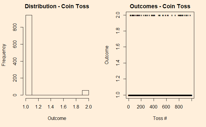
We denote the outcomes 1 for heads and 2 for tails. In the plot on the right-hand side, you see those 10,000 points distributed between the two. Now, introduce a bias to the coin – 95% heads (1) and 5% tails (2) and reduce the experiments to 1000 for better visualisation of the low probability state.
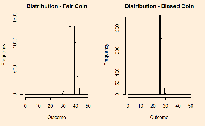
Now, add each distribution 25 times and check what happens.
You can see that the fair coin has already started converging to a Gaussian, whereas the biased one has a long way to go. We repeat the exercise for 500 additions before we get a decent fit to a normal distribution (below).
You can still see a bit of a tail protruding outside the reference line. So it didn’t matter what distribution you started with; as long as you got an adequate number of samples, the sums are normally distributed.
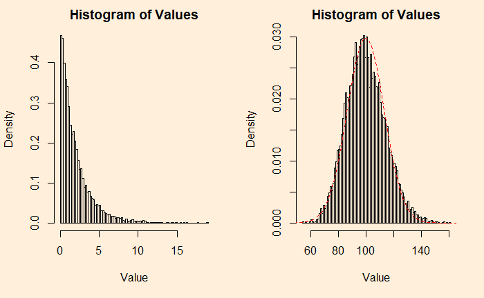
An example from the continuous family is the chi2 distribution with the degrees of freedom (df) 2. Following are two plots – the one on the left is the original chi2, and the right is adding 50 such distributions.
plots <- 1
plot_holder <- replicate(1,0)
for (i in 1:plots){
 add_plot1 <- plot_holder + rchisq(10000, df=2)
 plot_holder <- add_plot1
}

par(bg = "antiquewhite1", mfrow = c(1,2))

hist(add_plot1, breaks = 100, main = 'Histogram of Values', xlab = "Value", ylab = "Density", freq = FALSE)

plots <- 50
plot_holder <- replicate(1,0)
for (i in 1:plots){
 add_plot2 <- plot_holder + rchisq(10000, df=2)
 plot_holder <- add_plot2
}

hist(add_plot2, breaks = 100, main = 'Histogram of Values', xlab = "Value", ylab = "Density", freq = FALSE)
lines(seq(0,200), dnorm(seq(0,200), mean = 99.8, sd = 13.4), col = "red",lty= 2)
Tailpiece
Although we have used additions (of samples) to prove the point, the averages, which are of more practical importance, will behave the same way; after all, averages are nothing but additions divided by a constant (total number of samples).
Today, we will redo something we did cover in an earlier post – the sum of distributions. It directly demonstrates what we know as the central limit theorem (CLT). We will use R codes for this purpose.
We start with a uniform distribution. But what is that? As its name suggests, it is a class of continuous distribution and can take any value between the bounds with equal probabilities. Or the values are uniformly distributed between the boundaries.
There are many real-life examples of uniform distribution but of the discrete type, e.g., coin toss, dice rolling, and drawing cards. The resting direction of a spinner, perhaps, is an example of a continuous uniform.
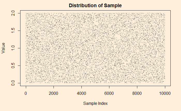
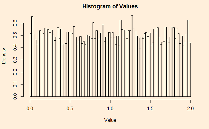
As an illustration, see what happens if I collect 1000 observations from a uniform distribution set between 0 and 2.
uni_dist <-  runif(n = 10000, min = 0, max = 2) # or simply,  runif(10000,0,2)

plot(uni_dist, main = 'Distribution of Sample', xlab = "Sample Index", ylab = "Value", breaks = 100)
Look closely; can you see patterns in the plot? Well, that is just an illusion caused by randomness. Historically, such observations confused the public. The famous one is the story of flying bombs in the Second World War.
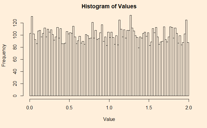
Some people like a different representation of the same plot – the histogram. A histogram provides each value and its contributions (frequencies, densities, etc.).
uni_dist <-  runif(n = 10000, min = 0, max = 2)
hist(uni_dist, main = 'Histogram of Values', xlab = "Value", ylab = "Frequency", breaks = 100)
Now, you will appreciate why it is a uniform distribution. I have 100 bins (or bars), and each carries more or less 100 (frequency) values, making it 100000 overall.
If you don’t like frequencies on the Y-axis, switch it off, and you get densities.
hist(uni_dist, main = 'Histogram of Values', xlab = "Value", ylab = "Density", breaks = 100, freq = FALSE)
Start of CLT
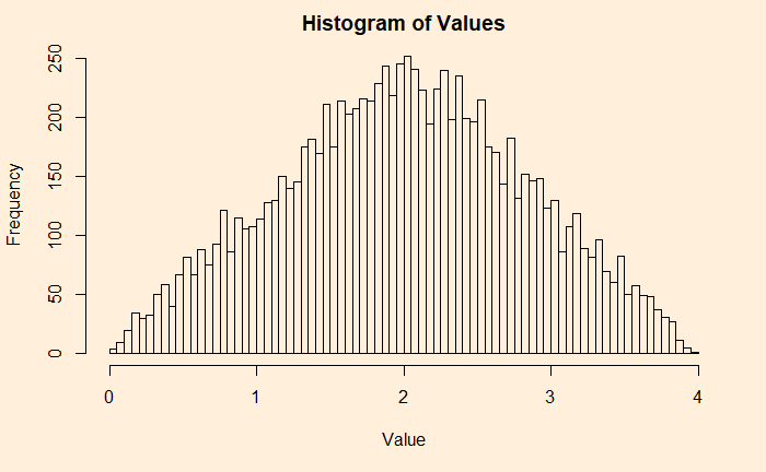
Adding two such independent sample data is the start of the CLT.
uni_dist1 <-  runif(n = 10000, min = 0, max = 2)
uni_dist2 <-  runif(n = 10000, min = 0, max = 2)

hist(uni_dist1+uni_dist2, main = 'Histogram of Values', xlab = "Value", ylab = "Frequency", breaks = 100)
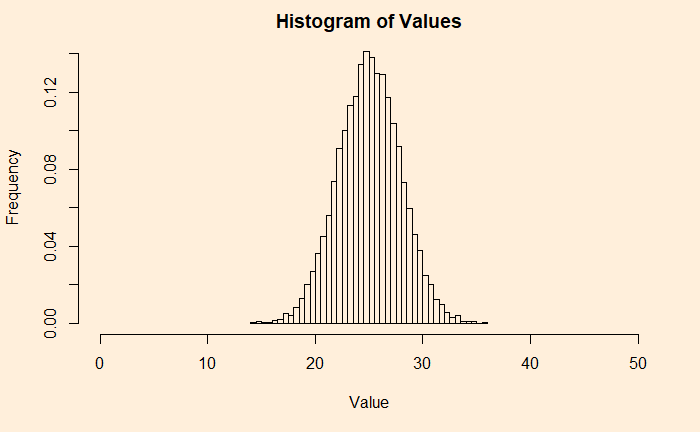
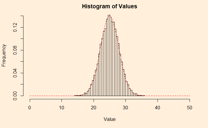
Let’s make a code and automate the addition by placing the calculation into a loop.
plots <- 25
plot_holder <- replicate(1,0)

for (i in 1:plots){
 add_plot <- plot_holder + runif(10000,0,2)
 plot_holder <- add_plot
}

his_ar <- hist(plot_holder, xlim = c(0, 2*plots), breaks = 2*plots, main = 'Histogram of Values', xlab = "Value", ylab = "Frequency", freq = FALSE)
Here is a Gaussian, and hence the CLT. Verify it by adding a line from a uniform distribution and match.
lines(seq(0,2*plots), dnorm(seq(0,2*plots), mean = plots, sd = 2.8), col = "red",lty= 2)
We will check some not-so-uniform distributions next.
You may have heard about the Pareto principle or the 80:20 rule. It is used in several fields and sounds like: 80% of actions come due to 20% of reasons or 80% returns from 20% of efforts etc.
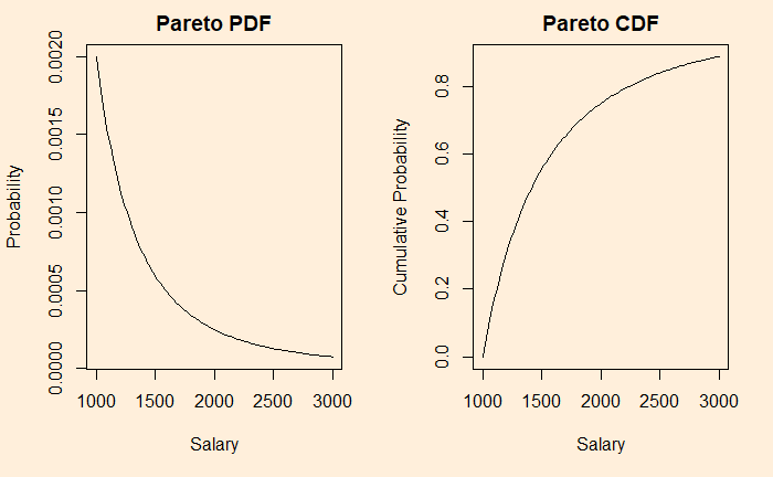
Pareto distribution is a form of power-law probability distribution used to describe several phenomena. In R, dpareto describes the probability density function and ppareto, the cumulative distribution function.
Let’s work out an example. Suppose the salaries of workers obey a Pareto distribution with a minimum wage of 1000 and the so-called shape factor, alpha = 3. What is the mean salary, and what is the percentage of people who earn more than 2000?
The Median is when the cumulative probability hits 0.5. So, applying the function for solving x such that ppareto(x, shape=3, scale=1000) = 0.5. x comes out to be 1260. For the answer to the other question, you find out the inverse of CDF (or 1 – CDF), i.e., 1 – ppareto(2000, shape=3, scale=1000) = 0.125 = 12.5%.
Last time, we made the analogy between Bayesian inference and selection by elimination. We have used definitive data and, therefore, bar plots. But in reality, data are far more messy and probabilistic. Like this:
If these were describing productions from a factory, the distribution happens because of random variations of the product quality, variations of measurement etc.
It is a logical fallacy used in debates to distract the argument by introducing an irrelevant topic, usually loaded with emotions, into the discussion to divert the opponent.
The name comes from an old method of training dogs in fox hunting. In this process, before the dog (to be trained) leaves in search of the fox that just left by following the scent, the trainer drags a bag of smelly red herrings on the trail. Some dogs will get distracted by the strong smell of the fish and stop following the fox. The trainer then tries and keep the dogs to stay on course.
How is the red herring different from the straw figure fallacy? In some aspects, they seem similar. In the latter case, the original argument is distorted or misrepresented, and the new subject becomes the target. But in the former case, the initial point is completely ignored and is substituted with a new one, which gets attacked.
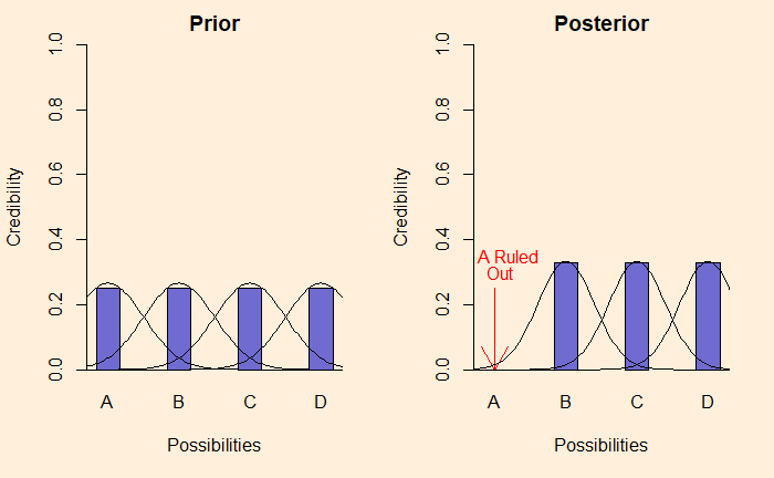
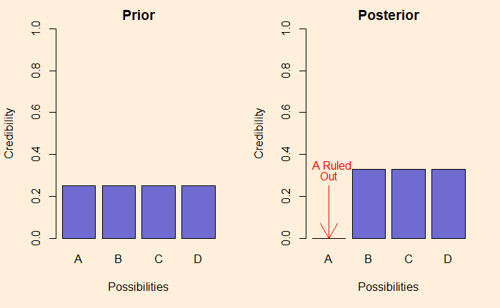
One of the simpler explanations for Bayesian inference is given by John K. Kruschke in his book, Doing Bayesian Data Analysis. As per the author, Bayesian inference is the reallocation of credibility across possibilities. Let me explain what he meant by that.
Suppose there are four different, mutually exclusive causes for an event. And we don’t know what exactly caused the event to happen. In such cases, we may give equal credibility, 0.25, to each. This forms the prior credibility of the events. Imagine, after some investigations, one of the possibilities is ruled out. The new credibilities are now restricted to the three remainings, with the weightage automatically updated to 0.33. We call the new set posterior.
If you continue the investigation and eliminate one more, the situation becomes as shown below.
Let’s see two paradoxes that can exist if you can time travel.
The first one is the grandfather paradox. Imagine you can time travel, go back to the past, and kill your grandfather before he met your grandmother. That means he did not have children, and you could not be born in the first place (to time travel)!
The second one is the bootstrap paradox. You buy a copy of Hamlet from a bookshop and go back to the time before William Shakespeare has written Hamlet. You give the book to William. He then copies it and claims his own. Years passed, and the book made several copies. One of them enters the same bookshop you originally visited. The question is: who wrote Hamlet?
A direct consequence of these paradoxes could be that there is no time travel possible. Another possibility is that a parallel universe is created as a result, and your existence (and Hamlet’s) is real in one of them.
We have learned mathematically that at the Roulette table, the house always wins, yet we spent countless minutes watching YouTube videos learning strategies to beat the wheel. We also watched financial analysts all day on TV, reasoning on hindsight and glorifying market-beating fund managers, forgetting they were just the survivors of Russian roulette. The same people continue to make us believe in momentum and hot hands.
People gamble and play the lottery, where they are guaranteed to lose, and fail to invest for their retirement, where they are guaranteed to win. Three-quarters of Americans believe in at least one phenomenon that defines the law of physics, including psychic healing (55 per cent), extrasensory perception (41 per cent), haunted houses (37 per cent), and ghosts (32 per cent).
Rationality, by Steven Pinker
We have seen how journalism can mesmerise readers by reporting an 86% increase in myocarditis for the vaccinated, a 300% increase in thrombosis over oral contraceptives, or an 18% risk of colorectal cancer by eating processed meat. We just became easy prey for our inability to make decisions based on risk-benefit trade-offs and the eternal confusion between absolute and relative risks.
Even in an era of open data, data science and data journalism, we still need basic statistical principles in order not to be misled by apparent patterns in the numbers.
The Art of Statistics: How to Learn from Data, by David Spiegelhalter
The author was referring to variabilities in the observed rates of events when the population is small, which is the concept behind funnel plots.
We understand that international trade is a win-win for both parties, yet we let free rein to populism and Brexit. We know that the Muslim community in India is on the fastest downhill in the fertility curve, yet we want to believe that the opposite is true and continue believing in one-child policies.
We also know that life is not a zero-sum game and that probability theory is not another useless thing you study in schools and forget later, but it is about how we make decisions and appreciate life. The understanding, or the lack of it, can be a choice between life and death, as we have just witnessed in the global pandemic.
Could everyone have a fact-based worldview one day? Big change is always difficult to imagine. But it is definitely possible, and I think it will happen, for two simple reasons. First: a fact-based worldview is more useful for navigating life, just like an accurate GPS is more useful for finding your way in the city. Second, and probably more important: a fact-based worldview is more comfortable.
Factfulness, by Hans Rosling with Anna Rosling Rönnlund and Ola Rosling