Data & Statistics

The Truth that Exists in Mathematical Models

The concept of comparative advantage is something we saw when we analysed international trade as beneficial to both participating countries. Yet, the notion remains highly challenged by the common public. Trade, in their mind, remains a zero-sum game. If I go and sell goods in a foreign country, they lose, and I win.

Similarly, the role that the climate models play in understanding global warming. No matter how hard one tries to prove the fact using charts and equations, the public still requires to hear stories of hardships of extreme weather events to move their views. Mathematical models are inevitable as we are dealing with a complex problem with many factors that are not related linearly to the climate.

Part of the blame for this situation falls on the economists and scientists themselves. Most often, they assume the concepts they develop are simple and intuitive, and those who don’t understand are some less intelligent type.

On the other hand, people grow up hearing exaggerated stories about common sense and simple narratives. Models and equations are too difficult to understand and, therefore, some form of a trick played by the proponent.

The Truth that Exists in Mathematical Models Read More »
Drake Equation – The Probability of ET

If you recall, we had used the concept of joint probability to explain the swiss cheese models of viral infection. That the probability of someone getting infected by a virus is a joint probability of several independent events.

In 1961, Frank Drake made the following equation to invoke some thoughts on estimating the probability of life outside earth.

N = R* x fp x ne x fl x fi x fc x L

  • N: number of civilisations in the galaxy with which communication might be possible
  • R*: average rate of star formation in the galaxy
  • fraction of those stars having planets
  • fraction of those planets that could support life per star
  • fraction of those that could go on to make intelligent life
  • fraction of that civilisation that could develop technologies
  • the length of time they could release detectable signals into space

Choice of parameters

The choice of the parameters is the difficult part and what invited criticisms of the equation.

Drake Equation – The Probability of ET Read More »

Trusting the witness

In the city of M, there are only taxis in two colours, red and blue. One night a cab was involved in a hit-and-run incident. As per a witness, the colour of the cab was blue. Based on the information from the authorities, 80% of the cars are red, and 20% are blue. Tests have found that the accuracy at which the witness can identify the colours is about 80% under challenging lighting conditions. What is the probability that the witness correctly identified the right one?

Well, we will use Bayes’ rule to estimate the accuracy. Here is Bayes’ rule modified to suit our context.

\\ P(B|W) = \frac{P(W|B)*P(B)}{P(W|B)P(B) + P(W|R)*P(R)}

The terms are
P(B|W) - the probability that the cab colour is blue, given the witness' testimony.  
P(W|B) - the probability that the witness identifies blue, given the cab is blue = 80% or 0.8.  
P(B) - a priori probability of finding a blue cab in the city = 20% or 0.2.
P(W|R) - the probability that the witness identifies blue, given the cab is red = 20% or 0.2.  
P(R) - a priori probability of finding a red cab in the city = 80% or 0.8.

After substituting the numbers in the equation, the required probability becomes:

\\ P(B|W) = \frac{0.8*0.2}{0.8*0.2 + 0.2*0.8} = 0.5

No different from tossing a coin!

Trusting the witness Read More »

Survival Data – Sankey Diagram

We have learned survival analysis in the last few posts, using a dataset involving 42 data points from an efficacy for an experimental drug. The data set was in the following format.

groupgenderrelapse
Treatment FemaleTRUE
Treatment MaleTRUE
Treatment FemaleFALSE
Treatment FemaleTRUE
ControlMaleTRUE
ControlFemaleTRUE
ControlFemaleTRUE
ControlMaleTRUE
ControlFemaleTRUE

Sankey diagram

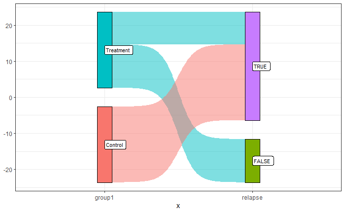
A Sankey diagram is a visualisation technique for showing the flow of energy, material, or, in this case, events. The simplest example is visualising the flow of how the treatment and control groups responded to the illness’s relapse.

It is noticeable that all the participants in the control group had relapses of the disease, whereas it was mixed in the treatment group.

The plot was created by executing the following R code:

library(ggsankey)
library(tidyverse)
df1 <- ill_data %>% make_long(group1, relapse)

san_plot <- ggplot(df1, aes(x = x
                            , next_x = next_x
                            , node = node
                            , next_node = next_node
                            , fill = factor(node)
                            , label = node))
san_plot <- san_plot + geom_sankey(flow.alpha = 0.5
                                   , node.color = "black"
                                   , show.legend = FALSE)
san_plot <- san_plot + geom_sankey_label(size = 3, color = "black", fill = "white", hjust = 0.0)
san_plot <- san_plot + theme_bw()

san_plot

Note that the package ‘ggsankey’ may not be available from your usual repository, CRAN. You may be required to run the following two lines to get it.

install.packages("remotes")
remotes::install_github("davidsjoberg/ggsankey")

Let’s add another node to the Sankey, the gender.

df1 <- ill_data %>% make_long(group1, relapse, gender)

san_plot <- ggplot(df1, aes(x = x
                            , next_x = next_x
                            , node = node
                            , next_node = next_node
                            , fill = factor(node)
                            , label = node))
san_plot <- san_plot + geom_sankey(flow.alpha = 0.5
                                   , node.color = "black"
                                   , show.legend = FALSE)
san_plot <- san_plot + geom_sankey_label(size = 3, color = "black", fill = "white", hjust = 0.0)
san_plot <- san_plot + theme_bw()

san_plot

Further resources

World Energy Flow 2019: IEA

Survival Data – Sankey Diagram Read More »

Weibull distribution

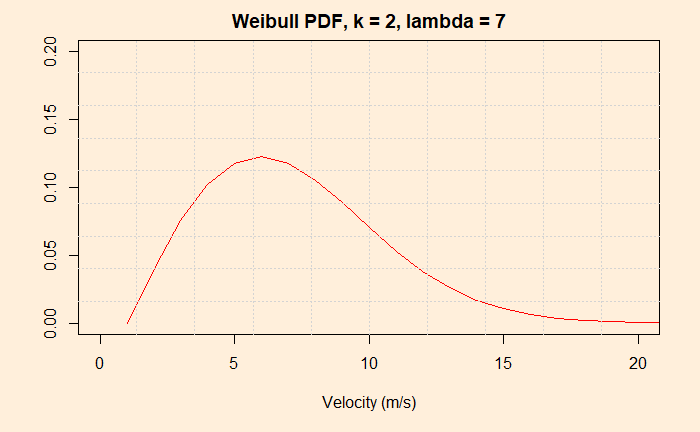
The Weibull distribution is a continuous probability distribution. Its speciality is that it can fit different distribution shapes and is a favourite for time-to-failure data, a vital parameter of interest in reliability analysis. It is related to the exponential distribution. The distribution has two parameters: shape (k) and scale (lambda).

Because of the flexibility to change the shape probability distribution function by varying its key parameters, k and lambda, Weibull finds several applications. Notable among them is modelling the distribution of wind velocities.

Weibull distribution Read More »

Survival Plots – Cox proportional hazards model

Here is where we stopped last time. The next step is quantifying the difference between the treatment and the control groups. Now refresh your memory or hazard ratio, efficacy – all those stuff.

Cox proportional hazards model

The main idea is to find out if the survival time depends on one or more variables or predictors. In our case, there is only one variable with two values – treatment or placebo. Cox model does regression (curve fitting or history matching) of the survival curve using the predictor. The model has an exponential relationship between the observed hazard to the effect of the predictor.

h(t) = h_0(t) e^{B_1X_1}

h(t) is the observed hazard (a function of time), and h0(t) is the baseline hazard. The exponential term is the effect of the condition (treatment or not). Note that the exponential term is not a function of time, and eB1 is the hazard ratio. We know we have two conditions for X1, i.e. X1 = 1 (treatment) and X1 = 0 (control).

\frac{h(t|X_1=1)}{h(t|X_1=0} = \frac{h_0(t) e^{B1}}{h_0(t)} = e^{B1}

The above is the ratio between the hazard when the treatment is present and the hazard when the treatment is absent.

Note the regression can be performed using a combination of variables, e.g. age, sex etc.

\frac{h_{X1}(t)}{h_{X2}(t)} =  \frac{h_{0}(t) e^{\sum\limits_1^n BX1}}{h_{0}(t) e^{\sum\limits_1^n BX2}} =  \frac{e^{\sum\limits_1^n BX1}}{e^{\sum\limits_1^n BX2}}

Significance

The following R commands do all the job and spit out the hazard ratio and the significance or p-value.

ill_cox_fit <- coxph(Surv(weeks, illness) ~ group, data = ill_data1)

The output is:

Call:
coxph(formula = Surv(weeks, illness) ~ group, data = ill_data1)

  n= 42, number of events= 30 

                  coef exp(coef) se(coef)      z Pr(>|z|)    
groupTreatment -1.5721    0.2076   0.4124 -3.812 0.000138 ***
---
Signif. codes:  0 ‘***’ 0.001 ‘**’ 0.01 ‘*’ 0.05 ‘.’ 0.1 ‘ ’ 1

               exp(coef) exp(-coef) lower .95 upper .95
groupTreatment    0.2076      4.817   0.09251    0.4659

Concordance= 0.69  (se = 0.041 )
Likelihood ratio test= 16.35  on 1 df,   p=5e-05
Wald test            = 14.53  on 1 df,   p=1e-04
Score (logrank) test = 17.25  on 1 df,   p=3e-05

The ‘exp(coef)’ value is nothing but the hazard ratio. And we know that the efficacy is (1 – hazard ratio), and in our case, it is about 80%. The p-value is low, and therefore the difference in survival time between the treatment and control is statistically significant.

Survival Plots – Cox proportional hazards model Read More »

Survival Plots – R Simulations

We continue from where we stopped last time and develop an R code for survival analysis.

We need to code 1 for people who experienced the event, and the censored ones (who haven’t experienced or left the group) get 0. Note that you can substitute indicator 2 for 1 and 1 for 0. The following are the first ten entries of the data frame.

groupweeksIllness
Treatment 61
Treatment 61
Treatment 61
Treatment 60
Treatment 71
Treatment 90
Treatment 101
Treatment 100
Treatment 110
Treatment 131

The survival package

The first thing we want is the ‘survival’ package. After installing the package, type the following commands.

ill_fit <- survfit(Surv(weeks, illness) ~ group, data = ill_data1, type = "kaplan-meier")
summary(ill_fit)

par(bg = "antiquewhite1")
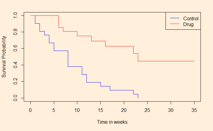
plot(ill_fit, col = c("blue", "red"), xlim = c(0,35), xlab = "Time in weeks", ylab = "Survival Probability")
legend("topright", legend = c("Control", "Drug"), col = c("blue", "red"), lty = c(1,2))

And the output is:

Call: survfit(formula = Surv(weeks, illness) ~ group, data = ill_data1, 
    type = "kaplan-meier")

                group=Control 
 time n.risk n.event survival std.err lower 95% CI upper 95% CI
    1     21       2   0.9048  0.0641      0.78754        1.000
    2     19       2   0.8095  0.0857      0.65785        0.996
    3     17       1   0.7619  0.0929      0.59988        0.968
    4     16       2   0.6667  0.1029      0.49268        0.902
    5     14       2   0.5714  0.1080      0.39455        0.828
    8     12       4   0.3810  0.1060      0.22085        0.657
   11      8       2   0.2857  0.0986      0.14529        0.562
   12      6       2   0.1905  0.0857      0.07887        0.460
   15      4       1   0.1429  0.0764      0.05011        0.407
   17      3       1   0.0952  0.0641      0.02549        0.356
   22      2       1   0.0476  0.0465      0.00703        0.322
   23      1       1   0.0000     NaN           NA           NA

                group=Treatment 
 time n.risk n.event survival std.err lower 95% CI upper 95% CI
    6     21       3    0.857  0.0764        0.720        1.000
    7     17       1    0.807  0.0869        0.653        0.996
   10     15       1    0.753  0.0963        0.586        0.968
   13     12       1    0.690  0.1068        0.510        0.935
   16     11       1    0.627  0.1141        0.439        0.896
   22      7       1    0.538  0.1282        0.337        0.858
   23      6       1    0.448  0.1346        0.249        0.807

We can see the difference in survival chances for people who had undergone treatment vs those who had not. Is this significant, and if so, how much is the difference? We will see next.

Survival Plots – R Simulations Read More »

Survival Plots – Kaplan-Meier Analysis

We will see how to make survival plots using the Kaplan-Meier (KM) method. The KM method is the cumulative probability of survival at regular intervals or whenever data is collected. Let’s go step by step to understand this. First, look at a data-collection table and familiarise yourself with a few terms.

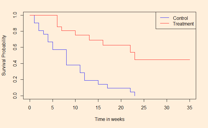
The table describes the first few rows of 42 data points collected over 35 weeks (Data courtesy: reference 1). Week number represents the time, and the group describes if the person is treated with the drug or part of the control (placebo).

Week #GroupIllHealthy
6Treated31
7Treated10
9Treated01
10Treated11
11Treated01
13Treated10
16Treated10
1Control20
2Control20
3Control10
4Control20
5Control20

Time

In our case, it is the week number. We have a start of the study and an end of the study. Also, there are specific points in time for collecting data.

Event

The event, in this case, is the occurrence of illness.

Censoring

From the point of view of the study, there are people who have not yet experienced the event, i.e. remained healthy or were somehow left out of it at the time of data collection. These are people who are considered censored.

Survival plot

Here is the survival plot we obtained based on the Kaplan-Meier analysis. As you can see below, the graph shows the number of people who escaped the event (illness) at the end of the time frame. We’ll see how we got it using R next.

References

1) Generalized Linear Models: Germán Rodríguez
2) Kaplan–Meier estimator: Wiki
3) The Kaplan-Meier Method: karger

Survival Plots – Kaplan-Meier Analysis Read More »

Survival Plots

Survival analysis is used in many fields to understand certain events occurring as a function of time. Examples are patients surviving illness after treatments, employee turnover of companies, etc.

Survival plots are representations where the X-axis gives time, and the Y-axis gives the percentage (or proportion) of survivors or the portion that did not experience the event. Kaplan-Meier estimator is typically used to generate survival plots from experimental data.

Survival Plots Read More »

The Malaria Vaccine is Here

Malaria is one of the few mass-killer diseases still holding its fort against vaccines. It is because the culprits, parasites such as Plasmodium Falciparum, are more complex than viruses. But the story is changing. This week, The Lancet Infectious Diseases published an article summarising the study results of the R21/Matrix-M vaccine, which combines Oxford’s R21 and Novavax’s Matrix-M.

It was a randomised control trial involving around 400 children aged 5 – 17 months from Nanoro, Burkina Faso. The participants were divided into three groups to receive either a 25-microgram, 50-microgram malaria vaccine or a placebo. Note that 25 and 50 represent the doses of Matrix-M. R21 remained 5 micrograms in both cases. They also received a booster dose after 12 months. Note that the jabs were given before the malaria season.

Following was one set of results:

GroupPrimary Case
clinical malaria
Total
number
5 μg R21
25 μg Matrix-M
67132
5 μg R21
50 μg Matrix-M
54137
Control
rabies vaccine
121140

The numbers in the tables are the cumulative incident values collected over a year (from 14 days since the booster to 12 months). The Hazard Ratio (risk ratio of the intervention group to the control group) is estimated by regression of the survivorship plot using the Cox proportional hazards model. The efficacy = 1 – HR is estimated to be 71% for the low-dose group (group 1) and 80% for the high-dose group(group 2).

Efficacy and immunogenicity of R21/Matrix-M vaccine: The Lancet Infectious Diseases

Randomised Controlled Trials: BMJ

Types of malaria parasites: Stanford medicine

The Malaria Vaccine is Here Read More »