Data & Statistics

Speed Matters

Another example to trouble your system 1, a.k.a. intuitive thinking and a version of the mileage paradox. It seems even Einstein found this riddle interesting!

I have to cover a distance of 2 kilometres. I did the first kilometre at 15 km/h (km. per hour). What speed should I maintain in the next one kilometre to cover the total distance at an average speed of 30 km/h?  

System 2 thinking

You may require a pen a paper to solve this puzzle. Take the first part: how much time does it take to cover one km at 15 km/h? The answer is 60/15 = 4 min. The second part, time to cover two km at 30 km/h: 60 mins for 30 km, 2 mins for 1 km or 4 mins for 2 km. But you already consumed 4 mins in the first one km!

So I can’t achieve the target; was it obvious the first time you heard the problem?
Speed Matters Read More »

Why Most Published Results are Wrong

It is the title of a famous analysis paper published by Ioannidis in 2005. While the article goes a bit deeper in its commentary, we check the basic understanding behind the claim – through Bayesian thinking.

Positive predictive value, the ability of analysis to predict the positive outcome correctly, is the posterior probability of an event based on prior knowledge and the likelihood. The definition of PPV in the language of Bayes’ theorem is,

P(T|C_T) = \frac{P(C_T|T) P(T) }{P(C_T|T) P(T) + P(C_T|nT) P(nT)}

P(T|CT) – The probability that the hypothesis is true given it is claimed to be true (in a publication)
P(CT|T) – The probability that the claim is true given it is true (true hypothesis proven correct)
P(T) – The prior probability of a true hypothesis
P(CT|nT) – The probability that the claim is true given it is not true (false hypothesis not rejected = 1 – false hypothesis rejected)
P(nT) – The prior probability of an incorrect hypothesis (1 – P(T))

Deluge of data

The last few years have seen an exponential growth of correlations due to a flurry of information and technology breakthroughs. For example, the US government issues data of ca. 45000 economic statistics and an imaginative economist can find out several millions of correlations among those, most of which are just wrong. In other words, the proportion of causal relationships in these millions of correlations is declining with more data. In the language of our equation, the prior (P(T)) drops.

Suppose the researcher can rightly identify a true hypothesis 80% of the time (which is quite impressive) and rightly reject an incorrect one at 90% accuracy. Yet, the overall success, PPV, is only 47% if the prior probability of a true relationship is only 1 in 10.

P(T|C_T) = \frac{0.8 * 0.1}{0.8 * 0.1 + 0.1 * 0.9} = 0.47

References

Why Most Published Research Findings Are False: John P. A. Ioannidis; PLoS Medicine, 2005, 2(8)

The Signal and the Noise: Nate Silver

Why Most Published Results are Wrong Read More »

Precision, Accuracy and Errors – Continued

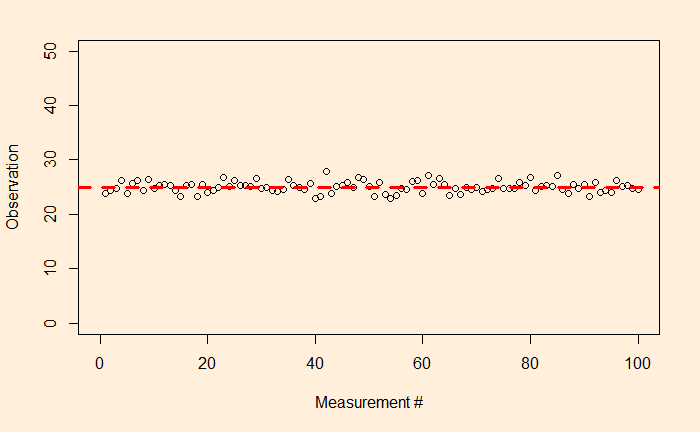
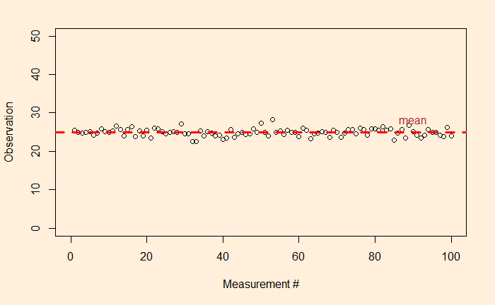
We have seen what precision is – it says something about the quality of the measurements. And we saw the following as an example of high-precision data collection: the fluctuations are closer to the average.

Accuracy

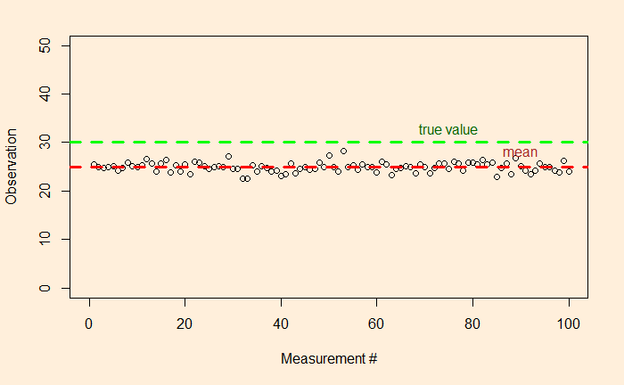
But what about if the true value – unfortunately, something the measurer would never know – of the unknown was 30 instead of 25?

So there is a clear offset between the mean and the true value. In other words, the accuracy of the measurements is low. If precision is related to the presence of random errors, accuracy is compromised by systematic bias.  This may have been caused by mistakes in the instrumental settings or by poor methodology.

The other potential reason for poor accuracy is the presence of outliers.

By the way, both systematic bias and outliers are deterministic errors.

Precision, Accuracy and Errors – Continued Read More »

Precision, Accuracy and Errors

Let’s revisit something that we touched upon some time ago – the topic of observation theory. For those who don’t know what it is, the observation theory is about estimating the unknowns through measurements.

While the unknowns, the parameters of interest could be deterministic, such as the height of a mountain, or the temperature rise, the measured values are random or stochastic variables. And two terms that represent the quality of the observations are precision and accuracy.

Precision

Precision means how close repeated measurements are to each other. As an illustration, the following are 100 data points from a measurement campaign.

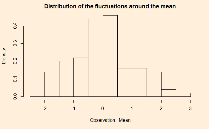
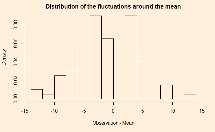
The dotted red line represents the mean (= 25). The fluctuation around the mean can be calculated by subtracting 25 from each observation. Here is how the fluctuations are distributed.

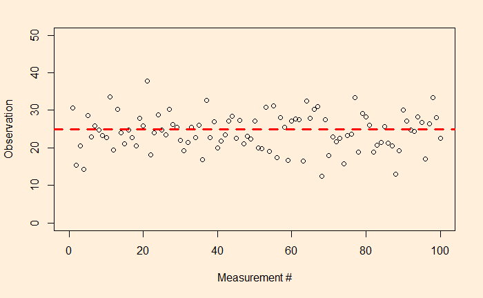
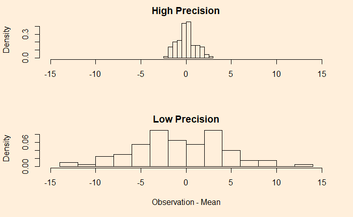
Now, look at another example.

A comparison of the two examples shows that the first one has a narrower distribution of errors (higher precision), and the second one has broader (lower precision). But they both follow a sort of normal distribution around mean zero.

We’ll discuss accuracy in the next post.

Precision, Accuracy and Errors Read More »

Earthquakes – Where Do They Occur?

We saw the empirical rule – Gutenberg-Richter relationship – in the last post. Today, we use the wealth of data from the ANSS Composite Catalog to demonstrate a super cool feature of R – the mapview(). To remind you, this is how the data frame appears.

Now, let’s ask: where did the biggest, say, 9 and above magnitude quakes occur? To answer that, we need two packages, “sf” and “mapview”.

library(sf)
library(mapview)

Then run the following commands,

quake_data_big <- quake_data %>% filter(Magnitude >= 9)
mapview(quake_data_big, xcol = "Longitude", ycol = "Latitude", crs = 4269, grid = FALSE)

And then magic happens,

extending it further, i.e., magnitude 8 and above,

And greater than 7

Earthquakes – Where Do They Occur? Read More »

Gutenberg-Richter Relationship

Charles Francis Richter and Beno Gutenberg, in 1944, found some interesting empirical statistics about earthquakes. It was about how the magnitude of earthquakes related to their frequencies. Today, we revisit the topics using data downloaded from ANSS Composite Catalog (364,368 data from 1900 – 2012).

A histogram of the magnitude is below.

The next step is to generate annual frequency from this. Since the data is from 1900-2012, we will divide the frequency by 112 to get the desired parameter. The following R codes provide the steps till the plot is generated. Note that the Y-axis is in the log scale.

quake_data <- read.csv("./earth_quake.csv")
hist_quake <- hist(quake_data$Magnitude, breaks = 50)
plot(hist_quake$mids, (hist_quake$counts/112), log='y', ylim = c(0.001,1000), xlab = "Magnitude", ylab = "Annual frequency")

Add an extra line to make a linear fit.

abline(lm(log10(hist_quake$counts/112) ~ hist_quake$mids), col = "red", lty = 2, lwd = 3)

Gutenberg-Richter Relationship Read More »

Endogeneity

Endogeneity is one assumption that we make while performing regression using the OLS method. But what is endogeneity? Let’s go back to regression. In mathematical language:

    observation = deterministic model + residual error
    Y = (a + b X) + e

    The term residual error represents all the things unknown to the observer but may have contributed towards the observation. But for linear regression, there is a condition, Gauss–Markov condition, that requires the error term to be uncorrelated to the independent variable. If this is not true, it is a case of endogeneity.

    The first reason for endogeneity is called an omitted variable. An example is a cause that results in the variation of X or Y (or both).

    The second cause is simultaneity or bidirectional; X causes Y, and Y causes X. It is also called reciprocal causation.

    The third cause is selection bias, which means the sampling itself is not randomised.

    Endogeneity Read More »

    Distribution of Heights

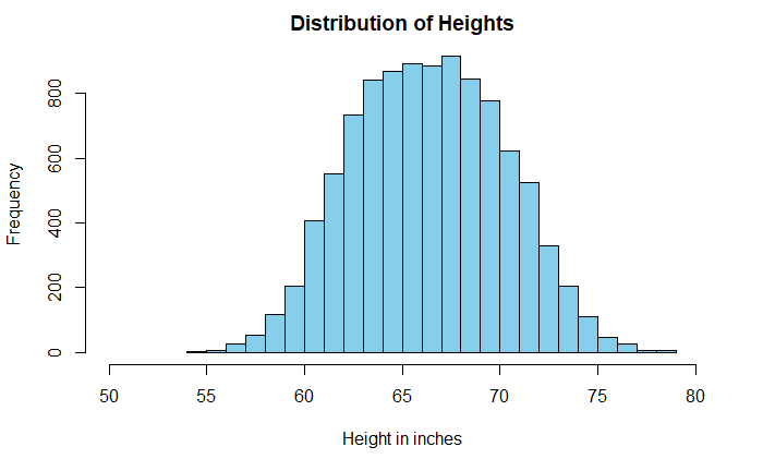
    Histograms are a powerful means of understanding the spread of data. Sometimes the shape of the plot can mislead the analysis. A well-known example is the distribution of heights of adults.

    The data is taken from Kaggle, but I suspect it comes from simulations and not actual measurements. A casual look at the data suggests a broad dispersion of heights in the centre, with a mean of 66.4 inches (168.6 cm) and a standard deviation of 3.9 inches (9.8 cm).

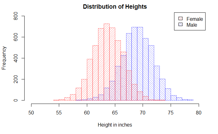
    But look what happens when we replace the single plot with two sub-plots based on the key categorical variable, gender.

    Pop_data_male <- Pop_data %>% filter(Gender == "Male") 
    Pop_data_female <- Pop_data %>% filter(Gender == "Female") 
    
    hist(Pop_data_male$Height, breaks = 20, col = rgb(0,0,1,1/2), xlim = c(50,80), ylim = c(0,800), density = 20, angle = 135, main = "Distribution of Heights", xlab = "Height in inches", ylab = "Frequency")
    
    hist(Pop_data_female$Height, breaks = 20, add = T, col = rgb(1,0,0,1/2), density = 20,angle = 45)
    
    legend("topright", c("Female", "Male"), fill = c(rgb(1,0,0,1/2), rgb(0,0,1,1/2)),  density = 20, angle = c(45, 135))

    Distribution of Heights Read More »

    Comparing Apples to Oranges

    I have an apple weighing 150 g. and an orange weighing 145 g. Which fruit is unusually heavier? One would argue that, based on the absolute weight of the fruits, the apple is heavier. But then you are comparing apples with oranges!

    A proper comparison is only possible if you standardise the weights and bring them to the same page. In other words, we use Z-score and compare them on a standard normal distribution. If X is the measurement, mu is the mean of the population where the sample belongs, and sigma is the standard deviation.

    Z = \frac{X-\mu}{\sigma}

    Once the Z-scores are estimated, one can place it over a standard normal distribution. Note that we have made the assumption that the weights of apples and oranges follow normal distributions.

    Suppose the following are the parameters of those fruits.

    AppleOrange
    Mean (g)160140
    Standard
    Deviation (g)
    1520

    Z-scores are obtained by applying the equation.

    AppleOrange
    Z(150-160)/15
    = -0.66
    (145-140)/20
    = 0.25

    So the orange is heavier than usual.

    Comparing Apples to Oranges Read More »

    Worldwar Survivors

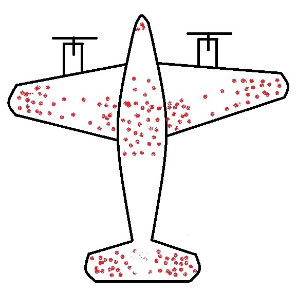
    The story of returning warplanes from world war II presents the finest example of understanding survivorship bias. Here it goes.

    When the US military had a chance to look at the fighter planes that came back from the battlefield, they observed some patterns. They found that the bullet marks on the planes were not uniform. Instead, it had denser patches on the fuselage and fewer spots on, say, engines, cockpit or some of the weaker parts – roughly what you see on the sketch below.

    The idea was to use the data to optimise armouring the planes to sufficiently make the aircraft safer without adding too much weight that reduces the range.

    So the statistical Research Group (SRG) was assembled to devise the strategy. Abraham Wald was the leading statistician who came up with this counterintuitive advice: the armour will not be where the holes are, but it will be where there are none. Because the planes with holes in those spots were shot down and never came back!

    Survivors will mislead you

    This is the classical survivorship bias. In the field, the planes were shot all over. The surviving ones presented one pattern; the unlucky ones would have shown the opposite.

    Abraham Wald and the Missing Bullet Holes
    Survivorship Bias: Eddie Woo

    Worldwar Survivors Read More »