Data & Statistics

Logistic Regression – Cleveland Data

Let’s do a logistic regression of health data. Experiments with the Cleveland database focused on distinguishing the presence (value: 1,2,3,4) from the absence (value 0). The featured health parameters are

Age
Sex
CP: chest pain
Trestbps: resting blood pressure (mm Hg)
Chol: serum cholesterol (mg/dl)
Fbs: fasting blood sugar > 120 mg/dl
Restecg: Rest ECG
Thalach: maximum heart rate achieved during the thallium stress test
Exang: exercise-induced angina
Oldpeak: ST depression induced by exercise relative to rest
Slope: the slope of the peak exercise ST segment
Ca: number of major vessels (0-3) coloured by fluoroscopy
Thal:
Hd: diagnosis of heart disease

After cleaning up and conditioning, the data looks like this:

297 obs. of  14 variables:
 $ Age     : num  63 67 67 37 41 56 62 57 63 53 ...
 $ Sex     : Factor w/ 2 levels "F","M": 2 2 2 2 1 2 1 1 2 2 ...
 $ CP      : Factor w/ 4 levels "1","2","3","4": 1 4 4 3 2 2 4 4 4 4 ...
 $ Trestbps: num  145 160 120 130 130 120 140 120 130 140 ...
 $ Chol    : num  233 286 229 250 204 236 268 354 254 203 ...
 $ Fbs     : Factor w/ 2 levels "0","1": 2 1 1 1 1 1 1 1 1 2 ...
 $ Restecg : Factor w/ 3 levels "0","1","2": 3 3 3 1 3 1 3 1 3 3 ...
 $ Thalach : num  150 108 129 187 172 178 160 163 147 155 ...
 $ Exang   : Factor w/ 2 levels "0","1": 1 2 2 1 1 1 1 2 1 2 ...
 $ Oldpeak : num  2.3 1.5 2.6 3.5 1.4 0.8 3.6 0.6 1.4 3.1 ...
 $ Slope   : Factor w/ 3 levels "1","2","3": 3 2 2 3 1 1 3 1 2 3 ...
 $ Ca      : Factor w/ 4 levels "0","1","2","3": 1 4 3 1 1 1 3 1 2 1 ...
 $ Thal    : Factor w/ 3 levels "3","6","7": 2 1 3 1 1 1 1 1 3 3 ...
 $ Hd      : Factor w/ 5 levels "0","1","2","3",..: 1 3 2 1 1 1 4 1 3 2 ...
logic <- glm(Hd ~ ., data = heart_data, family = "binomial")
predicted.data <- data.frame(Prob.HD = logic$fitted.values, HD = heart_data$Hd)
par(cex=0.8, mai=c(0.7,0.7,0.2,0.5), bg = "antiquewhite1")
plot(x = predicted.data$HD, y = predicted.data$Prob.HD)

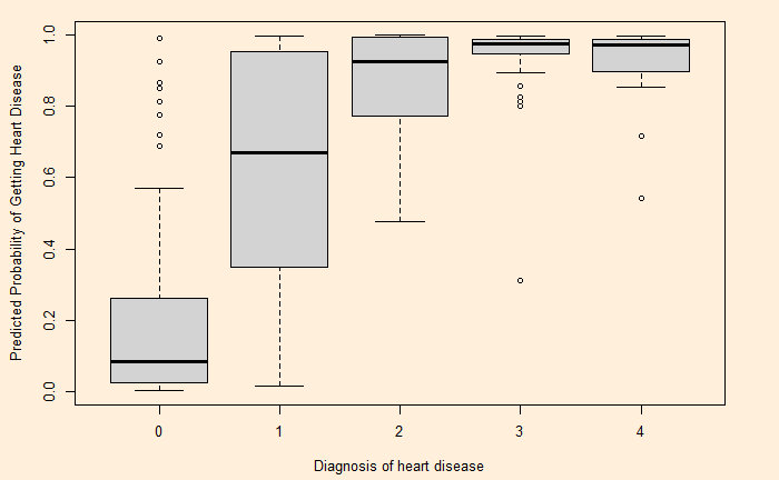
An even fancier plot can be made using the following code:

logic <- glm(Hd ~ ., data = heart_data, family = "binomial")
predicted.data <- data.frame(Prob.HD = logic$fitted.values, HD = heart_data$Hd)
predicted.data <- predicted.data[order(predicted.data$Prob.HD, decreasing = FALSE),]
predicted.data$Rank <- 1:nrow(predicted.data)
  
ggplot(data = predicted.data, aes(x = Rank, y = Prob.HD)) +
  geom_point(aes(color = HD), alpha = 1, shape = 4, stroke = 2) +
  xlab("Index") +
  ylab("Predicted Probability of Getting Heart Disease") +
  theme(text = element_text(color = "white"), 
        panel.background = element_rect(fill = "black"), 
        plot.background = element_rect(fill = "black"),
        panel.grid = element_blank(),
        legend.text = element_text(color = "black"),
        legend.title = element_text(color = "black"),
        axis.text = element_text(color = "white"),
        axis.ticks = element_line(color = "white")) 

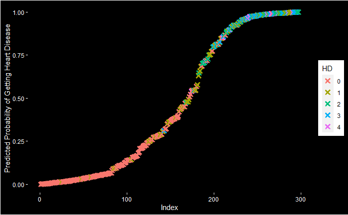
Logistic Regression – Cleveland Data Read More »

Time Series Analysis – Decomposition

Here is another time series, namely, the air passengers.

A key task of the time series analysis is to break down the data into signal and noise. In R, there is a function called decompose to do the job.

decom_AP <- decompose(AP, type = "additive")
plot(decom_AP)

Note that the data is already in a time series format. If it is a regular data frame, use function ‘ts’ first before attempting the decompose function.

Here is the illustration – the data (blue circle), compared with the seasonality.

Here is data with seasonality + trend

And finally, data is compared with the sum of all three, seasonality + trend + random

Time Series Analysis – Decomposition Read More »

Time Series Analysis

Time series is data of the same entity collected at regular intervals. And the analysis of this is a time series analysis. Here, the time is the independent variable (typically the X-axis), and a characteristic is measured, which forms the dependent variable. The objective of the time series analysis is to understand the pattern of changes over time. And to make projections about the future.

Components of time series analysis

  1. The long-term tendencies of the data are called trends.
  2. The repeating feature of the pattern is called seasonality
  3. The repeating but non-seasonal patterns are called cycles.
  4. The unpredictable ups and downs of the data is the last component, which is variation.

Time Series Analysis Read More »

Finite Population Correction

Finite population correction is the factor applied to reduce the error when the sample size is significant in comparison to the total population.

If the sample size is n and the population size is N, the finite correction population factor is,

FPC = \sqrt{\frac{N-n}{N-1}}

To apply this correlation, multiply the standard error with this factor.

Finite Population Correction Read More »

Surprisingly Popular

We saw Galton’s “wisdom of the crowd” before. It says that a crowd’s judgement is more accurate than an individual’s. The near-accurate estimate of the weight of a prize-winning ox by the common public became famous after Galton. But what happens if the mass is wrong?

These are questions on specialised subjects that a knowledgeable minority knows. When such questions are asked, unsurprisingly, the wrong answers get the majority.

Surprisingly popular algorithm

To deal with this problem, researchers from Princeton and MIT have developed a solution that involves two questions instead of one (What do they think the right answer is, and how popular do they think each answer will be?). Take this example.

1) Is Philadelphia the capital of Pennsylvania (Y/N)?
2) What do you think is the prevalent answer (Y/N)?

Philadelphia is not the correct answer (it’s Harrisburg), and only the minority knows that. The majority will say YES to the first; of those, most will respond YES about the others. On the other hand, the minority will answer NO, and since they know it’s specialised information, they also expect most others to say YES. Thus, the ‘YES’ will be more, or the ‘NO’ will be lower in the second case.

Take the difference between the first question and the ‘popular’ question. ‘Yes’ will be negative (first YES < second YES), and ‘NO’ will be positive (first NO > second NO). Therefore, No is surprisingly popular and the correct answer.

Surprisingly Popular: Princeton University

Surprisingly Popular Read More »

Binomial Probability Calculator

I found this cool Binomial Probability Calculator from Stat Trek. Plug in the probability of success, the number of trials and the number of successes, and you get a set of probabilities ranging from exact to cumulative.

Here is one problem to try: In a city, it has been estimated that the probability of drivers not wearing seat belts is 10% and driving under the influence of alcohol is 5%. If the police check five people at random, what is the probability of catching at least one person who has committed at least one offence?

The first step is to estimate the probability of success of a single trial (person). Probability of not wearing a seat belt (SB) or drink and drive (DD) = P(SB U DD) = P(SB) + P(DD) – P(SB & DD) = 0.05 + 0.1 – 0.05 x 0.1 = 0.145. The rest is simple, # trials = 5; # success (x) = 1.

The answer we are looking for is the probability of at least one person committing a crime, which is = P(X >/= x) = 0.543 (the last entry in the results).

Now, try this one: The probability of failure (on demand) for a safety instrument is 1 in 10000. A plant has 1000 such instruments. What is the chance that there is at least one (x = 1) failed instrument? The answer P(X >/= x) = 0.095 or about 10%.

References

Binomial probability calculator: Stat Trek

Binomial Distribution Word Problems: superprof

Binomial Probability Calculator Read More »

Representativeness Heuristics

Heuristics are mental shortcuts or straightforward rules of thumb, often developed from past experiences, used to make quick decisions. While it helps enormously to cut down time and effort to make decisions – decisions are taxing to the brain – occasionally, it can also lead to troubles. For example, a popular heuristic, the availability bias, makes us think that we live in an era of violence more than ever before, thanks to the day-to-day images we see in the media.

Here, we look at another one – the representativeness heuristics. The best way to describe it is:
“If it looks like a duck, swims like a duck, and quacks like a duck, then it probably is a duck”.

In representativeness heuristics, when compelled to make a decision, one compares herself with a prototype (or stereotype) of an event or behaviour she already has in mind.

In the famous Linda’s Problem, the image of a girl who participates in a demonstration drives us to tag her as a feminist.

A known example with more serious implications is racial profiling. It is when the police search for a crime suspect or an airport security officer doing random checks disproportionately focus on blacks or people of colour.

Representativeness Heuristics Read More »

Happiness and PCA

Let’s do a principal component analysis of the underlying variables in the estimation of the Happiness Index. They are

Real GDP per capita
Social support
Healthy life expectancy
Freedom to make life choices
Generosity
Perceptions of corruption

The objective is to see how countries are clustered together in the PCA.

Happiness and PCA Read More »

PCA of NBA Players

Let’s now move to NBA. Following is the PCA biplot of the ESPN top 40 NBA players of the regular season 2022-23.

We can see a few things:
1) Damian Lillard and Steph Curry are in a cluster which is closer to the vector 3PM (three points made)
2) A few centres are closer to each other, and the vector BLKPG (blocks per game) is closer to them.
3) Jokic and Giannis are placed somewhere far away.
4) APG (assists per game) and TOPG (turnover per game) are similar contributions (negative) to the principal component 2. The leaders, Harden, Haliburton and Young, are closer to the APG vector.
5) Centres and power forwards dominate the right side of principal component 1, whereas the guards take the left.

We see 3PM and FG% (field goal percentages) diametrically opposite to each other, suggesting they are negatively correlated.

And, if you are wondering who they are:

The data are taken from the ESPN site using the following R code:

library(rvest)
nba_23 <- read_html("https://www.espn.com/nba/seasonleaders")
nba_23 <- nba_23 %>% html_table(fill = TRUE)

Followed by a few clean-up steps

nba_data <- as.data.frame(nba_23)
names(nba_data) <- nba_data[2,]
nba_data <- nba_data[-1:-2,]
index <- which(nba_data$PLAYER == "PLAYER")
nba_data <- nba_data[-index,]
nba_data <- nba_data %>% mutate_at(vars(GP, MPG, `FG%`, `FT%`, `3PM`, RPG, APG, STPG, BLKPG, TOPG, PTS), as.numeric)

References

2022-2023 NBA Season Leaders: ESPN

PCA of NBA Players Read More »