Correlation and mtcars Dataset

‘mtcars’ is a popular dataset which is used to illustrate a bunch of statistical concepts. The data is collected from the 1974 Motor Trend US magazine and comprises fuel consumption and ten aspects of automobile design and performance for 32 automobiles (1973–74 models). It is a built-in dataset in R, and the first few lines may be seen using the following command.

head(mtcars)

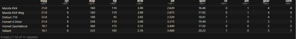
The following are the variables in the set.

VariableExplanation
mpgMiles
(US) gallon
cyl# of cylinders
dispDisplacement
(cu.in.)
hpGross horsepower
dratRear axle ratio
wtWeight
(1000 lbs)
qsec1/4 mile time
vsEngine
(0 = V-shaped,
1 = straight)
amTransmission
(0 = automatic,
1 = manual)
gear# of forward gears
carb# of carburettors

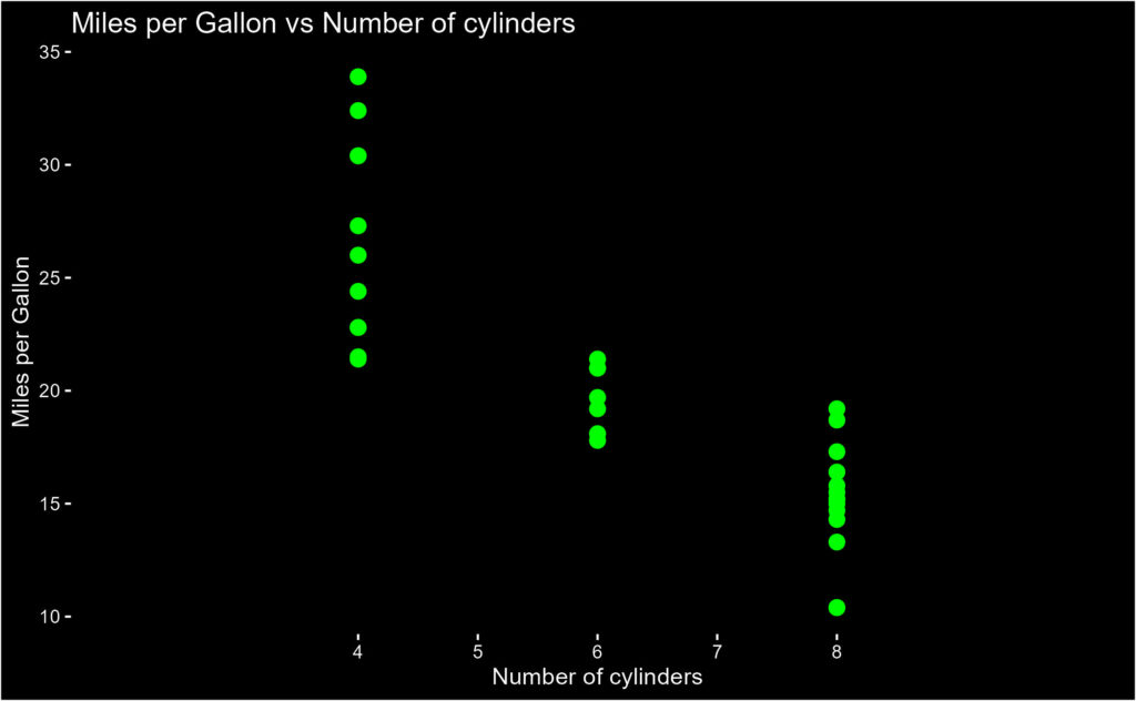
The data enables one to find out the relationship between the different characteristics with the fuel efficiency of cars. E.g., the following plot relates the miles per gallon with the number of cylinders.

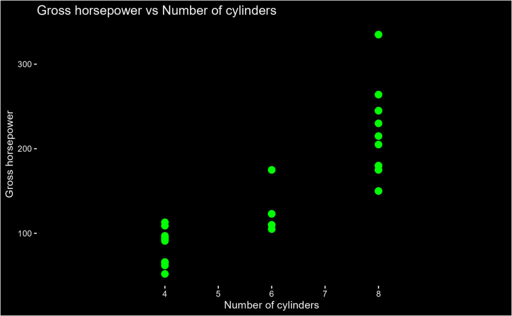
Or how the gross horsepower is related to the number of cylinders.

Correlation and mtcars Dataset Read More »

Temperature Anomaly – Warming Stripes

We have seen the spiral plot and ridgeline plot visualising the temperature anomaly (compared to the 1961-80 average). Today, we make another fancy plot – Warming Stripes – using R (again, courtesy: Ed Hawkins of the University of Reading). The data used here is the same as that we described in an earlier post.

c_data %>% ggplot(aes(x = Year, y = 1, fill = T_diff)) +
geom_tile()+
scale_y_continuous(expand = c(0, 0)) +
            scale_fill_gradientn(colors = rev(brewer.pal(11, "RdBu")))+
            guides(fill = guide_colorbar(barwidth = 1))+
            labs(title = "",
            caption = "")+
            theme_minimal() +
            theme(axis.text.y = element_blank(),
                       axis.line.y = element_blank(),
                       axis.title = element_blank(),
                       panel.grid.major = element_blank(),
                       legend.title = element_blank(),
                       axis.text.x = element_text(vjust = 3),
                       panel.grid.minor = element_blank(),
                       plot.title = element_text(size = 14, face = "bold"),
                       panel.background = element_rect(fill = "black"), 
                       plot.background = element_rect(fill = "black"),
                       axis.text = element_text(color = "white"),
                       legend.text = element_text(color = "white")
                       )

Temperature Anomaly – Warming Stripes Read More »

IESDS -The Cards Game

Amy and Becky are playing a game. Six cards – numbered 1 through 6 – are placed face down on the table. The cards are shuffled, and each one takes a card at random. The person with the higher number wins. Amy looks at her card and finds it is #2. Becky looks at hers and asks if Amy wants to trade her card. What should Amy’s response be? Note both players are rational.

If Becky had a 6, she wouldn’t ask for a trade, as #6 is guaranteed to win. If she had #5, the only card she benefits from is #6, something Amy would never trade. That eliminates #5 and #6 from the game. By extending the logic, 4 and 3 are also eliminated. That leaves #1 something Becky is happy to offer, but Amy will never accept.

So Amy’s answer to the call is a NO.

These types of games are known as the Iterated Elimination of Strictly Dominated Strategies (IESDS).

IESDS -The Cards Game Read More »

Temperature Anomaly – The Ridgeline plot

We have seen the temperature anomaly distribution visualised through a spiral plot. This time it’s another cool one – the ridge plot.

library(tidyverse)
library(ggridges)

c1_data <- c_data %>% group_by(Year) %>% mutate(T_av = mean(T_diff))

c1_data %>% filter(Year > 1950 & Year < 2022) %>% 
  ggplot(aes(x = T_diff, y = factor(Year, levels = seq(2021, 1950, -1)), fill = T_av )) +
  geom_density_ridges(bandwidth = 0.1, scale = 4, size = 0.1, color = "white") +
  scale_fill_gradient2(low = "darkblue", mid = "white", high = "darkred", midpoint = 0, guide = "none") +
  coord_cartesian(xlim = c(-1, 3)) +  
  scale_x_continuous(breaks = seq(-1, 2, 0.5)) +
  scale_y_discrete(breaks = seq(1950, 2020, 10)) + 
  labs(y = NULL, x = "Temperature Anomaly (\u00B0C)", title = "Temperature Anomaly Distribution") +
  theme(text = element_text(color = "white"), 
        panel.background = element_rect(fill = "black"), 
        plot.background = element_rect(fill = "black"),
        panel.grid = element_blank(),
        axis.text = element_text(color = "white"),
        axis.ticks = element_line(color = "white")) 

For the data and clean-up, see the earlier post.

Ridgeline plot in R with ggridges: Riffomonas Project

Temperature Anomaly – The Ridgeline plot Read More »

The Climate Spiral – The Spiral with Plotly

In the last post, we initiated the plotting of the abnormal temperature differences over the years (from the standardised values) thought to have been arising out of global warming. Today, we will build the famous spiral plot to visualise it.

First, we transform the data to polar coordinates.

c_data <- c_data %>% select(Year, all_of(month.abb)) %>% 
  pivot_longer(-Year, names_to = "Month", values_to = "T_diff") %>%
  mutate(Month = factor(Month, levels = month.abb)) %>%
  mutate(Month_no = as.numeric(Month), radius = T_diff + 1.5, theta = 2*pi*(Month_no-1)/12, x = radius * sin(theta), y = radius * cos(theta), z = Year)

The input (the original table) and the output (the transformed table) are presented below.

Plotly

Plotly is an open-source graphing library, which also has one for R (plotly).

plot_ly(c_data, x = ~x, y = ~y, z = ~z, type = 'scatter3d', mode = 'lines',
        opacity = 1, line = list(width = 6, color = ~T_diff, reverscale = FALSE))

The Climate Spiral – The Spiral with Plotly Read More »

The Climate Spiral

Let’s construct a visualisation of global temperature change – from 1880 – similar to what the British climate scientist Ed Hawkins did. The data used in the exercise has been downloaded from the GitHub channel of Riffomonas. He tabulated the deviation in the annual global mean from the data normalized between the temperatures 1951 – 1980.

The first step is to pivot the data into the following format:

c_data <- read.csv("./climate.csv")

c_data <- c_data %>% select(Year, all_of(month.abb)) %>% 
  pivot_longer(-Year, names_to = "Month", values_to = "T_diff") %>%
  mutate(Month = factor(Month, levels = month.abb)) %>%
  mutate(Month_no = as.numeric(Month))

Next, we plot the data we built.

c_data %>% ggplot(aes(x = Month_no, y = T_diff, group = Year, color = Year)) +
  geom_line() + 
  scale_x_continuous(breaks = 1:12, labels = month.abb) +
  scale_y_continuous(breaks = seq(-2, 2, 0.2)) +
  coord_cartesian()

Add a line to change to polar coordinates.

c_data %>% ggplot(aes(x = Month_no, y = T_diff, group = Year, color = Year)) +
  geom_line() + 
  scale_x_continuous(breaks = 1:12, labels = month.abb) +
  scale_y_continuous(breaks = seq(-2, 2, 0.2)) +
  coord_polar()

Climate data: Riffomonas

Riffomonas Project: Youtube

Climate spiral: Wiki

The Climate Spiral Read More »

Probability of Condom Failure

As per CDC, male condoms as a contraceptive has a failure rate of 13% for typical use and 3% for perfect use. The question is: what does it mean? The website doesn’t clarify further.

Possibility 1: a woman will get 13% of the times she has sex using a condom.

If that is true, using the protection once a month (during fertile days), a binomial equation tells you there is an 81% chance of getting pregnant in a year; (1 – (1-0.13)12)*100 = 81. It is no different from the approximate chances of conception for a woman without fertility issues.

The correct interpretation of the statistic is that it’s the number of pregnancies when 100 women use that birth control method for one year. Putting the number 0.13 back in the binomial equation, one can get the condom failure probability of about a per cent. That is pretty impressive.

1 – (0.988)12 = 0.13

References

Contraception: CDC
Statistically safe sex: Math Careers
Interpreting Birth Control Failure Rates: Very well health
Chances of getting pregnant: Medical news today
Risk Savvy: Gerd Gigerenzer

Probability of Condom Failure Read More »

The Bayesian Bag

Three bags, each containing ten balls, with the following combinations:
1) 3 red, 7 black
2) 8 red, 2 black
3) 4 red, 6 black
One of the bags is randomly selected, and a ball is drawn. If the ball drawn is red, what is the probability that it is taken from the third bag?

Use Bayes’ equation to get the answer:

\\ P(3|R) = \frac{P(R|3) * P(3)}{P(R|3) * P(3) + P(R|1) * P(1) * P(R|2) * P(2)} \\ \\ = \frac{(4/10) * (1/3)}{(4/10) * (1/3) + (3/10) * (1/3) + (8/10) * (1/3)} = \frac{4/30}{15/30} = \frac{4}{15}

The Bayesian Bag Read More »

Social Cost of Carbon – The Stern Review

The Stern Review has been one of the most influential economic reports on climate change. It is an independent review commissioned by the chancellor of the exchequer of the UK to assess climate change and its economics.

The report acknowledges the urgency required to control climate change. According to the report, the loss due to climate change is about 5% of GDP each year. He recommends carbon taxes, about 1% of the GDP, as the way to finance mitigation strategies.

Social Cost of Carbon – The Stern Review Read More »

An Ocean Full of Bombay Duck

Here is a story of the survival of the fittest. It seems it is caused by global warming or some other confounding factor. A recent publication by Kang et al. in “Environmental Biology of Fishes” tells a curious – potentially scary – case of things to come.

The team noticed a sudden spike in a particular variety of fish off the coast of southeast China. This weirdly named fish, the Bombay Duck, has had a ten-fold population growth in the last decade. Bombay Duck (Harpadon nehereus) is fish that can survive a low Oxygen environment due to a high (about 90%) water content in its tissues.  

So scientists postulate that as the water temperature rises, thanks to global warming, the dissolved oxygen levels in the water drop, and makes the lives of the indigenous fish species in danger, leaving only those species that can thrive under these conditions to multiply in numbers. So a fish that did not exist in the national statistics as an independent species until recently suddenly becomes a dominant variety.

Increase of a hypoxia-tolerant fish: Environmental Biology of Fishes

An Ocean Full of Bombay Duck Read More »