The Climate Data – Nasa Power

NS_data <- get_power(
  community = "re",
  lonlat = c(1.6780, 56.5187),
  pars = c("T2M", "WS10M", "WD10M"),
  dates = c("2021-1-1", "2021-03-31"),
  temporal_api = "daily")

Wind_rose<-NS_data[,9:10]
colnames(Wind_rose)<-c("ws", "wd")

windRose(Wind_rose,paddle = FALSE,breaks = c(1,5,10,15,20),
         col=c("#4f4f4f", "#0a7cb9", "#f9be00", "#ff7f2f"))

References

The Power Project: NASA

The Climate Data – Nasa Power Read More »

Drinking and Police

Here is some data on drinking and getting in trouble with the police. Assess the relationship between drinking habits and getting into trouble with the authorities. Does this data provide evidence of drinking and getting into trouble with the police?

NeverOccasionalFrequent
Trouble with Police 60200420
No trouble with Police 480027002800
Observation table

The first step is to form the hypothesis. Here is the null hypothesis:

H0 – Drinking habits and getting into trouble with the police are independent.

The alternative is

H1 – Drinking habits and getting into trouble with the police are not independent.

We will use the chi-squared test to validate the null hypothesis.

We will use the chi-squared test to validate the null hypothesis. It requires observed data as well as the expected data under the null hypothesis conditions. From the data, the number of people belonging to each of the drinking categories is:

NeverOccasionalFrequentTotal
#48602900322010980
%44.2626.4129.33100

So, under ‘normal’ conditions (conditions of independence), one would expect similar percentages of individuals getting into trouble with the police, the expected numbers we needed.

NeverOccasionalFrequent
Trouble with Police 301178200
No trouble with Police 455927203020
Expectation table

If you add a row below each category, you will get the same split as per the total.

NeverOccasionalFrequent
%44.2626.4129.33

It’s time for the chi-square test, i.e. (observed – expected)2/expected summed over all the members.

(60 – 301)2 / 301 + (200 – 178)2 / 178 + (420 – 200)2 / 200 +(4800 – 4559)2 / 4559 +(2700 – 2720)2 / 2720 + (2800 – 3020)2 / 3020 = 467

The chi-squared statistic is 467. The degrees of freedom are the product of one less than the number of categorical variables (i.e. (2-1) x (3-1) = 2). Upon looking at the probability table, you can find that 467 is way on the right side of the distribution, with the probability (p-value) almost zero. So the data did not happen by chance, and the null hypothesis is rejected.

Drinking and Police Read More »

Asymmetry of Information – Market for Lemon

We have seen information asymmetry. And it is a market failure. Why? Because it’s a feature that violates a fundamental theorem of welfare economics, i.e., “the competitive market will maximise the total social welfare”. In the event of a market failure, the overall group is worse off; we have seen one example in the past, i.e., externality.

Insurance is a good example of market failure due to information asymmetry. Another one is “the market for lemons,” which we’ll see in the end.

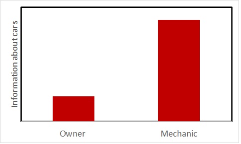
We saw the owner-mechanic case where the seller holds superior information. Insurance is a transaction where the opposite happens; the seller suffers from a lack of information about the (health condition) of the buyer. Suppose a target group of customers with 90% healthy and 10% sick. For the healthy, there is a 10% chance of incurring a $10,000 charge next year and the rest, none. For the unhealthy, there is a 50% chance of incurring $10,000 and 50% none. So, the expected values (of cost) are:

Healthy: 0.9 x 0 + 0.1 x 10,000 = 1000
Unhealthy: 0.5 x 0 + 0.5 x 10,000 = 5000

If everyone buys health insurance, the expected cost to the insurance company is:

0.9 x 1000 + 0.1 x 5000 = 1400.

Taking a profit of 100 per person, it sets a premium of $1500 for health insurance. Now, what happens in reality?

All the sick will buy the insurance, and only the risk-averse will buy from the healthy. Because the healthy will look at the expected cost (1000) and feel discouraged by the premium that costs 500 more. If there are a total of 1000 people, and 50% of the healthy are risk-averse (buyers of the insurance). Then, the revenue of the insurance company is

0.9 (proportion of healthy) x 0.5 (proportion of risk-averse) x 1000 (total people) x 1500 (premium) + 0.1 (proportion of unhealthy) x 1000 (total people) x 1500 (premium) = 0.9 x 0.5 x 1000 x 1500 + 0.1 x 1000 x 1500

825,000.

And the cost,

0.9 (proportion of healthy) x 0.5 (proportion of risk-averse) x 1000 (total people) x 1000 (expected cost on healthy) + 0.1 (proportion of unhealthy) x 1000 (total people) x 5000 (expected cost on unhealthy) = 0.9 x 0.5 x 1000 x 1000 + 0.1 x 1000 x 5000

950,000

The company loses money due to what is known as adverse selection. What happens if the company raises the premium? Well, it will discourage more healthy companies from entering the market, and the company will lose more money.

Market for Lemons

The problem of lemons is an example in the used-car market. Lemon is a poorly performing product. Since the buyer can’t tell the difference between a lemon and a good car (the plum), they are willing to pay some price corresponding to an average-performing car. Seeing what is happening, the top plum cars will exit the market, further compounding the miseries of the buyer (and the seller alike).

Asymmetry of Information – Market for Lemon Read More »

Asymmetry of Information – Signaling

Here is another manifestation of information asymmetry. How does a new car that entered the market convince customers about its quality? Here, the car manufacturer knows much more about the product than the customer.

This is what Hyundai did in the US, recovering from a phase of making average-quality cars into better ones. It offered its customers a 10-year / 100,000-mile warranty. This is called a signal, which is an expensive action that reveals information.

A certificate of higher education—even better, from a top university—is a powerful signal to the hiring manager. Whether the degree subject is directly applicable to the job or not, the hiring company sees the certificate as evidence of the candidate’s quality, a signal offered by the employee to the employer.

Asymmetry of Information – Signaling Read More »

Asymmetry of Information – Moral Hazard

We have seen it before; information asymmetry leads to what is known as a principal-agent problem.

Take the popular example of the conflict between the car owner and the mechanic. You, a car owner, want to check the vehicle for annual maintenance. Under normal circumstances, unless the owner knows all about the car mechanics, a mechanic knows more about the car repair.

While the whole point of going to the workshop and what is expected from a mechanic both emanate from this (asymmetric) information, it can potentially develop a principal (car owner) agent (mechanic) problem.

You assume that the mechanic will use the information to exploit you by selling unnecessary parts and services. It happens because the incentives of the two parties (the principal and agent) are not the same and possibly conflicting. The owner wants to repair the car at a minimum cost, and the agent wants to maximise his return. In the end, a Moral Hazard is created. A moral hazard is an adverse behaviour that is encouraged by the situation.

Solutions to Moral Hazard

The easiest way is for the owner to gain more information. It may come from taking a ‘second opinion’ from another mechanic (who may have a different incentive) or an auto consultant (who may not even have an incentive).

The second is to reduce the incentive that the agent has. An example is the rating system, preferably at a neutral site, that can deter the agent from ripping the customer off.

Asymmetry of Information – Moral Hazard Read More »

Portfolio Theory – Normal DIstribution

With all its simplicity, portfolio theory still describes the value in grouping securities, preferably ones uncorrelated with each other, for more predictable returns. The statistical parameters, mean and standard deviation, representing the expected return and risk, respectively, also suggest an underlying probability distribution. Despite all criticism around the usage or normal distribution (symmetric bell curve), we still utilise it to explain the portfolio concept.

In the previous post, we saw two stocks, 1 and 2, with two different expected returns (12 and 6) and risks (6 and 3). If the overall returns followed a normal distribution, they would have appeared like in the following plot.

Here, the blue curve represents the one with a higher expected return and higher volatility. The red one is more conservative. The combined set (1:1) for a correlation coefficient of 0 (uncorrelated) behaves in the following way.

The advantage of using a standard distribution (normal, in this case) is that it enables us to estimate various probabilities. E.g., the chance of ending up with a zero return and below for the blue curve (aggressive one) is 2.3%, which is similar to what the conservative (red) can give. On the other hand, for the joint distribution (green curve), it is just 0.4%.

Portfolio Theory – Normal DIstribution Read More »

Portfolio Theory

Portfolio theory is a simple theoretical framework for building investment mixes to achieve returns while managing risks. It used the concepts of expected values and standard deviations to communicate the philosophy.

Take two funds, 1 and 2. 1 has an expected rate of return of 12%, and 2 has 6%. On the other hand, 1 is more volatile (standard deviation = 6), whereas 2 is less risky (standard deviation = 3), based on historical performances. In one scenario, you invest 50:50 in each.

The expected value is 0.5 x 12 + 0.5 x 6 = 9%

To estimate the risk of the portfolio, construct the following matrix.

Omega values (1 and 2) are the proportions, sigmas are the standard deviations, and sigma12 is the covariance between 1 and 2. Substituting 0.5 for each omega (50:50) and noting that covariance is the product of the standard deviations x correlation coefficient, we get the following table for the two securities that are weakly correlated (correlation coefficient = 0.5),

Add the entries in these boxes to get the portfolio variance. Take the square root for the standard deviation = 3.97.

The expected rate of return of the portfolio is 9%, and the risk (volatility) is 3.97%. Continue this for all the proportions (omega1 = 1 to 0) and then plot the returns vs volatility; you get the following plot for a correlation coefficient of 0.5.

Imagine the securities do not correlate (coefficient = 0). The relationship changes to the following.

The risk is lower than the lowest (3%) for proportions of security1 less than 0.4. Even better, if the two securities are negatively correlated (correlation coefficient = -0.5),

If there are n securities in the portfolio, you must create an n x n matrix to determine the variance.

Portfolio Theory Read More »

Bayes’ Theorem – Graphical Representation

Here is a graphical illustration of Bayes’ theory. We use the old example of Steve, “the shy and withdrawn”.

The colour orange represents the number of librarians, and the light blue the farmers.

From the relative sizes of the rectangles, you make out that the number of farmers is more than the number of librarians. This, we call, the prior information.

Let’s assume that 80% of the librarians are shy and withdrawn, and only 25% of the farmers possess those characteristics. The following picture, green representing shyness, is more or less that.

Now, here is the question: when you see a random shy and withdrawn person, where do you likely to classify him, given you have two choices – librarian or farmer?

Well, likely in the rectangle on the left, which comes from the farmer group! And if you want a precise probability, here is the math below:

Bayes’ Theorem – Graphical Representation Read More »

The Net Present Value

Future Value

How much money will I have ONE year from today if I invest 100 dollars at an interest rate of 10%? Here, 10% is the annual return. The answer is 100 + 10% of 100 = 100 + 100 x 10% = 110. How much money will I have two years from now if I invest 100 dollars today at the same rate of return?

Value at the end of year 1 = 100 + 100 x 10% = 100 x (1 + 10%)
Value at the end of Year 2 = [100 x (1 + 10%)] + [100 x (1 + 10%)] x (1 + 10%) = 100 x (1 + 10%)2.
So, in general, the future value of P at the end of n years, at a rate of return of r, is:

FV = P x (1 + r)n

Present Value

Let’s ask the question in reverse. How much money should I invest to get 110 dollars in one year from today at a rate of return of 10%? We know that intuitively – it is 100. Formally, we get it by dividing 110 by (1 + 10%). By the way, 10% equals 0.1 (110/1.1 = 100). So the present value of 110 one year from now is 110 / (1 + 0.1). If we extend this further, the present value of C, n years from today, at a rate of return of r, is

PV = C/(1+r)n

Net Present Value

What is the present value (PV) of the future benefits that will happen in the following manner?

Year 1 = 200
Year 2 = 200
Year 3 = 200
Year 4 = 200

That must be PV of year 1 benefit + PV of year 2 benefit + PV of year 3 benefit + PV of year 4 benefit.

200/(1+0.1) + 200/(1+0.1)2 + 200/(1+0.1)3 + 200/(1+0.1)4 = 181.82 + 165.29 + 150.26 + 136.60 = 633.97.

The story is not over yet. What if I need to invest 500 dollars today to get the above benefits (200 dollars every year for 4 years)? Is it a good deal or a bad deal?

To get the answer, you estimate the present value of the future cash flows and subtract what is required to pay today. That is 633.97 – 500 = 133.97. Not bad. It is the net present value of this business.

The underlying principle behind these calculations is known as the ‘time value of money‘.

The Net Present Value Read More »

Simpson’s Paradox – Illustration

We have seen Simpson’s paradox multiple times before. Here is another illustration. Consider two countries; each has a million people. Following is the number of diseased individuals in a particular episode of the illness. So which country is safe to live?

Country ACountry B
# deaths
(per mln)
76.854.8

The conclusions seem pretty obvious,? Until you see the following breakdowns. First, the demographic distribution.

AgeAB
0 – 90.82
10 – 191.22
20 – 293.58
30 – 395.517
40 – 491119
50 – 591822
60 – 692119
70 – 79218
> 80183
Overall100100

And the incident rate of the disease

AgeAB
0 – 900
10 – 1901
20 – 2901
30 – 3912
40 – 491020
50 – 591030
60 – 6980100
70 – 79100200
> 80200300

Multiplying the respective columns gives the number of death per million people.

AgeAB
0 – 900
10 – 1900.02
20 – 2900.08
30 – 390.0550.34
40 – 491.13.8
50 – 591.86.6
60 – 6916.819
70 – 792116
> 80369
76.75554.84

The country that saved more people in each age category had more fatalities because it had more people in those buckets where the illness was severe.

Simpson’s Paradox – Illustration Read More »