January 2023

Exaggerated State of the Union

Political pitches are notorious for exaggerating facts. One example is the 2011 state of the union address of then-US President Obama. Here, he created a visual illusion using a bubble plot in the following form to represent how America’s economy compared with the rest of the top 4. Note what follows here is not the exact plot he showed but something I reproduced using those data.

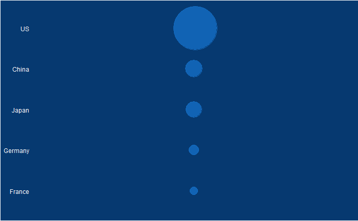
Doesn’t it look fantastic? The actual values of GDP of the top 5 in 2010 were:

CountryGDP
(trillion USD)
US14.6
China5.7
Japan5.3
Germany3.3
France2.5

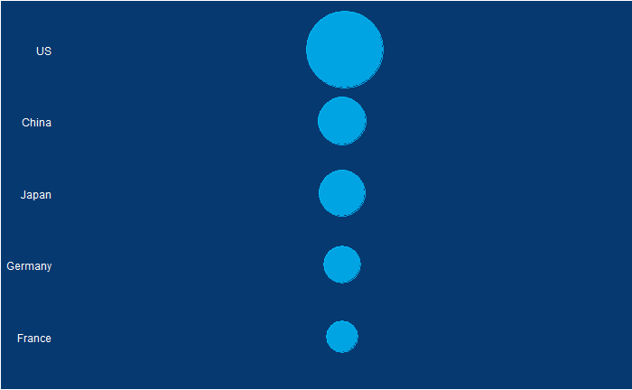
The president used bubble radii to scale the GDP numbers, which is not an elegant style of representation. It is because the area of the circle and the perspective it creates for the viewer squares with the radius. In other words, if the radius is three times, the area becomes nine times.

What would have been a better choice was to use the radius for scaling the bubble.
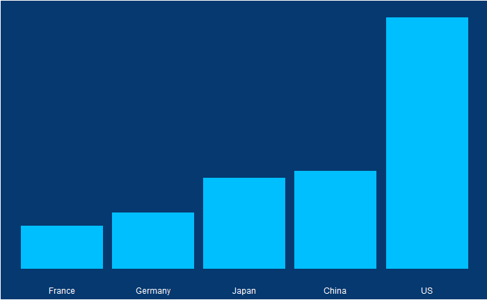
Or use a barplot.

Reference

The 2011 State of the Union Address: Youtube (pull up to 14:25 for the plot)

Exaggerated State of the Union Read More »

Principal Agent Problem

The principal-agent problem is a key concept in economic theory, which has some fascinating consequences in real life. It is easier to understand the idea using the following example.

You want to buy a house. There are a lot of potential sellers in the market; you meet one of them, agree on a price and settle the deal – a simple transaction between a buyer and a seller. But real life is more complex. You may not know where those sellers are, the market value or the paperwork that may be required to complete the process etc. So you approach a real estate agent, who has more knowledge in this topic than you, the principal. In technical language, an asymmetry of information exists.

The agent knows something that you don’t. And she realises the value (say, buy the best house at the cheapest rate) on the principal’s behalf.

A far more complex principal-agent dynamics work in a large company. A simple owner-household transaction becomes a series of relationships between the owner (shareholders) – board, board-CEO, CEO-top management, manager – technical expert etc. Here, the lower-down person (in the hierarchy) needs to act to realise the values and visions of the higher.

So what’s the problem?

The biggest one is trust. Ideally, you want the incentives of both parties (the principal and the agent) to be aligned. But since the agent has more knowledge, you suspect the former to misuse the information asymmetry to her advantage. It leads to a conflict of incentives, and the principal can’t make it if the agent did a good deal or a bad deal on your behalf.

Principal Agent Problem Read More »

The Data that Speaks – Final Episode

We will end this series on vaccine data with this final post. We will use the whole dataset and map how disease rates changed after introducing the corresponding vaccines. The function, ‘ggarrange’ from the library ‘ggpubr‘ helps to combine the individual plots into one.

library(dslabs)
library(tidyverse)
library(ggpubr)

We have used years corresponding to the introduction of vaccines or sometimes the year of licencing. In Rubella and Mumps, lines corresponding to two different years are provided to coincide with the starting point and the start of nationwide campaigns.

The Data that Speaks – Final Episode Read More »

The Data that Speaks – Continued

We have seen how good visualisation helps communicate the impact of vaccination in combating contagious diseases. We went for the ’tiles’ format with the intensity of colour showing the infection counts. This time we will use traditional line plots but with modifications to highlight the impact. But first, the data.

library(dslabs)
library(tidyverse)

vac_data <- us_contagious_diseases
as_tibble(vac_data)

‘count’ represents the weekly reported number of the disease, and ‘weeks_reporting’ indicates how many weeks of the year the data was reported.
The total number of cases = count * 52 / weeks_reporting. After correcting for the state’s population, inf_rate = (total number of cases * 10000 / population) in the unit of infection rate per 10000. As an example, a plot of measles in California is,

vac_data %>% filter(disease == "Measles") %>% filter(state == "California") %>% 
  ggplot(aes(year, inf_rate)) +
  geom_line()

Extending to all states,


vac_data %>% filter(disease == "Measles") %>% ggplot() + 
  geom_line(aes(year, inf_rate, group = state)) 

Nice, but messy, and therefore, we will work on the aesthetic a bit. First, let’s exaggerate the y-axis to give more prominence to the infection rate changes. So, transform the axis to “pseudo_log”. Then we reduce the intensity of the lines by making them grey and reducing alpha to make it semi-transparent.


vac_data %>% filter(disease == "Measles") %>% ggplot() + 
  geom_line(aes(year, inf_rate, group = state), color = "grey", alpha = 0.4, size = 1) +
  xlab("Year") + ylab("Infection Rate (per 10000)") + ggtitle("Measles Cases per 10,000 in the US") +
  geom_vline(xintercept = 1963, col ="blue") +
  geom_text(data = data.frame(x = 1969, y = 50), mapping = aes(x, y, label="Vaccine starts"), color="blue") + 
  scale_y_continuous(trans = "pseudo_log", breaks = c(5, 25, 125, 300)) 

What about providing guidance with a line on the country average?

avg <- vac_data %>% filter(disease == "Measles") %>% group_by(year)  %>% summarize(us_rate = sum(count, na.rm = TRUE) / sum(population, na.rm = TRUE) * 10000)

geom_line(aes(year, us_rate),  data = avg, size = 1)

Doesn’t it look cool? The same thing for Hepatitis A is:

The Data that Speaks – Continued Read More »

The Data that Speaks

Vaccination is a cheap and effective way of combating many infectious diseases. While it has saved millions of people around the world, vaccine sceptics also emerged, often using unscientific claims or conspiracy theories. This calls for extra efforts from the scientific community in fighting against misinformation. Today, we use a few R-based visualisation techniques to communicate the impact of vaccination programs in the US in the fight against diseases.

We use data compiled by the Tycho project on the US states available with the dslabs package.


library(dslabs)
library(tidyverse)
library(RColorBrewer)

vac_data <- us_contagious_diseases

the_disease = "Polio"
vac_data <- vac_data %>%  filter(disease == the_disease & !state%in%c("Hawaii","Alaska")) %>% 
  mutate(rate = count / population * 10000) %>% 
  mutate(state = reorder(state, rate))


vac_data %>% ggplot(aes(year, state, fill = rate)) + 
  geom_tile(color = "grey50") + 
  scale_x_continuous(expand=c(0,0)) + 
  scale_fill_gradientn(colors = brewer.pal(9, "Reds"), trans = "sqrt") + 
  geom_vline(xintercept = 1955, col ="blue") +
  theme_minimal() + 
  theme(panel.grid = element_blank()) + 
  ggtitle(the_disease) + 
  ylab("") + 
  xlab("")

Now, changing the disease to measles and the start of vaccination to 1963, we get the following plot.

The Data that Speaks Read More »

Speed Matters

Another example to trouble your system 1, a.k.a. intuitive thinking and a version of the mileage paradox. It seems even Einstein found this riddle interesting!

I have to cover a distance of 2 kilometres. I did the first kilometre at 15 km/h (km. per hour). What speed should I maintain in the next one kilometre to cover the total distance at an average speed of 30 km/h?  

System 2 thinking

You may require a pen a paper to solve this puzzle. Take the first part: how much time does it take to cover one km at 15 km/h? The answer is 60/15 = 4 min. The second part, time to cover two km at 30 km/h: 60 mins for 30 km, 2 mins for 1 km or 4 mins for 2 km. But you already consumed 4 mins in the first one km!

So I can’t achieve the target; was it obvious the first time you heard the problem?

Speed Matters Read More »

Why Most Published Results are Wrong

It is the title of a famous analysis paper published by Ioannidis in 2005. While the article goes a bit deeper in its commentary, we check the basic understanding behind the claim – through Bayesian thinking.

Positive predictive value, the ability of analysis to predict the positive outcome correctly, is the posterior probability of an event based on prior knowledge and the likelihood. The definition of PPV in the language of Bayes’ theorem is,

P(T|C_T) = \frac{P(C_T|T) P(T) }{P(C_T|T) P(T) + P(C_T|nT) P(nT)}

P(T|CT) – The probability that the hypothesis is true given it is claimed to be true (in a publication)
P(CT|T) – The probability that the claim is true given it is true (true hypothesis proven correct)
P(T) – The prior probability of a true hypothesis
P(CT|nT) – The probability that the claim is true given it is not true (false hypothesis not rejected = 1 – false hypothesis rejected)
P(nT) – The prior probability of an incorrect hypothesis (1 – P(T))

Deluge of data

The last few years have seen an exponential growth of correlations due to a flurry of information and technology breakthroughs. For example, the US government issues data of ca. 45000 economic statistics and an imaginative economist can find out several millions of correlations among those, most of which are just wrong. In other words, the proportion of causal relationships in these millions of correlations is declining with more data. In the language of our equation, the prior (P(T)) drops.

Suppose the researcher can rightly identify a true hypothesis 80% of the time (which is quite impressive) and rightly reject an incorrect one at 90% accuracy. Yet, the overall success, PPV, is only 47% if the prior probability of a true relationship is only 1 in 10.

P(T|C_T) = \frac{0.8 * 0.1}{0.8 * 0.1 + 0.1 * 0.9} = 0.47

References

Why Most Published Research Findings Are False: John P. A. Ioannidis; PLoS Medicine, 2005, 2(8)

The Signal and the Noise: Nate Silver

Why Most Published Results are Wrong Read More »

Precision, Accuracy and Errors – Continued

We have seen what precision is – it says something about the quality of the measurements. And we saw the following as an example of high-precision data collection: the fluctuations are closer to the average.

Accuracy

But what about if the true value – unfortunately, something the measurer would never know – of the unknown was 30 instead of 25?

So there is a clear offset between the mean and the true value. In other words, the accuracy of the measurements is low. If precision is related to the presence of random errors, accuracy is compromised by systematic bias.  This may have been caused by mistakes in the instrumental settings or by poor methodology.

The other potential reason for poor accuracy is the presence of outliers.

By the way, both systematic bias and outliers are deterministic errors.

Precision, Accuracy and Errors – Continued Read More »

Precision, Accuracy and Errors

Let’s revisit something that we touched upon some time ago – the topic of observation theory. For those who don’t know what it is, the observation theory is about estimating the unknowns through measurements.

While the unknowns, the parameters of interest could be deterministic, such as the height of a mountain, or the temperature rise, the measured values are random or stochastic variables. And two terms that represent the quality of the observations are precision and accuracy.

Precision

Precision means how close repeated measurements are to each other. As an illustration, the following are 100 data points from a measurement campaign.

The dotted red line represents the mean (= 25). The fluctuation around the mean can be calculated by subtracting 25 from each observation. Here is how the fluctuations are distributed.

Now, look at another example.

A comparison of the two examples shows that the first one has a narrower distribution of errors (higher precision), and the second one has broader (lower precision). But they both follow a sort of normal distribution around mean zero.

We’ll discuss accuracy in the next post.

Precision, Accuracy and Errors Read More »

Looking for Rules that Don’t Exists

The following is a riddle that used to make rounds on the internet: I have 50, then I spend it in the following way.

SpendBalance
2030
1515
96
60
Total spend
= 50
Total balance
= 51

The total spend is 50, and the total balance is 51 – how to explain the extra 1?

The riddle has intrigued a lot of people. But the answer is: no rule requires matching the sum of spend with the sum of the balance! Take this extreme example: I have 50, and I spent it fully.

SpendBalance
500
Total spend
= 50
Total balance
= 0

This time there is not much effort required for the mind to get convinced.

Looking for Rules that Don’t Exists Read More »