September 2022

Trading and Pareto Efficiency – Continued

Last time we concluded that international trade was Pareto inefficient even though it made both countries richer (i.e. GDP) because it creates winners and losers within the country. But the effect can be reversed if the government shares the gains with the loser.

But this is easier said than done. Experience has shown that governments are typically slow to compensate than permitting trade.

But where is this benefit coming from? It happens because the price differential exists between two countries. One reason could be that technology makes the production of the same goods in one country cheaper than the other. The second may be the preference for different countries – country A values item 1 over item 2, whereas country B likes the opposite.

The advantage doesn’t need to be absolute; it only needs to be relative. Consider this example: there is a job that pays $100, which involves two activities. Amy can do activity 1 in 20 hrs and activity 2 in 10 hrs. Betty can perform activity 1 in 100 hrs and activity 2 in 300 hrs. Amy has an advantage in both jobs. What maximises the reward for Amy – do the job herself or partner with Betty?

Let’s analyse the following four situations:

CaseJob 1
Hrs A
Job 2
Hrs A
Job 1
Hrs B
Job 1
Hrs B
Gain A
($/hr)
Gain B
($/hr)
A job 1
A job 2
2010100/30
= 3.33
0
B job 1
B job 2
1003000100/400
= 0.25
A job 1
B job 2
2030050/20
= 2.5
50/300
= 0.16
B job 1
A job 2
1010050/10
= 5
50/100
= 0.5

Interestingly, partnering made both parties better off. This is trade 101.

Inspired by the lecture notes of David Autor, MIT department of economics.

Trading and Pareto Efficiency – Continued Read More »
Trading and Pareto Efficiency

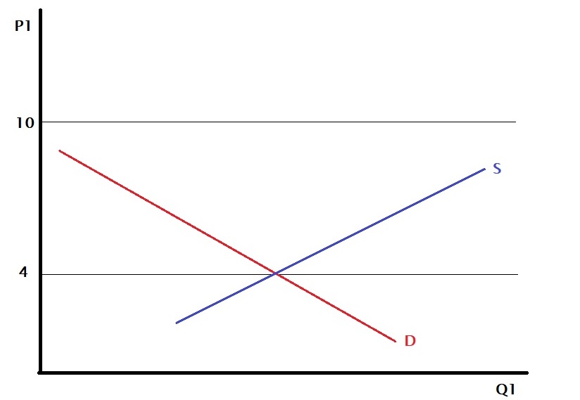
Is international trade Pareto efficient? To understand that, we will create a scenario for the trade of a commodity from country A to country B.

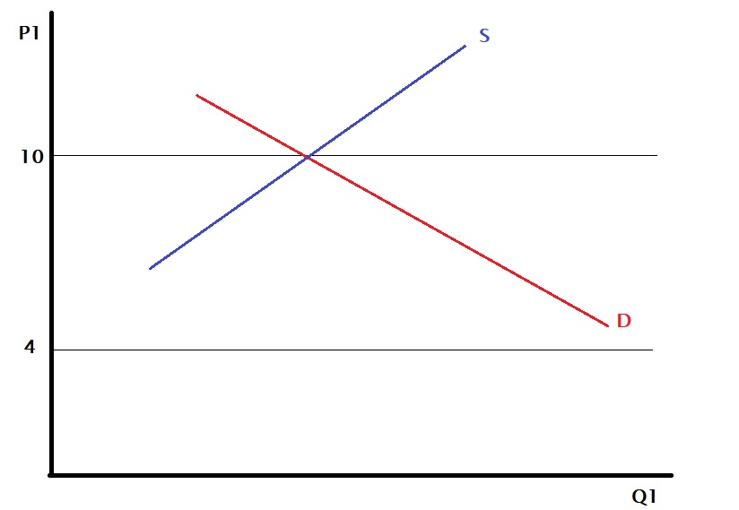
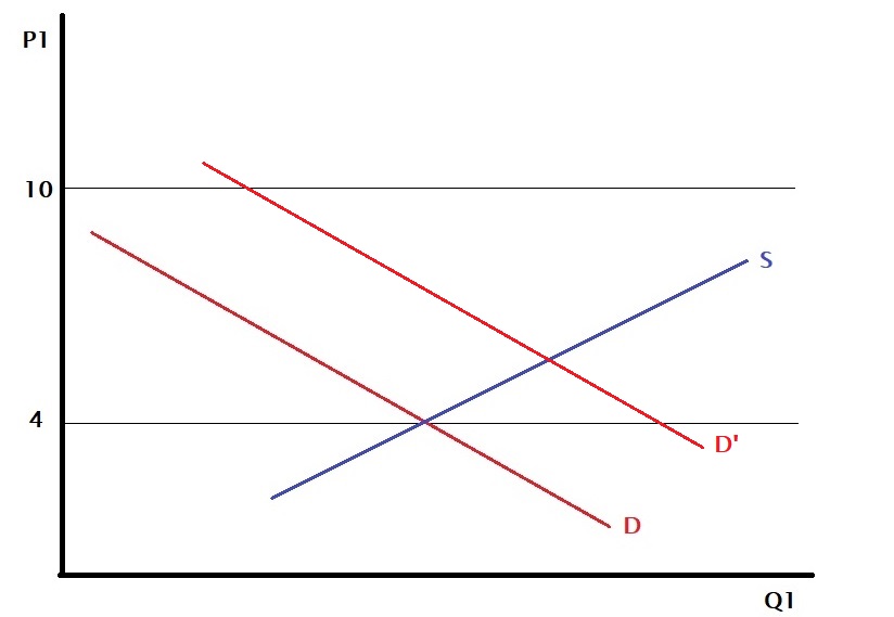
Country A

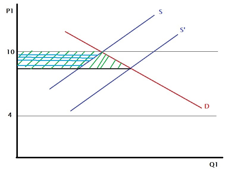
Before exporting started, $4 was the price of the commodity based on the supply and demand curves.

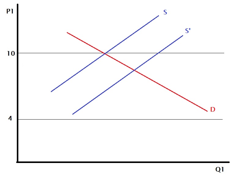
Country B

At the same time, the price of the same item in country B was $10.

When country A exports goods to country B, the supply curve of the latter shifts by that amount to the right (to higher Q).

So the price in country B has reduced from $10 to $8.

At the same time, you may imagine that the demand curve in country A shifts to the right (towards higher Q) because by adding the new entity (country B) to the existing domestic demand, country A has increased the demand.

And the impact is? The price in country A has gone up from $4 to $6.

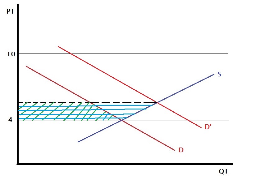
Country A’s consumers are hurt because of the price rise, but the producers are happy as they can enjoy a higher price in the other country. On the other hand, consumers in country B are pleased because of the lowering, but their domestic producers are unhappy as this move impacted their margin.

In country A, the consumers lost the area shaded in green (the area under the demand curve between the two prices). At the same time, the producers gained the region corresponding to the blue-shaded (the one above the supply curve between those two prices). And the net benefit is the blue-shaded triangle (blue-shaded – green-shaded). So the is a net benefit for country A.

On the other hand, in country B, the consumer gained the larger area (green), whereas the domestic producers lost the smaller (blue), and the net is a gain – the triangle that has only green shade. So a net benefit here as well.

Pareto efficiency

So the trade yielded net benefit for both countries. But was the move a Pareto improvement? It was not; because, in the process of trade, the consumers in country A are worse off, and so are the domestic producers of country B.

Trading and Pareto Efficiency Read More »

Evolution vs Conversion

Misconceptions about evolution exist due to humans’ inability to comprehend the enormousness of time. That leads to common misconceptions such as, “I haven’t seen a monkey giving birth to a human”, “if humans evolved from monkeys, why do monkeys still exist?” etc.

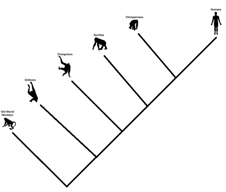
Firstly, monkeys did not evolve into humans. In the evolution tree (remember: it’s a tree and not a line), monkeys are not our ancestors; they are cousins. In other words, the common ancestors of monkeys and humans (apes) existed about 30 million years ago. The monkeys we see today had a trajectory from that time to the present, just like their distant cousin, humans, in that period.

The same goes for chimpanzees and humans. Chimpanzees are our closest cousins, and that branch goes back 5-7 million years ago. A rough sketch of the branching business is shown below.

Understanding Evolutionary Trees: Evo Edu Outreach (2008) 1:121–137

Evolution vs Conversion Read More »

Efficiency and Equity

Consider this example:
Andy and Becky are both chocolate lovers. Andy has ten chocolates, and Becky has zero. Is the system Pareto efficient? (Hint: try taking one away from Andy and give it to Becky). The system, at this current state, is Pareto efficient. But not equitable.

Equity means the distribution of goods and services is reasonable to the parties involved. The chocolate lover Becky getting no chocolate is unlikely a reflection of an equitable society!

A market, at a competitive equilibrium, is supposed to be Pareto efficient. And this says nothing about justice. While driving efficiency is a market objective, managing equity is a political decision.

An instrument used by governments to manage this inequity is taxation. For example, in a progressive tax structure, the highest income earner will pay more proportion of their wealth compared to a lower income earner. The expectation is that the distribution of after-tax wealth is fairer than before. But you may argue that taxing is Pareto inefficient as it hurts citizens, more so the people with more wealth.

Efficiency and Equity Read More »

Pareto Efficiency

We have briefly touched upon the topic of Pareto efficiency in one of the earlier posts. Let’s understand the term a bit deeper. Start with the definition: An outcome is Pareto efficient if there is no other outcome that makes at least one person better off without leaving anyone worse off. Any move away from the efficient position will harm someone, or it is not efficient if I can make someone better off and not hurt somebody else.

Two chocolate lovers

Andy and Becky love chocolate. There were ten chocolates, and Andy got four and Becky six. Are they in a Pareto equilibirum? Test the situation by taking one chocolate away from Andy or Becky. Will it make someone unhappy? Since the answer is yes, They are in Pareto efficient state.

Prisoner’s dilemma

Time to revisit the Prisoner’s dilemma. The payoff matrix is of the following form.

Prisoner B
CooperateBetray
Prisoner ACooperate(3, 3)(1, 4)
Betray(4, 1)(2, 2)

Let’s look at each of the four outcomes. Remember, we already know that (betray, betray) is the Nash equilibrium or the rationally expected outcome.

  1. Cooperate-Cooperate (3, 3): Try to move in any direction; one of them will be worse off. For example, move to the right: player B gets richer (3 to 4), whereas A becomes poorer (3 to 1). Therefore, the state is Pareto efficient.
  2. Cooperate-Betray (1, 4): Try to go to any other quadrant; B falls short. So their current state is Pareto efficient.
  3. Betray-Cooperate (4, 1): This time, player A gets the stick. The existing condition is Pareto efficient.
  4. Betray-Betray (2,2): Move to the Cooperate-Cooperate quadrant, and both players will be better off (3 and 3), suggesting their state is not Pareto efficient.

In summary

The only outcome in the prisoner’s dilemma that is not Pareto efficient is the one that is the rational choice or the Nash equilibrium.

Pareto Efficiency Read More »

Trusting the witness

In the city of M, there are only taxis in two colours, red and blue. One night a cab was involved in a hit-and-run incident. As per a witness, the colour of the cab was blue. Based on the information from the authorities, 80% of the cars are red, and 20% are blue. Tests have found that the accuracy at which the witness can identify the colours is about 80% under challenging lighting conditions. What is the probability that the witness correctly identified the right one?

Well, we will use Bayes’ rule to estimate the accuracy. Here is Bayes’ rule modified to suit our context.

\\ P(B|W) = \frac{P(W|B)*P(B)}{P(W|B)P(B) + P(W|R)*P(R)}

The terms are
P(B|W) - the probability that the cab colour is blue, given the witness' testimony.  
P(W|B) - the probability that the witness identifies blue, given the cab is blue = 80% or 0.8.  
P(B) - a priori probability of finding a blue cab in the city = 20% or 0.2.
P(W|R) - the probability that the witness identifies blue, given the cab is red = 20% or 0.2.  
P(R) - a priori probability of finding a red cab in the city = 80% or 0.8.

After substituting the numbers in the equation, the required probability becomes:

\\ P(B|W) = \frac{0.8*0.2}{0.8*0.2 + 0.2*0.8} = 0.5

No different from tossing a coin!

Trusting the witness Read More »

Survival Data – Sankey Diagram

We have learned survival analysis in the last few posts, using a dataset involving 42 data points from an efficacy for an experimental drug. The data set was in the following format.

groupgenderrelapse
Treatment FemaleTRUE
Treatment MaleTRUE
Treatment FemaleFALSE
Treatment FemaleTRUE
ControlMaleTRUE
ControlFemaleTRUE
ControlFemaleTRUE
ControlMaleTRUE
ControlFemaleTRUE

Sankey diagram

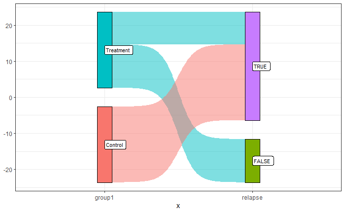
A Sankey diagram is a visualisation technique for showing the flow of energy, material, or, in this case, events. The simplest example is visualising the flow of how the treatment and control groups responded to the illness’s relapse.

It is noticeable that all the participants in the control group had relapses of the disease, whereas it was mixed in the treatment group.

The plot was created by executing the following R code:

library(ggsankey)
library(tidyverse)
df1 <- ill_data %>% make_long(group1, relapse)

san_plot <- ggplot(df1, aes(x = x
                            , next_x = next_x
                            , node = node
                            , next_node = next_node
                            , fill = factor(node)
                            , label = node))
san_plot <- san_plot + geom_sankey(flow.alpha = 0.5
                                   , node.color = "black"
                                   , show.legend = FALSE)
san_plot <- san_plot + geom_sankey_label(size = 3, color = "black", fill = "white", hjust = 0.0)
san_plot <- san_plot + theme_bw()

san_plot

Note that the package ‘ggsankey’ may not be available from your usual repository, CRAN. You may be required to run the following two lines to get it.

install.packages("remotes")
remotes::install_github("davidsjoberg/ggsankey")

Let’s add another node to the Sankey, the gender.

df1 <- ill_data %>% make_long(group1, relapse, gender)

san_plot <- ggplot(df1, aes(x = x
                            , next_x = next_x
                            , node = node
                            , next_node = next_node
                            , fill = factor(node)
                            , label = node))
san_plot <- san_plot + geom_sankey(flow.alpha = 0.5
                                   , node.color = "black"
                                   , show.legend = FALSE)
san_plot <- san_plot + geom_sankey_label(size = 3, color = "black", fill = "white", hjust = 0.0)
san_plot <- san_plot + theme_bw()

san_plot

Further resources

World Energy Flow 2019: IEA

Survival Data – Sankey Diagram Read More »

Weibull distribution

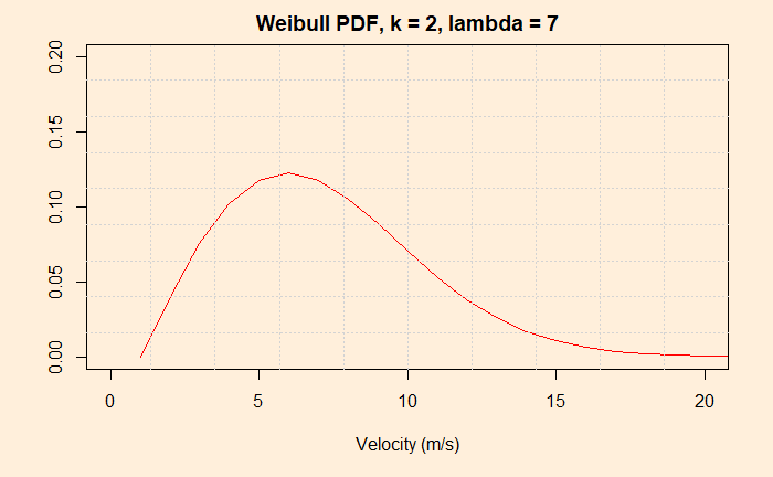
The Weibull distribution is a continuous probability distribution. Its speciality is that it can fit different distribution shapes and is a favourite for time-to-failure data, a vital parameter of interest in reliability analysis. It is related to the exponential distribution. The distribution has two parameters: shape (k) and scale (lambda).

Because of the flexibility to change the shape probability distribution function by varying its key parameters, k and lambda, Weibull finds several applications. Notable among them is modelling the distribution of wind velocities.

Weibull distribution Read More »

Survival Plots – Cox proportional hazards model

Here is where we stopped last time. The next step is quantifying the difference between the treatment and the control groups. Now refresh your memory or hazard ratio, efficacy – all those stuff.

Cox proportional hazards model

The main idea is to find out if the survival time depends on one or more variables or predictors. In our case, there is only one variable with two values – treatment or placebo. Cox model does regression (curve fitting or history matching) of the survival curve using the predictor. The model has an exponential relationship between the observed hazard to the effect of the predictor.

h(t) = h_0(t) e^{B_1X_1}

h(t) is the observed hazard (a function of time), and h0(t) is the baseline hazard. The exponential term is the effect of the condition (treatment or not). Note that the exponential term is not a function of time, and eB1 is the hazard ratio. We know we have two conditions for X1, i.e. X1 = 1 (treatment) and X1 = 0 (control).

\frac{h(t|X_1=1)}{h(t|X_1=0} = \frac{h_0(t) e^{B1}}{h_0(t)} = e^{B1}

The above is the ratio between the hazard when the treatment is present and the hazard when the treatment is absent.

Note the regression can be performed using a combination of variables, e.g. age, sex etc.

\frac{h_{X1}(t)}{h_{X2}(t)} =  \frac{h_{0}(t) e^{\sum\limits_1^n BX1}}{h_{0}(t) e^{\sum\limits_1^n BX2}} =  \frac{e^{\sum\limits_1^n BX1}}{e^{\sum\limits_1^n BX2}}

Significance

The following R commands do all the job and spit out the hazard ratio and the significance or p-value.

ill_cox_fit <- coxph(Surv(weeks, illness) ~ group, data = ill_data1)

The output is:

Call:
coxph(formula = Surv(weeks, illness) ~ group, data = ill_data1)

  n= 42, number of events= 30 

                  coef exp(coef) se(coef)      z Pr(>|z|)    
groupTreatment -1.5721    0.2076   0.4124 -3.812 0.000138 ***
---
Signif. codes:  0 ‘***’ 0.001 ‘**’ 0.01 ‘*’ 0.05 ‘.’ 0.1 ‘ ’ 1

               exp(coef) exp(-coef) lower .95 upper .95
groupTreatment    0.2076      4.817   0.09251    0.4659

Concordance= 0.69  (se = 0.041 )
Likelihood ratio test= 16.35  on 1 df,   p=5e-05
Wald test            = 14.53  on 1 df,   p=1e-04
Score (logrank) test = 17.25  on 1 df,   p=3e-05

The ‘exp(coef)’ value is nothing but the hazard ratio. And we know that the efficacy is (1 – hazard ratio), and in our case, it is about 80%. The p-value is low, and therefore the difference in survival time between the treatment and control is statistically significant.

Survival Plots – Cox proportional hazards model Read More »

Survival Plots – R Simulations

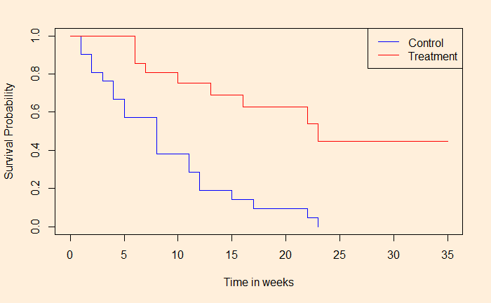
We continue from where we stopped last time and develop an R code for survival analysis.

We need to code 1 for people who experienced the event, and the censored ones (who haven’t experienced or left the group) get 0. Note that you can substitute indicator 2 for 1 and 1 for 0. The following are the first ten entries of the data frame.

groupweeksIllness
Treatment 61
Treatment 61
Treatment 61
Treatment 60
Treatment 71
Treatment 90
Treatment 101
Treatment 100
Treatment 110
Treatment 131

The survival package

The first thing we want is the ‘survival’ package. After installing the package, type the following commands.

ill_fit <- survfit(Surv(weeks, illness) ~ group, data = ill_data1, type = "kaplan-meier")
summary(ill_fit)

par(bg = "antiquewhite1")
plot(ill_fit, col = c("blue", "red"), xlim = c(0,35), xlab = "Time in weeks", ylab = "Survival Probability")
legend("topright", legend = c("Control", "Drug"), col = c("blue", "red"), lty = c(1,2))

And the output is:

Call: survfit(formula = Surv(weeks, illness) ~ group, data = ill_data1, 
    type = "kaplan-meier")

                group=Control 
 time n.risk n.event survival std.err lower 95% CI upper 95% CI
    1     21       2   0.9048  0.0641      0.78754        1.000
    2     19       2   0.8095  0.0857      0.65785        0.996
    3     17       1   0.7619  0.0929      0.59988        0.968
    4     16       2   0.6667  0.1029      0.49268        0.902
    5     14       2   0.5714  0.1080      0.39455        0.828
    8     12       4   0.3810  0.1060      0.22085        0.657
   11      8       2   0.2857  0.0986      0.14529        0.562
   12      6       2   0.1905  0.0857      0.07887        0.460
   15      4       1   0.1429  0.0764      0.05011        0.407
   17      3       1   0.0952  0.0641      0.02549        0.356
   22      2       1   0.0476  0.0465      0.00703        0.322
   23      1       1   0.0000     NaN           NA           NA

                group=Treatment 
 time n.risk n.event survival std.err lower 95% CI upper 95% CI
    6     21       3    0.857  0.0764        0.720        1.000
    7     17       1    0.807  0.0869        0.653        0.996
   10     15       1    0.753  0.0963        0.586        0.968
   13     12       1    0.690  0.1068        0.510        0.935
   16     11       1    0.627  0.1141        0.439        0.896
   22      7       1    0.538  0.1282        0.337        0.858
   23      6       1    0.448  0.1346        0.249        0.807

We can see the difference in survival chances for people who had undergone treatment vs those who had not. Is this significant, and if so, how much is the difference? We will see next.

Survival Plots – R Simulations Read More »