Science

What Asteroid Ryugu Tells Us

I’m sure you remember Miller–Urey experiments that, in the 1950s, generated molecules of life by passing electric discharge over a mixture of methane (CH3), ammonia (NH3), water (H2O) and hydrogen (H2). The molecules reported were amino acids such as aspartic acid, glycine, alanine and alpha-amino butyric acid.

Ferus et al. in 2017 went even further. They shone electric discharge (simulating lightning) and laser (simulating asteroid plasma) on a mixture of NH3, CO and H2O, producing RNA nucleobases – uracil, cytosine, adenine, and guanine.

Straight from space

While laboratory experiments such as these demonstrated the origin of fundamental molecules from simple gaseous species present in the universe, it can never replace evidence from space, the true cradle of these building blocks of life. And that’s what happened when scientists analysed samples from an asteroid.

The team led by Yasuhiro Oba analysed samples collected in 2018 from asteroid Ryugu and found uracil, one of the four bases of RNA.

Pristine sample

The beauty of this sample is that it was uncontaminated by anything from the earth as it was collected and sealed at the asteroid surface by the Hayabusa2 mission.

Studies like these suggest that foundations of life, such as the molecules of interest, might have been formed in carbonaceous asteroids and delivered to the early earth.

Reference

Yasuhiro Oba et al.; Nature Communications, 2023, 14:1292

Asteroid sample study: The conversation

Stanley L Miller, A production of Amino Acids Under Possible Primitive Earth Conditions, Science, 1953

Formation of nucleobases in a Miller–Urey reducing atmosphere, PNAS, 2017

What Asteroid Ryugu Tells Us Read More »
Road Safety in India – Comparison with the US

In the last three posts, we have been looking at the statistics of road accidents in India. It would be interesting at this stage to compare that with the US.

ParameterThe USIndia
Population
(mln)
3301321
Fatalities38,824131,714
Fatalities per
million population
117.65100
Injured
Persons
2,282,015348,729
Injured per
million population
6915263
Crashes/
Accidents
6,393,624366,138
Accidents per
million population
19374277
Survival probability
Injured /(Injured +fatality)
0.980.72

Road Safety in India – Comparison with the US Read More »

Road Safety in India – Survival rate

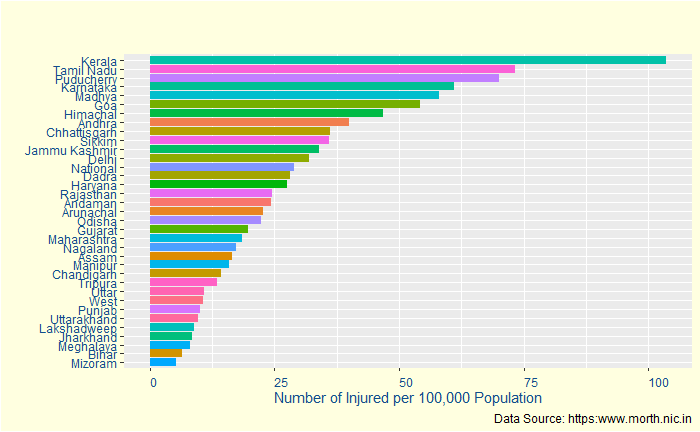
In the final episode of accident data analysis, we will go into the remaining key stats – injuries and fatalities – and postulate a potential problem with the interpretation, i.e. data registration. But first, a plot of the number of injuries per population.

Kerala is now 33% more than the nearest rival, almost suggesting it is the most dangerous state for a passenger. But is that entirely true? Let’s see the following statistic – the fatalities per 100,000 population.

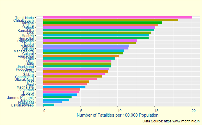
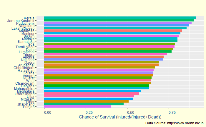
Strangely, it moves down to the 16th. Puducherry, which is third in injuries, also goes down. To understand this better, let’s define survival rate = the number of injured / (number of injured + number of dead).

Yes, Kerala has a > 90% survival chance after an accident. It may indicate a few things:
1) Kerala has better accident care for the injured (that prevents them from dying)
2) Kerala has more proportion of low-intensity accidents compared to other states
3) Kerala’s registration system is more thorough in recording incidents. And higher survival rate is an artefact of having a higher reporting rate of all incidents, however minor it could be.

Not so fast

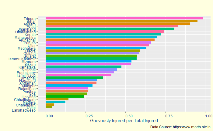
When you are about to conclude data collection, here is another one: the proportion of grievously injured people among the total Injured.

Almost 75% of the injured are seriously injured. So to conclude, Kerala remains one the most dangerous for road safety, but most of the injured are somehow saved, despite the severity.

Road Safety in India – Survival rate Read More »

Road Safety in India – Dangerous States

One of the rather unfortunate aspects of statistics is that it doesn’t say why something has happened. They also can’t reveal data quality, making it difficult to compare different entities. Therefore, it leaves the burden of interpretation in the hands of the (responsible) reporter. Not always a desirable combination! With this introduction, let’s continue with the road safety data. This time we go deeper into state-level statistics.

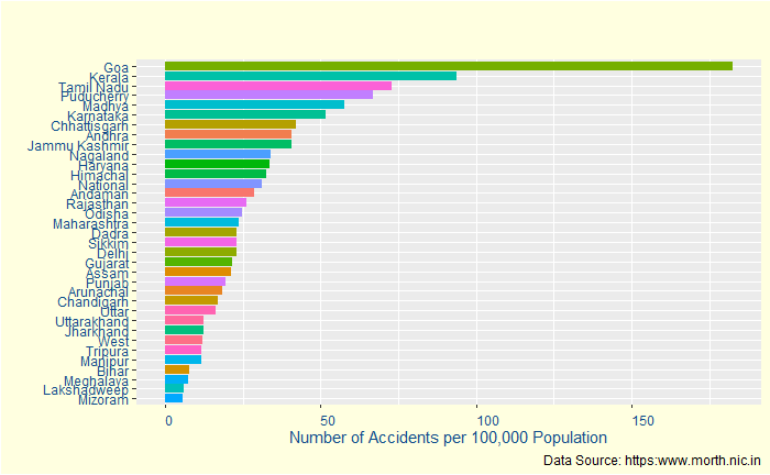
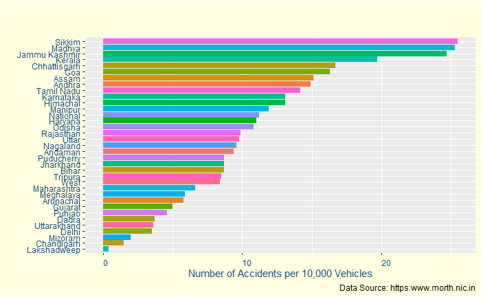
Number of Accidents

Does this make Goa the most accident-prone region? Not necessarily. It is one of the smaller states in India with about 1.4 mln population. The same goes for Puducherry, at number four, with a quarter of a million. If you want to know the difficulties of interpreting data from a smaller population, read this post. Another factor is the incident reporting system. It may not be a coincidence that the top four regions are also known for better data recording, with the three among the four (Kerala, Goa and Puducherry) at the top-5 of the human development index. We’ll come back to this a bit later.

The same statistics on a different basis – the number of accidents per 10,000 vehicles – are below:

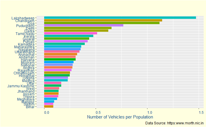
Before we move on: let’s try and understand if we can explain the top candidates based on their vehicle per population density. For that, we divide accidents per 100,000 population with accidents per 10,000 vehicles and divide by 10.

Yes, the top regions (Sikkim, Madhya Pradesh and Jammu & Kashmir) of the previous plot are way down in this plot. Again the statistics of smaller samples. That leaves one curious entity that we haven’t addressed so far – Kerala, which is among the top so far, not so small in population (33 million) or in vehicle density (~ 0.5). More about this coming up next.

The R code used for building the plots is below:

state_data %>% 
  ggplot(aes(x=reorder(State, Acci_per_Pop), y=Acci_per_Pop, fill = State)) + 
  geom_bar(stat = "identity") +
  geom_col() +
  coord_flip()

HDI of Indian States: Wiki

Road Safety in India – Dangerous States Read More »

Road Safety in India

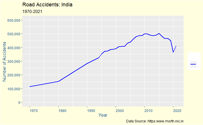
One of the reasons statistics have a poor reputation in society is the way commentators tell incomplete stories. Typically, data can hold multiple layers of truth; not all are evident from the descriptions. In the next few posts, we will try and understand how road safety has performed in India in the last 50 years.

Road Accidents

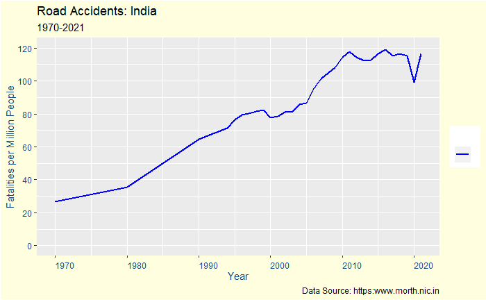
It’s been increasing but showing a little turnaround in the last decade.

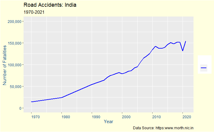
The Number of Fatalities

Surely, the numbers are stabilizing but not decreasing. We need to go deeper into any confounding effects, such as population change or any growth in the number of vehicles.

Risk to a person

So, the risk to an average person remains high though it has stabilized in recent times. The next question is if road travel has become more dangerous.

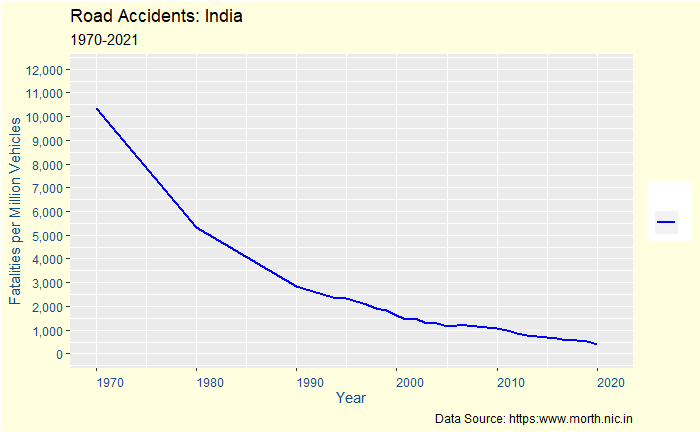
Risk to a passenger

In the basic sense, it is just a reflection of the exponential growth of vehicles – the base or denominator – in the last few years. In other words, the threat to life has not increased proportionally to the increase in the number of vehicles. One can also argue that automobiles are becoming better in safety performance.

Road Safety in India Read More »

The Arizona DNA Problem

If there is a 7.5% chance that two people share one spike (locus) of DNA, what is the chance two people share nine loci? Well, let it be (7.5/100)9 = 7.5 x 10¹¹ or 1 in 13 billion! So a decent case for DNA match as forensic evidence!

Now the twist, an Arizona laboratory reported about 100 matches with nine loci of DNAs in a database of just over 60,000 samples. How is that possible? The first (1 in 13 billion) was an estimate, and this is data. So the estimation must be wrong by a zillion miles, right?

If you recall the birthday problem, you may realise this can’t be dismissed without further enquiry. Let’s start

Suppose there are 60,000 samples. What is the number of distinct pairs that can form from 60000? It is 60000C2 = 60000 x 59999 / 2 = 1,799,970,000. For each pair, how many ways to match 9 out of 13 loci? It is 13C9 = 13!/(4! x 9!) = 715. So the total number of 9 loci match = 1,799,970,000 x 715 = 1.286979 x 10¹².

If the chance of 9 local matches of one pair is 1 in 13 billion, then the number of matches possible in 1.286979e+12 pairs is 1.286979 x 10¹²/13 x 109 = 99.

The Arizona DNA Problem Read More »

Natural Medicines and Fallacies

The terms nature and natural products invoke cult-like sentiments in society. They are usually used as opposites for synthetic products, chemicals, toxins, poisons, etc. Let’s look at some common irrationalities associated with ‘nature’.

Argumentum ad populum

Or appeal to the people. In simple language, it means since everybody thinks it’s true, it must be true! There are more reasons why something popular is likely wrong, especially in specialised fields of study, as the population of practitioners in topics such as medicine is negligible in society.

Post hoc ergo propter hoc

We have seen it before. It means Y happened after X; therefore, X caused Y. Almost all traditional medicines against what is now known as viral infections are examples of this fallacy. A famous example is Phyllanthus, as a cure for Hepatitis A, a water-borne viral infection (of the liver). The illness, if it’s caused by Hepatitis A or E, will go away in itself. But what happens if a person gets the same symptoms caused by Hepatitis B? Not something pleasant.

Argumentum ad antiquitatem

Appeal to tradition is often related to one’s cultural identity. It was written, so it must be true. A classical case is where people from the East think of modern medicines as Western medicines and take pride in ancient science that treated almost everything.

Absence of data as proof of absence

The presence of side effects is a common criticism directed against evidence-based, modern medicine. They consider the treatment of an ailment using a drug to be a trade-off between the risks and benefits. Naturally, this mandates the inventors to probe deep into the dangers and advantages of the given molecules used for treatment. Historically, similar scrutiny has never occurred in traditional medicines, thereby lacking data on their adverse effects.

Natural Medicines and Fallacies Read More »

The behavioural immune system

It is a term introduced by the psychological scientist Mark Schaller, describing mechanisms devised by animals, including humans, to counter microbes that cause infection. A simple example is the repulsion towards rotten food.

The behaviour immune system may be considered complementary to the body’s immunological defence. The latter consumes energy and is reactive; the pathogens first enter, and then the body produces compounds (e.g. antibodies) to counter. But a repulsive smell or taste prevents some from consuming it in the first place.

References

Mark Schaller, Phil. Trans. R. Soc. B (2011) 366, 3418–3426

Behavioural immune system: Wiki

The behavioural immune system Read More »

The Data that Speaks – Final Episode

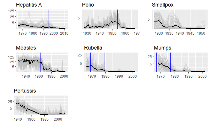
We will end this series on vaccine data with this final post. We will use the whole dataset and map how disease rates changed after introducing the corresponding vaccines. The function, ‘ggarrange’ from the library ‘ggpubr‘ helps to combine the individual plots into one.

library(dslabs)
library(tidyverse)
library(ggpubr)

We have used years corresponding to the introduction of vaccines or sometimes the year of licencing. In Rubella and Mumps, lines corresponding to two different years are provided to coincide with the starting point and the start of nationwide campaigns.

The Data that Speaks – Final Episode Read More »

The Data that Speaks – Continued

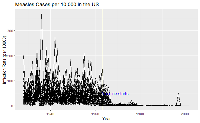
We have seen how good visualisation helps communicate the impact of vaccination in combating contagious diseases. We went for the ’tiles’ format with the intensity of colour showing the infection counts. This time we will use traditional line plots but with modifications to highlight the impact. But first, the data.

library(dslabs)
library(tidyverse)

vac_data <- us_contagious_diseases
as_tibble(vac_data)

‘count’ represents the weekly reported number of the disease, and ‘weeks_reporting’ indicates how many weeks of the year the data was reported.
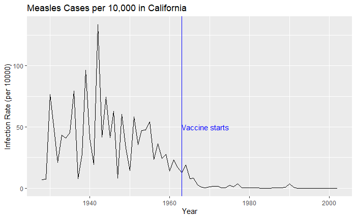
The total number of cases = count * 52 / weeks_reporting. After correcting for the state’s population, inf_rate = (total number of cases * 10000 / population) in the unit of infection rate per 10000. As an example, a plot of measles in California is,

vac_data %>% filter(disease == "Measles") %>% filter(state == "California") %>% 
  ggplot(aes(year, inf_rate)) +
  geom_line()

Extending to all states,


vac_data %>% filter(disease == "Measles") %>% ggplot() + 
  geom_line(aes(year, inf_rate, group = state)) 

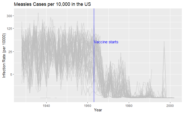
Nice, but messy, and therefore, we will work on the aesthetic a bit. First, let’s exaggerate the y-axis to give more prominence to the infection rate changes. So, transform the axis to “pseudo_log”. Then we reduce the intensity of the lines by making them grey and reducing alpha to make it semi-transparent.


vac_data %>% filter(disease == "Measles") %>% ggplot() + 
  geom_line(aes(year, inf_rate, group = state), color = "grey", alpha = 0.4, size = 1) +
  xlab("Year") + ylab("Infection Rate (per 10000)") + ggtitle("Measles Cases per 10,000 in the US") +
  geom_vline(xintercept = 1963, col ="blue") +
  geom_text(data = data.frame(x = 1969, y = 50), mapping = aes(x, y, label="Vaccine starts"), color="blue") + 
  scale_y_continuous(trans = "pseudo_log", breaks = c(5, 25, 125, 300)) 

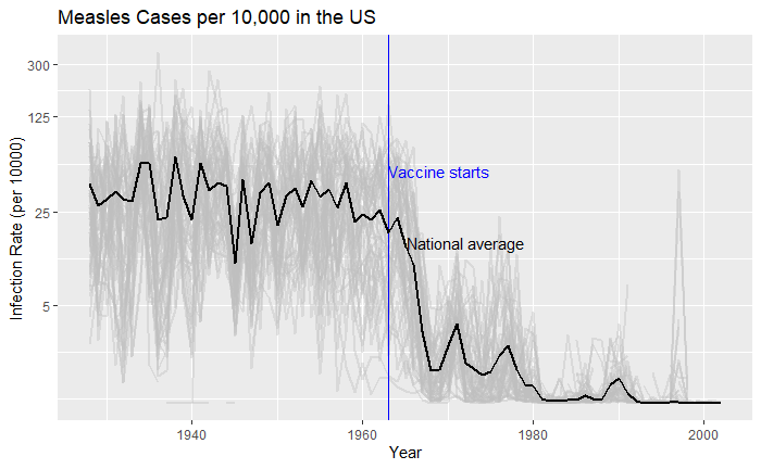
What about providing guidance with a line on the country average?

avg <- vac_data %>% filter(disease == "Measles") %>% group_by(year)  %>% summarize(us_rate = sum(count, na.rm = TRUE) / sum(population, na.rm = TRUE) * 10000)

geom_line(aes(year, us_rate),  data = avg, size = 1)

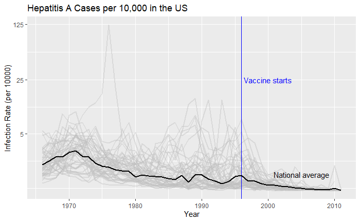
Doesn’t it look cool? The same thing for Hepatitis A is:

The Data that Speaks – Continued Read More »