Life

The Neandertal Affair

The contents of this post are based on Svante Pääbo’s 2010 paper titled “A Draft Sequence of the Neandertal Genome“, published in Science (Green et al., Science, 328, 710, 2010). The study reports genome sequencing of three samples collected from Neandertal bones from Vindija Cave in Croatia, and are carbon dated to be around 38,300 years old.

Based on the existing pieces of evidence, modern humans (Homo Sapiens) and Neandertals (Homo Neanderthalensis) diverged from the common ancestor (Homo Heidelbergensis) around 500,000 – 800,000 years ago. Here is a representation made by Dbachmann of the immediate ancestry of humans and taken from Wiki.

Reference: https://commons.wikimedia.org/w/index.php?curid=65505773#/media/File:Hominini_lineage.svg

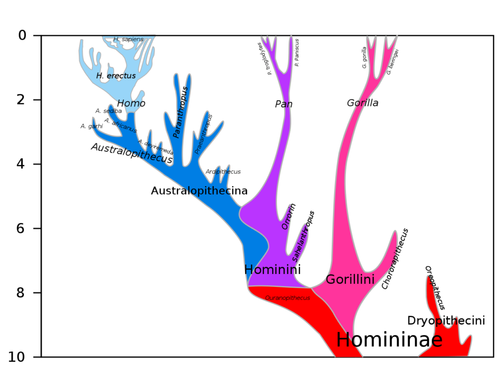
The numbers on the Y-axis represent the past years in millions (mya). If you are wondering who appears on the two sub-branches of the branch, Pan, they are Chimpanzee (P. troglodytes) and Bonobo (P. paniscus)!

The earlier analysis of the mitochondrial DNA of Neanderthal, which was the subject of a publication in 1997, showed a lack of relationship between modern humans and Neandertals. That was insufficient to prove that interbreeding never happened, as other parts of genomes also need to be studied. If you are confused about what these are all about – a typical genome of a multicellular animal has two distinct parts: the nuclear genome and the mitochondrial genome. Most genomes (e.g., humans and other cellular life forms) are made of DNA (deoxyribonucleic acid).

The biggest challenge to confirming the interbreeding was the reason for similarities is the fact that these two have a common ancestor within the last million years. So a similarity between the two groups can be within the variability margins of homo sapiens themselves. To reemphasise the point: even if no interbreeding ever happened, the Neanderthals and Sapiens can still have similarities (e.g. humans and chimps have more than 90% similarities in their genomes).

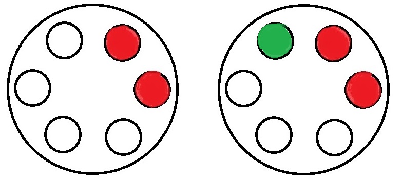
The study compared the Neandertal genomes to five present-day humans: one each from San (Southern) Africa, Yoruba (West Africa), Papua New Guinean, Han Chinese, and French (Western Europe). To cut the long story, they found that the Neandertals are more closely related (by about 3-5%) to present-day non-Africans than to Africans, suggesting some form of interbreeding. The following graphic represents the findings.

Reference: https://commons.wikimedia.org/w/index.php?curid=65505773

Tailpiece

Most of the similarities and differences are academic. And society should not start equating them with friendship, relationships and identities. They are far more complex and, many times, socially constructed.

The Neandertal Affair Read More »

Svante Pääbo

The man who sequenced the first Neanderthal genome, the person who discovered a new type of human, the Denisovans, Svante Pääbo, is the winner of the Nobel prize in Physiology this year.

Let’s start with perhaps the most important one – the 1997 publication on the sequencing of mitochondrial DNA (mDNA). It established the presence of an extinct human, who was unlike the modern human. But in 2010, he sprung another surprise through genome sequencing and showed that there was, indeed, a gene flow from Neanderthal to modern non-African humans.

He’s not done yet! In the same year (2010), he published the mitochondrial DNA genome of an unknown hominin from southern Siberia, the Denisovans.

References

Krings et al., Cell, 90, 19–30, 1997
Green et al., Science, 328, 710, 2010
Krause et al., Nature, 464, 894, 2010

Svante Pääbo Read More »

Life Expectancy in Covid Times

The story of Covid-19 is getting three years old, and we are still getting the magnitude of the calamity it caused. One way of studying the impact is by mapping the change in life expectancy during the pandemic. Nature human behaviour has just published a paper on this topic, summarising data collected from 29 countries.

Understanding life expectancy

The calculations, known as the period life expectancies, are not a prediction but an estimate of how long a newborn will live if today’s death rate persists for her entire life. So these numbers will vary between 2020, when it was severe cases of Covid-19 with no vaccinations available, to 2021, where there were some mitigations available, to 2022, where the deadliness was relatively lower.

LE deficit

The researchers covered the change in LE rates of countries, that included Europe, the USA and Chile, since 2019, using data on all-cause mortality. They also define a term, LE deficit, which is the difference between the observed LE, and expected LE based on pre-pandemic estimates. Consider this: a country estimates an LE of 80 years in the last quarter of 2021. Imagine it was 79 years in 2015 and was slowly progressing upward (based on the trends from the past few years), and the expectation by Q4 2021 was 82. Then the LE deficit is 80 – 80 = 2 years.

There are a bunch of findings worth mentioning here:
Of the countries under investigation, only Finland, Norway and Denmark did not see a decline in LE (in comparison with 2019) in 2020.
Many Western European countries bounced back in 2021, i.e. positive change LE from 2020 to 2021, whereas most of Eastern European, the USA and Chile continued the fall.

One impressive trend was the correlation between vaccination coverage and life expectancy deficit.

Life expectancy changes since COVID-19: Nature Human Behaviour

Life Expectancy in Covid Times Read More »

Energy Use and Human Development – The Threshold

We have seen the relationship between the human development index (HDI) and energy consumption.

There are two parts to the curve – a linear part until about 0.9 HDI and a plateauing part then onwards. Let’s focus on the linear. While attributing a causality, that energy consumption is the reason why some countries have high HDIs, may be a tricky conclusion to make, it nonetheless can be established without much trouble that countries that are behind the curve have the right to improve. It becomes a matter of distributive justice.

And that threshold energy consumption is around 25,000 kWh per person per year. The number of people that crossed this threshold is about 38%. Here is something already interesting. The percentage of people who crossed 0.9 HDI is only 13%. The difference between the two numbers is mainly due to China and Russia – large, reasonably energy-consuming countries that still need to climb the HDI ladder.

The amount of additional energy required for the below-threshold is about 80,000 TWh, which is about half of today’s global consumption of 160,000 TWh! If you are curious about the “excess” energy used by the top countries, it is 40,000 TWh. The shortfall and the excess don’t match because of the choice of 25,000 kWh, which is arbitrary and is not an average.

Alan D. Pasternak, Global Energy Futures and Human Development: A Framework for Analysis, 2000
Global energy consumption: Our World in Data
World Population Review: Energy Consumption

Energy Use and Human Development – The Threshold Read More »

Electricity Use and Human Development – Part 2

We have seen how electricity consumption and human development are related. This time, we go further to seek available data on the total energy consumption. That led to a dataset from “worldpopulationreview.com”. The question was how electricity consumption is related to overall energy consumption. Here is how they are related.

They are reasonably related, especially for the lower-consuming countries.

The next relationship is no more a surprise, i.e. between the total energy consumption and the human development index.

World Population Review: Energy Consumption

Electricity Use and Human Development – Part 2 Read More »

Electricity Use and Human Development

Today, let’s look at the relationship between the human development index and per capita electricity consumption.

The data was acquired from Wikipedia by web scraping using an R program. The codes used for the extraction, conditioning and plotting are provided below.

# Packages required 
library(xml2)
library(rvest)
library(tidyverse)
library(ggrepel)


#Web scraping of data
url <- "https://en.wikipedia.org/wiki/List_of_countries_by_electricity_consumption" 
page <- read_html(url) #Creates an html document from URL
table_energy <- html_table(page, fill = TRUE) #Parses tables into data frames

url <- "https://en.wikipedia.org/wiki/List_of_countries_by_Human_Development_Index" 
page <- read_html(url) #Creates an html document from URL
table_hdi <- html_table(page, fill = TRUE)

#clean-up 
hdi_countries <- as.data.frame(table_hdi[2])
ene_countries <- as.data.frame(table_energy[1])

hdi_countries <- hdi_countries %>% select(Nation, HDI)
ene_countries <- ene_countries %>% select(Country = Country.Region, Elec = `Total.electricityconsumption.GW.h.yr.`, Population, PCElec = `Average.electrical.power.per.capitaexpressed.in`)

hdi_countries <- hdi_countries[-1,]
ene_countries <- ene_countries[-2:-1,]

ene_hdi <- merge(hdi_countries, ene_countries, by.x="Nation", by.y="Country")
ene_hdi$HDI <- as.numeric((gsub(",", "", ene_hdi$HDI)))
ene_hdi$Elec <- as.numeric((gsub(",", "", ene_hdi$Elec)))
ene_hdi$Population <- as.numeric((gsub(",", "", ene_hdi$Population)))
ene_hdi$PCElec <- as.numeric((gsub(",", "", ene_hdi$PCElec)))

#plotting 
ggplot(ene_hdi, aes(x=PCElec, y=HDI)) +
  geom_point(aes(size = Population, colour = Nation)) + 
  geom_text_repel(aes(label = Nation), size = 3) + 
  scale_x_continuous(limits = c(0, 30000), breaks = seq(0, 30000, 5000)) +
  labs(title = "HDI vs Electricity Use", subtitle = "",  y = "Human Development Index", x = "Annual per capita Electricity Use, kWh") +
  theme(axis.text.x = element_text(angle=0, hjust = 0), plot.background=element_rect(fill="lightyellow")) +
  theme(axis.text.y=element_text(color= "dodgerblue4"), axis.title.y=element_text(color = "dodgerblue4")) + 
  theme(axis.text.x=element_text(color = "dodgerblue4", angle = 0, vjust = 0, hjust = 0), axis.title.x=element_text(color = "dodgerblue4")) + 
    theme(legend.position = "none")

Electricity Use and Human Development Read More »

The Tragedy of the Commons

The tragedy of the commons is a term that frequently enters climate change discussions. It symbolises what happens to a common resource when used across multiple users. Because it is shared among many, consumers stop acknowledging the other users, and if you leave the market free for all, the resource vanishes in no time.

Does that mean a solution is not possible? The answer is yes. In the original format, the game is played only once, whereas, in real life, the consumers get several chances course-correct their actions. In the case of climate change, there was a phase that was dominated by the exploitation of resources with no thinking about the consequences (global warming). But once the understanding came, there were plenty of opportunities created by the likes of UNFCC that resulted in a Kyoto protocol or a Paris agreement. In other words, cooperation is possible and can alter some of the eventualities of the tragedy of the commons.

The Tragedy of the Commons Read More »

Who Emits the Most?

We have seen that the global CO2 emissions in 2021 were about 39.4 gigatonnes. But how do different countries contribute to this? Hsiang and Hsiang report contributions from the top 15 countries in 2014. Here are the top 10 that I picked up.

CountryEmissions
(2014)
G tonne CO2
Cumulative
Emissions
(1751–2014)
G tonne CO2
Emission
per capita
(2014)

tonnes CO2
China10.3174.77.5
United States5.3375.916.2
India2.241.71.7
Russia1.7151.311.9
Japan1.253.59.6
Germany0.786.58.9
Iran0.614.88.3
Saudi Arabia0.612.019.5
South Korea0.614.011.7
Canada0.529.515.1

Notice that these ten already account for 75% of the total 34.1 Gt in 2014! Also to check is the disparity in the per capita contribution and the cumulative contribution that created this monster of climate change in the first place.

Hsiang and Hsiang, Journal of Economic Perspectives, 2018, 32(4), 3–32

Who Emits the Most? Read More »

The Nature in Natural Selection

We have seen before misconceptions about the theory of evolution still prevail due to generations of improper education. As a consequence, together with the existing cultural doctrines, the word nature got a superior stature as the ever-benevolent parent who can do nothing by love and care. So nature selects living organisms to something (perfection to some, purpose to another).

Let’s spend time and understand what is ‘nature’ in natural selection against the backdrop of evolution. What causes new species or the entities that survived?

Yes, nature is a killing machine. The species who endured it had differentiating features to accomplish the incredible. The species who prevailed can’t see the horror, but a hypothetical alien sitting outside the earth can vividly see the extinction of millions in favour of the hundreds.

The Nature in Natural Selection Read More »

Back to Roulette

We are back in the game of chances, the roulette – not the Vegas one, but the Russian. Imagine two rounds are put in a revolver that has six cartridges. You don’t know the order in which they are kept, i.e. next to each other, or there are gaps between them. What is the probability you get hit by the bullet?

It is pretty straightforward: there are two in six chances to get hit (2/6 = 33.3%), and four in six you survive (4/6 = 66.7%). OK, you survive the first round. If there is a second round and you have two choices. Pull the trigger straight away, or spin it again before pulling. Which one do you choose?

3 types of arrangements

The number of arrangements possible for two bullets to be placed inside six possible cartridges is 6C2 = 6!/(4!2!) = 6 x 5 / 1 x 2 = 15. Those 15 fall into three categories as below:

Next to each other

There are six such arrangements that are possible ({1,2}, {{2,3}, {3,4}, {4,5}, {5,6}, {6,1}). In the above figure, the left one with two reds represents one such. In such an arrangement, the number of empty spots that follows a bullet is just one (marked as green on the above right). Since there are four empty cartridges, the probability of the second one hitting is (1/4).

With one gap

Six arrangements are possible with one gap between them ({1,3}, {{2,4}, {3,5}, {4,6}, {5,1}, {6,2}). The chance of the second one hitting, in this case, is (2/4).

With two gaps

Three are are possible with two gaps between them ({1,4}, {{2,5}, {3,6}). The chance of hitting is again (2/4).

To spin or not to spin?

So what is the probability of surviving if you prefer to spin again? That will be the same as the first time = 66.7%. If not, you calculate the chances in the following manner.

6/15 (probability to get arrangements of type 1) x 3/4 (chance of survival) + 6/15 (probability to get arrangements of type 2) x 2/4 (chance of survival) + 3/15 (probability to get arrangements of type 3) x 2/4 (chance of survival) = 6/15 x 3/4 + 6/15 x 2/4 + 3/15 x 2/4 = (9/2 + 6/2 + 3/2)/15 = 9/15 = 0.6 = 60%.

The bottom line is: you better ask to spin again and increase the probability of survival by 6.7%!

Back to Roulette Read More »