Bias in a Coin – Impact of Prior
We have seen in an earlier post how the Bayes equation is applied to parameter values and data, using the example of coin tosses. The whole process is known as the Bayesian inference. There are three steps in the process – choose a prior probability distribution of the parameter, build the likelihood model based on the collected data, multiply the two and divide by the probability of obtaining the data. We have seen several examples where the application of the equation to discrete numbers, but in most real-life inference problems, it’s applied to continuous mathematical functions.
The objective
The objective of the investigation is to find out the bias of a coin after discovering that ten tosses have resulted in eight tails and two heads. The bias of a coin is the chance of getting the observed outcome; in our case, it’s the head. Therefore, for a fair coin, the bias = 0.5.
The likelihood model
It is the mathematical expression for the likelihood function for every possible parameter. For processes such as coin flipping, Bernoulli distribution perfectly describes the likelihood function.

Gamma in the equation represents an outcome (head or tail). If the coin is tossed ‘i’ times and obtains several heads and tails, the function becomes,

The calculations
1. Uniform prior: The prior probability of the Bayes equation is also known as belief. In the first case, we do not have any certainty regarding the bias. Therefore, we assume all values for theta (the parameter) are possible as the prior belief.
theta <- seq(0,1,length = 1001)
ptheta <- c(0,rep(1,999),0)
ptheta <- ptheta / sum(ptheta)

D_data <- c(rep(0,8), rep(1,2))
zz <- sum(D_data)
nn <- length(D_data)

pData_theta <- theta^zz *(1-theta)^(nn-zz)

pData <- sum(pData_theta*ptheta)

ptheta_Data <- pData_theta*ptheta/pData
2. Narrow prior: Suppose we have high certainty about the bias. We think that is between 0.4 to 0.6. And we repeat the process,
theta <- seq(0,1,length = 1001)
ptheta <- dnorm(theta, 0.5, 0.1)

D_data <- c(rep(0,8), rep(1,2))
zz <- sum(D_data)
nn <- length(D_data)

pData_theta <- theta^zz *(1-theta)^(nn-zz)

pData <- sum(pData_theta*ptheta)

ptheta_Data <- pData_theta*ptheta/pData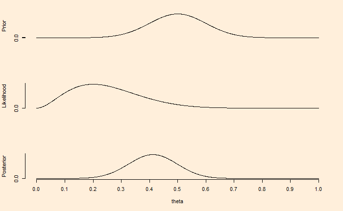
In summary
The first figure demonstrates that if we have a weak knowledge of the prior, reflected in the broader spread of credibility or the parameter values, the posterior or the updated belief moves towards the gathered evidence (eight tails and two heads) within a few experiments (10 flips).
On the other hand, the prior in the second figure reflects certainty, which may have been due to previous knowledge. In such cases, contradictory data from a few flips is not adequate to move the posterior towards it.
But what happens if we collect a lot of data? We’ll see next.
Bias in a Coin – Impact of Prior Read More »