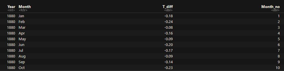
Bayes’ Theorem – Graphical Representation
Here is a graphical illustration of Bayes’ theory. We use the old example of Steve, “the shy and withdrawn”.
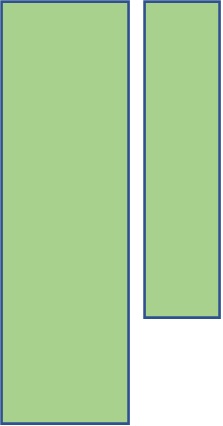
The colour orange represents the number of librarians, and the light blue the farmers.

From the relative sizes of the rectangles, you make out that the number of farmers is more than the number of librarians. This, we call, the prior information.
Let’s assume that 80% of the librarians are shy and withdrawn, and only 25% of the farmers possess those characteristics. The following picture, green representing shyness, is more or less that.
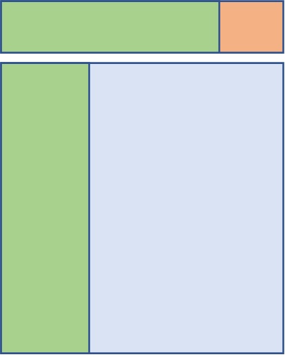
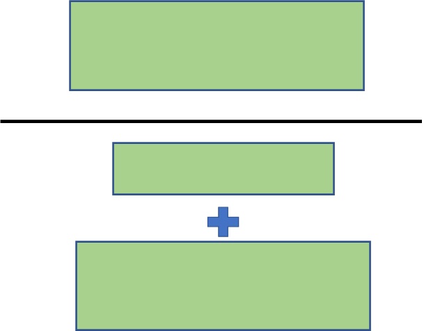
Now, here is the question: when you see a random shy and withdrawn person, where do you likely to classify him, given you have two choices – librarian or farmer?
Well, likely in the rectangle on the left, which comes from the farmer group! And if you want a precise probability, here is the math below:
Bayes’ Theorem – Graphical Representation Read More »