Life

Cooling Tower Fallacy

Can displaying wrong images justify a right cause? Today, we discuss pollution.

It is no longer a matter of debate that pollutants cause massive health hazards. As per the World Health Organisation (WHO), air pollution caused 4.2 million premature deaths worldwide in 2019. Most of it is manifested via cardiovascular and respiratory diseases and cancer.

The following are the five main entities that cause air pollution. Those are
Particulate matter (PM)
Carbon monoxide (CO)
Ozone (O3)
Nitrogen dioxide (NO2)
Sulfur dioxide (SO2)

You may have noticed the conspicuous absence of carbon dioxide in this list. This is because CO2 is not a pollutant but a greenhouse gas that causes global warming. So, it is a bad actor, though not exactly the way one would imagine.

Now, the fallacy: below is a photo I got when I typed ‘pollution’ in the image search column, followed by another picture that came up for ‘carbon dioxide’.

power plant, cooling tower, coal-fired power station-4349830.jpg
power plant, air pollution, coal-fired power station-6698838.jpg

The sorry thing is that neither of these shows pollutants nor CO2. These are images of cooling towers emitting water vapour; journalists have been using such images from power plants and other industries for ages to represent pollution and global warming. The reason? They make excellent visuals of dense plumes, captivating the readers. According to a 2007 Royal Society of Chemistry survey report, more than two-thirds of people in the UK believe these images are of carbon dioxide emissions and accelerating climate change.

Myth of cooling towers is ..: RSC

Ambient (outdoor) air pollution: WHO

Cooling Tower Fallacy Read More »

Turn of the knob

Came across one of the finest videos on YouTube about our past, present and future life, Yuval Noah Harari’s talk to youngsters and teachers, which triggered the idea of this post.

Turning the knob

Knowledge is like turning the knob. When it turns, you see things in a new light; until then, no matter how hard you try, you don’t get it out of ‘common knowledge’. Unfortunately, the common knowledge is almost always wrong!

The hyperpigmented on the equator

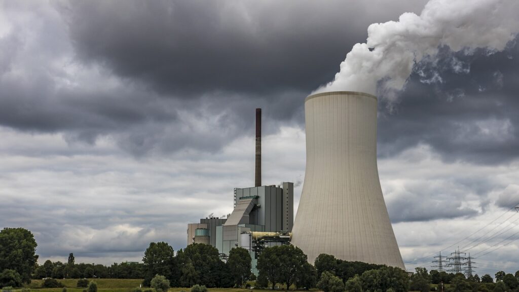
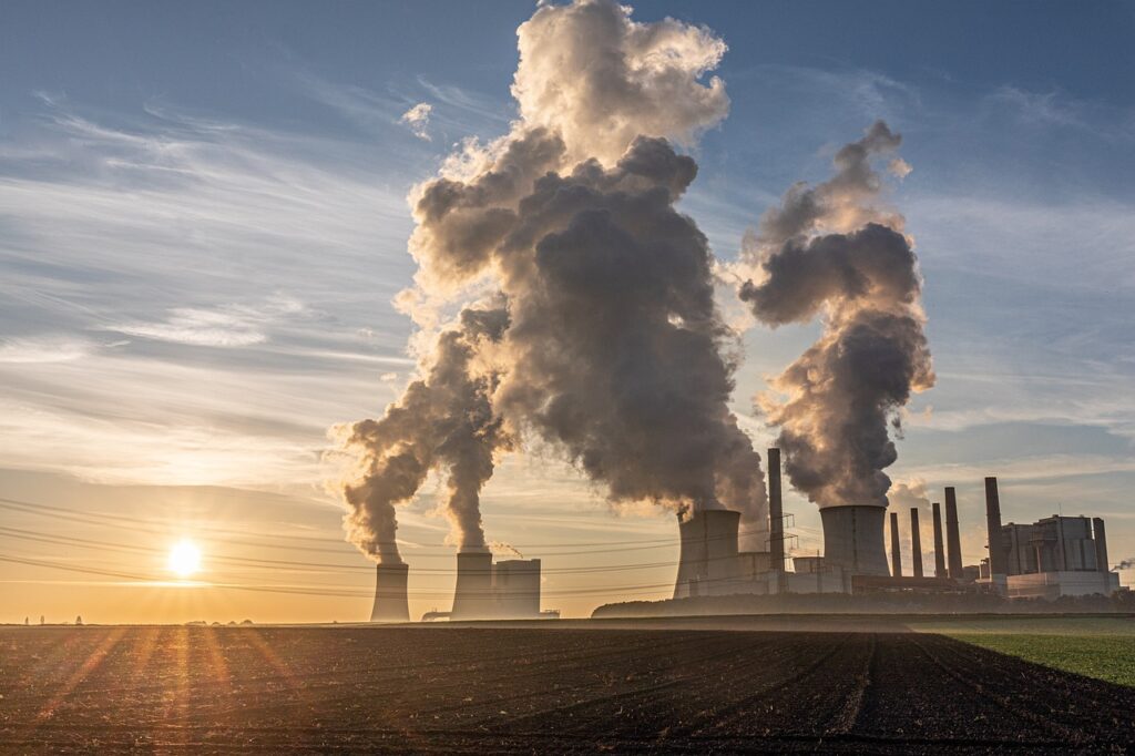
Take the favourite example of pigmentation of humans living in the equatorial region. For a moment, let’s ignore the people who believe that people of colour are of a separate species. We are dealing with more reasonable people here. If the narrative is that people in sunny regions have become dark-skinned because of heat and light, it’s an easier narrative to sell. It fits with the common knowledge – we all know what happens when we fry things; a little too much and it turns black.

Unfortunately, that’s not how things evolve. The theory of evolution switch needs to turn on. What about this: a group of people (perhaps dominated by the light-skinned) reach a sunny region. A few of them got skin cancer due to their lack of protective pigmentation and died maybe a few years earlier than their accidentally darker companions. That raised (by a small margin) the probability of darker parents, their children and their children having the advantage, and wow, after 10,000 years, there was a complete dominance of the dark. So, will that happen in Australia after 10,000 years? We’ll answer that in the end.

Humans of Flores

There used to be a pack of humans living in Flores, an island in Indonesia (until they were extinct about 50,000 years ago). They were humans as they shared the homo family. They were different humans because we are homo sapiens, and they were not. They were pretty short – about 1 m. tall – people. Not just them but the animals of that island as well. A simple convincing argument is that the animals got trapped on the island, became resource-constrained, and to survive, they had to consume less food. And they became smaller. It’s convincing because 1) it gives a feeling that one bunch of people after starvation has shrunk, or 2) they passed a genetic code to the children and made them shrink.

Turn the switch, and you get it: big humans reached the island. Once they got disconnected from the mainland due to sea level rise, the larger ones faced a more significant disadvantage due to food shortage, and the smaller ones survived better. In the next generation, there were disproportionally smaller kids from the surviving parents (the new group has larger ones too). Turn a few pages, centuries and generations: the island is full of smaller humans. This narrative is difficult to fathom without the switch as it is against the common knowledge. First, how can more miniature humans be fitter? That doesn’t conform very well with the stereotypes! Second, something forcing people (in one lifetime) to become smaller is easier to imagine than this chance game of smaller ones surviving (in a hundred lifetimes).

The future evolutions

That naturally begs the question. Will the Australians (the white Australians) turn back after 10,000 years? Even the broader question: What will be the next evolution of humans? The answer to the first question is a no, and the answer to the second question is impossible to predict.

The code lies in the knowledge paradox we are in. Australian whites won’t turn black because they know why it happens and what to do against death from skin cancer. It could be as simple as using sunscreen (or deciding not to venture out in the UV-intense part of the day). And this will translate to other things as well. If we know something gives us a disadvantage, we will engineer means to counter it. It has to be a disadvantage that gave the survivors the chance to survive, and we are closing those weaknesses!

Must watch video

Yuval Noah Harari Speaks to Young Readers & Teachers: Yuval Noah Harari

Turn of the knob Read More »

Shortcuts to Accidents

We saw cognitive reflection problems, where our mind (brain) wants us to lock in – what it believes to be – a ‘timely’ answer which it gets via mental shortcuts. Here is one such question

RoadMajor
Accidents
Minor
Accidents
Road 1200016
Road 21000?

Fill the box with the question mark to make the accidents in two roads equivalent.

Studies have shown a high proportion of people answered 8. Their attempt was perhaps to maintain the same ratio (2000:16 == 1000:8). But the question was to estimate the number of minor incidents required for a road with fewer major accidents to make it equivalent to the one with more major accidents. Naturally, it should be much more than 1000 (the shortfall of major accidents on Road 2 vs Road 1).

Cars and workers

Another famous trick puzzle has the following form:

It takes 7 workers to make 7 cars in 7 days. How many days would it take 5 workers to make 5 cars?

Park your instincts to answer 5 (so that 5-5-5 matches with 7-7-7!) for a while. Try this first,
If 7 workers can build 4 cars in 3 days, how many days would it take 8 workers to build 6 cars??
I assume more people answer the second one correctly because it shows fewer visible patterns and may slow you down.

Answer: car per worker per day = (4/7)/3 = 4/21. So, 8 workers can make 32/21 cars in a day. But we want 6 cars => (32/21) x X (days) = 6. X = (21 x 6)/32 = 3.9 days.

In the same way, the first question is answered as follows:
(7/7)/7 = 1/7 car per worker per day. 5 workers can make 5/7 cars in a day. For making 5 cars, one needs (5/7) x X (days) = 5 or X = 35/5 = 7 days.

Shortcuts to Accidents Read More »

The Science We Trust

People lament about the dominance of beliefs and the reduction of scientific temperament in society. Unfortunately, it is a fact and can only be worse in future. And I want to argue that it can only be like that. Let’s look at a few reasons why achieving scientific character is a mission impossible.

It’s another religion

Unfortunately, it has to be.

Take the example of the discovery of gravitational waves in 2015. The number of people involved in the observation, which includes the setting hypothesis, the detection, and the mathematical modelling, could be about 1000. The rest of the world (1000 short of 7 billion) only gets the publication, which is already a heavily cut-down, readable version of the actual data.

Imagine a million people downloaded the paper.

As per an old report in physics today, the percentage of physics graduates (minimum decent training level in this field) was about 0.01. It suggests the inconvenient truth that 99.99% of people are already at a considerable disadvantage.

I.e., half all physics graduates and the rest others!

The people who understand the model (the specific mathematics behind the event) are even fewer and could be in the hundreds at best.

All the others – 6999 million out of 7000 – get the news from the media. And they must trust the report. A belief system is created but is not going to last like a religion, as we shall see soon.

What is Science

Most people know science through technology, the application of the former into products. To define it in one word: science is hypothesis testing. And most people are alien to it. It is probabilistic, conditional, and will/must update with time. Each of these contradicts the doctrines of religion.

Probabilistic thinkers meet the real people

Back to the gravitational waves: Movements on the ground, temperature changes in the instruments or numerous other known or unknown errors can all lead to artificial signals or noises. The importance of the results led to keeping a significance level for the rejection of the null hypothesis (that the observed signal is a noise) to be extremely low – one in a billion. If you recall, most of our ordinary life experiments that is one in 20!

The team investigating the gravitational waves published the findings (as real) only when they found the probability that it could happen by chance is one in a billion. Yet, they would only use the words such as ‘likely’, ‘probably’ or ‘mostly’, to respond to the public, who want ‘yes’ or ‘no’ as answers.

And they change with time

Science updates with new information. Remember the chaos during covid time? The understanding of the illness changed daily during the pandemic. The use of masks (to use or not to use) and modes of contagion (airborne vs liquid-borne), to name a few. While the changes of advice were perfectly understandable and acceptable for those scientists, it was causing confusion and anger to the 99.99%.

The Science We Trust Read More »

The Big “But” Fallacy

The big but fallacy involves starting with a generally accepted statement only to negate it at the end with a but. An example is: “Yes, it is wrong to hurt animals, but this time it was different (as I was hungry!)”.

The fallacy is closely related to what is known as the “special pleading”. Here, the ‘but’ gives the ‘special’ exception from the generally accepted rules or ethics.

The Big “But” Fallacy Read More »

Asymmetry of Information – Market for Lemon

We have seen information asymmetry. And it is a market failure. Why? Because it’s a feature that violates a fundamental theorem of welfare economics, i.e., “the competitive market will maximise the total social welfare”. In the event of a market failure, the overall group is worse off; we have seen one example in the past, i.e., externality.

Insurance is a good example of market failure due to information asymmetry. Another one is “the market for lemons,” which we’ll see in the end.

We saw the owner-mechanic case where the seller holds superior information. Insurance is a transaction where the opposite happens; the seller suffers from a lack of information about the (health condition) of the buyer. Suppose a target group of customers with 90% healthy and 10% sick. For the healthy, there is a 10% chance of incurring a $10,000 charge next year and the rest, none. For the unhealthy, there is a 50% chance of incurring $10,000 and 50% none. So, the expected values (of cost) are:

Healthy: 0.9 x 0 + 0.1 x 10,000 = 1000
Unhealthy: 0.5 x 0 + 0.5 x 10,000 = 5000

If everyone buys health insurance, the expected cost to the insurance company is:

0.9 x 1000 + 0.1 x 5000 = 1400.

Taking a profit of 100 per person, it sets a premium of $1500 for health insurance. Now, what happens in reality?

All the sick will buy the insurance, and only the risk-averse will buy from the healthy. Because the healthy will look at the expected cost (1000) and feel discouraged by the premium that costs 500 more. If there are a total of 1000 people, and 50% of the healthy are risk-averse (buyers of the insurance). Then, the revenue of the insurance company is

0.9 (proportion of healthy) x 0.5 (proportion of risk-averse) x 1000 (total people) x 1500 (premium) + 0.1 (proportion of unhealthy) x 1000 (total people) x 1500 (premium) = 0.9 x 0.5 x 1000 x 1500 + 0.1 x 1000 x 1500

825,000.

And the cost,

0.9 (proportion of healthy) x 0.5 (proportion of risk-averse) x 1000 (total people) x 1000 (expected cost on healthy) + 0.1 (proportion of unhealthy) x 1000 (total people) x 5000 (expected cost on unhealthy) = 0.9 x 0.5 x 1000 x 1000 + 0.1 x 1000 x 5000

950,000

The company loses money due to what is known as adverse selection. What happens if the company raises the premium? Well, it will discourage more healthy companies from entering the market, and the company will lose more money.

Market for Lemons

The problem of lemons is an example in the used-car market. Lemon is a poorly performing product. Since the buyer can’t tell the difference between a lemon and a good car (the plum), they are willing to pay some price corresponding to an average-performing car. Seeing what is happening, the top plum cars will exit the market, further compounding the miseries of the buyer (and the seller alike).

Asymmetry of Information – Market for Lemon Read More »

Asymmetry of Information – Signaling

Here is another manifestation of information asymmetry. How does a new car that entered the market convince customers about its quality? Here, the car manufacturer knows much more about the product than the customer.

This is what Hyundai did in the US, recovering from a phase of making average-quality cars into better ones. It offered its customers a 10-year / 100,000-mile warranty. This is called a signal, which is an expensive action that reveals information.

A certificate of higher education—even better, from a top university—is a powerful signal to the hiring manager. Whether the degree subject is directly applicable to the job or not, the hiring company sees the certificate as evidence of the candidate’s quality, a signal offered by the employee to the employer.

Asymmetry of Information – Signaling Read More »

Asymmetry of Information – Moral Hazard

We have seen it before; information asymmetry leads to what is known as a principal-agent problem.

Take the popular example of the conflict between the car owner and the mechanic. You, a car owner, want to check the vehicle for annual maintenance. Under normal circumstances, unless the owner knows all about the car mechanics, a mechanic knows more about the car repair.

While the whole point of going to the workshop and what is expected from a mechanic both emanate from this (asymmetric) information, it can potentially develop a principal (car owner) agent (mechanic) problem.

You assume that the mechanic will use the information to exploit you by selling unnecessary parts and services. It happens because the incentives of the two parties (the principal and agent) are not the same and possibly conflicting. The owner wants to repair the car at a minimum cost, and the agent wants to maximise his return. In the end, a Moral Hazard is created. A moral hazard is an adverse behaviour that is encouraged by the situation.

Solutions to Moral Hazard

The easiest way is for the owner to gain more information. It may come from taking a ‘second opinion’ from another mechanic (who may have a different incentive) or an auto consultant (who may not even have an incentive).

The second is to reduce the incentive that the agent has. An example is the rating system, preferably at a neutral site, that can deter the agent from ripping the customer off.

Asymmetry of Information – Moral Hazard Read More »

Portfolio Theory – Normal DIstribution

With all its simplicity, portfolio theory still describes the value in grouping securities, preferably ones uncorrelated with each other, for more predictable returns. The statistical parameters, mean and standard deviation, representing the expected return and risk, respectively, also suggest an underlying probability distribution. Despite all criticism around the usage or normal distribution (symmetric bell curve), we still utilise it to explain the portfolio concept.

In the previous post, we saw two stocks, 1 and 2, with two different expected returns (12 and 6) and risks (6 and 3). If the overall returns followed a normal distribution, they would have appeared like in the following plot.

Here, the blue curve represents the one with a higher expected return and higher volatility. The red one is more conservative. The combined set (1:1) for a correlation coefficient of 0 (uncorrelated) behaves in the following way.

The advantage of using a standard distribution (normal, in this case) is that it enables us to estimate various probabilities. E.g., the chance of ending up with a zero return and below for the blue curve (aggressive one) is 2.3%, which is similar to what the conservative (red) can give. On the other hand, for the joint distribution (green curve), it is just 0.4%.

Portfolio Theory – Normal DIstribution Read More »

Portfolio Theory

Portfolio theory is a simple theoretical framework for building investment mixes to achieve returns while managing risks. It used the concepts of expected values and standard deviations to communicate the philosophy.

Take two funds, 1 and 2. 1 has an expected rate of return of 12%, and 2 has 6%. On the other hand, 1 is more volatile (standard deviation = 6), whereas 2 is less risky (standard deviation = 3), based on historical performances. In one scenario, you invest 50:50 in each.

The expected value is 0.5 x 12 + 0.5 x 6 = 9%

To estimate the risk of the portfolio, construct the following matrix.

Omega values (1 and 2) are the proportions, sigmas are the standard deviations, and sigma12 is the covariance between 1 and 2. Substituting 0.5 for each omega (50:50) and noting that covariance is the product of the standard deviations x correlation coefficient, we get the following table for the two securities that are weakly correlated (correlation coefficient = 0.5),

Add the entries in these boxes to get the portfolio variance. Take the square root for the standard deviation = 3.97.

The expected rate of return of the portfolio is 9%, and the risk (volatility) is 3.97%. Continue this for all the proportions (omega1 = 1 to 0) and then plot the returns vs volatility; you get the following plot for a correlation coefficient of 0.5.

Imagine the securities do not correlate (coefficient = 0). The relationship changes to the following.

The risk is lower than the lowest (3%) for proportions of security1 less than 0.4. Even better, if the two securities are negatively correlated (correlation coefficient = -0.5),

If there are n securities in the portfolio, you must create an n x n matrix to determine the variance.

Portfolio Theory Read More »