Decision Making

The Central Limit and Hypothesis Testing

The validity of newly explored data from the perspective of the existing population is the foundation of the hypothesis test. The most prominent hypothesis test methods—the Z-test and t-test—use the central limit theorem. The theorem prescribes a normal distribution for key sample statistics, e.g., average, with a spread defined by its standard error. In other words, knowing the population’s mean, standard deviation and the number of observations, one first builds the normal distribution. Here is one example.

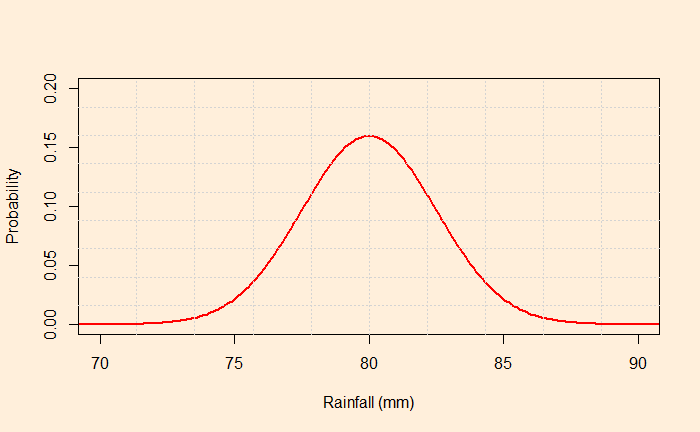
The average rainfall in August for a region is 80 mm, with a standard deviation of 25 mm. What is the probability of observing rainfall in excess of 84 mm this August as an average of 100 samples from the region?

The central limit theorem dictates the distribution to be a normal distribution with mean = 80 and standard deviation = 25/sqrt(100) = 2.5.

Mark the point corresponds to 84; the required probability is the area under the curve above X = 84 (the shaded region below).

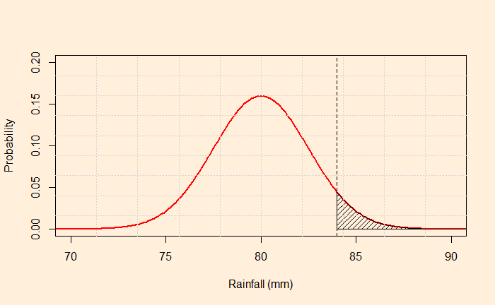
The function, ‘pnormGC’, from the package ‘tigerstats’ can do the job for you in R.

library(tigerstats)
pnormGC(84, region="above", mean=80, sd=2.5,graph=TRUE)

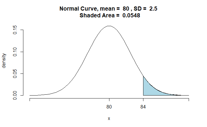
The traditional way is to calculate the Z statistics and determine the probability from the lookup table.

P(Z > [84-80]/2.5) = P(Z > 1.6) 
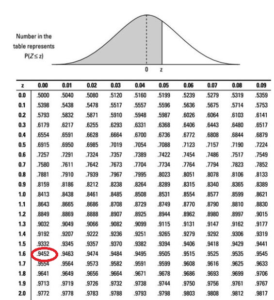
1 - 0.9452 = 0.0548

Well, you can also use the R command instead of searching in the lookup table.

1 - pnorm(1.6)

The Central Limit and Hypothesis Testing Read More »

Pascal’s Mugging

Remember Pascal’s Wager? It was an argument for the existence of God based on the idea of a payoff matrix, which is heavily dominated by the case in which God exists. So, the conclusion was to believe in God without seeking evidence. Something similar to Pascal’s wager but doesn’t require infinite rewards is Pascal’s mugging, a concept made by Eliezer Yudkowsky and later elaborated by Nick Bostrom.

Pascal was walking down the street. He was stopped by a shady-looking man asking for his wallet. It was an attempt to mug but without having any arms to threaten the victim. Knowing he has no gun to threaten Pascal, the mugger offers a deal. “Give me your wallet and I will give back double the money tomorrow.”

A utilitarian who trusts the expected value theory can make the following calculations and make a decision:
Imagine I have $10 in my wallet, and the minimum probability expected from the mugger keeping his promise is 50% for a break-even value.
This is because the expected value = – 10 + 0.5 x 20 = 0. Since the shady-looking man is not convincing enough to have such a high chance of repaying, I decide not to hand over my wallet.

Hearing the answer, the mugger increases the deal to 10x. That means if Pascal thinks the mugger has a 1/10 chance of paying 10x, he can hand over the wallet. The answer again was negative. The mugger increases the payment to 1000, 10000, and a million. What would Pascal do?

Now, Pascal is in a dilemma. On the one hand, he knows that the probability that the mugger will pay a million dollars is close to zero, and therefore, he must not hand over the wallet. However, as a rational utilitarian, he can’t ignore the fact that the calculations give a profit if the payback is 1 million dollars.

Pascal’s Mugging Read More »

People v. Collins v. Statistics

People v. Collins was a 1968 trial in the Supreme Court of California that reversed the convictions of Janet and Malcolm Collins by a jury in Los Angeles of second-degree robbery. The events that led to the original conviction were as follows:

On June 18, 1964, Mrs. Juanita Brooks was walking home along an alley in San Pedro, City of Los Angeles. She was suddenly pushed to the ground, and she saw a young woman running, wearing “something dark.” She had hair “between a dark blond and a light blond,”. After the incident, Mrs Brooks discovered that her purse, containing between $35 and $40, was missing.

At about the same time, John Bass, who lived on the street at the end of the alley, saw a woman run out of the alley and enter a yellow automobile driven by a black male wearing a moustache and beard.

The prosecutor (of the jury trial) brought a statistician to prove the crime using the laws of probability. The expert hypothesised the following chances and made his calculations.

Characteristic Probability
1Yellow automobile1/10
2Man with moustache 1/4
3Girl with poleytail 1/10
4Girl with blondehair Girl with blonde hair
5Interracial couple in a car1/10
6Interracial couple in car1/1000

The profession used the product rule (the AND rule) of probability to prove the case. Multiplying all the probabilities, he concluded that the chance for any couple to possess the characteristics of the defendants is 1/12,000,000! Note that such multiplication is only possible if the individual probabilities are independent.

But the statistician (and the jury) convenient ignored a few things:
1) The validity of the probabilities. Those were his ‘inventions’ without any support from data.
2) The events (characteristics) were not independent from each other. More likely than not, the person with a beard has a moustache.
3) Once, a blond girl and a black man with a beard were counted, talking about the low probability of an interracial couple in a car is wrong. Think about it—the probability of an interracial couple, given one is a blond girl and another is a bearded black man, must be close to 1.

References

People v. Collins: Justia US Law
The Worst Math Ever Used In Court: Vsauce2
A Conversation About Collins: William B. Fairley; Frederick Mosteller

People v. Collins v. Statistics Read More »

Durbin-Watson Test

We have seen examples of regression where the basic assumption of uncorrelated residuals is compromised. Finding the autocorrelation of the residuals using Durbin–Watson is one way to diagnose the correlation. Here, we perform a step-by-step estimation.

Step 1: Plot the data

plot(Nif_data$Year, Nif_data$Index, xlab = "Year", ylab = "Index")

Step 2: Develop a regression model

fit <- lm(Index ~ Year, data=Nif_data)
summary(fit)
Call:
lm(formula = Index ~ Year, data = Nif_data)

Residuals:
    Min      1Q  Median      3Q     Max 
-3410.3  -544.5   -96.5   507.6  5603.0 

Coefficients:
            Estimate Std. Error t value Pr(>|t|)    
(Intercept) -438.128     27.801  -15.76   <2e-16 ***
Year         566.726      2.243  252.65   <2e-16 ***
---
Signif. codes:  0 ‘***’ 0.001 ‘**’ 0.01 ‘*’ 0.05 ‘.’ 0.1 ‘ ’ 1

Residual standard error: 1020 on 5352 degrees of freedom
Multiple R-squared:  0.9226,	Adjusted R-squared:  0.9226 
F-statistic: 6.383e+04 on 1 and 5352 DF,  p-value: < 2.2e-16

Step 3: Estimate Residuals

Nif_data$resid <- resid(fit)

Step 4: Durbin–Watson (D-W) Statistics

D-W statistic is the sum of differences between successive residuals squared divided by the sum of residuals squared.

D-W Statistics = sum (ei - ei-1)2 / sum(ei2)
sum(diff(Nif_data$resid)^2) / sum(Nif_data$resid^2)
0.006301032

R can do better – using the ‘durbinWatsonTest’ function from the library ‘car’.

library(car)
fit <- lm(Index ~ Year, data=Nif_data)
durbinWatsonTest(fit)
lag Autocorrelation D-W Statistic p-value
   1       0.9936623   0.006301032       0
 Alternative hypothesis: rho != 0

Durbin-Watson Test Read More »

Autocorrelation of Sine Waves

We have seen autocorrelation and cross-correlation functions. This time, we will create a few neat patterns using sinusoidal waves.

sine_wave = sin(pi*1:100/10)
plot(sine_wave, main=expression( y == sin(pi*t/10)), col = "red", type = "l", xlim=c(0,100), xlab = "t", ylab = "y(t)")

And the autocorrelation of the function is:

acf(sine_wave, lag.max = 80, main = expression(Autocorrelation  ~ of ~ y == sin(pi*t/10)))

What about a cross-correlation between a sine and a cos wave?

sine_wave = sin(pi*1:100/10)
cos_wave = cos(pi*1:100/10)
ccf(sine_wave, cos_wave, 80, main = expression(Crosscorrelation ~ of ~ y == sin(pi*t/10) ~ AND ~ y == cos(pi*t/10)))

We will zoom the plot to know the maximum cross-correlation, which is expected to be the time delay between the waves; 5 in our case.

Autocorrelation of Sine Waves Read More »

Cross-Correlation

If autocorrelation represents the correlation of a variable with itself but at different time lags, cross-correlation is between two variables (at time lags). We will use a few R functions to illustrate the concept. The following are data from our COVID archives.

‘ccf’ function of ‘stats’ library is similar to ‘acf’ we used for the autocorrelation. Here is the cross-collation between the infected and the recovered.

ccf(C_data$Confirmed, C_data$Recovered, 25)

The ‘lag2.plot’ function of the ‘astsa’ library presents the same information differently.

lag2.plot(C_data$Confirmed, C_data$Recovered, 20)

The correlation peaked at a lag of about 12 days, which may be interpreted as the recovery time from the disease. On the other hand, the infected vs deceased gives a slightly higher lag at the maximum correlation.

Cross-Correlation Read More »

Autocorrelation – gg_lag

We continue from the Aus beer production data set. In the last post, we manually built scatter plots at a few lags (lag = 0, 1, 2, and 4) and introduced the ‘acf’ function.

There is another R function, ‘gg_lag’, which can be an even better illustration.

new_production %>% gg_lag(Beer)

For example, the lag = 1 plot (top left). The yellow cluster represents the plot of Q4 on the Y-axis against Q3 of the same year on the X-axis. On the other hand, the purple cluster represents the plot of Q1 on the Y-axis against Q4 of the previous year on the X-axis.

Similarly, for the lag = 2 plot (top middle), The yellow represents the plot of Q4 against Q2 (two quarters earlier) of the same year. The purple represents the plot of Q1 against Q3 of the previous year.

The lag = 4 plot shows a strong positive correlation (everyone on the diagonal line). This is not surprising; it plots Q4 of one year against Q4 of the previous year, Q1 of one year with Q1 of the previous year, etc.

Autocorrelation – gg_lag Read More »

Autocorrelation – Quarterly Production

As we have seen, autocorrelation is the correlation of a variable in a time series with itself but at a time lag. For example, how are the variables at time ts correlated to the t-1s? We will use the aus_production dataset from the R library ‘fpp3’ to illustrate the concept of autocorrelation.

library(fpp3)
str(aus_production)
 $ Quarter    : qtr [1:74] 1992 Q1, 1992 Q2, 1992 Q3, 1992 Q4, 1993 Q1, 1993 Q2, 1993 Q3, 1993 Q4, 1994 Q1, 1994 Q2, 1994 Q3, 1994 Q4, 1995 Q1, 1995 Q2, 1995 Q3,...
 $ Beer       : num [1:74] 443 410 420 532 433 421 410 512 449 381 ...
 $ Tobacco    : num [1:74] 5777 5853 6416 5825 5724 ...
 $ Bricks     : num [1:74] 383 404 446 420 394 462 475 443 421 475 ...
 $ Cement     : num [1:74] 1289 1501 1539 1568 1450 ...
 $ Electricity: num [1:74] 38332 39774 42246 38498 39460 ...
 $ Gas        : num [1:74] 117 151 175 129 116 149 163 138 127 159 ...

We will use the beer production data.

Let’s plot the production data with itself without any lag in time.

plot(B_data, B_data, xlab = "Beer Production at i", ylab = "Beer Production at i")

There is no surprise here; the data is in perfect correlation. In the next step, we will give a lag of one time interval, i.e., a plot of (2,1), (3,2), (4,3), etc. The easiest way to achieve this is to remove the first element of the vector and plot against the vector with the last element removed.

plot(B_data[-1], B_data[-n], xlab = "Beer Production at i - 1", ylab = "Beer Production at i")

You clearly see a lack of correlation. What about a plot with a lag of 2 and 4?

There is a negative correlation compared with the time series 2 quarters ago.

There is a good correlation compared with the time series 4 quarters ago.

The whole process is established using the autocorrelation function (ACF).

autocorrelation <- acf(B_data, lag.max=10, plot=FALSE)
plot(autocorrelation,
     main="Autocorrelation",
     xlab="Lag Parameter",
     ylab="ACF")

ACF at large parameter 1 indicates how successive values of beer production relate to each other, 2 indicates how production two periods apart relate to each other, etc.

Autocorrelation – Quarterly Production Read More »

White Noise

White noise is a series that contains a collection of uncorrelated random variables. The following is a time series of Gaussian white noise generated as:

W_data <- 5*rnorm(500,0,1)

The series has zero mean and a finite variance.

Signal with noise

Many real-life signals are composed of periodic signals contaminated by noise, such as the one shown above. Here is a periodic signal given by
2cos(2pi*t/100 + pi)

Now, add the white noise we developed earlier:

White Noise Read More »