Decision Making

The Centipede Game

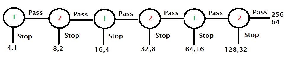
Here is a game played between two players, player 1 and player 2. There are two piles of cash, 4 and 1, on the table. Player 1 starts the game and has a chance to stop the game by taking four or the pass to the next player. In the next round, before player 2 starts, each stack of money is doubled, i.e. they become 8 and 2. Player 2 now has the chance to take a pile and stop or pass it back to player 1. The game continues for a maximum of six rounds.

Best strategy

To find the best strategy, we need to start from the end and move backwards. As you can see, the last chance is with player 2, and she has the option to end the game by taking 128 or else the other player will get 256, leaving 64 for her to take.

Since player 1 knows that player 2 will stop the game in the sixth round, he would like to end in round five, taking 64 and avoiding the 32 if the game moved to another.

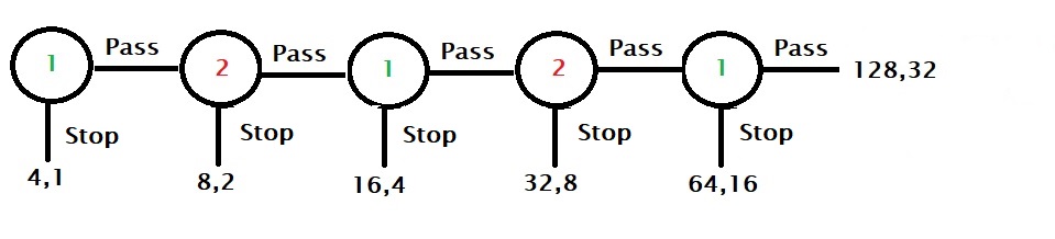
Player 2, who understands that there is an incentive to be the player who stops the game, can decide to stop earlier at fourth, and so on. So by applying backward induction, the rational player comes to the Nash equilibrium and controls the game in the first round, pocketing 4!

Irrationals earn more

On the other hand, player 1 passes the first round, signalling cooperation to the other player. Player 2 may interpret the call and let the game to the second round, trusting to bag the ultimate prize of 265. Here onwards, even if one of them decides to end the game, which is a bit of a letdown to the other, both players are better off than the original Nash equilibrium of 4.

The Centipede Game Read More »

Benford’s Law

Benford’s law forms from the observation that in real-life datasets, the leading digits or set of digits follow a distribution in a successively decreasing manner, with number 1 having the highest frequency. As an example, take the population of all countries. The data is collected from a Kaggle location, and leading integers are pulled out as follows:

pop_data <- read.csv("./population.csv")

ben_data <- pop_data %>% select(pop = `Population..2020.`)
library(stringr)
ben_data$digi <- str_extract(ben_data$pop, "^\\d{1}")
ben_data$digi <- as.integer(ben_data$digi)

The next step is to plot the histogram using the extracted digits.

Let’s not stop here, extract the first two digits and plot.

Benford’s Law Read More »

Monty Hall: Appreciating the Host

We have discussed the Monty Hall problem already a couple of times. One reason why people make this mistake is that they forget the role of the host in reducing the uncertainty of the car’s location. In other words, when the host eliminates one wrong door, he doubles the chances for the participant.

100 doors

Imagine a modified game in which there are 100 doors. You pick one. There can not be two opinions here that the chances of guessing the right door (having a car behind it) is one in one hundred. The host then opens all but one opening and shows you 98 goats. Will you switch this time? Or do you still think your original choice has a 50% probability of finding the car?

Monty Hall: Appreciating the Host Read More »

Error, Noise and Bias

We have built the definitions of data scatter (noise) and bias based on a group of data points in the previous post. This time, we estimate the mean squared errors of the data.

Noise

Here is a collection of data:

If you are not aware of the bias in the data, you would have calculated the error in the following way. Estimate the mean, calculate deviations for each of the points from the mean, square them and calculate the mean of the squares.

Note that this is also called the variance. For our data, the mean is 40, and the mean square ‘error’ is 15.75.

Somehow, you learned that the data was biased, and the true value was 45 instead of 40. Now you can estimate the mean square error as given below.

The value of this quantity is 39, which is the combined effect of the error due to noise and bias.

One way of understanding the total error is to combine the error at zero scatter and the error at zero bias. They are represented in the two plots below.

The mean squared error (MSE) in the zero-scatter (left) is 25 (square of the bias), and the zero bias is 15.75. And the sum is 40.75; not far from the total (39) estimated before.

Why MSE and not ME?

While you may question why the differences are squared, before averaging, it is apparent that in the absence of squaring, the scattered data around the mean, the plusses and minuses, can cancel each other and give a false image of an impressive data collection. On the other hand, the critics will naturally express their displeasure at seeing an exaggerated plot like the one below!

This is what happens when the errors are squared.

Reference

Noise: A Flaw in Human Judgment: Daniel Kahneman, Olivier Sibony, Cass R. Sunstein

Error, Noise and Bias Read More »

The St. Petersburg Paradox

We know what the expected value theory is. The St. Petersburg paradox seriously challenges that. It is a coin-tossing game and it goes like this:

A casino makes a coin-tossing game for a single player. In the first toss, if you get a head, you win a dollar, and the game ends. If it’s a tail, the game continues but doubles the payoff (two dollars) for the next round. At the appearance of the first head, you go home collecting whatever you won. What is the price you want to pay to the casino to enter the game?

The expected value

Let’s see what the expected value of the game is.
EV = P(1 T) x V(1 T) + P(2 T) x V(2 T) + P(3 T) x V(3 T) + …
where P(1 T) is the probability of one tail and V(1 T) is the value of one tail etc.
EV = (1/2) x 2 + (1/4) x 4 + (1/8) x 8 + …
= 1 + 1 + 1 + 1 … = Infinity.

Therefore, the rational player must be willing to pay any price to get into the game!

In reality, you will not pay that amount. Think about this: what is the probability of getting a head in the first toss (and you get one dollar)? It is 50%. Similarly, the chance of ending up with 4 dollars is 25%, and so on.

This disparity between the expected value and the reality is the St. Petersburg paradox.

Bernoulli’s solution

Daniel Bernoulli suggested using utility instead of value to solve this problem. The utility is a subjective internal measure of the player towards the gain from the game. According to him, the utility of the additional amount (earned from the contest) was a logarithmic function of the money.

u(w) = k log(w), w represents the wealth. It is logarithmic, he hypothesised, as there is an inverse relation (1/w) between change in wealth and its value. Mathematically,
du(w)/dw = 1/w

With this information, let’s rework the expected utility of this game

nP( nT)wu(w)
u = logw
(k = 1)
Expected
Utility
11/220.690.35
21/441.390.35
31/882.080.26
51/32323.470.11
101/102410246.930.007
1.07

Unlike the previous case, the sum of utilities converges.

The St. Petersburg Paradox Read More »

The Unexpected Hanging Paradox

A judge gives the verdict to the prisoner that he will be hanged one noon next week, on a weekday, but the day would be a surprise. The prisoner goes back to the cell and makes the following assumptions.

If the executioner doesn’t appear by Thursday noon, he will not be hanged as the last day, Friday, is no more a surprise. After eliminating Friday, he extends the logic to Thursday, which now becomes the final day. Finally, he concludes that he will not be executed as none of the days will come as a surprise.

The prisoner is happy and confident that he will not be hanged, only to find out by complete surprise that he was executed on Wednesday at noon. The judge now stands correct; it was a surprise to the convict. But what was wrong with his logic?

The Unexpected Hanging Paradox Read More »

First Instinct Fallacy

Our fundamental instinct to resist changes reflects well in the first-instinct fallacy of answering multiple-choice questions. However, studies have time and again suggested in favour of rechecking and updating the initial ‘gut feel’ as a test-taking strategy. One such example is the test conducted by Kruger et al. in 2005.

Following the eraser

The study followed eraser marks of 1561 exam papers for a psychology course at UIUC. The researchers categorised the changes in answers into three, viz., wrong to right, right to wrong and wrong to wrong, based on the 3291 changes they found. And here is what they found:

Answer changeNumbers%
Wrong to right169051
Right to wrong83825
Wrong to wrong76323

An important statistic is that about 79% of the students changed their answers. It is significant because, when asked separately, 75% of the students believed that the original choices were more likely to be correct in situations of uncertainty.

Switching to the wrong hurts

The level of fear or shame on a decision to shift from right to wrong overwhelms the misery of failure by sticking to the incorrect one, even though the data showed the advantages the second thinking brings. In a subsequent study, the team asked 23 students of the University of Illinois asked which of the outcomes would hurt them most – 1) you made a switch from a correct answer to a wrong and 2) you did not move away from the initial instinct after considering the eventually correct answer. The response from the majority of respondents suggested that people who were in the first situation regretted it more than the second.

[1] Counterfactual thinking and the first instinct fallacy: Justin Kruger, Derrick Wirtz, Dale T Miller
[2] Our first instinct is far too often wrong: FT

First Instinct Fallacy Read More »

The q-q Plot: The Method

Making a q-q plot is easy in R. Get data, and type a single line command; you’re ready. I will show you the process and the output using the famous mtcars dataset, which is in-built in R. For example, if you want to know the data, qsec, which is 1/4 mile time, of 32 automobiles follows a normal distribution, you type.

qqnorm(mtcars$qsec)
qqline(mtcars$qsec)

These functions are from the stats library. The first line makes the (scatter) plot for your sample, and the second one ( qqline()) makes the line representing the theoretical distribution line, which makes it easier to evaluate whether the points deviate from the reference line.

You can see that the qsec data is more or less uniformly distributed, something you may see from the histogram of the data below.

Take a different data which is left-skewed, such as hp, and its qqplot

The q-q Plot: The Method Read More »

The q-q Plot: The Codes

It took quite some time and online help to get some of the R codes to generate the analysis of the last post. So let me share them with you.

The Data

The data was generated using the rnorm function, which is a random number generator using a normal distribution. The following lines of codes generate 10,000 random data points from a normal distribution, with an average of 67 and a standard deviation of 2.5, add them to a data frame, and plot the histogram.

theo_dat <- rnorm(10000, mean = 67, sd = 2.5)
height_data <- data.frame(Height = theo_dat)
par(bg = "antiquewhite")

hist(height_data$Height, main = "", xlab = "Height (inch)", ylab = "Frequency", col = c("grey", "grey", "grey", "grey", "grey", "grey", "grey","grey","brown","blue", "red", "green"), freq = TRUE, ylim = c(0,2000))
abline(h = 2000, lty = 2)
abline(h = 1500, lty = 2)
abline(h = 1000, lty = 2)
abline(h = 500, lty = 2)

Horizontal lines are drawn to mark a few reference frequencies, and the option freq is turned ON (TRUE), which is the default. On the other hand, the density plot may be obtained by one of the two options: freq = FALSE or prob = TRUE.

par(bg = "antiquewhite")
hist(height_data$Height, main = "", xlab = "Height (inch)", ylab = "Density", col = c("grey", "grey", "grey", "grey", "grey", "grey", "grey","grey","brown","blue", "red", "green"), prob = TRUE, ylim = c(0,0.2))
abline(h = 0.2, lty = 2)
abline(h = 0.15, lty = 2)
abline(h = 0.1, lty = 2)
abline(h = 0.05, lty = 2)

quantile function (stats library) can give quantiles at specified intervals, in our case, 5%.

quantile(height_data$Height, probs = seq(0,1,0.05))
0%5%10%15%20%25%30%
57.8862.87 63.80 64.3764.8765.3165.69
35%40%45%50%55%60%65%
66.0569766.3766.6966.9867.2967.6267.97
70%75%80%85%90%95%100%
68.3169.1069.5668.7070.1571.0677.55

A bunch of things are attempted below:
1) The spacing (breaks) of the histogram bins as per quantiles
2) Rainbow colours for the bins are given to the bins
3) Two X-axes are given one 2.5 units below another

vec <- rainbow(9)[1:10]
vic <- rev(vec)
mic <- c(vec,vic)
lab <- c("0%", "5%", "10%", "15%", "20%", "25%", "30%", "35%", "40%", "45%", "50%", "55%", "60%", "65%", "70%", "75%", "80%", "85%", "90%", "95%", "100%" )

par(bg = "antiquewhite")
hist(height_data$Height, breaks = quantile(height_data$Height, probs = seq(0,1,0.05)), col = mic, xaxt = "n", main = "", xlab = "", ylab = "Density")
axis(1, at = quantile(height_data$Height, probs = seq(0,1,0.05)) , labels=lab)
axis(1, at = quantile(height_data$Height, probs = seq(0,1,0.05)), line = 2.5)

Note that the 10th bin (from the left came out with no colour as we selected 9 from the rainbow and 10 total array elements for the colour vector.

The q-q Plot: The Codes Read More »

The q-q Plot: Episode 1

The Quantile-Quantile (q-q) plot is a technique for verifying how well your data compares with a given distribution. Quantiles are regular intervals for cutting a probability distribution into equal probability pieces. We have seen before about percentiles, Px, the value below which x percentage (100 portions) of the data lies, and quartiles, which divide the distribution into four equal parts of 25% each (first, second, third, and fourth quartiles).

Distribution

Imagine you collected 10,000 sample data for a parameter, say the height of 10000 adult males, and made a histogram.

You can see that the X-axis describes the height (in inches). Each bin (bar) is one inch wide (X-distance). This is how you interpret the plot: say, the red bin starts at 67, ends at 68, and has a height of 1500 in frequency. This would mean that about 1500 individuals (out of the 10,000) are 67 to 68 inches tall. Similarly, from the brown bucket, there are ca. 1300 males between 65 and 66.

The same graph may be represented with density on the Y-axis instead of frequency.

Using density, we rescale the frequency so that the total area under the curve becomes one, and each bin will provide probabilities of occurrence. For example,

1 x 0.16 + 1 x 0.15 + 1 x 0.125 + 1 x 0.13 + 1 x 0.1 + 1 x 0.1 + 1 x 0.06 + 1 x 0.06 + 1 x 0.025 + 1 x 0.025 + ... = 1

Plot against the quantiles

So far, we have used equal quantity for the parameter (height) on the X-axis. We will change it to something different. We will take percentage intervals (a type of quantile). We use 5% intervals, and the height values corresponding to each of the 5% occurrences are tabulated:

0%5%10%15%20%25%30%
57.8862.87 63.80 64.3764.8765.3165.69
35%40%45%50%55%60%65%
66.0569766.3766.6966.9867.2967.6267.97
70%75%80%85%90%95%100%
68.3169.1069.5668.7070.1571.0677.55

Key observations are 1) the distance between 0 to 5 maybe 5%, but on the scale, it occupies a length of almost 5 inches (62.87 – 57.88). 2) there is an equal probability of observing the value in each group. If you plot the density against the percentiles, we get this:

To understand the second point, equal probability groups, let me add another scale to the X-axis:

Now find the area of any block, e.g. the left red = (62.87 – 57.88) x 0.0093 = 0.046. The next brown = (63.80 – 62.87) x 0.053 = 0.049. Finally, one of the white boxes = (66.98 – 66.69) * 0.17 = 0.049. Now you know the probability groups.

Compare actual with theory

In q-q, you collect the values of various quantiles of your data and plot them against the theoretical quantiles of a specified (normal, chi-squared, etc.) distribution. Since it is theory vs actual, and if they perfectly match, you should get a diagonal straight line.

Before we close

We will do the exercise another time. I will also show you the various R codes used in this post.

The q-q Plot: Episode 1 Read More »