The following is a riddle that used to make rounds on the internet: I have 50, then I spend it in the following way.
Spend
Balance
20
30
15
15
9
6
6
0
Total spend = 50
Total balance = 51
The total spend is 50, and the total balance is 51 – how to explain the extra 1?
The riddle has intrigued a lot of people. But the answer is: no rule requires matching the sum of spend with the sum of the balance! Take this extreme example: I have 50, and I spent it fully.
Spend
Balance
50
0
Total spend = 50
Total balance = 0
This time there is not much effort required for the mind to get convinced.
Seeing the great wall of China from the moon is an example of an urban myth. Interestingly, the story goes back to a 1932 cartoon that proclaimed “the only one that would be visible to the human eye from the moon”. Yes, 37 years before the first human landing on the moon happened!
As per the NASA website, the wall is generally not visible to the unaided eye even in low Earth orbit, let alone from the moon’s surface. At the same time, some of the other human-made landmarks are visible from low orbits. A key reason for this invisibility is that the texture of the material used to build the wall is similar to the surrounding landscape.
We saw the empirical rule – Gutenberg-Richter relationship – in the last post. Today, we use the wealth of data from the ANSS Composite Catalog to demonstrate a super cool feature of R – the mapview(). To remind you, this is how the data frame appears.
Now, let’s ask: where did the biggest, say, 9 and above magnitude quakes occur? To answer that, we need two packages, “sf” and “mapview”.
Charles Francis Richter and Beno Gutenberg, in 1944, found some interesting empirical statistics about earthquakes. It was about how the magnitude of earthquakes related to their frequencies. Today, we revisit the topics using data downloaded from ANSS Composite Catalog (364,368 data from 1900 – 2012).
A histogram of the magnitude is below.
The next step is to generate annual frequency from this. Since the data is from 1900-2012, we will divide the frequency by 112 to get the desired parameter. The following R codes provide the steps till the plot is generated. Note that the Y-axis is in the log scale.
Can a smoker advise another one about the benefits of quitting smoking? Or can a leader insist on masking without wearing a mask?
It is the essence of the Tu Quoque (“you too”) fallacy. It involves treating an argument as invalid because you retort that the person who made the affirmation herself doesn’t follow it.
You may recognise the well-known idiom, “practice what you preach.” Hypocrisy may indeed be called out, but that does not make facts incorrect.
Another logical fallacy that is closer to this is Whataboutism. The key difference here is that the person who receives the criticism points to someone else who is not necessarily the person who delivered the original criticism. It is like saying, ” But the other group also did something similar” to justify one’s own mistake.
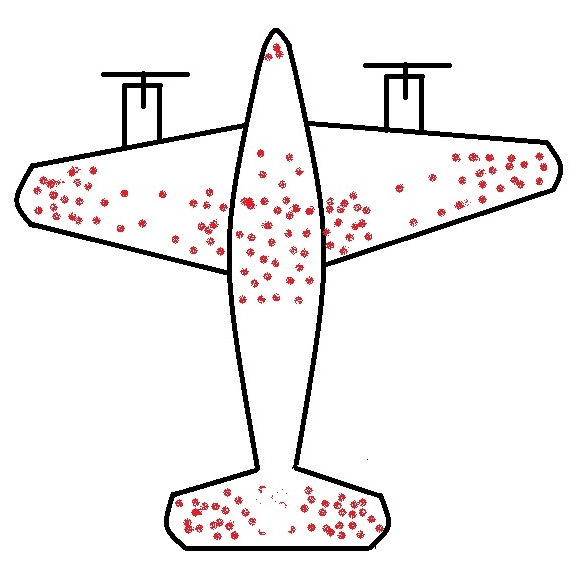
The story of returning warplanes from world war II presents the finest example of understanding survivorship bias. Here it goes.
When the US military had a chance to look at the fighter planes that came back from the battlefield, they observed some patterns. They found that the bullet marks on the planes were not uniform. Instead, it had denser patches on the fuselage and fewer spots on, say, engines, cockpit or some of the weaker parts – roughly what you see on the sketch below.
The idea was to use the data to optimise armouring the planes to sufficiently make the aircraft safer without adding too much weight that reduces the range.
So the statistical Research Group (SRG) was assembled to devise the strategy. Abraham Wald was the leading statistician who came up with this counterintuitive advice: the armour will not be where the holes are, but it will be where there are none. Because the planes with holes in those spots were shot down and never came back!
Survivors will mislead you
This is the classical survivorship bias. In the field, the planes were shot all over. The surviving ones presented one pattern; the unlucky ones would have shown the opposite.
Following are the grades (out of 10) of five students in three exams they did in a year.
Exam 1 (Jan)
Exam 2 (May)
Exam 3 (Sept)
Student 1
4
5
7
Student 2
3
4
5
Student 3
6
3
6
Student 4
5
7
6
Student 5
7
5
3
Here are some of the reasons why they performed in that fashion.
The analysis
Student 1 is the star of the class. She comes from a middle-class family and is very hard-working and strategic. She had to overcome a series of adverse events in the year, but her perseverance earned her good grades.
Student 2 is an average one who comes from a financially average family, often distracted due to his habit of playing video games. Despite the backlashes, his hard work helped him to overcome the final hurdle.
Student 3 is the most confident young man, but at times overconfident, and that proved his downfall in the middle of the year. But he bounced back toward the end to show his true talent. Form may be temporary, but class is permanent.
Student 4 is intelligent but inconsistent. He was a bit unlucky earlier this year due to family issues, but he overcame those and became a decent performer.
Student 5 comes from an average family, and he lost his focus due to various family issues, including a breakup.
The narrative fallacy
The situation mentioned above is an example of what is known as the narrative fallacy. In reality, the scores you have seen above are the outcome of a coin-flipping exercise, and the points scored are the number of heads in the game. You may observe a few standard things within all those narratives that followed. They each present a compelling story. You will never see mentions of randomness or luck in it. They satisfy the audience’s thirst for the cause and effect of the event, i.e., the exam results. They all ignore things that didn’t fall into the storyline. The following table lists each student’s circumstances, and the highlighted words denote what has been cherry-picked by the author to tell her tale.
Student 1
Confident, Financially OK, Video games, Hard working, Break up, Strategic, Inconsistent, Average
Student 2
Confident, Financially OK, Video games, Hard working, Break up, Strategic, Inconsistent, Average
Student 3
Confident, Financially OK, Video games, Hard working, Break up, Strategic, Inconsistent, Average
Student 4
Confident, Financially OK, Video games, Hard working, Break up, Strategic, Inconsistent, Average
Student 5
Confident, Financially OK, Video games, Hard working, Break up, Strategic, Inconsistent, Average
The investment gurus
The media is full of examples of narrative fallacies. Two classes of experts lead the table, namely the financial analysts and sports pundits.
Yesterday was a disastrous night for Leicester City’s Wout Faes, who scored not one, but two own goals for the opponents, Liverpool, that too at a time when his team was leading!
What is the probability?
A quick search online suggests that based on the last five seasons of the English Premier League for football, there is about a 9% chance of scoring an own goal in a match. Assuming the own-goals spread randomly as a Poisson distribution with an expected value (lambda) of 0.09 (9%), we can write down the following code a get a feel of how they distribute in e year. Note that there are 380 matches in a season.
plot(rpois(380,0.09), ylim = c(0,2), xlim = c(0,400), xlab = "Match Number", ylab = "Number of Own Goals", pch = 1)
The plot is just one realisation, and because the process is random, there are several possibilities of having own goals (0, 1, 2 or > 2) in a season.
1000th own goal last year
The following calculations are for the average number of own goals in the history of the premier league (the completed 30 seasons).
The expected value of having two own goals in a match is ca. 1.3 per season; for reference, the 2019-20 season had one occurrence.
Next, what is the expected value for two-own goals committed by one team?
epl <- rpois(380*2,0.09/2)
Extending it further: the probability of both goals being scored by the same player in a match becomes 0.09/20 (excluding the goalkeeper). The following code brings out the expected number of instances that a player scores two own goals in a match until the end of last season, i.e., 428 x 3 + 380 x 27 matches.
The answer is 2.3. The actual number stood at 3 at the end of last season (Jamie Carragher (1999, Liverpool vs Manchester United), Michael Proctor (2003, Sunderland vs Charlton) and Jonathan Walters (2013, Stoke vs Chelsea)).
20% of mushrooms in a forest are red, 50% are brown, and 30% are white. A red mushroom has a 20% chance of being poisonous, whereas, for a non-red, it is 5%. What is the probability that a poisonous mushroom is red?
We have applied Bayes’ rule several times previously to solve similar problems. So straight to the equation.
P(R|P) = Probability of red mushroom given that it is poisonous P(P|R) = Probability of poisonous mushroom given that it is red = 0.2 P(R) = Prior probability of finding a red mushroom = 0.2 P(P|nR) = Probability of poisonous mushroom given that it is not red = 0.05 P(nR) = 0.5 + 0.3 = 0.8
We have been hearing about hypothesis testing a lot. But what is that in reality? We will resolve it systematically by working with samplings from a large – computer-generated – population.
What is hypothesis testing?
It is a tool to express something about a population from its small subset, known as a sample. If one measures the heights of 20 men in the city centre, does something with the data and makes a claim about men in the city, it qualifies as a hypothesis. Imagine if it was a cunning journalist who measured the heights (mean = 163 cm and standard deviation = 20 cm) and reported that the people in the city were seriously undersized (the national average is 170), a claim the mayor vehemently disputes.
So, we need someone to perform a hypothesis test assessing two mutually exclusive arguments about the city’s population and tell which one has support from the data. The mayor says the average is 170, and the journalist says it’s not.
The arguments
Null hypothesis: The population mean equals the national average (170 cm). Alternate hypothesis: The population mean does not equal the national average (170 cm).
Build the population
The city has 100,000 men, and their height data is available to an alien. The average is, indeed, 170 cm. And do you know how she got that information? By running the following R code:
n_pop <- 100000
pop <- rnorm(n_pop, mean = 170, sd = 17.5)
Don’t you believe it? Here they are:
The journalist took a sample of 30 from it. So the statistician’s job is to verify if his number (sample mean of 163 cm at sample standard deviation of 20 cm) is possible from this population.
Test statistic
Calculating a suitable test statistic is the first step. A statistic is a measure that is applied to a sample, e.g., sample mean. If the same is done to a population, it is called a parameter. So population parameters and sample statistics. For the given task, we chose a t-test statistic by smartly combining the mean and standard deviation of the sample into a single term in the following fashion:
X bar is the sample mean mu0 is the null value s is the sample standard deviation and n is the number of individuals in the sample
For the present case, it is:
Why is that useful?
To understand the purpose of the t-test statistics, we go back to the alien. It collected 10,000 samples, 30 data points at a time, from the population, and here is how it was obtained.
You can already suspect that our t-value of -1.92, obtained from an average of 163 cm, is not improbable for a population average of 170 cm. In other words, getting a sample mean of 163 is “natural” within the scatter (distribution) of heights. If you are not sure how t-values change, try substituting 162, and you get -2.2 (higher magnitude, further away from the middle).
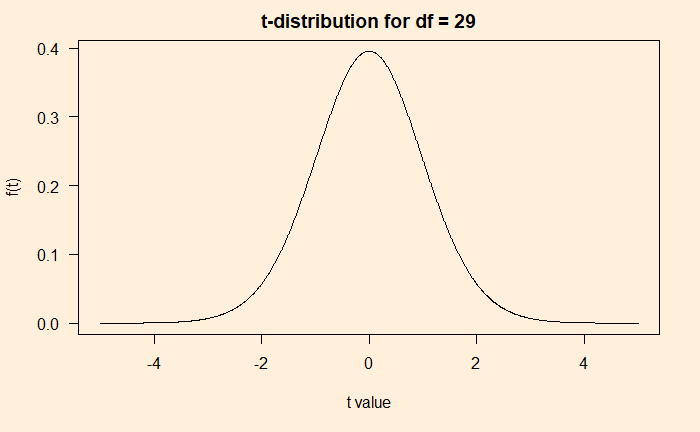
t-distribution
Luckily, there has been a standard distribution that resembles the above histogram created from the subsamples. As per wiki, the t-distribution was first derived in 1876 by Helmert and Lüroth. It is of the following form.
The beauty of this function is that it has only one parameter, df (number of data points – 1). The plot of the function for df = 29 is below.
x_t <- seq(- 5, 5, by = 0.01)
df <- 29

y_t <- gamma((df+1)/2)(1+(x_t^2)/df)^(-(df+1)/2)/(sqrt(df*3.14)*gamma(df/2))

plot(x_t, y_t, type = "l", main = "t-distribution for df = 29", xlab = "t value", ylab = "f(t)")
Combining distributions
Before going forward with inferences, let’s compare the sampling distribution (from 10000 samples as carried out by the alien) with the t-distribution we just evaluated.
Pretty decent fitting! Although, in reality, we never get a chance to produce the sampling distribution (the histogram), we do not need that anymore as we are convinced that the t-distribution will work instead.
Verdict of the test
The t-statistic derived from the sample, -1.92, is within the distribution if the average height of 170 cm is valid for the population. But by how much? One way to specify an outlier is by agreeing on a significance value; the statistician’s favourite is 95%. It means if the t value of the sample (the value of the x-axis) is in such a way that it is part of 95% of the distribution, then the sample mean that produced the t-value is valid. In the following figure, the 95% coverage is shaded, and our statistic is denoted as a red dot. In summary: a value of 163 cm is perfectly reasonable in the universe of 170!
Based on this, the collected data is not sufficient to dislodge the null hypothesis – a temporary respite for the mayor. Interestingly, the data can never prove he was right – it only says there is insufficient ground to reject his position.