It is interesting to see how posterior distributions are a compromise between prior knowledge and the likelihood. An extreme, funny case is a coin that is thought to be bimodal, say at 0.25 and 0.75. But when data was collected, it gave almost equal heads and tails.
First thing first: the twin paradox is not a paradox! Now, what is it?
Before we go to the twin paradox, we must know the concept of relativity of simultaneity. It is a central concept in the special theory of relativity and happens because the speed of light is constant. A famous thought experiment is when a light flashes at the centre point of a train, running at constant velocity. To the observer inside the train, the light will reach the engine and the tail simultaneously (the same distance from the light source). But for a standing observer on the platform, the light will hit the back of the train first, as it is catching up, and strike the engine last, as it is going away from the light source. And both are right. Or the distant simultaneity depends on the reference point.
Put differently, A and B are two objects. And A moves towards the static B at a constant velocity. But from A’s vantage point, it feels stationary, and B is moving towards A. Both A and B are correct.
Over the twin paradox: Anne and Becky are twins. Becky goes away in a spaceship to a distant planet and comes back. From the stay-at-home Anne’s perspective, Becky’s clock is running slow due to the special theory of relativity. So, when she comes back, Becky will be younger than Anne. But Becky, while heading back, looks at Anne and says it was Anne who was moving towards her (in her perspective), so Anne is younger. How can both be happening? So, it’s a paradox.
Interestingly, this time, we can’t say both are right. Anne is right; Becky is the younger of the two when she returns. The only time one can claim to be at rest and the rest of the world is moving is when the moving person is moving with constant velocity. Sadly, Becky cannot claim it; she changed her direction to return and created acceleration. Remember: velocity comprises speed as well as direction. On the other hand, Anne’s version is valid as she had no acceleration but was standing at constant (zero) velocity.
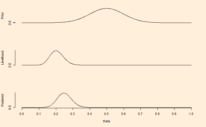
Last time, we have seen how the choice of prior impacts the Bayesian inference (the updating of knowledge utilising new data). In the illustration, a well-defined (narrower) distribution of existing understanding more or less remained the same after ten new, mostly contradicting data.
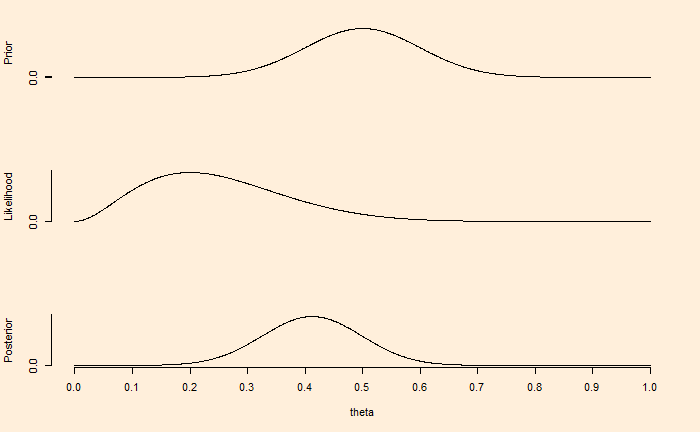
Now, the same situation but collected 100 data, with 80% leading to tails (the same proportion as before).
Now, the inference is leaning towards new compelling pieces of evidence. While Bayesian analysis never prohibits the use of broad and non-specific beliefs, the value of having well-defined facts is indisputable, as illustrated in these examples.
If there are multiple sets of prior available, it is prudent to check their impact on the posterior and map their sensitivities. Sets of priors can also be joined (pooled) together for inference.
We have seen in an earlier post how the Bayes equation is applied to parameter values and data, using the example of coin tosses. The whole process is known as the Bayesian inference. There are three steps in the process – choose a prior probability distribution of the parameter, build the likelihood model based on the collected data, multiply the two and divide by the probability of obtaining the data. We have seen several examples where the application of the equation to discrete numbers, but in most real-life inference problems, it’s applied to continuous mathematical functions.
The objective
The objective of the investigation is to find out the bias of a coin after discovering that ten tosses have resulted in eight tails and two heads. The bias of a coin is the chance of getting the observed outcome; in our case, it’s the head. Therefore, for a fair coin, the bias = 0.5.
The likelihood model
It is the mathematical expression for the likelihood function for every possible parameter. For processes such as coin flipping, Bernoulli distribution perfectly describes the likelihood function.
Gamma in the equation represents an outcome (head or tail). If the coin is tossed ‘i’ times and obtains several heads and tails, the function becomes,
The calculations
1. Uniform prior: The prior probability of the Bayes equation is also known as belief. In the first case, we do not have any certainty regarding the bias. Therefore, we assume all values for theta (the parameter) are possible as the prior belief.
The first figure demonstrates that if we have a weak knowledge of the prior, reflected in the broader spread of credibility or the parameter values, the posterior or the updated belief moves towards the gathered evidence (eight tails and two heads) within a few experiments (10 flips).
On the other hand, the prior in the second figure reflects certainty, which may have been due to previous knowledge. In such cases, contradictory data from a few flips is not adequate to move the posterior towards it.
But what happens if we collect a lot of data? We’ll see next.
The principal-agent problem is a key concept in economic theory, which has some fascinating consequences in real life. It is easier to understand the idea using the following example.
You want to buy a house. There are a lot of potential sellers in the market; you meet one of them, agree on a price and settle the deal – a simple transaction between a buyer and a seller. But real life is more complex. You may not know where those sellers are, the market value or the paperwork that may be required to complete the process etc. So you approach a real estate agent, who has more knowledge in this topic than you, the principal. In technical language, an asymmetry of information exists.
The agent knows something that you don’t. And she realises the value (say, buy the best house at the cheapest rate) on the principal’s behalf.
A far more complex principal-agent dynamics work in a large company. A simple owner-household transaction becomes a series of relationships between the owner (shareholders) – board, board-CEO, CEO-top management, manager – technical expert etc. Here, the lower-down person (in the hierarchy) needs to act to realise the values and visions of the higher.
So what’s the problem?
The biggest one is trust. Ideally, you want the incentives of both parties (the principal and the agent) to be aligned. But since the agent has more knowledge, you suspect the former to misuse the information asymmetry to her advantage. It leads to a conflict of incentives, and the principal can’t make it if the agent did a good deal or a bad deal on your behalf.
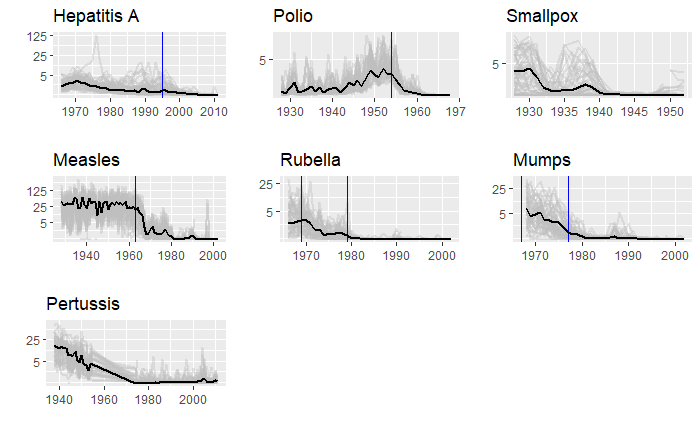
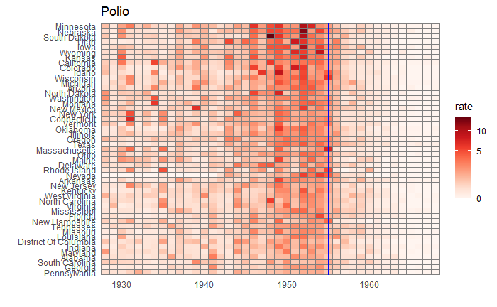
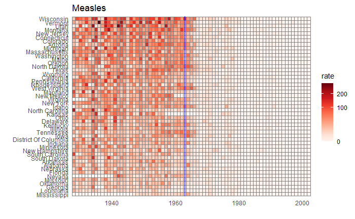
We will end this series on vaccine data with this final post. We will use the whole dataset and map how disease rates changed after introducing the corresponding vaccines. The function, ‘ggarrange’ from the library ‘ggpubr‘ helps to combine the individual plots into one.
We have used years corresponding to the introduction of vaccines or sometimes the year of licencing. In Rubella and Mumps, lines corresponding to two different years are provided to coincide with the starting point and the start of nationwide campaigns.
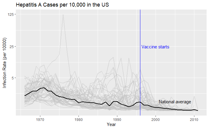
We have seen how good visualisation helps communicate the impact of vaccination in combating contagious diseases. We went for the ’tiles’ format with the intensity of colour showing the infection counts. This time we will use traditional line plots but with modifications to highlight the impact. But first, the data.
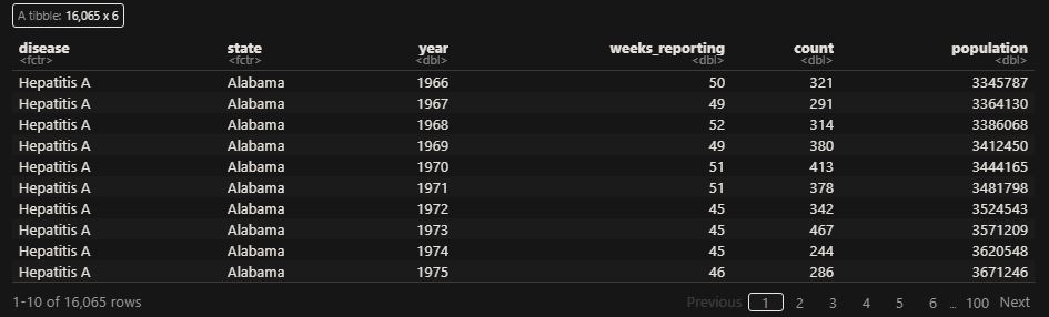
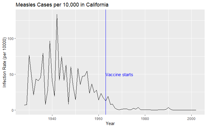
‘count’ represents the weekly reported number of the disease, and ‘weeks_reporting’ indicates how many weeks of the year the data was reported. The total number of cases = count * 52 / weeks_reporting. After correcting for the state’s population, inf_rate = (total number of cases * 10000 / population) in the unit of infection rate per 10000. As an example, a plot of measles in California is,
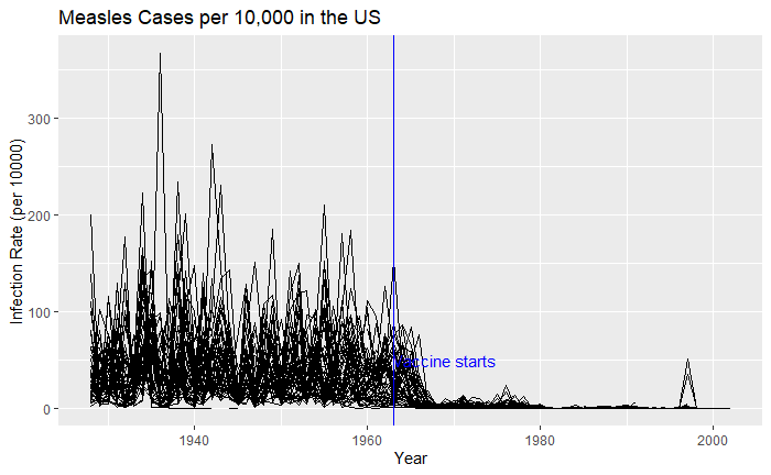
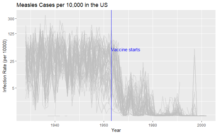
Nice, but messy, and therefore, we will work on the aesthetic a bit. First, let’s exaggerate the y-axis to give more prominence to the infection rate changes. So, transform the axis to “pseudo_log”. Then we reduce the intensity of the lines by making them grey and reducing alpha to make it semi-transparent.
vac_data %>% filter(disease == "Measles") %>% ggplot() +
  geom_line(aes(year, inf_rate, group = state), color = "grey", alpha = 0.4, size = 1) +
  xlab("Year") + ylab("Infection Rate (per 10000)") + ggtitle("Measles Cases per 10,000 in the US") +
  geom_vline(xintercept = 1963, col ="blue") +
  geom_text(data = data.frame(x = 1969, y = 50), mapping = aes(x, y, label="Vaccine starts"), color="blue") +
  scale_y_continuous(trans = "pseudo_log", breaks = c(5, 25, 125, 300))
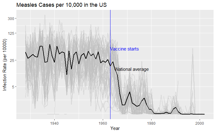
What about providing guidance with a line on the country average?
Vaccination is a cheap and effective way of combating many infectious diseases. While it has saved millions of people around the world, vaccine sceptics also emerged, often using unscientific claims or conspiracy theories. This calls for extra efforts from the scientific community in fighting against misinformation. Today, we use a few R-based visualisation techniques to communicate the impact of vaccination programs in the US in the fight against diseases.
We use data compiled by the Tycho project on the US states available with the dslabs package.
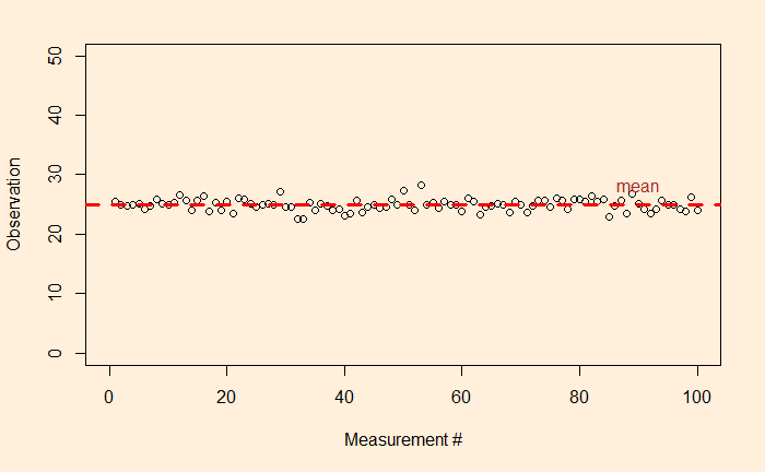
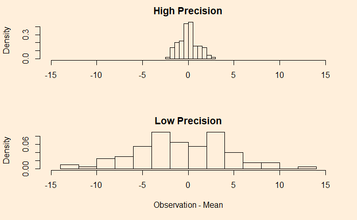
We have seen what precision is – it says something about the quality of the measurements. And we saw the following as an example of high-precision data collection: the fluctuations are closer to the average.
Accuracy
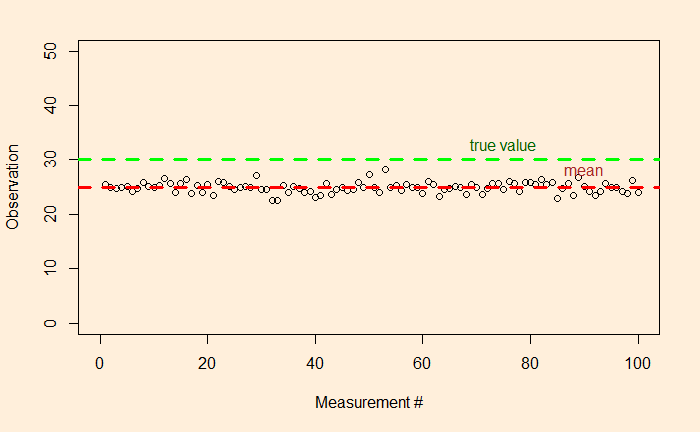
But what about if the true value – unfortunately, something the measurer would never know – of the unknown was 30 instead of 25?
So there is a clear offset between the mean and the true value. In other words, the accuracy of the measurements is low. If precision is related to the presence of random errors, accuracy is compromised by systematic bias. This may have been caused by mistakes in the instrumental settings or by poor methodology.
The other potential reason for poor accuracy is the presence of outliers.
By the way, both systematic bias and outliers are deterministic errors.
Let’s revisit something that we touched upon some time ago – the topic of observation theory. For those who don’t know what it is, the observation theory is about estimating the unknowns through measurements.
While the unknowns, the parameters of interest could be deterministic, such as the height of a mountain, or the temperature rise, the measured values are random or stochastic variables. And two terms that represent the quality of the observations are precision and accuracy.
Precision
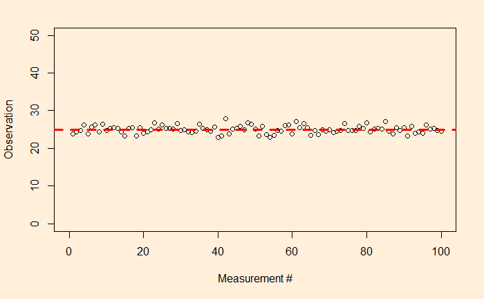
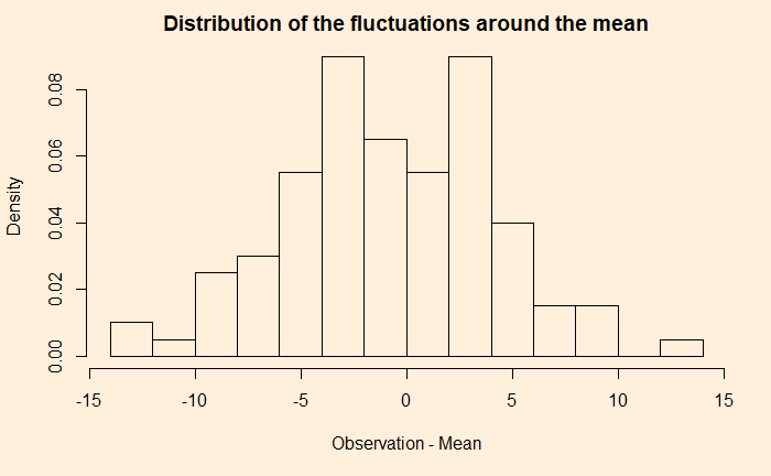
Precision means how close repeated measurements are to each other. As an illustration, the following are 100 data points from a measurement campaign.
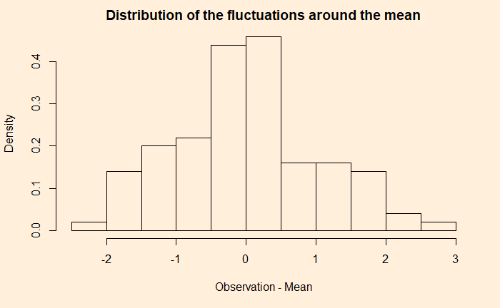
The dotted red line represents the mean (= 25). The fluctuation around the mean can be calculated by subtracting 25 from each observation. Here is how the fluctuations are distributed.
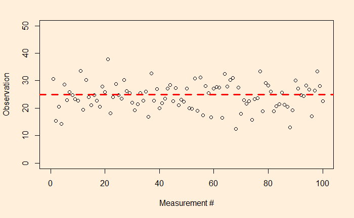
Now, look at another example.
A comparison of the two examples shows that the first one has a narrower distribution of errors (higher precision), and the second one has broader (lower precision). But they both follow a sort of normal distribution around mean zero.