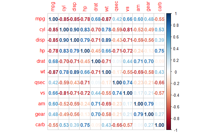
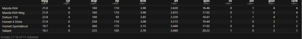
Changepoint Analysis
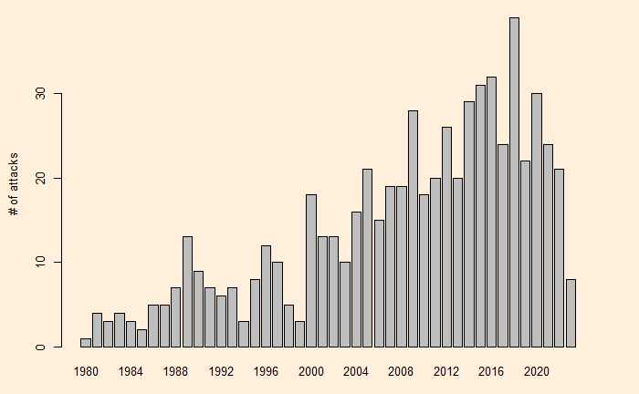
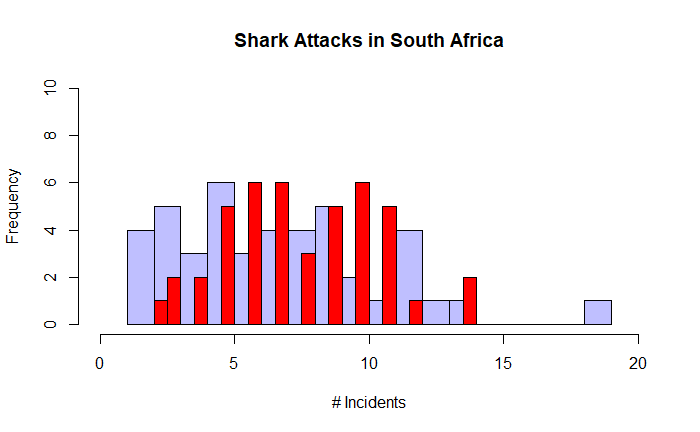
This time, we will do what is known as the change point analysis using the shark attack data that we used earlier. We use R programming to evaluate the key parameters.
First, we need the “changepoint” library to be installed. We use the function, “cpt.mean” which calculates the optimal positioning and the number of changepoints for data.
cpt.mean(inv_afr$AUS)Class 'cpt' : Changepoint Object
~~ : S4 class containing 12 slots with names
cpttype date version data.set method test.stat pen.type pen.value minseglen cpts ncpts.max param.est
Created on : Mon Jun 26 03:47:02 2023
summary(.) :
----------
Created Using changepoint version 2.2.4
Changepoint type : Change in mean
Method of analysis : AMOC
Test Statistic : Normal
Type of penalty : MBIC with value, 11.35257
Minimum Segment Length : 1
Maximum no. of cpts : 1
Changepoint Locations : 24 The program estimated the change point at 24. The next step is to plot and see what it did.
plot(cpt.mean(inv_afr$AUS))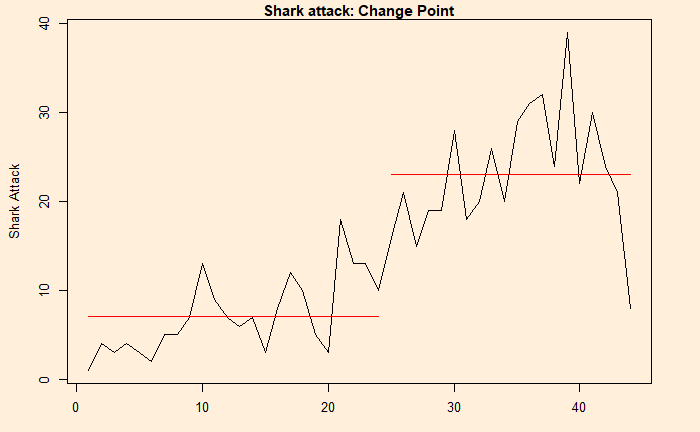
Changepoint Analysis Read More »