Data & Statistics

Duck Curve – The Villain in the Renewable Drama

The hundredfold reduction of solar energy cost is nothing short of magic. To summarise the recipe in one sentence: the US developed technology, Germany created the market, and China just made it! So the question is: if solar is so cheap (cheaper than almost any other technology), why don’t we rely on solar and dump other dirtier ones? It only works when it is sunny, and the electricity demand is not always when it is sunny! It only works when it’s sunny, and the electricity demand goes with a logic of its own, often conflicting with the sunlight.
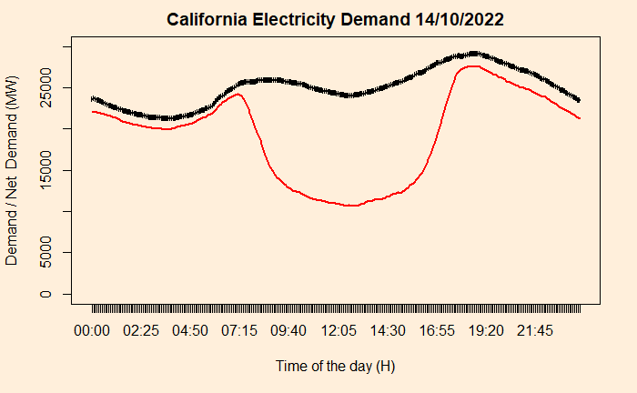
The duck that you see above has a lot of consequences. The plot indicates the requirement for traditional power generation to start operating in the evening time to manage the peak demand. But the economics is not that simple. Traditional power plants are typically more expensive and can’t make money by only producing in the evening and night. Secondly, the plants can have limitations in ramping up production so fast. These two limitations force the plants to run all day at some capacity leading to the renewable power plans to left unused. This waste (potential) power is called curtailment.

One way to manage is by storing electricity. But that comes with a cost, reducing the cost advantage created by solar significantly. Another way is to have common grids connecting multiple time zones and countries.

Reference

California duck curve: IEA

Demand trend California: CAISO

Duck Curve – The Villain in the Renewable Drama Read More »
California Duck Curve

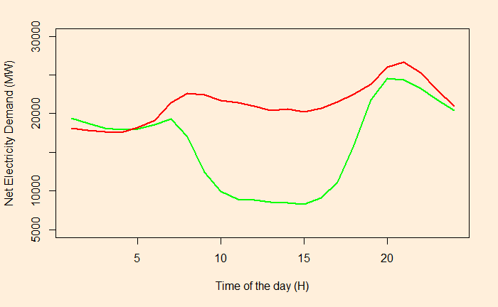
It is the demand curve for electricity net of solar output throughout the day.

The red line describes the demand in 2014 and the green in 2019.

If PV generates more energy than demand – called over-generation – curtailment may happen to the electricity (not stored for future use).

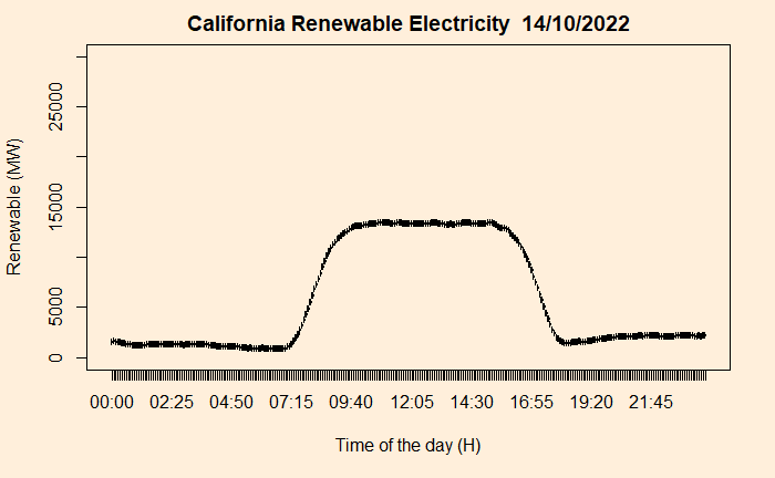
The red line represents the net demand (System demand minus wind and solar), and the black is the system demand.

So subtracting the net demand from the total, one can get a decent shape of renewable energy in the Californian electricity market.

Needless to say, solar dominates.

Reference

California duck curve: IEA

Demand trend California: CAISO

California Duck Curve Read More »

Energy Use and Human Development – The Threshold

We have seen the relationship between the human development index (HDI) and energy consumption.

There are two parts to the curve – a linear part until about 0.9 HDI and a plateauing part then onwards. Let’s focus on the linear. While attributing a causality, that energy consumption is the reason why some countries have high HDIs, may be a tricky conclusion to make, it nonetheless can be established without much trouble that countries that are behind the curve have the right to improve. It becomes a matter of distributive justice.

And that threshold energy consumption is around 25,000 kWh per person per year. The number of people that crossed this threshold is about 38%. Here is something already interesting. The percentage of people who crossed 0.9 HDI is only 13%. The difference between the two numbers is mainly due to China and Russia – large, reasonably energy-consuming countries that still need to climb the HDI ladder.

The amount of additional energy required for the below-threshold is about 80,000 TWh, which is about half of today’s global consumption of 160,000 TWh! If you are curious about the “excess” energy used by the top countries, it is 40,000 TWh. The shortfall and the excess don’t match because of the choice of 25,000 kWh, which is arbitrary and is not an average.

Alan D. Pasternak, Global Energy Futures and Human Development: A Framework for Analysis, 2000
Global energy consumption: Our World in Data
World Population Review: Energy Consumption

Energy Use and Human Development – The Threshold Read More »

Electricity Use and Human Development – Part 2

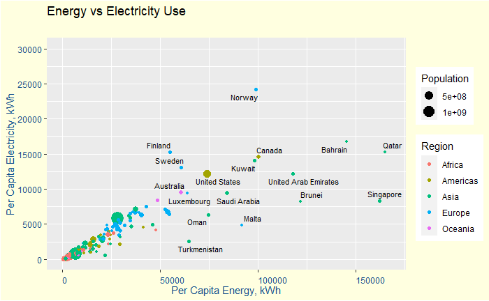
We have seen how electricity consumption and human development are related. This time, we go further to seek available data on the total energy consumption. That led to a dataset from “worldpopulationreview.com”. The question was how electricity consumption is related to overall energy consumption. Here is how they are related.

They are reasonably related, especially for the lower-consuming countries.

The next relationship is no more a surprise, i.e. between the total energy consumption and the human development index.

World Population Review: Energy Consumption

Electricity Use and Human Development – Part 2 Read More »

Electricity Use and Human Development

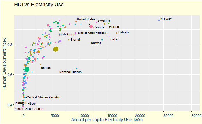
Today, let’s look at the relationship between the human development index and per capita electricity consumption.

The data was acquired from Wikipedia by web scraping using an R program. The codes used for the extraction, conditioning and plotting are provided below.

# Packages required 
library(xml2)
library(rvest)
library(tidyverse)
library(ggrepel)


#Web scraping of data
url <- "https://en.wikipedia.org/wiki/List_of_countries_by_electricity_consumption" 
page <- read_html(url) #Creates an html document from URL
table_energy <- html_table(page, fill = TRUE) #Parses tables into data frames

url <- "https://en.wikipedia.org/wiki/List_of_countries_by_Human_Development_Index" 
page <- read_html(url) #Creates an html document from URL
table_hdi <- html_table(page, fill = TRUE)

#clean-up 
hdi_countries <- as.data.frame(table_hdi[2])
ene_countries <- as.data.frame(table_energy[1])

hdi_countries <- hdi_countries %>% select(Nation, HDI)
ene_countries <- ene_countries %>% select(Country = Country.Region, Elec = `Total.electricityconsumption.GW.h.yr.`, Population, PCElec = `Average.electrical.power.per.capitaexpressed.in`)

hdi_countries <- hdi_countries[-1,]
ene_countries <- ene_countries[-2:-1,]

ene_hdi <- merge(hdi_countries, ene_countries, by.x="Nation", by.y="Country")
ene_hdi$HDI <- as.numeric((gsub(",", "", ene_hdi$HDI)))
ene_hdi$Elec <- as.numeric((gsub(",", "", ene_hdi$Elec)))
ene_hdi$Population <- as.numeric((gsub(",", "", ene_hdi$Population)))
ene_hdi$PCElec <- as.numeric((gsub(",", "", ene_hdi$PCElec)))

#plotting 
ggplot(ene_hdi, aes(x=PCElec, y=HDI)) +
  geom_point(aes(size = Population, colour = Nation)) + 
  geom_text_repel(aes(label = Nation), size = 3) + 
  scale_x_continuous(limits = c(0, 30000), breaks = seq(0, 30000, 5000)) +
  labs(title = "HDI vs Electricity Use", subtitle = "",  y = "Human Development Index", x = "Annual per capita Electricity Use, kWh") +
  theme(axis.text.x = element_text(angle=0, hjust = 0), plot.background=element_rect(fill="lightyellow")) +
  theme(axis.text.y=element_text(color= "dodgerblue4"), axis.title.y=element_text(color = "dodgerblue4")) + 
  theme(axis.text.x=element_text(color = "dodgerblue4", angle = 0, vjust = 0, hjust = 0), axis.title.x=element_text(color = "dodgerblue4")) + 
    theme(legend.position = "none")

Electricity Use and Human Development Read More »

Who Emits the Most?

We have seen that the global CO2 emissions in 2021 were about 39.4 gigatonnes. But how do different countries contribute to this? Hsiang and Hsiang report contributions from the top 15 countries in 2014. Here are the top 10 that I picked up.

CountryEmissions
(2014)
G tonne CO2
Cumulative
Emissions
(1751–2014)
G tonne CO2
Emission
per capita
(2014)

tonnes CO2
China10.3174.77.5
United States5.3375.916.2
India2.241.71.7
Russia1.7151.311.9
Japan1.253.59.6
Germany0.786.58.9
Iran0.614.88.3
Saudi Arabia0.612.019.5
South Korea0.614.011.7
Canada0.529.515.1

Notice that these ten already account for 75% of the total 34.1 Gt in 2014! Also to check is the disparity in the per capita contribution and the cumulative contribution that created this monster of climate change in the first place.

Hsiang and Hsiang, Journal of Economic Perspectives, 2018, 32(4), 3–32

Who Emits the Most? Read More »

Back to Roulette

We are back in the game of chances, the roulette – not the Vegas one, but the Russian. Imagine two rounds are put in a revolver that has six cartridges. You don’t know the order in which they are kept, i.e. next to each other, or there are gaps between them. What is the probability you get hit by the bullet?

It is pretty straightforward: there are two in six chances to get hit (2/6 = 33.3%), and four in six you survive (4/6 = 66.7%). OK, you survive the first round. If there is a second round and you have two choices. Pull the trigger straight away, or spin it again before pulling. Which one do you choose?

3 types of arrangements

The number of arrangements possible for two bullets to be placed inside six possible cartridges is 6C2 = 6!/(4!2!) = 6 x 5 / 1 x 2 = 15. Those 15 fall into three categories as below:

Next to each other

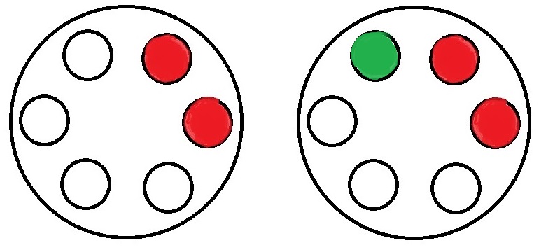
There are six such arrangements that are possible ({1,2}, {{2,3}, {3,4}, {4,5}, {5,6}, {6,1}). In the above figure, the left one with two reds represents one such. In such an arrangement, the number of empty spots that follows a bullet is just one (marked as green on the above right). Since there are four empty cartridges, the probability of the second one hitting is (1/4).

With one gap

Six arrangements are possible with one gap between them ({1,3}, {{2,4}, {3,5}, {4,6}, {5,1}, {6,2}). The chance of the second one hitting, in this case, is (2/4).

With two gaps

Three are are possible with two gaps between them ({1,4}, {{2,5}, {3,6}). The chance of hitting is again (2/4).

To spin or not to spin?

So what is the probability of surviving if you prefer to spin again? That will be the same as the first time = 66.7%. If not, you calculate the chances in the following manner.

6/15 (probability to get arrangements of type 1) x 3/4 (chance of survival) + 6/15 (probability to get arrangements of type 2) x 2/4 (chance of survival) + 3/15 (probability to get arrangements of type 3) x 2/4 (chance of survival) = 6/15 x 3/4 + 6/15 x 2/4 + 3/15 x 2/4 = (9/2 + 6/2 + 3/2)/15 = 9/15 = 0.6 = 60%.

The bottom line is: you better ask to spin again and increase the probability of survival by 6.7%!

Back to Roulette Read More »

Covid and Smoking

A paper was published in April 2020 on the open science platform, Qeios. The topic was the potential benefit of tobacco smoking to protect against Covid-19.

The conclusions in the article were based on data from observational studies and not randomised clinical trials. We have already discovered issues which arise from observational studies, collider bias being one of them.

Collider bias happens when two variables, e.g., risk factor and outcome, influence a third, namely, the likelihood of being sampled. In our case, the sampling occurred on or before April 2020, in the earlier part of the pandemic. As you may recall, testing was in the developing stages, and the focus was on front-line health workers and patients with severe symptoms. In technical terms, the sample was not random or representative.

Therefore, the data space has narrowed down to health workers, and within those, there are smokers and non-smokers. As a consequence of the testing strategy, the survey censored out the smokers who had no symptoms. And this exaggerated proportion of non-smokers who had symptoms in the sample.

References

Low incidence of daily active tobacco smoking in patients with symptomatic COVID-19: Qeios, CC-BY 4.0 · Article, April 21, 2020

Collider bias undermines our understanding of COVID-19 disease risk and severity: Nature Communications, 2020, 11:5749

Randomised Controlled Trials: BMJ

Covid and Smoking Read More »

LCA of carrier Bags

I’m sure this has bothered most of us at some point. It is about the use of plastic bags. Plastic consumption and its environmental effect due to poor biodegradability frequently come under the public discourse. And here is an interesting research report based on the Life Cycle Analysis (LCA) of a few commonly used carrier bags in the UK, published by the Environment Agency (2011).

LCA is a standard methodology to estimate the material, energy usage, and environmental impact throughout a product’s lifecycle (‘cradle to grave’). The study covered only the carriers available from the UK. The material in focus was conventional HDPE, HDPE with pro-degradant additive, starch-polyester (biopolymer), paper, heavy-duty LDPE, non-woven PP and cotton bag.

The end-of-life processes for the different materials included landfill and incineration (for all) and mechanical recycling and composting, where applicable.

The following table contains the energy use and waste generation from 1000 bags of each material.

Bag TypeElectricity
(kWh)
Heat
(from
NG)
(kWh)
Heat
(from
Fuel oil)
(kWh)
Waste
(g)
Conventional HDPE6.151418.4
HDPE + additive6.392426.1
biopolymer17.2494.8
LDPE32.5813.953171.2
Non-woven PP87.755,850
Cotton111,800

The study assumed the reuse of about 40% of all lightweight carrier bags as bin liners.

The next one up was the global warming potential. GWP (excluding primary reuse) for the cotton bag (250 kg CO2 eq.) was more than ten times that of any other bag! It was followed by PP (22), LDPE (7), paper (6), biopolymer (5), HDPE (2.1) with additive and HDPE (2), in descending order. In other words, a cotton bag requires to be used 173 times to match HDPE and PP 14 times.

Here is a summary:

Bag typeSensitivityGWP
(kg CO2 eq)
HDPEBaseline1.578
HDPERecycling1.400
HDPERecycling
(no reuse)
1.785
HDPE
prodegradant
Baseline1.750
biopolymer Baseline4.184
biopolymer Composting2.895
biopolymer Composting
(no reuse)
3.329
Paper bag
(4 uses)
Baseline1.381
Paper bag
(4 uses)
Recycling1.090
Paper bag
(4 uses)
Composting1.256
LDPE
(5 uses)
Baseline1.385
LDPE
(5 uses)
100%
Recycling
1.196
PP
(14 uses)
Baseline1.536
PP
(14 uses)
100%
Recycling
1.292
Cotton bag
(172 uses)
Baseline1.579

To conclude

HDPE bags have the lowest environmental impact among lightweight bags on 8 out of 9 counts.
The starch-polyester (biopolymer) bag has the highest impact in 7 out of 9.
The paper bag needs to be used four times to match HDPE’s global warming potential.
The cotton bag has a greater impact than the HDPE bag in 7 out of 9 categories, even when used 173 times.
The key to reducing the impact is to reuse as much as possible.

Reference

Life cycle assessment of supermarket carrier bags: a review of the bags available in 2006

LCA of carrier Bags Read More »

Mileage Paradox

Andy owns a car with 20 km/L mileage and Becky has one with 8. They both purchased new cars to tackle the rising fuel price. Andy’s new car is now 30 km/L, and Becky’s is 10. If they both drive similar kilometres, who will save more money?

A quick glance at the problem tells you a 50% improvement for Andy (20 to 30), whereas only 25% for Becky (8 to 10). So Andy, right? Not so fast. Because you are dealing with a compound unit (kilometre per litre) with the actual quantity, we are after (litre), which is in the denominator. So our intuition based on simple numbers goes for a toss.

Imagine they both drive 2000 kilometres this year. Andy consumed 2000 (km) / 20 (km/L) = 100 L in the past, but will consume 2000/30 = 66.7 L this year. On the other hand, Becky’s consumption will reduce from 2000/8 = 250 to 2000/10 = 200. So Becky saves 17 L more than Andy.

Speed paradox

A similar problem of averaging denominators exists in the famous challenge of average speeds: Cathy travelled from A to B at 30 km/h and returned (B to A) at 60 km/h. What was Cathy’s average speed? Needless to say, the intuitive answer (30+60)/2 = 45 is wrong. It is easy to solve if you assume a fixed distance (magnitude doesn’t matter), say, 100 km. For A to B, she took 100 (km)/30 (km/h) = 3.33 h and for the return 100 (km)/60 (km/h) = 1.67 h. So she travelled 200 km in 5 hours. The average speed is 200 (km) / 5 (h) = 40 km/h.

Mileage Paradox Read More »