Data & Statistics

En-ROADS to Afforestation

Let’s run another popular choice for CO2 removal – aforestation or planting trees. In this scenario,100% of the available land is used for afforestation.
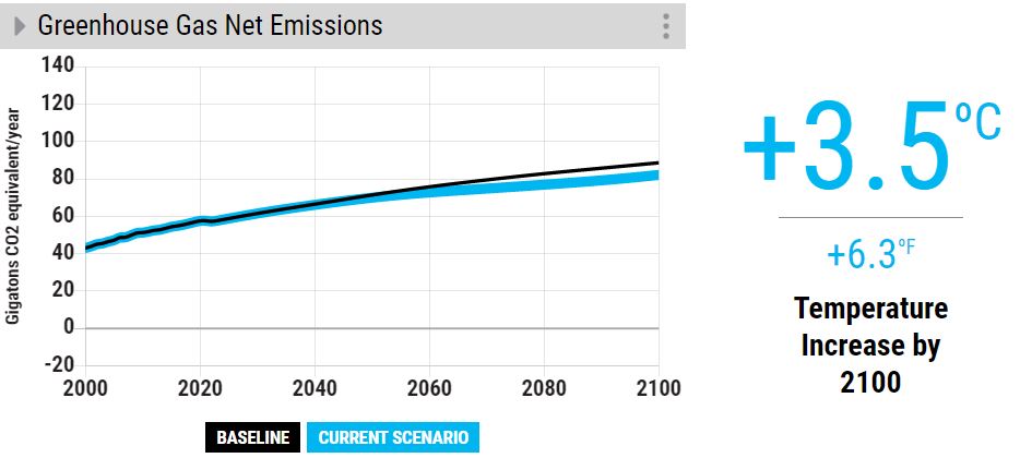
Now, compare that with a highly reduced rate of deforestation.

The outcome is the same – a very marginal reduction of temperature rise.

It takes time for trees to grow

The key reason for the aforestation failure is the time it takes for the trees to grow. The time till 2100 is less than 80 years, and an 80-year-old tree is still young!

References

The Paris Agreement: UNFCCC

EN-ROADS: Climate Interactive

En-ROADS to Afforestation Read More »
En-ROADS to Carbon Price

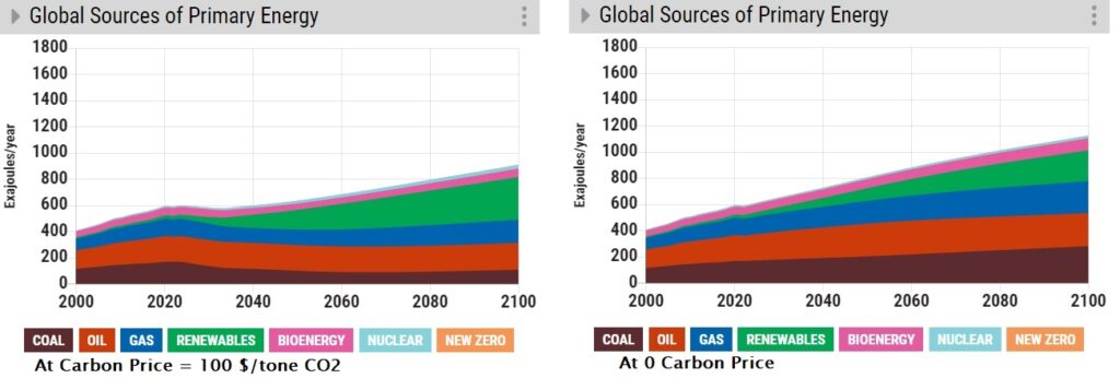
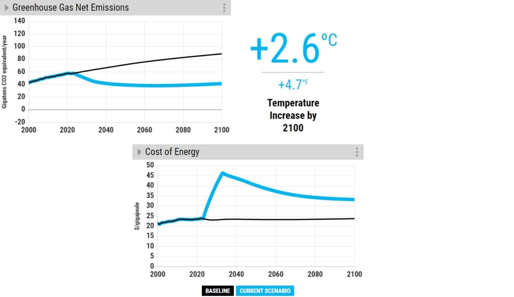
We will use En-ROADS to simulate the impact of the carbon price on climate goals. First, we switch off the efficiency buttons from the previous runs. And set the carbon price to 100 $/tone CO2.

It would be interesting to see how the price impacted the energy mix.

As you can see, the market turned away from Coal in favour of more renewables. We now raise the price to 200 $/tone CO2.

References

The Paris Agreement: UNFCCC

EN-ROADS: Climate Interactive

En-ROADS to Carbon Price Read More »

En-ROADS to Efficiency

We saw En-ROADS last time as a tool to simulate the impact of steps we can/should to en route to a decarbonised future. Now, we simulate scenarios, starting with energy efficiency.

The silver bullet?

There is a reason to start with this. A lot of people (policymakers) think energy efficiency offers huge opportunities in the journey of decarbonisation, and it comes at zero cost (or even at negative cost)! I suspect the famous McKinsey curve has something to do with this belief. I suspect the famous McKinsey curve has something to do with this belief. But let’s test the hypothesis.

Simulation results

First, the baseline: we have seen before that if we maintain the status quo, we end up with a temperature rise of +3.6 oC compared to the pre-industrialised levels. We do run the model in two steps. First, we make set maximum efficiency changes (transport and building) at the current volume of electrification, i.e. no growth.

The underlying assumptions for this simulation are a growth rate of 5% per year from 2023 and a 5% rate for buildings and industries (new and retrofitted).

Now, switch on electrification to the mix. Here we added 100% electrification of new transport (rail and road) and buildings from 2023, which we know, can not be true!

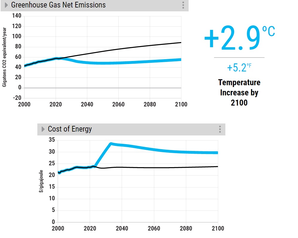
So, what are we seeing? Even at extremely optimistic rates of energy efficiency and electrification rates, we will miss the climate goal of 2100. Building electrification also causes an increase in energy costs in the medium term.

Ignoring building electrification still makes most of the results (+2.9 oC) at no cost. The question now is: here is an option (improving efficiency) that can still make a good stride towards decarbonised work at no cost, but not realised. From an economic standpoint, this doesn’t make sense – a market failure.

References

The Paris Agreement: UNFCCC

EN-ROADS: Climate Interactive

En-ROADS to Efficiency Read More »

En-ROADS to Climate Goal

Limiting “global warming to well below 2, preferably to 1.5 oC, compared to pre-industrial levels”, is the main objective of the Paris agreement, which is a legally binding international treaty on climate change. However formidable the goal might appear, there are pathways to achieve it with the help of deploying appropriate technologies and policies.

We introduce En-ROADS, the online climate simulation tool developed by Climate Interactive, Ventana Systems, UML Climate Change Initiative, and MIT Sloan, to create the results from various scenarios. The simulator provides a set of outputs, such as the temperature increase by 2100, CO2 emissions, cost of energy, sea level rise, and about 100 others from a selection of inputs that include 1) energy efficiency and electrification, 2) growth, 3) land use, 4) carbon capture technologies, and 5) Carbon pricing and other policies.

The screenshot of the interface provided below shows how the interactive lets the user handle some serious physics and math of climate change as child’s play and free of charge!

References

The Paris Agreement: UNFCCC

EN-ROADS: Climate Interactive

En-ROADS to Climate Goal Read More »

Loss and Damage and COP27

The 27th session of the Conference of the Parties (COP27) has just concluded this morning at the Sharm El-Sheikh (Egypt) Climate Change Conference with the signing of what’s proclaimed a landmark deal, the endorsement of the “loss and damage” fund.

Governments took the ground-breaking decision to establish new funding arrangements, as well as a dedicated fund, to assist developing countries in responding to loss and damage. Governments also agreed to establish a ‘transitional committee’ to make recommendations on how to operationalize both the new funding arrangements and the fund at COP28 next year. The first meeting of the transitional committee is expected to take place before the end of March 2023.

UN Climate Press Release:

From COP 19

“Acknowledging the contribution of adaptation and risk management strategies towards addressing loss and damage associated with climate change impacts”

FCCC/CP/2013/10/Add.1: Decision 2/CP.19

Although the term, loss and damage, came inside COP books in 2013 at the COP17 in Warsaw, Poland, the push for a suitable compensation mechanism supporting vulnerable countries to endure the cost of climate change, which is predominantly inflicted by a few industrialised countries, has a long history. As per Wiki, AOSIS proposed an insurance pool as early as 1991 when United Nations Framework Convention on Climate Change (UNFCCC) was in the process of setting up.

Reference

COP27: UNFCCC

COP19 Reports: UNFCCC

Loss and damage: Wiki

Loss and Damage and COP27 Read More »

The goodness of Fit Continued

After fitting the data with the linear regression model, you determine the R-squared, which tells how good the fit is. R-squared represents how good the relationship between the model and the dependent variable is on a 0 to 1 scale.

Let’s take the previous example,

The question is: How good is the red line (model) compared to the mean?

That gives you the R-squared.
R2 = [Var(mean) – Var(line)] / Var (mean) = 1 – [ Var(line) / Var (mean)]

In the best fitting case, there is no variation around the model line and in the worst case, it is as bad as that around the mean.

The variation around the mean = sum of squares of differences between the mean and the actual data = 41.27269.

The variation around the line = sum of squares of differences between the line and the actual data = 13.7627.

Therefore, R2 = (41.27269 – 13.7627) / 41.27269 = 0.6665

Q1 <- data.frame("x" = c(10, 8, 13, 9.0, 11.0, 14.0, 6.0, 4.0, 12.0, 7.0, 5.0), "y" = c(8.04, 6.95, 7.58, 8.81, 8.33, 9.96, 7.24, 4.26, 10.84, 4.82, 5.68))

V_mean <- sum((Q1$y-mean(Q1$y))^2) 

V_line <- sum((Q1$y - 3 - 0.5*Q1$x)^2)

R_squared <- (V_mean - V_line) / V_mean

Not to forget: 3 + 0.5*Q1$x (Y = 3.0 + 0.5 X) is the equation of the line.

The goodness of Fit Continued Read More »

The goodness of Fit of Linear Regression

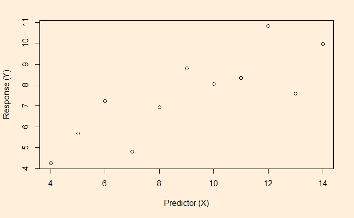
Regression models are a potential pathway to finding the relationship between dependent variables (response variable) and independent variables (predictor variables). And we have seen linear regression in the previous post. We will continue from there, focussing on a measure of the goodness of fit – the R-squared. Start with a scatter plot of an X vs Y.

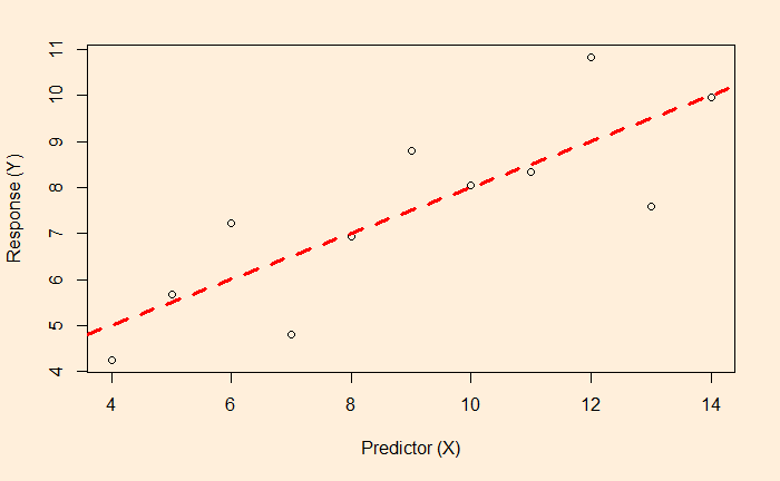
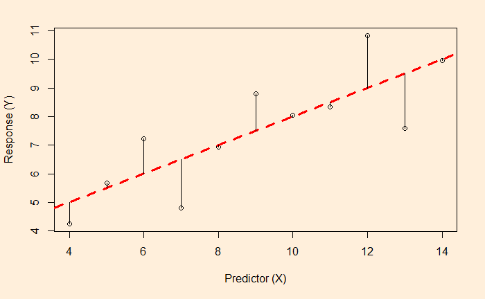
The most convenient way to think about linear regression is the broken red line – which represents the best fit – on the plot. The equation of that line is the model for predicting Y from X.

In our case, we shall see soon; the formula is Y = 3 + 0.5 x X.

For the time being, you may consider that that line is drawn to balance between the dots of the scatter.

Residuals – the distances from the fit

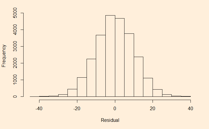
The lengths of the lines are the residuals of each data from the regression line. Remember, if the data are purely random and independent, the histogram of the residual forms a normal distribution with a mean equal to zero.

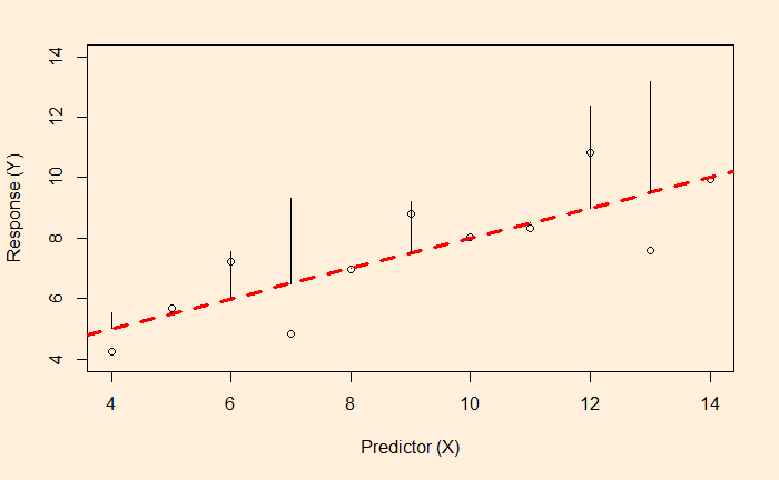
While the line is a result of a balancing act between the residuals, it is not by minimising the distances (as in the figure above) but by minimising the sum of squares of them (the figure below).

Squares of residuals

So, the line is drawn at which the sum of the squares of the errors is minimum.

The goodness of Fit of Linear Regression Read More »

Linear Regression

Regression is a tool that enables us to find the relationship between two variables. The most commonly used one among them is linear regression, where we find the dependant variation (y) as a function of the independent variable (x) in the form of a line, y = m*x + c; m and c are constants.

A feature of regression is the term residual. A residual is a difference between the actual and predicted values (as per the equation).

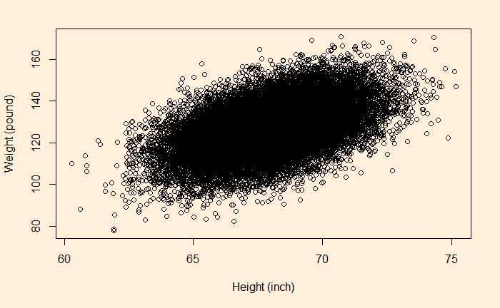
Let’s use the human height vs weight dataset to understand the concept of regression. The dataset has 25,000 synthetic records of human heights and weights of 18-year-old children. These were simulated from a 1993 Growth Survey of 25,000 children from birth to 18 years of age recruited from Maternal and Child Health Centres and schools.

Now, build a linear regression between the height and the weight by running the following R code.

lm(hw_data$Weight.Pounds. ~ hw_data$Height.Inches.)

It gives the following output.


Call:
lm(formula = hw_data$Weight.Pounds. ~ hw_data$Height.Inches.)

Coefficients:
           (Intercept)  hw_data$Height.Inches.  
               -82.576                   3.083  

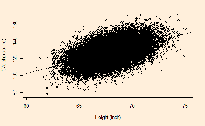
So the equation becomes weight = 3.083 x height – 82.576. You can add the line (the regression line) to the plot by typing,

abline(lm(hw_data$Weight.Pounds. ~ hw_data$Height.Inches.))

The residuals must follow a Gaussian if the data is random and independent. Let’s get the residual and make a histogram.

hist(hw_data$Weight.Pounds. - ( -82.576  +  3.083  * hw_data$Height.Inches.), main = "", xlab = "Residual", ylab = "Frequency")

UCLA Statistics

Linear Regression Read More »

Population but No Explosion

We have covered the topic of the population a few times already. Parameters such as fertility per woman and population growth rates started their downward journey for most countries some time ago. Take the top four populous countries in the world, China, India, the US and Indonesia.

ChinaIndiaUSIndonesia
Population
growth rate (%)
(1963)
2.462.061.442.66
Population
growth rate (%)
(2019)
0.3551.010.4551.1
Child per woman
(1963)
~65.883.355.63
Child per woman
(2021)
1.662.221.892.24

8 Billionth Child

But today is a special day. The United Nations considers 15th November 2022 as the official day of the birth of the 8th billionth child. It took 11 years for the number to go from seventh billion to eighth. And it will take another 15 years to reach ninth. Based on the UN estimates, the global population will peak somewhere between 10 and 11 billion.

The question is: how reliable is this UN estimate? The answer comes from a study published in 2001 by Nico Keilman. The publication explored 16 sets of population projections by the UN between 1951 and 1998 and concluded that they did a decent job of predicting population. Following are the Mean absolute percentage error (MAPE) of those studies.

Base YearMAPE
1950I12.6
1950II11.2
1950III3.5
19601.8
19652.2
19701.5
1975I0.6
1975II0.2
1980I0.2
1980II0.2
1985I0.9
1985II0.9
1990I1.1
1990II0.6
1995I0.4
Mean absolute percentage error (MAPE) in projected total population size

References

Population forecast: Gapminder
8 billionth child: BBC
The world’s population has reached 8 B. Don’t panic: The Economist
Keilman, N., Population Studies, 2001, 55, 149

Population but No Explosion Read More »

The Happiness Formula – Experience vs Memory

We started this blog stating that the “Thoughtful Examinations” was about life, knowledge, and happiness, yet we have spent the least amount of time, so far, on the topic of happiness, but not today. Let us start with a question: what causes happiness?

Before answering the question, we will briefly consider the two kinds of experiences of happiness. As per Nobel laureate Daniel Kahneman, they are the experiencing self and remembering self. The former is about joy, or the pain someone undergoes at a given moment, and the latter is about how she remembers it later.

Kahneman’s team conducted an experiment in which he collected data from 682 patients undergoing the colonoscopy process. As you may know, a colonoscopy is not a pleasant experience. It was a randomised control test (RCT) in which the group was divided into two – the first group was called the normal, and the second was the modified.

Adding a minute of happiness

For the normal group, it was the standard colonoscopic procedure, whereas, for the modified group, the researchers added a few minutes of a non-pharmacologic intervention by extending the duration with lessened pain to the patient. The tip of the colonoscope was allowed to rest in the rectum for about 3 minutes without any suction or inflation.

The assessment used the so-called Gottman–Levenson approach: the participants (patients who authorised the researchers to collect data) got a handheld device through which one can mark the extent of pain at regular intervals, from no pain (score = 0) to extreme pain (score = 10).

The end makes a difference

The study results were evaluated on two parameters – the patient’s feedback to a questionnaire and the rate of return for a follow-up colonoscopy. The questionnaire was a retrospective evaluation of how a participant felt about the procedure. The results were significantly different from each other. The patients who received the modified treatment remembered the whole event as less painful, although the beginning, the middle part and the peak pains were comparable to both groups.

The Happiness Formula – Experience vs Memory Read More »