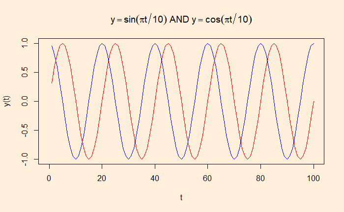
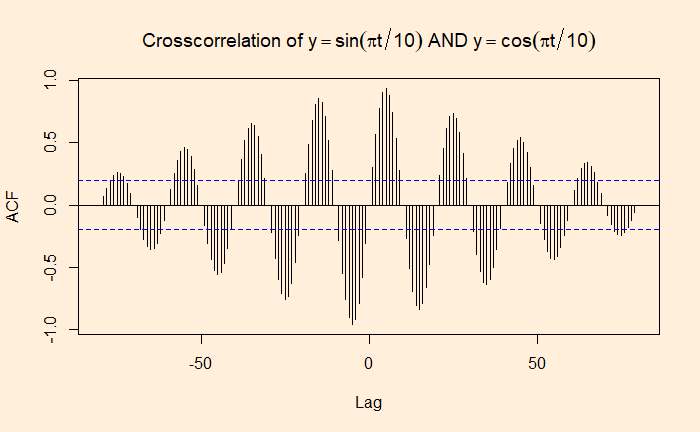
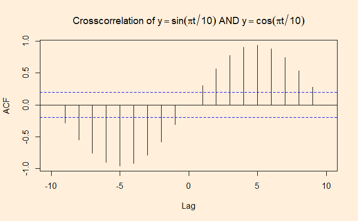
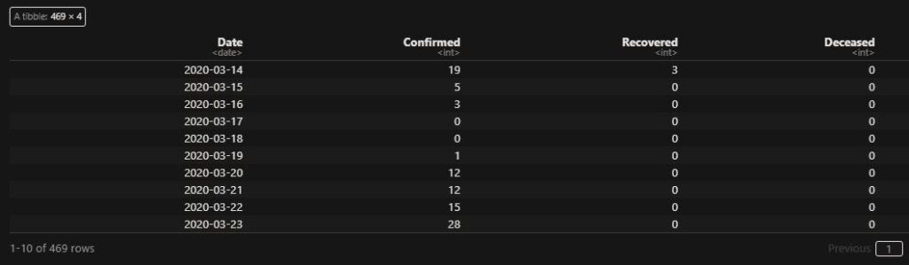
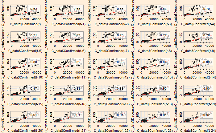
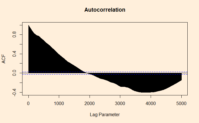
If autocorrelation represents the correlation of a variable with itself but at different time lags, cross-correlation is between two variables (at time lags). We will use a few R functions to illustrate the concept. The following are data from our COVID archives.
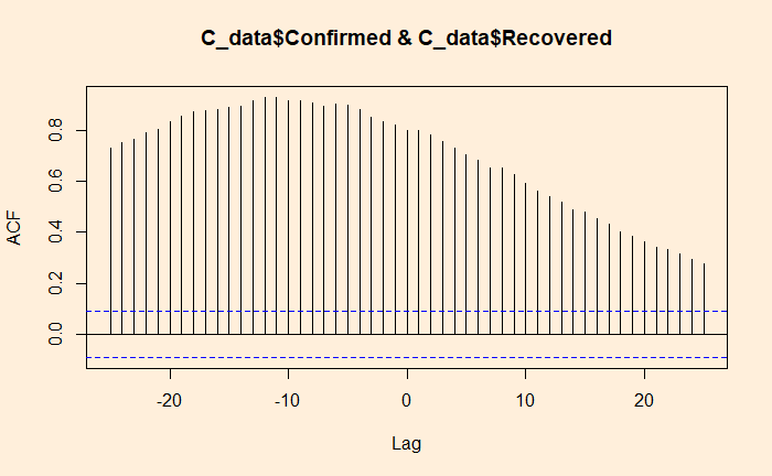
‘ccf’ function of ‘stats’ library is similar to ‘acf’ we used for the autocorrelation. Here is the cross-collation between the infected and the recovered.
ccf(C_data$Confirmed, C_data$Recovered, 25)
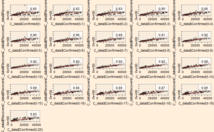
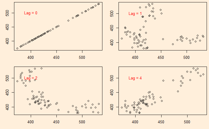
The ‘lag2.plot’ function of the ‘astsa’ library presents the same information differently.
lag2.plot(C_data$Confirmed, C_data$Recovered, 20)
The correlation peaked at a lag of about 12 days, which may be interpreted as the recovery time from the disease. On the other hand, the infected vs deceased gives a slightly higher lag at the maximum correlation.
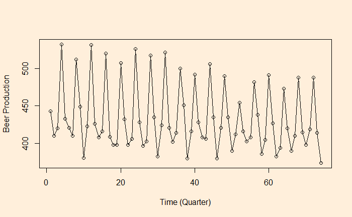
We continue from the Aus beer production data set. In the last post, we manually built scatter plots at a few lags (lag = 0, 1, 2, and 4) and introduced the ‘acf’ function.
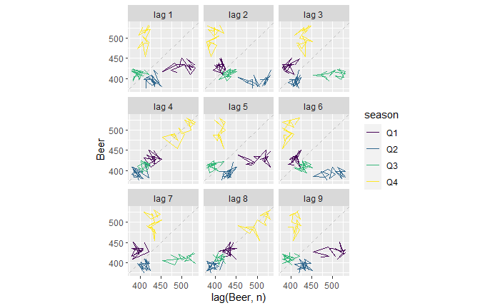
There is another R function, ‘gg_lag’, which can be an even better illustration.
new_production %>% gg_lag(Beer)
For example, the lag = 1 plot (top left). The yellow cluster represents the plot of Q4 on the Y-axis against Q3 of the same year on the X-axis. On the other hand, the purple cluster represents the plot of Q1 on the Y-axis against Q4 of the previous year on the X-axis.
Similarly, for the lag = 2 plot (top middle), The yellow represents the plot of Q4 against Q2 (two quarters earlier) of the same year. The purple represents the plot of Q1 against Q3 of the previous year.
The lag = 4 plot shows a strong positive correlation (everyone on the diagonal line). This is not surprising; it plots Q4 of one year against Q4 of the previous year, Q1 of one year with Q1 of the previous year, etc.
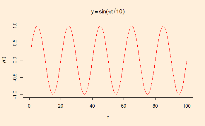
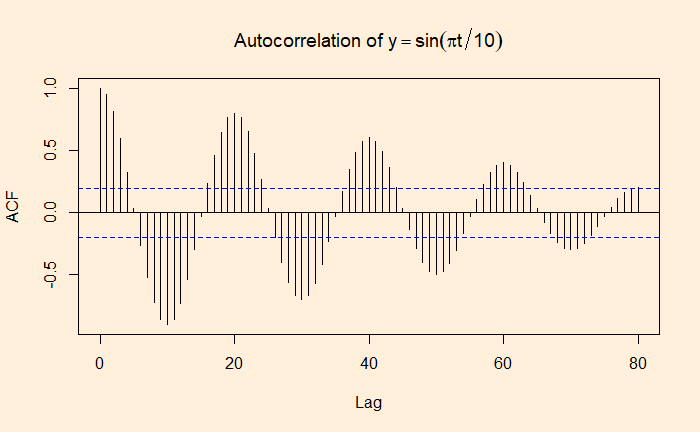
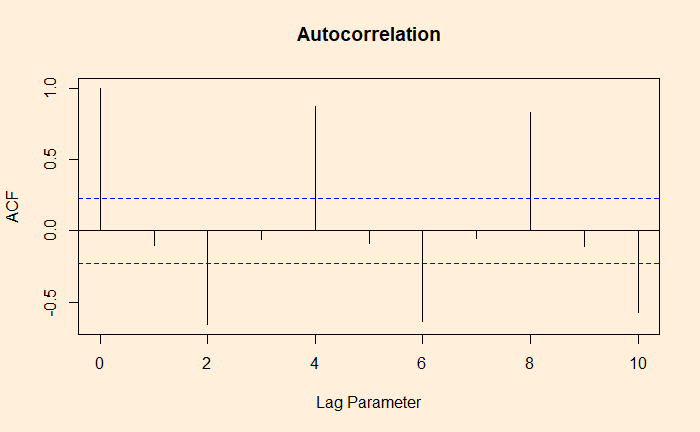
As we have seen, autocorrelation is the correlation of a variable in a time series with itself but at a time lag. For example, how are the variables at time ts correlated to the t-1s? We will use the aus_production dataset from the R library ‘fpp3’ to illustrate the concept of autocorrelation.
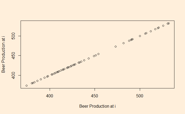
Let’s plot the production data with itself without any lag in time.
plot(B_data, B_data, xlab = "Beer Production at i", ylab = "Beer Production at i")
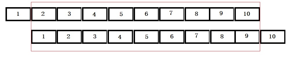
There is no surprise here; the data is in perfect correlation. In the next step, we will give a lag of one time interval, i.e., a plot of (2,1), (3,2), (4,3), etc. The easiest way to achieve this is to remove the first element of the vector and plot against the vector with the last element removed.
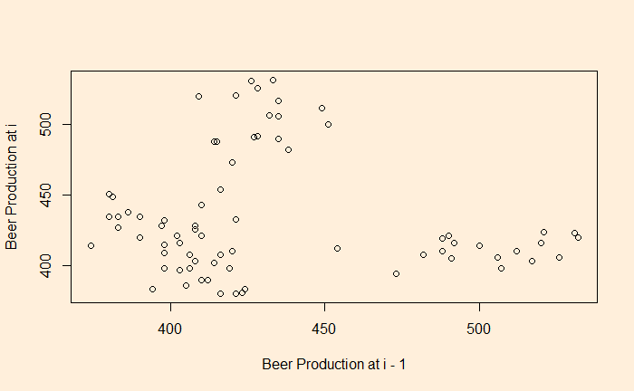
plot(B_data[-1], B_data[-n], xlab = "Beer Production at i - 1", ylab = "Beer Production at i")
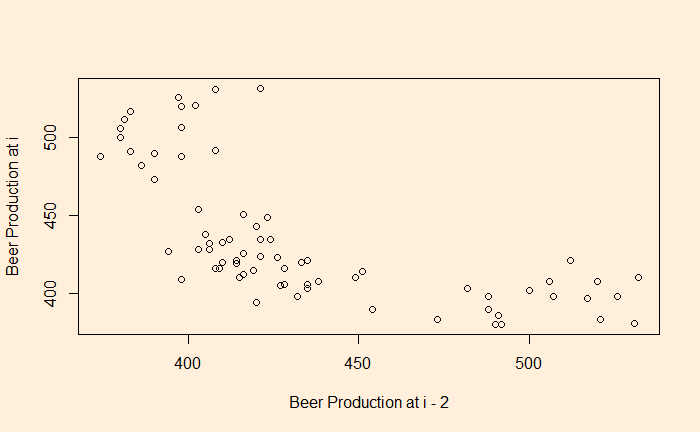
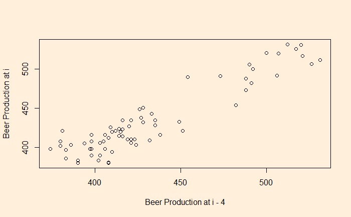
You clearly see a lack of correlation. What about a plot with a lag of 2 and 4?
There is a negative correlation compared with the time series 2 quarters ago.
There is a good correlation compared with the time series 4 quarters ago.
The whole process is established using the autocorrelation function (ACF).
ACF at large parameter 1 indicates how successive values of beer production relate to each other, 2 indicates how production two periods apart relate to each other, etc.
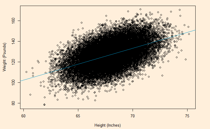
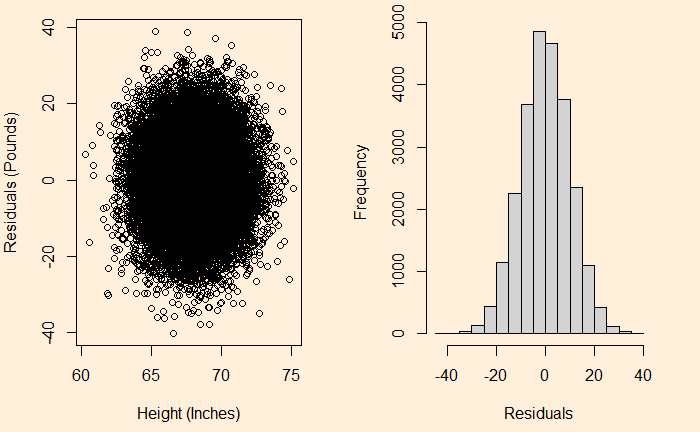
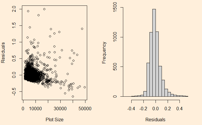
We have seen it before; the residuals in linear regression must be random and independent. It also means that the residuals are scattered around a mean with constant variance. This is known as homoscedasticity. When that is violated, it’s heteroscedasticity.
Here is the (simulated) height weight data from the UCLA statistics, with the regression line.
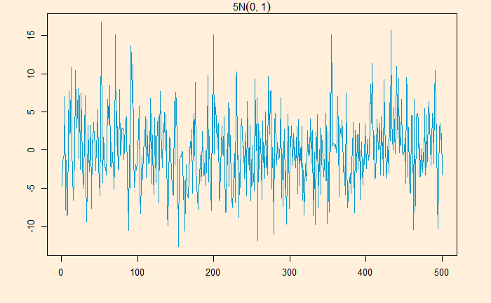
White noise is a series that contains a collection of uncorrelated random variables. The following is a time series of Gaussian white noise generated as:
W_data <- 5*rnorm(500,0,1)
The series has zero mean and a finite variance.
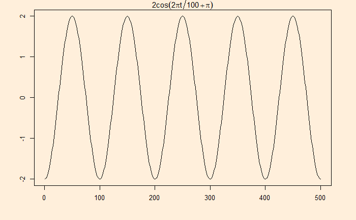
Signal with noise
Many real-life signals are composed of periodic signals contaminated by noise, such as the one shown above. Here is a periodic signal given by 2cos(2pi*t/100 + pi)
Data from a television production company suggests that 10% of their shows are blockbuster hits, 15% are moderate success, 50% do break even, and 25% lose money. Production managers select new shows based on how they fare in pilot episodes. The company has seen 95% of the blockbusters, 70% of moderate, 60% of breakeven and 20% of losers receive positive feedback.
Given the background, 1) How likely is a new pilot to get positive feedback? 2) What is the probability that a new series will be a blockbuster if the pilot gets positive feedback?
The first step is to list down all the marginal probabilities as given in the background.
Pilot
Outcome
Total
Positive
Negative
Huge Success
0.10
Moderate
0.15
Break Even
0.50
Loser
0.25
Total
1.0
The next step is to estimate the joint probabilities of pilot success in each category. 95% of blockbusters get positive feedback = 0.95 x 0.1 = 0.095. Let’s fill the respective cells with joint probabilities.
Pilot
Outcome
Total
Positive
Negative
Huge Success
0.095
0.005
0.10
Moderate
0.105
0.045
0.15
Break Even
0.30
0.20
0.50
Loser
0.05
0.20
0.25
Total
0.55
0.45
1.0
The rest is straightforward. The answer to the first question: the chance of positive feedback = sum of all probabilities under positive = 0.55 or 55%. The second quesiton is P(success|positive) = 0.095/0.55 = 0.17 = 17%
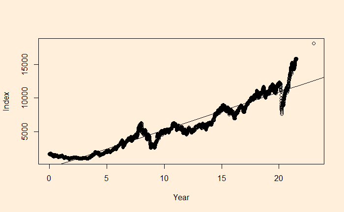
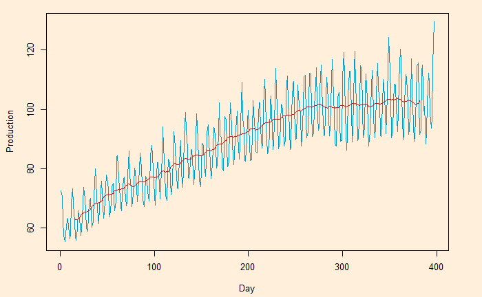
Here, we plot the daily electricity production data that was used in the last post.
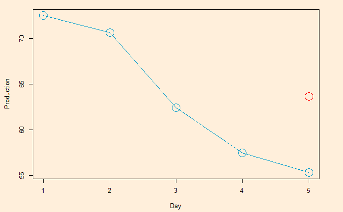
Following is the R code, which uses the filter function for building the 2-sided moving average. The subsequent plot represents the method on the first five points (the red circle represents the centred average of the first five points).
Moving averages and means to smoothen noisy (time series) data, unearthing the underlying trends. The process is also known as filtering the data.
Moving averages (MA) are a series of averages estimated on a pre-defined number of consecutive data. For example, MA5 contains the set of all the averages of 5 successive members of the original series. The following relationship represents how a centred or two-sided moving average is estimated.
MA5 = (Xt-2 + Xt-1 + Xt + Xt+1 + Xt+2)/5
‘t’ represents the time at which the moving average is estimated. t-1 is the observation just before t, and t+1 means one observation immediately after t. To illustrate the concept, we develop the following table representing consecutive 10 points (electric signals) in a dataset.
Date
Signal
1
72.5052
2
70.6720
3
62.4502
4
57.4714
5
55.3151
6
58.0904
7
62.6202
8
63.2485
9
60.5846
10
56.3154
The centred MA starts from point 3 (the midpoint of 1, 2, 3, 4, 5). The value at 3 is the mean of the first five points (72.5052 + 70.6720 + 62.4502 + 57.4714 + 55.3151) /5 = 63.68278.
Date
Signal
Average
1
72.5052
2
70.6720
3
62.4502
63.68278
4
57.4714
5
55.3151
6
58.0904
7
62.6202
8
63.2485
9
60.5846
10
56.3154
This process is continued – MA on point 4 is the mean of points 2, 3, 4, 5 and 6, etc.
Date
Signal
MA
1
72.5052
2
70.6720
3
62.4502
63.68278 [1-5]
4
57.4714
60.79982 [2-6]
5
55.3151
59.18946 [3-7]
6
58.0904
59.34912 [4-8]
7
62.6202
59.97176 [5-9]
8
63.2485
60.17182 [6-10]
9
60.5846
10
56.3154
The one-sided moving average is different. It estimates MA at the end of the interval. MA5 = (Xt-4 + Xt-3 + Xt-2 + Xt-1 + Xt)/5
Date
Signal
MA
1
72.5052
2
70.6720
3
62.4502
4
57.4714
5
55.3151
63.68278 [1-5]
6
58.0904
60.79982 [2-6]
7
62.6202
59.18946 [3-7]
8
63.2485
59.34912 [4-8]
9
60.5846
59.97176 [5-9]
10
56.3154
60.17182 [6-10]
We will look at the impact of moving averages in the next post.