Climate

Loss and Damage and COP27

The 27th session of the Conference of the Parties (COP27) has just concluded this morning at the Sharm El-Sheikh (Egypt) Climate Change Conference with the signing of what’s proclaimed a landmark deal, the endorsement of the “loss and damage” fund.

Governments took the ground-breaking decision to establish new funding arrangements, as well as a dedicated fund, to assist developing countries in responding to loss and damage. Governments also agreed to establish a ‘transitional committee’ to make recommendations on how to operationalize both the new funding arrangements and the fund at COP28 next year. The first meeting of the transitional committee is expected to take place before the end of March 2023.

UN Climate Press Release:

From COP 19

“Acknowledging the contribution of adaptation and risk management strategies towards addressing loss and damage associated with climate change impacts”

FCCC/CP/2013/10/Add.1: Decision 2/CP.19

Although the term, loss and damage, came inside COP books in 2013 at the COP17 in Warsaw, Poland, the push for a suitable compensation mechanism supporting vulnerable countries to endure the cost of climate change, which is predominantly inflicted by a few industrialised countries, has a long history. As per Wiki, AOSIS proposed an insurance pool as early as 1991 when United Nations Framework Convention on Climate Change (UNFCCC) was in the process of setting up.

Reference

COP27: UNFCCC

COP19 Reports: UNFCCC

Loss and damage: Wiki

Loss and Damage and COP27 Read More »

Jevons Paradox

Jevons paradox is a term associated with behavioural economics in which one, often a policymaker, expects a substantial decrease in energy consumption by replacing a lower efficiency unit with a higher one, instead finding only a marginal drop, or worse, an increase. It is also sometimes called the rebound effect.

Mexico’s C4C program

An example is a study by Davis et al. on the Cash for Coolers (C4C) program that ran in Mexico. C4C was a large-scale replacement program started in 2009 that helped ca. 1.5 million households to replace old refrigerators and air coolers with new energy-efficient (> 5% from the 2002 standard) ones. In return, the household can get up to $185 in subsidies.

A World Bank study, for example, estimated a savings of 481 kWh/y from the change out of refrigerators. In reality, Davis’ study found that the real benefit was about 11 kWh per month which translated to 11 x 12 = 132 kW/y, just over a quarter of what was originally envisaged.

Increased consumption from coolers

The air conditioner story was even more dramatic. After the substitution with the more energy-efficient ones, the overall energy consumption increased!

There can be different explanations for what happened. But one thing is clear – the implementor had made inaccurate assumptions about consumer behaviour. It is possible that in the process, the household got a chance to turn in some of the old, unused appliances in return for a subsidised new one.

Jevons Paradox Read More »

Narwhal Curve

The Narwhal curve shows the gap between the actual progress (for the US) on renewables and what it takes to get under 2 oC. It is called Narwhal as the shape of the graph resembles the toothed whale. The term is associated with Professor Leah Stokes, who plotted the progress of the top two emitters (electricity and transportation) to become carbon-free in the US until now (about 1- 2% growth rate) to the rate that is required to meet the target of carbon-free electricity and transportation by 2035, which is more than 10%.

narwhal, whale, fish-153618.jpg

Narwhal Curve Read More »

Solar Power and Capacity Factor

Solar Photo Voltaic (PV) is the most direct pathway for converting solar energy to use, say, electricity. While sunlight is available everywhere, they don’t fall at the same rate in different parts of the world, in different months of the year. The rates are described as irradiance or the energy that hits a unit area every second (W/m2).

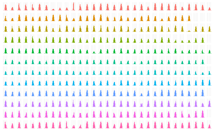
The following plot presents annual sunlight in one such location in Australia – irradiance against the hours of the day.

The plot also demonstrates one of the cool functions of R, factet_grid in ggplot. The code is presented below.

sol_plot <- sol_data %>% ggplot(aes(x = Time, y = Irradiance, colour = factor(Month)))+
  geom_bar(aes(), stat="identity", width=.5) + 
  facet_grid(Month~Day) + 

theme(strip.background = element_blank(), strip.text = element_blank(), axis.title.x = element_blank(), axis.title.y = element_blank(), axis.ticks.x = element_blank(), axis.text.x = element_blank(), axis.ticks.y = element_blank(), axis.text.y = element_blank())  + 
theme(legend.position="none")

sol_plot

The capacity factor is one handy parameter to remember while estimating the solar energy potential of a place. It is the actual amount of energy obtained (in MWh) in an average hour of the year if you install a one MW plant. You can get it by dividing the actual electricity output by the maximum possible output. The number typically varies between 10% – 30%.

Solar Power and Capacity Factor Read More »

Distributional Impacts and Net Energy Metering

While the entry of solar PV into the electricity mix has enabled the system to reduce carbon intensity, it created a new category known as distributed energy resources (DER). It became a complex problem for regulators as, on the one hand, they try to influence its adoption to customers by favourable discounts. But on the other hand, sometimes, it creates strange consequences for the non-adopters of DER.

Net metering is one of the mechanisms to incentivise adopters of (rooftop) solar PV. Burger et al. report a study on the topic in their working paper titled “Quantifying The Distributional Impacts of Rooftop Solar PV Adoption Under Net Energy Metering”. They used data on electricity consumption and income characteristics of 100,170 customers in Chicago, Illinois, which followed the net metering under default tariff.

The net metering scheme enables rooftop PV owners to push the unused electricity into the grid, and for every kWh, they receive the retail price. The question arises, what amount of money should one get back? Ideally, the sender should get the generation cost (energy cost) for every unit send. But it turned out that in the scheme that was in place, customers not only gained the generation cost but also part of the transmission and distribution costs! It happened because the latter were charged not as fixed prices but as volumetric charges (charges proportional to the energy consumed, kWh)!

And who are the adopters of rooftop PV? In the income scale, they were disproportionately more families of the higher income bracket. And naturally, this means when the grid owner recovers their fixed costs, they will charge more from the non-adopters, who are lower income classes, through volumetric charges.

Ironically, perhaps unaware of the underlying economics, the environmental groups also advocate for such schemes to continue in pursuit of increasing renewable penetration.

Distributional Impacts and Net Energy Metering Read More »

Emission Scopes – What They Say

The 2022 report of the Corporate Climate Responsibility Monitor assesses the latest status of 25 world-leading companies for their commitment to net-zero and actual performance.

The selected 25 reported combined revenue of USD 3.18 trillion, or 10% of the world’s top 500, in 2020. Their footprint (self-reported) added up to 2.7 GtCO2e/y; about 5% of the global.

The researchers looked at the ratings from CDP (the Carbon Disclosure Project) on transparency and 1.5°C-ratings from the Science Based Targets initiative (SBTi) on integrity. The notable finding from the report is the gulf between the target as they advertise and what they could achieve based on their actions so far.

Scope 3 emissions account for about 87% of the selected companies. And only about 8 of them had a reasonable plan to address emissions. One such credibility challenge is how companies plan to achieve carbon neutrality. The study raises its criticism over the (over) use of offset and nature-based solutions as the main strategies versus a plan for the absolute reduction of CO2 from activities.

Corporate Climate Responsibility Monitor

Emission Scopes – What They Say Read More »

Emission Scopes – Industries

Emissions accounting forms a pillar in the benchmarking of the industrial decarbonisation process. We have seen last time the categorisation (the scopes) of emissions. The relative contributions to these scopes vary from industry to industry. Today we discuss some of these variations based on the 2022 report published by the World Economic Forum.

The industrial sector accounts for about 30% of today’s global carbon emissions (excluding scope 3 emissions). Six sectors – oil, natural gas, steel, cement, aluminium and ammonia – take 80% of the share (without scope 3). The proportions of scopes 1, 2 and 3 of these sections are.

SectorScope 1
(Gt CO2e)
Scope 2
(Gt CO2e)
Scope 3
(Gt CO2e)
Oil3.212.3
NG2.17.6
Steel2.61.10.7
Cement2.40.20.8
Aluminimum1.080.03
Ammonia0.450.040.8

GHG Protocols

US EPA

World Economic Forum

Emission Scopes – Industries Read More »

Emission Scopes

We have seen how much is planet’s carbon budget and terms such as net-zero emissions to stay within the limit. These are as fine as targets. But how do we reach there, and how do we know we are on track? Answering these questions requires accounting.

One such thing is the standards defined by the greenhouse gas protocol. They provide the framework for businesses, governments and other entities. For companies, these led to the creation of scopes, which captures their direct and indirect emissions and the ones related to the supply chain.

Take an example of an oil and gas company. There are three scopes for the emissions. Scope 1 means the emissions related to the direct emissions from their operations, e.g., CO2 from the refinery, chemical plant or petroleum production. Scope 2 emissions are mainly the indirect emissions related to the energy they buy to run the operations, such as electricity, steam and heat. And finally, scope 3 happens when the customers burn the products they sell – petrol, diesel or kerosene.

GHG Protocols

US EPA

Emission Scopes Read More »

Duck Curve – The Villain in the Renewable Drama

The hundredfold reduction of solar energy cost is nothing short of magic. To summarise the recipe in one sentence: the US developed technology, Germany created the market, and China just made it! So the question is: if solar is so cheap (cheaper than almost any other technology), why don’t we rely on solar and dump other dirtier ones? It only works when it is sunny, and the electricity demand is not always when it is sunny! It only works when it’s sunny, and the electricity demand goes with a logic of its own, often conflicting with the sunlight.

The duck that you see above has a lot of consequences. The plot indicates the requirement for traditional power generation to start operating in the evening time to manage the peak demand. But the economics is not that simple. Traditional power plants are typically more expensive and can’t make money by only producing in the evening and night. Secondly, the plants can have limitations in ramping up production so fast. These two limitations force the plants to run all day at some capacity leading to the renewable power plans to left unused. This waste (potential) power is called curtailment.

One way to manage is by storing electricity. But that comes with a cost, reducing the cost advantage created by solar significantly. Another way is to have common grids connecting multiple time zones and countries.

Reference

California duck curve: IEA

Demand trend California: CAISO

Duck Curve – The Villain in the Renewable Drama Read More »

California Duck Curve

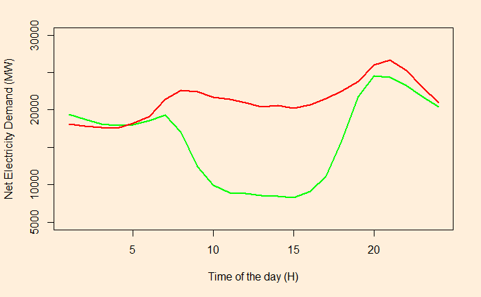
It is the demand curve for electricity net of solar output throughout the day.

The red line describes the demand in 2014 and the green in 2019.

If PV generates more energy than demand – called over-generation – curtailment may happen to the electricity (not stored for future use).

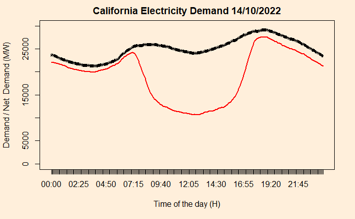
The red line represents the net demand (System demand minus wind and solar), and the black is the system demand.

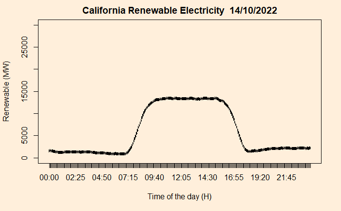
So subtracting the net demand from the total, one can get a decent shape of renewable energy in the Californian electricity market.

Needless to say, solar dominates.

Reference

California duck curve: IEA

Demand trend California: CAISO

California Duck Curve Read More »