Climate

McKinsey Curve

McKinsey curve is a global mapping of opportunities that can reduce GHG emissions and is quite influential among policymakers. These are GHG abatement curves estimated at a future period for different countries. Following is an illustration of how they appear (for getting the actual curves, follow the link in the reference).

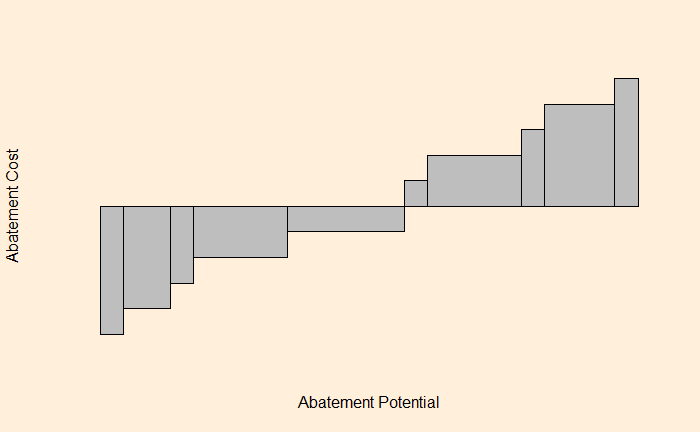
For an economist, it is a supply curve or the map of the marginal cost of making the marginal unit. Or the cost of reducing that last ton of greenhouse gas emissions. And each block represents one item – residential lighting, cellulosic biofuel, onshore wind, and coal power plant with CCS, to name a few.

Take one block, say the residential lighting: its width represents how many fewer greenhouse gas emissions we would have if we optimize the residential lighting system. The height is how much would that cost ($/ton CO2) to the households. If it is negative, it suggests the family gains money.

Most items on the negative side (the left side) are related to energy efficiency. And, by the definition of efficient markets, should happen by default, like changing CFL lamps with LED. But it’s a different matter altogether that these don’t always happen that way. But what is the idea of getting everything done on the list? From an economist’s standpoint, add a carbon tax larger than the height of the highest block on the right side. It becomes cheaper to perform abatement in that sector than pay taxes.

Reference

McKinsey Curve

McKinsey Curve Read More »

The Elevator Paradox

The elevator problem is an observation reported by physicists Marvin Stern and George Gamow. They observed that someone who waits for an elevator (to go down) at one of the top floors (not the topmost) is more likely to see the first elevator that stops at the floor going up.

Imagine the building has 20 floors, and the person who wants to go down has her office on the 19th. The elevator is in constant flight, and it takes 1 second to cover one floor. Let’s write down a hypothetical journey.

FloorUpDown
205:00:38
195:00:374:59:59; 5:00:39
18365:00; 40
173501
163402
153303
143204
133105
123006
112907
102808
92709
82610
72511
62412
52313
42214
32115
22016
11917
05:00:1818

Everyone who comes between 5:00 and 5:00:37 sees the elevator going up (at 5:00:37) and only the people who reached floor 19 at 5:00:38 and 5:00:39 miss that (and only see it comes down from floor 20).

The Elevator Paradox Read More »

Earthquakes – Where Do They Occur?

We saw the empirical rule – Gutenberg-Richter relationship – in the last post. Today, we use the wealth of data from the ANSS Composite Catalog to demonstrate a super cool feature of R – the mapview(). To remind you, this is how the data frame appears.

Now, let’s ask: where did the biggest, say, 9 and above magnitude quakes occur? To answer that, we need two packages, “sf” and “mapview”.

library(sf)
library(mapview)

Then run the following commands,

quake_data_big <- quake_data %>% filter(Magnitude >= 9)
mapview(quake_data_big, xcol = "Longitude", ycol = "Latitude", crs = 4269, grid = FALSE)

And then magic happens,

extending it further, i.e., magnitude 8 and above,

And greater than 7

Earthquakes – Where Do They Occur? Read More »

Gutenberg-Richter Relationship

Charles Francis Richter and Beno Gutenberg, in 1944, found some interesting empirical statistics about earthquakes. It was about how the magnitude of earthquakes related to their frequencies. Today, we revisit the topics using data downloaded from ANSS Composite Catalog (364,368 data from 1900 – 2012).

A histogram of the magnitude is below.

The next step is to generate annual frequency from this. Since the data is from 1900-2012, we will divide the frequency by 112 to get the desired parameter. The following R codes provide the steps till the plot is generated. Note that the Y-axis is in the log scale.

quake_data <- read.csv("./earth_quake.csv")
hist_quake <- hist(quake_data$Magnitude, breaks = 50)
plot(hist_quake$mids, (hist_quake$counts/112), log='y', ylim = c(0.001,1000), xlab = "Magnitude", ylab = "Annual frequency")

Add an extra line to make a linear fit.

abline(lm(log10(hist_quake$counts/112) ~ hist_quake$mids), col = "red", lty = 2, lwd = 3)

Gutenberg-Richter Relationship Read More »

What Happened in Fukushima

The nuclear event in Fukushima started with the Tohuku earthquake and the subsequent tsunami in 2011. It was interesting to notice that employing a probabilistic risk assessment (PRA) would have resulted in a decent chance for station backout due to tsunami (5%) and should have been factored into the decision-making process. Now let’s look at the technical details of what happened.

What happened?
The tsunami of 2011 resulted in the flooding of the low-lying blocks of the reactor buildings, and that caused system backout (main and electrical power and the Emergency diesel generators). This contributed to a lack of cooling and, thereby, the reactor melting. The cladding material of the fule rode is made of Zirconium (Zr), and at elevated temperatures, Zr reacted with water leading to the production of hydrogen and explosions. The end result was damage to the fuel core and a release of fission products, including the radioactive I and Cs.

What Happened in Fukushima Read More »

En-ROADS to Afforestation

Let’s run another popular choice for CO2 removal – aforestation or planting trees. In this scenario,100% of the available land is used for afforestation.

Now, compare that with a highly reduced rate of deforestation.

The outcome is the same – a very marginal reduction of temperature rise.

It takes time for trees to grow

The key reason for the aforestation failure is the time it takes for the trees to grow. The time till 2100 is less than 80 years, and an 80-year-old tree is still young!

References

The Paris Agreement: UNFCCC

EN-ROADS: Climate Interactive

En-ROADS to Afforestation Read More »

Carbon Price – Carbon Contracts for Difference

We saw last time in the En-ROADS simulation results the power of carbon price to make a difference in the decarbonisation pursuit. From the results, you can see what a carbon price of 200 $/tone of CO2 can do to the energy mix:

At that price, a whole set of renewable investment options is available to an investor. And only after such investment does the change happen. But that is not enough for someone to set billions of dollars in renewable projects. The magic word is uncertain. How could an investor trust the carbon price at a future date to be true? What happens if the governments backtrack from today’s commitments or remove schemes (say, cap and trade) altogether? So the political uncertainty for an investor is too high to depend on the carbon price.

CCFD – the hedge against uncertainty

One way to reduce the uncertainty and encourage investments in clean energy is a carbon contract for difference (CCFD). CCFD is the commitment by the government to pay out to companies a specified amount of money in case there is a difference between the expected and the actual.

References

The Paris Agreement: UNFCCC

EN-ROADS: Climate Interactive

Carbon Price – Carbon Contracts for Difference Read More »

En-ROADS to Carbon Price

We will use En-ROADS to simulate the impact of the carbon price on climate goals. First, we switch off the efficiency buttons from the previous runs. And set the carbon price to 100 $/tone CO2.

It would be interesting to see how the price impacted the energy mix.

As you can see, the market turned away from Coal in favour of more renewables. We now raise the price to 200 $/tone CO2.

References

The Paris Agreement: UNFCCC

EN-ROADS: Climate Interactive

En-ROADS to Carbon Price Read More »

En-ROADS to Efficiency

We saw En-ROADS last time as a tool to simulate the impact of steps we can/should to en route to a decarbonised future. Now, we simulate scenarios, starting with energy efficiency.

The silver bullet?

There is a reason to start with this. A lot of people (policymakers) think energy efficiency offers huge opportunities in the journey of decarbonisation, and it comes at zero cost (or even at negative cost)! I suspect the famous McKinsey curve has something to do with this belief. I suspect the famous McKinsey curve has something to do with this belief. But let’s test the hypothesis.

Simulation results

First, the baseline: we have seen before that if we maintain the status quo, we end up with a temperature rise of +3.6 oC compared to the pre-industrialised levels. We do run the model in two steps. First, we make set maximum efficiency changes (transport and building) at the current volume of electrification, i.e. no growth.

The underlying assumptions for this simulation are a growth rate of 5% per year from 2023 and a 5% rate for buildings and industries (new and retrofitted).

Now, switch on electrification to the mix. Here we added 100% electrification of new transport (rail and road) and buildings from 2023, which we know, can not be true!

So, what are we seeing? Even at extremely optimistic rates of energy efficiency and electrification rates, we will miss the climate goal of 2100. Building electrification also causes an increase in energy costs in the medium term.

Ignoring building electrification still makes most of the results (+2.9 oC) at no cost. The question now is: here is an option (improving efficiency) that can still make a good stride towards decarbonised work at no cost, but not realised. From an economic standpoint, this doesn’t make sense – a market failure.

References

The Paris Agreement: UNFCCC

EN-ROADS: Climate Interactive

En-ROADS to Efficiency Read More »

En-ROADS to Climate Goal

Limiting “global warming to well below 2, preferably to 1.5 oC, compared to pre-industrial levels”, is the main objective of the Paris agreement, which is a legally binding international treaty on climate change. However formidable the goal might appear, there are pathways to achieve it with the help of deploying appropriate technologies and policies.

We introduce En-ROADS, the online climate simulation tool developed by Climate Interactive, Ventana Systems, UML Climate Change Initiative, and MIT Sloan, to create the results from various scenarios. The simulator provides a set of outputs, such as the temperature increase by 2100, CO2 emissions, cost of energy, sea level rise, and about 100 others from a selection of inputs that include 1) energy efficiency and electrification, 2) growth, 3) land use, 4) carbon capture technologies, and 5) Carbon pricing and other policies.

The screenshot of the interface provided below shows how the interactive lets the user handle some serious physics and math of climate change as child’s play and free of charge!

References

The Paris Agreement: UNFCCC

EN-ROADS: Climate Interactive

En-ROADS to Climate Goal Read More »