Bouquets and Brickbats

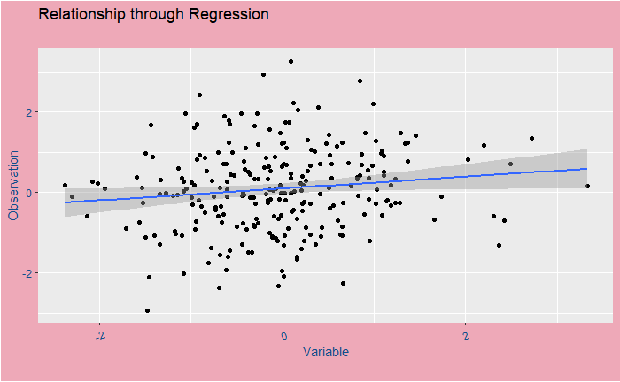
Regression to mean misleads a lot of us. We have seen the concept of regression before. In simple language: most of our superlative achievements and miserable falls are statistical, although you may like to credit them to your superior skillset or discredit to utmost stupidity. With statistical, I did not mean sheer luck but something milder; more like, ‘perhaps unexpected, but not improbable‘.

In flight training, the experienced trainers think that praise after an incredibly smooth landing follows a poor landing, and harsh criticism after a poor landing leads to improvement. They believe in this because 1) it fits with some old-generation stereotypes, 2) that’s what they see (but how often?) or 3) memories of such instances persist longer.

Regression to mean suggests that an above-the-average data point has more chance to be succeeded by something lower-than-the-average. Well, is that not why something called an average exists? Look at this problem differently. What is the probability that a given performance is outstanding? It has to be less than one and likely closer to zero; else, the dictionary meaning of the word outstanding will require a new definition. Having one such incident occurred, what is the chance of one more such event (or even rarer) to occur? It will be a product of two fractions, and the resulting number will be even smaller.

What happened here is a failure to understand how probability and regression work. So next time, if Lebron’s son doesn’t become a first-round pick, don’t blame the chap. What happened to him was normal, whereas what occurred to his father was rare!

Tversky, A.; Kahneman, D., Science, 1974 (185), Issue 4157, 1124-1131

Bouquets and Brickbats Read More »

The Confound of Nature Versus Nurture

The outcome of the debate of nature versus nurture is a foregone conclusion. It confused people in the past, but we now know that the problem is an example of confounding. Vaci et al. have published a paper in 2019 in a longitudinal study tracking chess players throughout their careers. And the results showed the importance of numerical intelligence and deliberate practice to master and retain chess skills. Nonlinear interactions between the two suggest that intelligent people benefit more from practice.

The work looked at 90 chess players across their careers – the Elo rating and the number of tournament games played. Three levels of intelligence – verbal, figural and numerical – were followed but found that the numerical has the highest correlation to the performance.

The nonlinearity of behaviour means people of different ages climbed up the rating ladder differently. For 20-year olds, players with an IQ of 120 benefited more from the same amount of practice than ones with IQs of 100 at lower practice regimes. At that stage, more practice of both groups reduced the gap between their performances. At the very high levels of practice, the higher intelligent folks started deviating from others for better performance. The behaviour is represented in the schematic below.

The joint influence of intelligence and practice on skill development throughout the life span: PNAS

The Confound of Nature Versus Nurture Read More »

Climate Goals and Sustainability Goals

2015 was a landmark year for international policymaking. The year started with the United Nations Sustainable Development Goals (SDG) and ended with the climate goals, known as the Paris Agreement.

While 17 goals constitute the SDG, we focus on the first one i.e., No poverty in all its forms everywhere. Extreme poverty per the international poverty line (IPL) stands at USD 1.90/day. The World Bank presented two additional levels at USD 3.20/day and USD 5.50/day. It means getting people out of these should be the priority of the rest of us.

Contradicting goals

At first sight, you may find a contradiction between these two goals. It is well known that carbon dioxide emissions increase with wealth (consumption), and targetting SDG1 flags an inconvenient truth of raising it further.

Asymmetry in emissions

A paper published last week (14/Feb/2022) in Nature Sustainability addresses this problem. The work computes the potential CO2 emissions due to the upliftment of masses from absolute poverty and proves that the increase is negligible in comparison with the total. The reason lies in the asymmetry of emissions between the rich and the poor. Let’s understand the math behind the claims.

In 2017, 9.2% of the global population lived in extreme poverty of less than USD 1.90/day, and their average footprint is 0.4 tCO2 (per person per year). Another 14.9% live between 1.90 and 3.2 USD/day. They contribute around 0.6 tCO2. The last batch includes about 19.5% of people who live between 3.2 and 5.5 USD/day and at 0.9 tCO2/person/year. To put these numbers in perspective, see the following:

CO2 Footprint
(tCO2/person/yr)
Global Average4.5
US Average14.5
top 10% US54.9
Europe Average6.3

Imagine we aim to lift the people in 1.90 (0.74 Billion) and 3.2 (1.2 Billion) USD/day bracket to 5.5 (1.6 Billion). It would mean 3.5 billion people in the USD 5.5 per day category with an average footprint of 0.9 tCO2. So the current emissions from the 3.5 billion = 0.74 * 0.4 + 1.2 * 0.6 + 1.6 * 0.9 = 2.46 GtCO2/yr. The new emissions (after 1.9 and 3.2 are raised above the 5.5 mark) = 0.74 * 0.9 + 1.2 * 0.9 + 1.6 * 0.9 = 3.19 GtCO2/yr. The difference = 3.19 – 2.46= 0.73 GtCO2/yr. The additional emissions, 0.73 is about 2% of the current global emission of 36 GtCO2/yr. And they live in India, China, Sub-Saharan Africa and South and Southeast Asia.

Impacts of poverty alleviation on national and global carbon emissions: Nature Sustainability
Extreme poverty trends: World bank blogs
UNSDG
Paris Agreement: UNFCC

Climate Goals and Sustainability Goals Read More »

420 Remaining in the Bank

Here is an update on the global carbon dioxide (CO2) situation. If you need a background on the topic, you may go to my previous posts on this topic. The world needs to restrict the average temperature rise, from the pre-industrial level, to below 1.5 oC to avert catastrophic climate changes. For simplicity, take 1850 as the start of the counting. 1.5 oC corresponds to a median concentration of CO2 of about 507 ppm (parts per million) in the atmosphere (425-785 ppm at 95% confidence range).

From these numbers, one can estimate the quantity of CO2 we could throw into the atmosphere before it crosses the critical concentration. The maximum remaining quantity of CO2 is known as the Carbon Budget.

Now the numbers: Based on the latest estimate at the beginning of 2022,

ItemQuantityUnit
Carbon Budget420GtCO2
CO2 Concentration414.7ppm
Global anthropogenic CO2 emissions
(2021)
39.4GtCO2
Global fossil CO2 emissions
(2021)
36.4GtCO2
Gt = Gigatonne = billion tonnes; anthropogenic = originating from human activity; 39.4-364. = 3GtCO2 comes from land usage

Spending Wisely

At the current rate, the budget will be over by 2032! There is a resolution from the global fraternity to reduce the net CO2 emission to zero by 2050. If we trust that commitment, one can draw spending scenarios to reach the target. If we spend the remaining 420 Gt in equal chunks, we can do it by spending 15 Gt every year until 2050 and put a hard brake, which is not practical, given the present lifestyle of 36.4 Gt/yr. Another scenario is by reducing 8% every year. Notice that an 8% yearly reduction corresponds to halving every nine years. In other words, the spending in 2030 has to be half of what we did last year.

And How are we doing?

Nothing to cheer about (so far). The emission figures from the last three years have been:

YearTotal CO2 Emitted
(GtCO2)
at 8% reduction
(GtCO2)
201936.736.7
202034.833.8
202136.431

Since we know the real reason for the decline in 2020, the global shutdown due to pandemic, the 8% reduction remains a project without any evidence of progress.

CO2 at 1.5 oC: UK Met office
Carbon Budget Preliminary Data: ESSD

420 Remaining in the Bank Read More »

Regression to Mean and the Placement of Camera

What is an easy way to show that speed cameras reduce the number of accidents? Why are superstar children have a higher probability of not meeting their parent’s performance levels? Why do the popularities of movie-sequels dip compare to the originals?

There is a standard statistical phenomenon that connects the questions mentioned above. It is called regression to the mean. Regression is a process to establish a mathematical relationship between an observation and the variables that, we think, are responsible for the observation. In the mathematical language:

observation = deterministic model + residual error
By the way, the error does not mean a mistake but the sum of all random contributions (which was not explainable).

Regression to mean

The data points in the above plot represent a fictitious relationship between an observation and its variable. The blue line that passes through those points is the regression line or the best-fit line corresponding to a simple mathematical relation. In other words, following that line will tell you the expected value (mean) of the observation at any future value of the variable.

But the reality is the dots, all over the place but smoothly arranged around the line. Here is an important thing: if you see an observation above the line, the possibility for the next one to come below is high so that the average falls on the line. The opposite is true for an observation below the line.

Blockbusters and accidents

What is common to all those situations described in the beginning? One factor is that we selected extreme values, superstars, superhit moves. In other words, we tend to pick up only the points that are either lower or higher than the regression lines to draw comparisons. So, naturally, the next one (the children, luck, number of accidents, the height of people) has to come dramatically lower (if we talk about top events) or higher (if bottom events).

To end

The most suitable places to keep the speed cameras are the locations with the highest number of accidents because those are unlikely to retain their ranks even without cameras. Similarly, the likelihood of matching the pinnacle of success is small for the star personalities or the blockbuster movies considered for making a sequel.

Regression to Mean and the Placement of Camera Read More »

Expert’s Curse 3: Illusion of Objectivity

A study in 1977 ‘found’ that more than 90% of educators consider themselves above-average teachers. As per the study by Swedish psychologist Ola Svenson (1981), 88% of the Americans and 77% of the Swedes were in the ‘top half’ for driving safely. In another study conducted in 2017, experts agreed (71%) that cognitive bias is a concern in forensics, but only 26% thought that it affected their judgement!

The accounts mentioned above are examples of the illusion of objectivity. It arises from the belief that one understands the world better by their perceptions. You see a lot of it in politics, art and sports. Two prominent examples are the heavy influence of political partisanship in the actions of public policy experts and economics.

Expert sports analysts, especially those coming from the sports after retirement or those who regularly associate with the superstars, often lose their objectivity by being gravitated by the stardom. Remember those heated discussions between Steven A and Max Kellerman – the eternal tussle of adulation versus statistics?

[1] Patricia Cross, New Directions for Higher Education, 17, Spring 1977
[2] O. Svenson, Acta Psychologica 47 (1981) 143-148
[3] Kukucka et al., Journal of Applied Research in Memory and Cognition, 2017

Expert’s Curse 3: Illusion of Objectivity Read More »

Expert’s Curse 2: Intuition

Intuitive decision making, also known as naturalistic decision making (NDM), is often associated with experts. The scope of intuition ranges from the ultra-fast recollection of what was memorised before to simple gut feeling. It is essential, at this stage, to differentiate between intuition from heuristics (simple rules of thumb) and probabilistic estimation.

Firefighters and chess players are the favourite examples of the proponents of intuition. It is also a trait associated with people in creative fields. Grand master-level chess players can identify almost all the possible moves fast. Similarly, an experienced firefighter manoeuvres her actions effortlessly in times of crisis. A third example can be an F1 champion making an overtake and avoiding collision at 300 km/h speed! One thing common to all three experts is the number of hours they spend on practises. Let’s analyse these cases one by one.

A chess player or any other performing person, be in sports or arts, can not get help from a decision-making tool (e.g. a computer) during the act. So, irrespective of whether intuition is the best method or not, using the head remains the only option.

The firefighter does not have the time to perform a quantitative evaluation of each of the options she may have. Also, there is no guarantee that estimation is even possible in highly uncertain conditions. So they resort to recognising the patterns around them and applying the appropriate techniques from the hundreds they had encountered in their training and experience.

So intuition, that way, is restricted to those experts who have either no choice or no time. But for a doctor, a judge or a teacher, the situation is different. They have access to data, and support systems are available to collect and interpret more data. In such cases, more than their experience, the ability to avoid biases, acceptance of ignorance, and learner mindset are more valuable.

The final group include investment advisors, sports analysts and political commentators. They are experts who take pride in their experience and intuition. In reality, they work in fields filled with high levels of uncertainty, and, more often, their rates of success are no better than pure chances!

Daniel Kahneman and Gary Klein, “Conditions for intuitive expertise: a failure to disagree”, American Psychologist 64(6):515-26

Expert’s Curse 2: Intuition Read More »

Expert’s Curse 1: Base Rate Fallacy

The first one on the list is the base rate fallacy or base rate neglect. We have seen it before, and it is easier to understand the concept with the help of Bayes’ theorem.

P(H) in the above equation, the prior probability of my hypothesis on the event is the base rate. For the case study of doctors in the previous post, the problem starts when the patient presents a set of symptoms. Take the example of the case of UTI from the questionnaire:

Mr. Williams, a 65-year-old man, comes to the office for follow up of his osteoarthritis. He has noted foul-smelling urine and no pain or difficulty with urination. A urine dipstick shows trace blood. He has no particular preference for testing and wants your advice.

eAppendix 1.: Morgan DJ, Pineles L, Owczarzak, et al. Accuracy of Practitioner Estimates of Probability of Diagnosis Before and After Testing. Published online April 5, 2021. JAMA Internal Medicine. doi:10.1001/jamainternmed.2021.0269

The median estimate from the practitioners suggested that they guessed a one-in-four probability of UTI (ranging from 10% to 60%). In reality, based on historical data, such symptoms lead to less than one in a hundred!

Was it only the base rate?

I want to argue that the medical professionals made more than one error, i.e., base rate neglect. As evident from the answer to the last question, it could be a combination of two possible suspects—anchoring and the prosecutor’s fallacy. First, let’s look at the questions and answers.

A test to detect a disease for which prevalence is 1 out of 1000 has a sensitivity of 100% and specificity of 95%.

The median survey response was 95% post-test probability (in reality, 2%!) for a positive and 2% (in reality, 0) for a negative.

The prosecutor’s fallacy arises from the confusion between P(H|E) and P(E|H). In the present context, P(E|H), also called the sensitivity, was 100%, but the answers got anchored to 95% representing specificity. To understand what I just meant, look at the Bayes’ rule in a different form:

\\ \text{Chance of Disease after a +ve result} = \frac{Sensitivity *  Prevalence}{Sensitivity *  Prevalence + (1-Specificity)*(1- Prevalence)} \\ \\ \text{Chance of Disease after a -ve result} = \frac{(1- Sensitivity )*  Prevalence}{(1- Sensitivity )*  Prevalence + Specificity*(1 - Prevalence)}

So it is not a classical prosecutor’s case but more like getting hooked to 95%, irrespective of what it meant—it is more of a case of anchoring.

Expert’s Curse 1: Base Rate Fallacy Read More »

The Curse of Expertise 

Practitioners are experts. They could be medical practitioners, domain experts, lawyers and judges, leaders of organisations, sports persons-turned-pundits, to name a few. A lot of decision making rests on their shoulders, and the tool they often employ is experience. And experience is a double-edged sword! On the one hand, it makes them the most suitable people for the job, but on the other hand, they tend to ignore quantitative inference and rely on personal experience instead.

JAMA Internal Medicine collected responses from 723 practitioners from outpatient clinics in the US and published a paper in April 2021. The study aimed to estimate the understanding of risks and clinical decisions taken by medical practitioners. They included physicians and nurse practitioners. They were given a questionnaire to fill in the pretest and post-test probabilities of a set of illnesses. The requested post-test estimates included those after positive tests and negative tests.

The survey had five questions – four containing clinical scenarios (pneumonia, breast cancer, cardiac ischemia and UTI) and one hypothetical testing situation (a disease with 0.1% prevalence and test with 100% sensitivity and 95% specificity). The scientific evidence and the median responses are tabulated below:

Clinical
Scenario
Scientific
evidence
Estimate
Resident
physician
Estimate
attending
physician
Estimate
Nurse
practitioner
Pneumonia
pretest
probability
25-42808580
post-test
after +ve test
46-65959595
post-test
after – ve test
10-19605050
breast cancer
pretest
probability
0.2 – 0.35210
post-test
after +ve test
3 – 9605060
post-test
after – ve test
< 0.055110
cardiac ischemia
pretest
probability
1-4.410515
post-test
after +ve test
2-11756090
post-test
after – ve test
0.43-2.55510
UTI
pretest
probability
0-1252030
post-test
after +ve test
0-8.377.59090
post-test
after – ve test
0-0.11555
Hypothetical
Scenario
post-test
after +ve test
2959595
post-test
after – ve test
0255

Those unheard are …

Before pointing fingers at the medical practitioners: you get this data because someone cared to measure, the specialists were happy to cooperate, and the Medical Association had the courage and insight to publish it. And the ultimate objective is quality improvement.

At the same time, the survey results suggest the lack of awareness of the element of probability in clinical practice and call for greater urgency to focus on scientific, evidence-based medical practice.

Morgan et al., JAMA Intern Med. 2021;181(6):747-755

The Curse of Expertise  Read More »

Hazard ratio and Chilli Magic

Clinical trials describe study results, which are essentially time-to-event data on risks, followed systematically from the standpoint of an event of interest, using the term Hazard Ratio (HR). HR gives the comparison of two risks positioned side by side on a survivorship plot. A survival plot can represent the number of people remaining alive in the study period, the time to disappear a pain, the time to recover from a disease in the presence of an intervention drug and so on.

Kaplan – Meier plot is a curve with time on the x-axis, and the proportion (or number) of people surviving is on the y-axis. For estimating the HR, the Kaplan – Meier plot should have two curves – one representing the intervention (experimental) group and the other the control (placebo) group.

Chilli pepper study

The famous 2019 paper on chilli pepper is an example to illustrate the hazard ratio. The researchers have followed a group of 22811 for about eight years and recorded the survival plot. The group had 15122 chilli eaters (experimental group) and 7689 non-chilli eaters (control group). A total of 1236 people had died by the end of the study, of which 500 were non-chilli eaters, and 736 were chilli takers. Let’s calculate:

Risk of death for chilli eaters = 736 / 15122
Risk of death for non chilli takers = 500 / 7689
The ratio = (736 / 15122) / (500 / 7689) = 0.75.
We will call the ratio the hazard ratio (HR) for the chilli eaters.

When the team looked at the specific cause of death, Cardiovascular disease (CVD), they found the following:

Risk of CVD mortality for chilli eaters = 251/ 15122
Risk of CVD mortality for non chilli takers = 193/ 7689
Hazard ratio = (251/ 15122) / (193/ 7689) = 0.66

So what are you waiting for? Eat your chilli and postpone the eventuality!

Bonaccio et al., Journal of the American College of Cardiology, 7 4 (25), 2019

Kaplan – Meier estimator: wiki

Hazard ratio and Chilli Magic Read More »