Time Series Analysis – Pollution
Time Series Analysis – Pollution Read More »
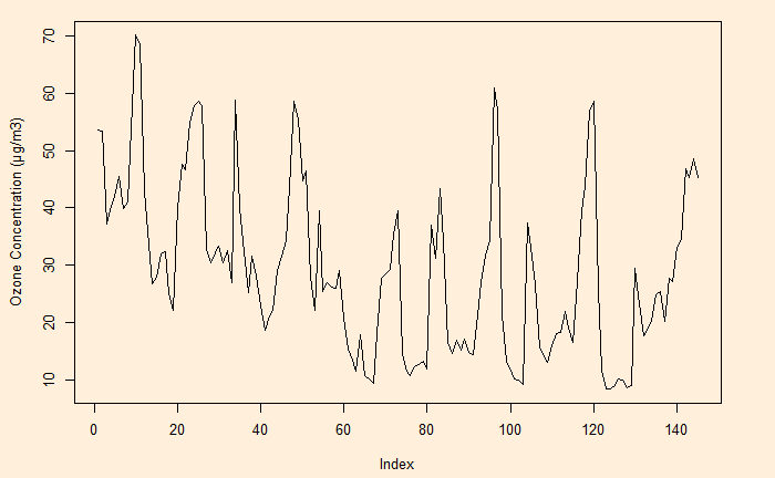
Time series is data of the same entity collected at regular intervals. And the analysis of this is a time series analysis. Here, the time is the independent variable (typically the X-axis), and a characteristic is measured, which forms the dependent variable. The objective of the time series analysis is to understand the pattern of changes over time. And to make projections about the future.
Time Series Analysis Read More »
Finite population correction is the factor applied to reduce the error when the sample size is significant in comparison to the total population.
If the sample size is n and the population size is N, the finite correction population factor is,

To apply this correlation, multiply the standard error with this factor.
Finite Population Correction Read More »
We saw Galton’s “wisdom of the crowd” before. It says that a crowd’s judgement is more accurate than an individual’s. The near-accurate estimate of the weight of a prize-winning ox by the common public became famous after Galton. But what happens if the mass is wrong?
These are questions on specialised subjects that a knowledgeable minority knows. When such questions are asked, unsurprisingly, the wrong answers get the majority.
To deal with this problem, researchers from Princeton and MIT have developed a solution that involves two questions instead of one (What do they think the right answer is, and how popular do they think each answer will be?). Take this example.
1) Is Philadelphia the capital of Pennsylvania (Y/N)?
2) What do you think is the prevalent answer (Y/N)?
Philadelphia is not the correct answer (it’s Harrisburg), and only the minority knows that. The majority will say YES to the first; of those, most will respond YES about the others. On the other hand, the minority will answer NO, and since they know it’s specialised information, they also expect most others to say YES. Thus, the ‘YES’ will be more, or the ‘NO’ will be lower in the second case.
Take the difference between the first question and the ‘popular’ question. ‘Yes’ will be negative (first YES < second YES), and ‘NO’ will be positive (first NO > second NO). Therefore, No is surprisingly popular and the correct answer.
Surprisingly Popular: Princeton University
Surprisingly Popular Read More »
I found this cool Binomial Probability Calculator from Stat Trek. Plug in the probability of success, the number of trials and the number of successes, and you get a set of probabilities ranging from exact to cumulative.
Here is one problem to try: In a city, it has been estimated that the probability of drivers not wearing seat belts is 10% and driving under the influence of alcohol is 5%. If the police check five people at random, what is the probability of catching at least one person who has committed at least one offence?
The first step is to estimate the probability of success of a single trial (person). Probability of not wearing a seat belt (SB) or drink and drive (DD) = P(SB U DD) = P(SB) + P(DD) – P(SB & DD) = 0.05 + 0.1 – 0.05 x 0.1 = 0.145. The rest is simple, # trials = 5; # success (x) = 1.
The answer we are looking for is the probability of at least one person committing a crime, which is = P(X >/= x) = 0.543 (the last entry in the results).
Now, try this one: The probability of failure (on demand) for a safety instrument is 1 in 10000. A plant has 1000 such instruments. What is the chance that there is at least one (x = 1) failed instrument? The answer P(X >/= x) = 0.095 or about 10%.
Binomial probability calculator: Stat Trek
Binomial Distribution Word Problems: superprof
Binomial Probability Calculator Read More »
Heuristics are mental shortcuts or straightforward rules of thumb, often developed from past experiences, used to make quick decisions. While it helps enormously to cut down time and effort to make decisions – decisions are taxing to the brain – occasionally, it can also lead to troubles. For example, a popular heuristic, the availability bias, makes us think that we live in an era of violence more than ever before, thanks to the day-to-day images we see in the media.
Here, we look at another one – the representativeness heuristics. The best way to describe it is:
“If it looks like a duck, swims like a duck, and quacks like a duck, then it probably is a duck”.
In representativeness heuristics, when compelled to make a decision, one compares herself with a prototype (or stereotype) of an event or behaviour she already has in mind.
In the famous Linda’s Problem, the image of a girl who participates in a demonstration drives us to tag her as a feminist.
A known example with more serious implications is racial profiling. It is when the police search for a crime suspect or an airport security officer doing random checks disproportionately focus on blacks or people of colour.
Representativeness Heuristics Read More »
People lament about the dominance of beliefs and the reduction of scientific temperament in society. Unfortunately, it is a fact and can only be worse in future. And I want to argue that it can only be like that. Let’s look at a few reasons why achieving scientific character is a mission impossible.
Unfortunately, it has to be.
Take the example of the discovery of gravitational waves in 2015. The number of people involved in the observation, which includes the setting hypothesis, the detection, and the mathematical modelling, could be about 1000. The rest of the world (1000 short of 7 billion) only gets the publication, which is already a heavily cut-down, readable version of the actual data.
Imagine a million people downloaded the paper.
As per an old report in physics today, the percentage of physics graduates (minimum decent training level in this field) was about 0.01. It suggests the inconvenient truth that 99.99% of people are already at a considerable disadvantage.
I.e., half all physics graduates and the rest others!
The people who understand the model (the specific mathematics behind the event) are even fewer and could be in the hundreds at best.
All the others – 6999 million out of 7000 – get the news from the media. And they must trust the report. A belief system is created but is not going to last like a religion, as we shall see soon.
Most people know science through technology, the application of the former into products. To define it in one word: science is hypothesis testing. And most people are alien to it. It is probabilistic, conditional, and will/must update with time. Each of these contradicts the doctrines of religion.
Back to the gravitational waves: Movements on the ground, temperature changes in the instruments or numerous other known or unknown errors can all lead to artificial signals or noises. The importance of the results led to keeping a significance level for the rejection of the null hypothesis (that the observed signal is a noise) to be extremely low – one in a billion. If you recall, most of our ordinary life experiments that is one in 20!
The team investigating the gravitational waves published the findings (as real) only when they found the probability that it could happen by chance is one in a billion. Yet, they would only use the words such as ‘likely’, ‘probably’ or ‘mostly’, to respond to the public, who want ‘yes’ or ‘no’ as answers.
Science updates with new information. Remember the chaos during covid time? The understanding of the illness changed daily during the pandemic. The use of masks (to use or not to use) and modes of contagion (airborne vs liquid-borne), to name a few. While the changes of advice were perfectly understandable and acceptable for those scientists, it was causing confusion and anger to the 99.99%.
The Science We Trust Read More »
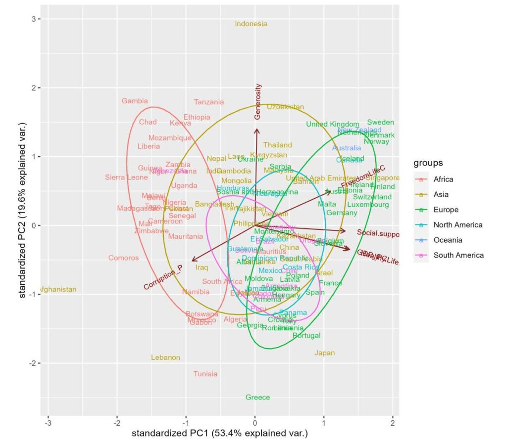
Let’s do a principal component analysis of the underlying variables in the estimation of the Happiness Index. They are
Real GDP per capita
Social support
Healthy life expectancy
Freedom to make life choices
Generosity
Perceptions of corruption
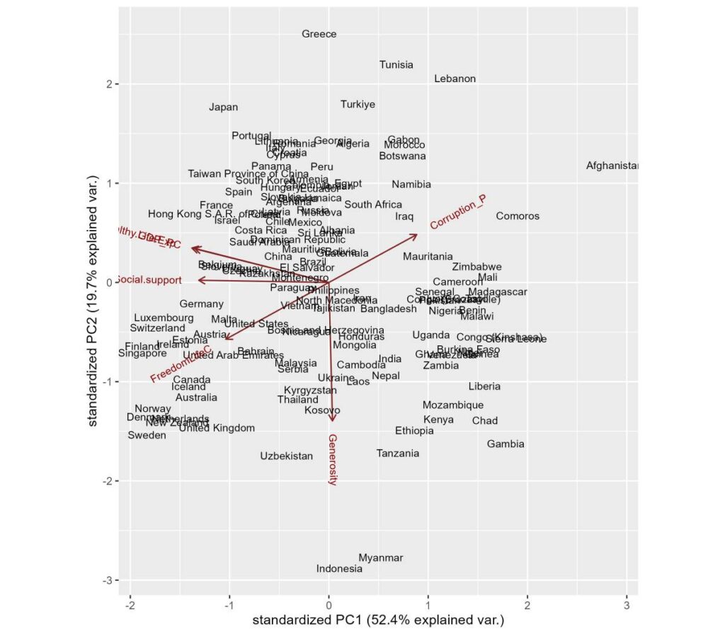
The objective is to see how countries are clustered together in the PCA.
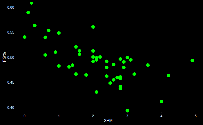
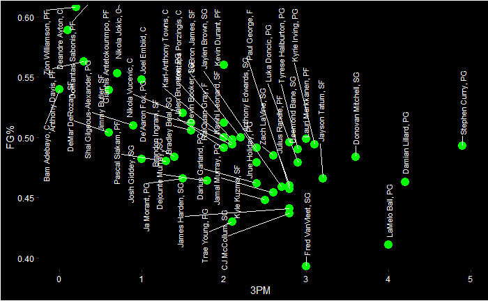
Let’s now move to NBA. Following is the PCA biplot of the ESPN top 40 NBA players of the regular season 2022-23.

We can see a few things:
1) Damian Lillard and Steph Curry are in a cluster which is closer to the vector 3PM (three points made)
2) A few centres are closer to each other, and the vector BLKPG (blocks per game) is closer to them.
3) Jokic and Giannis are placed somewhere far away.
4) APG (assists per game) and TOPG (turnover per game) are similar contributions (negative) to the principal component 2. The leaders, Harden, Haliburton and Young, are closer to the APG vector.
5) Centres and power forwards dominate the right side of principal component 1, whereas the guards take the left.
We see 3PM and FG% (field goal percentages) diametrically opposite to each other, suggesting they are negatively correlated.
And, if you are wondering who they are:
The data are taken from the ESPN site using the following R code:
library(rvest)
nba_23 <- read_html("https://www.espn.com/nba/seasonleaders")
nba_23 <- nba_23 %>% html_table(fill = TRUE)
Followed by a few clean-up steps
nba_data <- as.data.frame(nba_23)
names(nba_data) <- nba_data[2,]
nba_data <- nba_data[-1:-2,]
index <- which(nba_data$PLAYER == "PLAYER")
nba_data <- nba_data[-index,]
nba_data <- nba_data %>% mutate_at(vars(GP, MPG, `FG%`, `FT%`, `3PM`, RPG, APG, STPG, BLKPG, TOPG, PTS), as.numeric)2022-2023 NBA Season Leaders: ESPN
PCA of NBA Players Read More »
Let’s apply what we learned in the ‘mtcars’ data. We use R to perform the calculations. We require two packages, ‘stats’ and ‘ggbiplot’, to do the job.
library(stats)
library(ggbiplot)
Start with the simplest first – two variables – mpg and disp
data("mtcars")
car_data <- mtcars
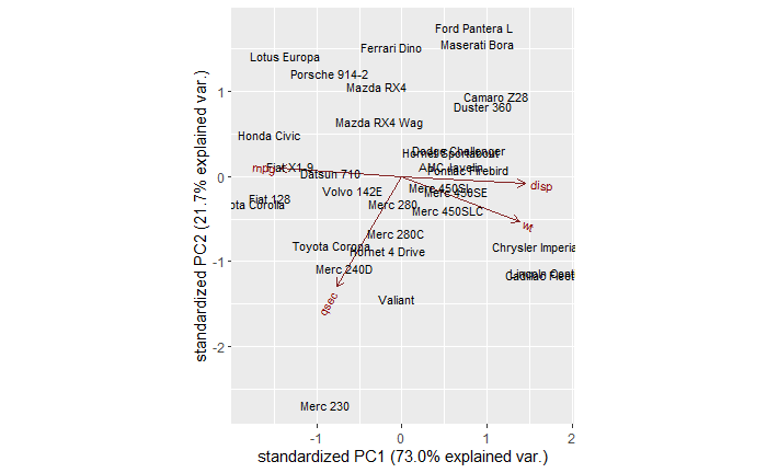
mtcars.pca <- prcomp(car_data[,c(1,3)], center = TRUE,scale. = TRUE)
ggbiplot(mtcars.pca,
ellipse = TRUE,
labels = rownames(car_data)
)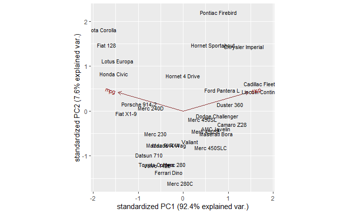
You can see a few clusters – things on the right, left and centre. You can also see two arrows, one corresponding to mpg and another to disp. It’s true we don’t need to do a PCA for two variables; a 2-D can do the job already.
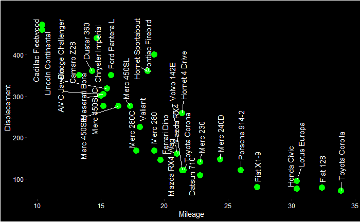
You can already start interpreting the PCA plot. The Cadilac and Lincoln are closer to the disp line in the PCA plot, which is towards the northwest of the Displacement vs Mileage plot. On the other hand, Honda, Porche etc., are closer to the mpg axis.
mtcars.pca <- prcomp(car_data[,c(1,3, 6, 7)], center = TRUE,scale. = TRUE)
ggbiplot(mtcars.pca)
ggbiplot(mtcars.pca,
  ellipse = TRUE,
  labels = rownames(car_data)#,
)
Principal Component Analysis Applied Read More »