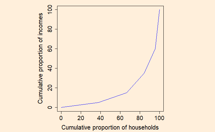
Step 3: Plot the cumulative proportion of households against the cumulative proportion of income to get the Lorenz curve.
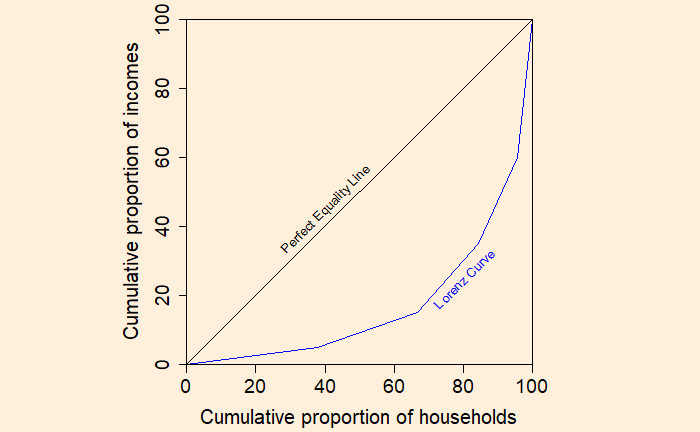
If every household has the same income, the Lorenz curve passes through the diagonal. And it is called the perfect equality line.
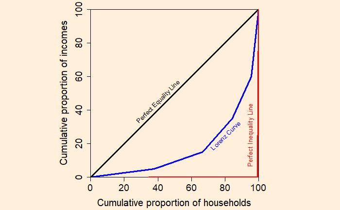
On the other extreme, if one household has all the income, you get the perfect inequality line.
Gini Coefficient
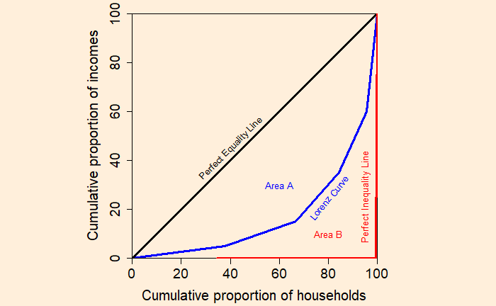
Let the area between the perfect equality line and the Lorenz curve be A, and the area under the Lorenz curve be B. Gini coefficient = Area A / (Area A + Area B)
Case 1: If the Lorenz curve coincides with the perfect equality line Gini coefficient = 0 / (0 + Area B) = 0; perfect equality Case 2: If the Lorenz curve coincides with the perfect inequality line Gini coefficient = Area A / (Area A + 0) = 1; perfect inequality
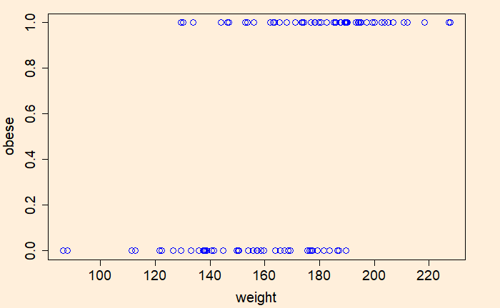
We’ll demonstrate the concept of ROC (Receiver Operating Characteristics) and AUC (Area Under Curve) with the help of (simulated) weight data and using R codes. Here are the first ten rows of the data.
Here ‘obese’ is the outcome variable that takes one of the two values, 0 (not obese) or 1 (obese). The ‘weight’ is the independent variable, also known as the predictor.
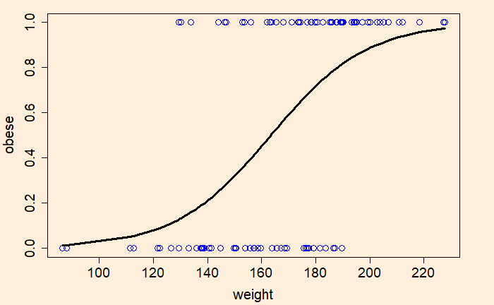
Now, we’ll do logistic regression of the data using the generalised linear model (‘glm’), store the output in a variable and plot.
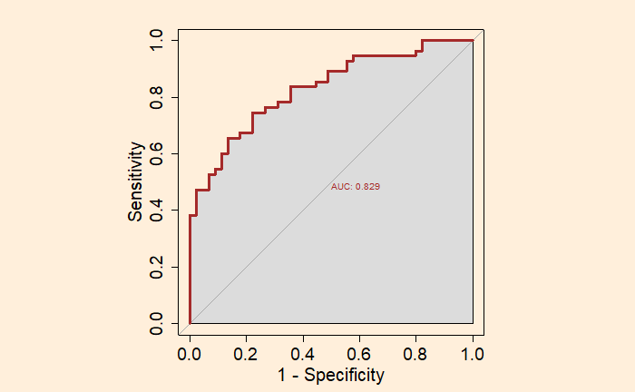
We used the following options to get the final plot. par(pty = “s”); for plotting the graph as a square plot = TRUE; for plotting the graph legacy.axes = TRUE; for plotting 1- specificity on the x-axis instead of the default specificity print.auc = TRUE; to print the value of AUC on the graph auc.polygon = TRUE; to present AUC as a shaded area.
Receiver Operating Characteristics (ROC) curve is used to estimate the worth of a logistic regression model. It is a plot between the true positive rate on the Y – axis and the false positive rate on the X – axis.
The ROC curve is a representation of the performance of a binary classification model. The diagonal line represents the case of not using a model. The area under the curve (AUC) of the ROC is a significant parameter. A model with a higher area under the curve (AUC) is preferred.
The next step is to assign a cut-off probability value for decision-making. Based on that, the decision-maker will classify the observation as either class 1 or 0. If Pc is that cut-off value, the following condition occurs.
The following classification table is obtained if the cut-off value is 0.5.
Launch T (F)
Actual Damage
Prediction (Pc = 0.5)
66
0
0
70
1
0
69
0
0
80
0
0
68
0
0
67
0
0
72
0
0
73
0
0
70
0
0
57
1
1
63
1
1
70
1
0
78
0
0
67
0
0
53
1
1
67
0
0
75
0
0
70
0
0
81
0
0
76
0
0
79
0
0
75
1
0
76
0
0
58
1
1
The accuracy of the prediction may be obtained by counting the actual and predicted values or by using the function, ‘confusionMatrix’ of the ‘caret’ library.
Although the overall accuracy is at an impressive 87.5%, the true positive rate or the failure estimation rate is pretty average (57%). Considering the significance of the decision, one way to deal with it is to increase the sensitivity by reducing the cut-off probability to 0.2. That leads to the following.
As you can see, the sensitivity of the second case, the lower cut-off value, is higher, but the overall accuracy of the prediction is poorer. And this is a key step of decision making – choosing higher accuracy of predicting failures (positive values) over the overall classification accuracy.
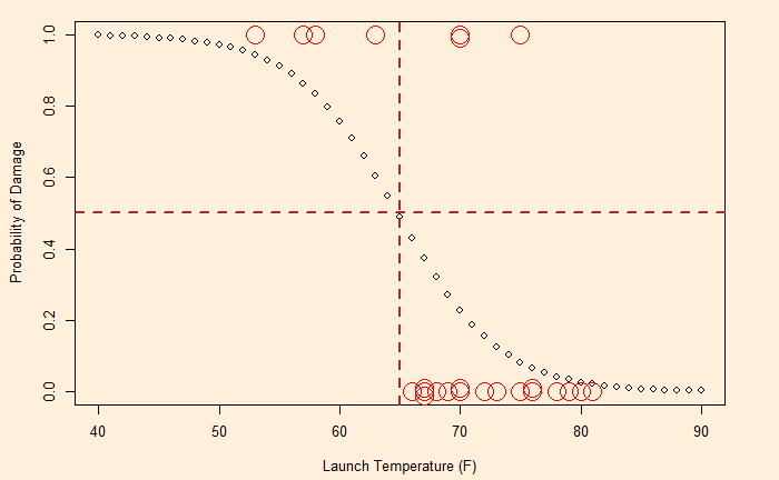
Remember the post on the O-ring failure of the Challenger disaster?
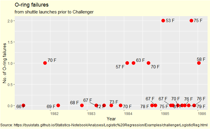
Here, we do a step-by-step logistic regression of the data. The following table shows the O-ring damages and launch temperatures of 24 previous shuttle launches. Damage = 1 represents failure, and 0 denotes no failure.
Flight #
Launch T (F)
O-ring Damage
STS 1
66
0
STS 2
70
1
STS 3
69
0
STS 4
80
0
STS 5
68
0
STS 6
67
0
STS 7
72
0
STS 8
73
0
STS 9
70
0
STS 41B
57
1
STS 41C
63
1
STS 41D
70
1
STS 41G
78
0
STS 51A
67
0
STS 51C
53
1
STS 51D
67
0
STS 51B
75
0
STS 51G
70
0
STS 51F
81
0
STS 51I
76
0
STS 51J
79
0
STS 61A
75
1
STS 61B
76
0
STS 61C
58
1
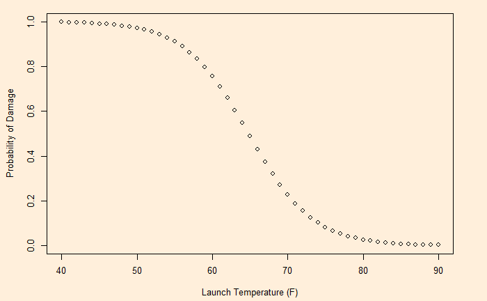
The logit function is:
The beta values (the intercept and slope) are obtained by the ‘generalised linear model’, glm function in R.
logic <- glm(Damange ~ ., data = challenge, family = "binomial")
summary(logic)
Call:
glm(formula = Damange ~ ., family = "binomial", data = challenge)

Deviance Residuals:
    Min       1Q   Median       3Q      Max
-1.0608  -0.7372  -0.3712   0.3948   2.2321

Coefficients:
            Estimate Std. Error z value Pr(>|z|)
(Intercept)  15.2968     7.3286   2.087   0.0369 *
Temp         -0.2360     0.1074  -2.198   0.0279 *
---
Signif. codes:  0 ‘***’ 0.001 ‘**’ 0.01 ‘*’ 0.05 ‘.’ 0.1 ‘ ’ 1

(Dispersion parameter for binomial family taken to be 1)

    Null deviance: 28.975  on 23  degrees of freedom
Residual deviance: 20.371  on 22  degrees of freedom
AIC: 24.371

Number of Fisher Scoring iterations: 5
The following plot is obtained by substituting the values 15.2968142 and -0.2360207 in the function.
Having developed the probabilities, now it’s time for decision-making. That is next.
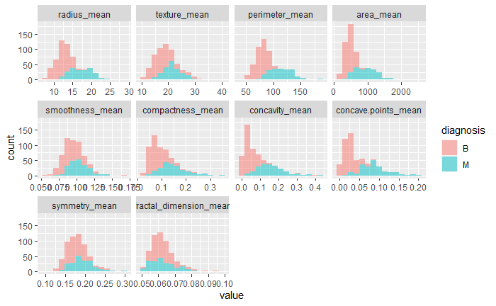
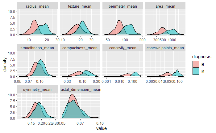
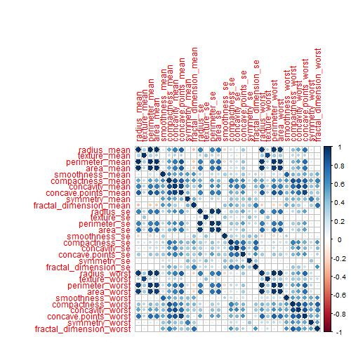
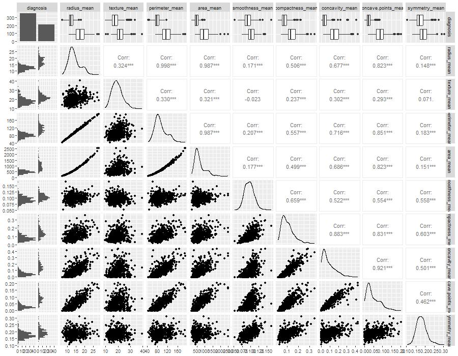
The dataset, known as the Breast Cancer Wisconsin (Diagnostic) Dataset, was obtained from Kaggle. It was built by Dr Wolberg, who used fluid samples from patients with solid breast masses. It provides ten features of cells from each sample – the mean value, extreme value and standard error of 10 features for the image returning 30 variables. Those ten components are:
radius
texture
perimeter
area
smoothness
compactness
concavity
concave points
symmetry
fractal dimension
The objective is to match the outcome, and diagnosis, which takes two values vz benign (B) or malignant (M). The following plot gives the overall summary of how the various features compare between benign (B) and malignant (M)
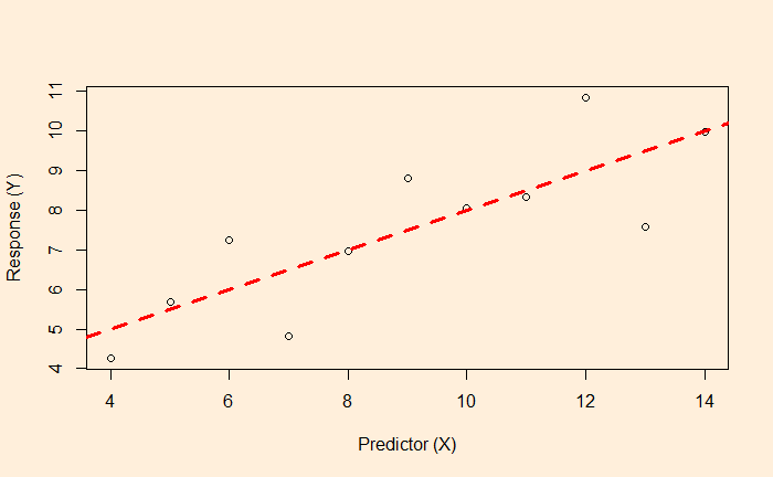
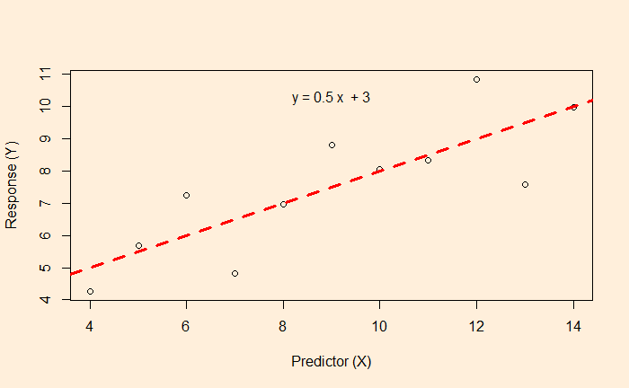
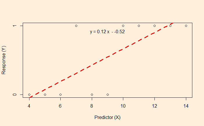
We know linear regression, which allows us to find the relationship between two variables and let us predict a dependent variable from an independent variable.
In this example, the function associated with the red dotted line lets us estimate the fat% if a BMI value is known.
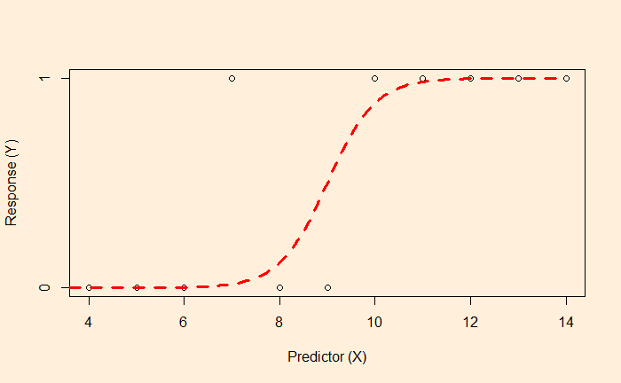
But what happens if the data is available, like the following?
Here, the survey gives either a YES or NO as the answer (1 = YES, 0 = NO). The linear regression and the subsequent equation are meaningless here. In such cases, we resort to logistic regression.
The objective of the logistic regression is not to get the value of Y but the probability. E.g., if the X value is 9, there is a 50% chance of getting a YES. On the other hand, X = 2 has a higher probability of getting a NO.
The plot tells you that the data is best suited for classification. Ys with < 50% chance to occur will be classified as the YES category, and < 50% is in NO.
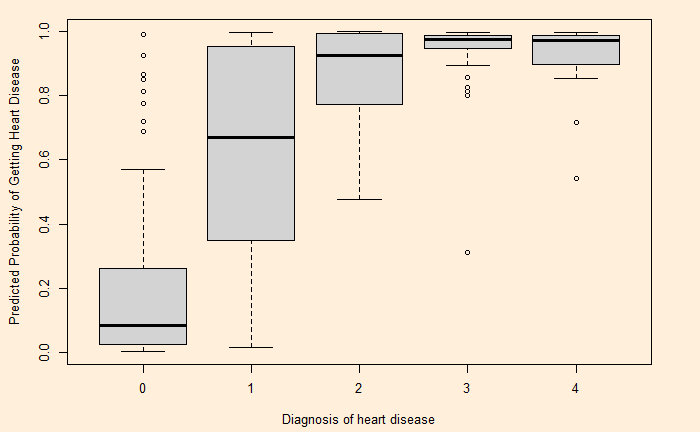
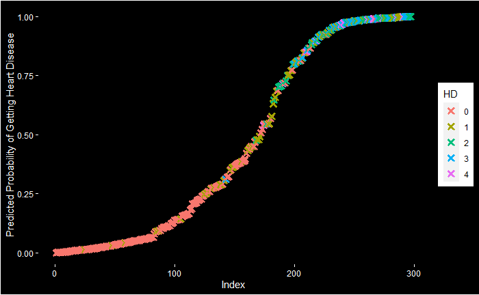
Let’s do a logistic regression of health data. Experiments with the Cleveland database focused on distinguishing the presence (value: 1,2,3,4) from the absence (value 0). The featured health parameters are
Age Sex CP: chest pain Trestbps: resting blood pressure (mm Hg) Chol: serum cholesterol (mg/dl) Fbs: fasting blood sugar > 120 mg/dl Restecg: Rest ECG Thalach: maximum heart rate achieved during the thallium stress test Exang: exercise-induced angina Oldpeak: ST depression induced by exercise relative to rest Slope: the slope of the peak exercise ST segment Ca: number of major vessels (0-3) coloured by fluoroscopy Thal: Hd: diagnosis of heart disease
After cleaning up and conditioning, the data looks like this:
We saw cognitive reflection problems, where our mind (brain) wants us to lock in – what it believes to be – a ‘timely’ answer which it gets via mental shortcuts. Here is one such question
Road
Major Accidents
Minor Accidents
Road 1
2000
16
Road 2
1000
?
Fill the box with the question mark to make the accidents in two roads equivalent.
Studies have shown a high proportion of people answered 8. Their attempt was perhaps to maintain the same ratio (2000:16 == 1000:8). But the question was to estimate the number of minor incidents required for a road with fewer major accidents to make it equivalent to the one with more major accidents. Naturally, it should be much more than 1000 (the shortfall of major accidents on Road 2 vs Road 1).
Cars and workers
Another famous trick puzzle has the following form:
It takes 7 workers to make 7 cars in 7 days. How many days would it take 5 workers to make 5 cars?
Park your instincts to answer 5 (so that 5-5-5 matches with 7-7-7!) for a while. Try this first, If 7 workers can build 4 cars in 3 days, how many days would it take 8 workers to build 6 cars?? I assume more people answer the second one correctly because it shows fewer visible patterns and may slow you down.
Answer: car per worker per day = (4/7)/3 = 4/21. So, 8 workers can make 32/21 cars in a day. But we want 6 cars => (32/21) x X (days) = 6. X = (21 x 6)/32 = 3.9 days.
In the same way, the first question is answered as follows: (7/7)/7 = 1/7 car per worker per day. 5 workers can make 5/7 cars in a day. For making 5 cars, one needs (5/7) x X (days) = 5 or X = 35/5 = 7 days.
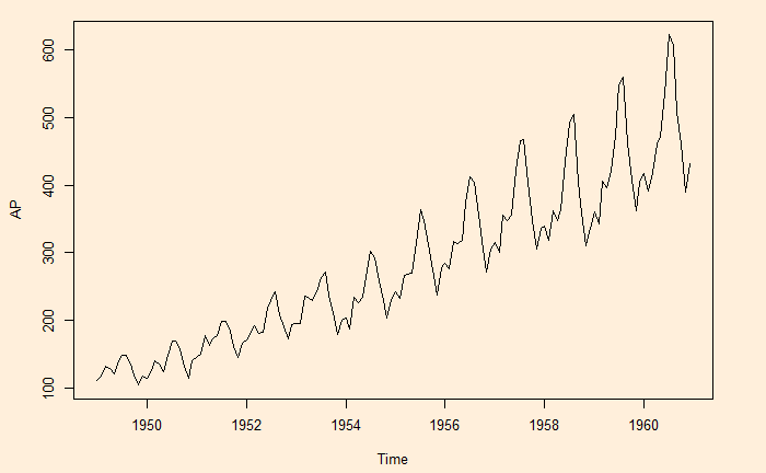
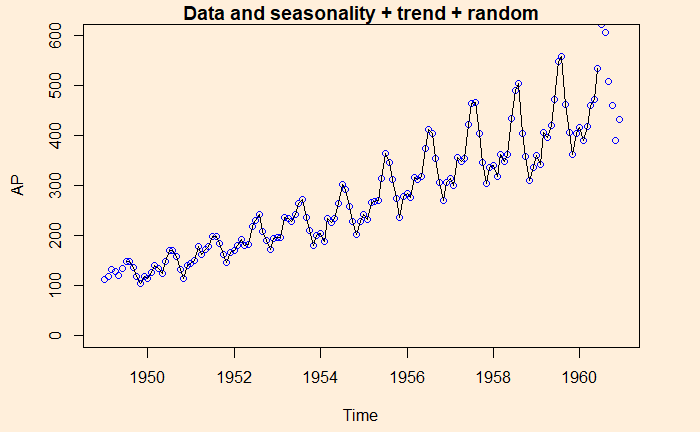
Here is another time series, namely, the air passengers.
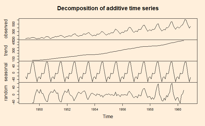
A key task of the time series analysis is to break down the data into signal and noise. In R, there is a function called decompose to do the job.
decom_AP <- decompose(AP, type = "additive")
plot(decom_AP)
Note that the data is already in a time series format. If it is a regular data frame, use function ‘ts’ first before attempting the decompose function.
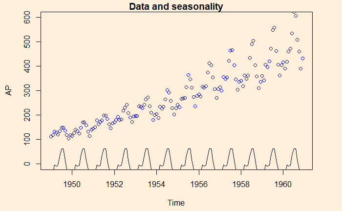
Here is the illustration – the data (blue circle), compared with the seasonality.
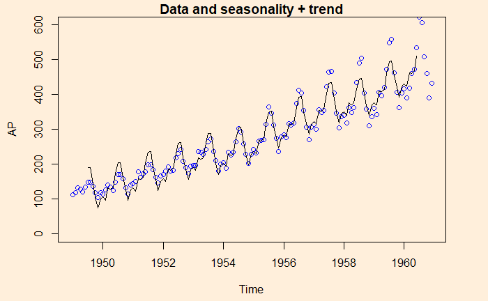
Here is data with seasonality + trend
And finally, data is compared with the sum of all three, seasonality + trend + random