August 2023

Cooling Tower Fallacy

Can displaying wrong images justify a right cause? Today, we discuss pollution.

It is no longer a matter of debate that pollutants cause massive health hazards. As per the World Health Organisation (WHO), air pollution caused 4.2 million premature deaths worldwide in 2019. Most of it is manifested via cardiovascular and respiratory diseases and cancer.

The following are the five main entities that cause air pollution. Those are
Particulate matter (PM)
Carbon monoxide (CO)
Ozone (O3)
Nitrogen dioxide (NO2)
Sulfur dioxide (SO2)

You may have noticed the conspicuous absence of carbon dioxide in this list. This is because CO2 is not a pollutant but a greenhouse gas that causes global warming. So, it is a bad actor, though not exactly the way one would imagine.

Now, the fallacy: below is a photo I got when I typed ‘pollution’ in the image search column, followed by another picture that came up for ‘carbon dioxide’.

power plant, cooling tower, coal-fired power station-4349830.jpg
power plant, air pollution, coal-fired power station-6698838.jpg

The sorry thing is that neither of these shows pollutants nor CO2. These are images of cooling towers emitting water vapour; journalists have been using such images from power plants and other industries for ages to represent pollution and global warming. The reason? They make excellent visuals of dense plumes, captivating the readers. According to a 2007 Royal Society of Chemistry survey report, more than two-thirds of people in the UK believe these images are of carbon dioxide emissions and accelerating climate change.

Myth of cooling towers is ..: RSC

Ambient (outdoor) air pollution: WHO

Cooling Tower Fallacy Read More »

Probability of Double Dice

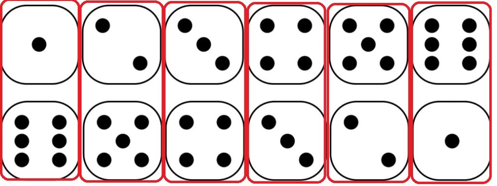
We have seen how the probability of getting a given sum can be estimated pictorially when two dice are thrown. It is done by displaying all possible combinations of 6 outcomes each (total of 6 x 6 = 36) and then counting the number of pairs for a given sum.

You will see these pairs along the diagonals.

For example, the probability of getting a sum of four is 3/36 by counting along the line that passes through all 4s. And if you do it for each diagonal, you get the following distribution.

There is an even smarter way to reach the above. It is done by listing the outcomes of the first die on the top row, flipping around the one from the second die and placing it below.

All the pairs that add up to seven appear as shown below. There are six of them.

Slide the second row to the right by one, and you get the 8s (5 out of 35).

This flipping (and then sliding) is a convenient way to understand convolution!

Probability of Double Dice Read More »

Accident on a Highway

If there is a 75% probability of accidents in an hour on a highway, what is the chance of accidents in 30 minutes? How many hours does it take for the highway to have an accident almost certain (i.e., 99%)?

We’ll do it in two different ways: first, the analytical.

Let p be the probability of at least one accident in 30 minutes. Then 1 – p is the chance of having no accidents in 30 minutes. Since accidents at a given moment are independent of some other moment, we can apply the AND rule, and the probability of no accidents in one hour is a joint probability of having no accidents in two consecutive half hours.
(1-p) x (1-p) = 1 – 0.75
(1-p)2 = 0.25
1 – p = 0.5
p = 0.5 = 50%

Another way to estimate these probabilities is to apply the Poisson distribution.

1 - ppois(q = 0, lambda = 1.4)
0.75

where,
q: number of successes
lambda: average rate of success

We adjusted lambda to match 0.75, which turned out to be 1.4 (accidents per hour). To get the probability for 30 minutes, use the same function for the rate of 1.4/2 accidents per half an hour.

1 - ppois(q = 0, lambda = 0.7)
0.503414

99% chance

Increase the lambda until the 1 – ppois reaches 0.99.

1 - ppois(q = 0, lambda = 4.9)
0.992

4.9 / 0.7 = 7 times 30 minutes = 3.5 hours.

Or

1- (0.5)7 = 0.99

Accident on a Highway Read More »

Chi-square – Interpretation

Un-VaccinatedVaccinated
(O-E)2/E(O-E)2/E
Contracted
pneumococcal pneumonia
5.785.78
Contracted
another type of pneumonia
0.110.11
Did not contract pneumonia0.930.93

You can see that the largest numbers for the chi-squares are against the row: ‘Contracted pneumococcal pneumonia’. These mean the largest departure from the expected values.

Un-VaccinatedVaccinated
(O-E)2/E(O-E)2/E
Contracted
pneumococcal pneumonia
(23 – 28*92/184)2/
(28*92/184)
(5 – 28*92/184)2/
(28*92/184)
Contracted
another type of pneumonia
(8 – 18*92/184)2/
(18*92/184)
(10 – 18*92/184)2/
(18*92/184)
Did not contract pneumonia(61 – 138*92/184)2/
(138*92/184)
(77 – 138*92/184)2/
(138*92/184)

In the unvaccinated case, the observation was more than the expectations (O:23 vs. E:14), whereas in the vaccinated case, it was fewer (O:5 vs. E:14).

Smaller values of chi-square suggest observed values are closer to the expected.

Reference

The Chi-square test of independence: Biochem Med 

Chi-square – Interpretation Read More »

Chi-square for Science

Science is built on the foundations of hypothesis testing. The Chi-square test of independence is one prime statistic for testing hypotheses when the variables are nominal.

The application of the Chi-square test is widely prevalent in clinical research. Here is an example of a case study published in ‘Biochemia Medica’. Following is the data from a group of 184 people, half of whom received a vaccine against pneumococcal pneumonia.

Un-VaccinatedVaccinated
Contracted
pneumococcal pneumonia
235
Contracted
another type of pneumonia
810
Did not contract pneumonia6177

1. Marginals

The first step in the Chi-square test is the calculation of the ‘marginals’. As marginals mean ‘on the sides’, we write them on the right column (the row-sums) and the bottom row (the column-sums).

Un-VaccinatedVaccinatedRow Sum
Contracted
pneumococcal pneumonia
23528
Contracted
another type of pneumonia
81018
Did not contract pneumonia6177138
Column Sum9292N = 184

2. Expected values

The chi-square test requires observed and expected values. It applies the following formula to each element and adds them up.

(O-E)2/E

The observed values are the data, and expectations are to be estimated based on the marginals. The expected data for a perfectly independent scenario is calculated as below. The expected value at (row i, column j) is obtained by RowSum(i) x ColumnSum(j)/(N).

Un-VaccinatedVaccinated
(O-E)2/E(O-E)2/E
Contracted
pneumococcal pneumonia
(23 – 28*92/184)2/
(28*92/184)
(5 – 28*92/184)2/
(28*92/184)
Contracted
another type of pneumonia
(8 – 18*92/184)2/
(18*92/184)
(10 – 18*92/184)2/
(18*92/184)
Did not contract pneumonia(61 – 138*92/184)2/
(138*92/184)
(77 – 138*92/184)2/
(138*92/184)

3. Test for Independence

Un-VaccinatedVaccinated
(O-E)2/E(O-E)2/E
Contracted
pneumococcal pneumonia
5.785.78
Contracted
another type of pneumonia
0.110.11
Did not contract pneumonia0.930.93

The Chi-square is calculated as the overall sum = 13.649

The p-value is estimated by looking at the Chi-square table for 13.349 at degrees of freedom (df) = 2.

The R code for the whole exercise

edu_data <- matrix(c(23, 5, 8, 10, 61, 77), ncol = 2 , byrow = TRUE)
colnames(edu_data) <- c("Vac", "No-Vac")
rownames(edu_data) <- c("npneumococcal pneumonia", "non-pneumococcal pneumonia", "Stayed healthy")


chisq.test(edu_data)
edu_data
	Pearson's Chi-squared test

data:  edu_data
X-squared = 13.649, df = 2, p-value = 0.001087

                           Vac No-Vac
npneumococcal pneumonia     23      5
non-pneumococcal pneumonia   8     10
Stayed healthy              61     77

The p-value suggests that the impact of vaccination on protecting against pneumococcal pneumonia is significant. And there is only a 1.1 in a thousand possibility that the difference is out of pure chance.

Reference

The Chi-square test of independence: Biochem Med 

Chi-square for Science Read More »

Picking Candies

A jar contains 60 candies, 10 reds, 20 blues and 30 yellows. If one takes out candies one by one, what is the probability that there is at least one yellow and one blue left after all the red candies have been taken out?

The solution is a combination of two mutually exclusive probabilities.

1) Probability that yellow is the 60th candy and blue is the last candy among the bunch of 10 reds and 20 blues.
OR
2) Probability that blue is the 60th candy and yellow is the last candy among the bunch of 10 reds and 30 yellows.

1a. The Probability that one of the 30 yellows is the last candy among 60 candies = 30/60
1b. The Probability that one of the 20 blues is the last candy among 30 candies = 20/30
2a. The Probability that one of the 20 blues is the last candy among 60 candies = 20/60
2b. The Probability that one of the 30 yellows is the last candy among 40 candies = 30/40

The first probability is a joint probability (‘AND’ rule) of 1a and 1b
The second probability is a joint probability of 2a and 2b
The final probability is the sum (‘OR’ rule) of the two.

(30/60) x (20/30) + (20/60) x (30/40) = 0.58

Picking Candies Read More »

Infinite Banana

A monkey reached a banana farm. As a rational monkey, it wants to let a dice decide the number of bananas to eat. The rules of the game are:

If the die finds 1 to 5, it eats that many bananas
If the die gets 6, it eats 5, tosses again, and the game continues.

What is the expected number of bananas that the monkey eats?

The exepcted value is: (1/6) x 1 + (1/6) x 2 + (1/6) x 3 + (1/6) x 4 + (1/6) x 5 + (1/6) x [5 + (1/6) x 1 + (1/6) x 2 + …]
= [20/6] + (1/6)[20/6] + (1/62)[20/6] + …
= [20/6] x [1 + 1/6 + 1/62 + 1/63 + …]
= [20/6] x [1/(1-1/6)]
= [20/6] x [6/5] = 20/5 = 4

Note we used the relationship for the infinite series 1 + x + x2 + x3 + … = 1/(1-x).

Infinite Banana Read More »

Turn of the knob

Came across one of the finest videos on YouTube about our past, present and future life, Yuval Noah Harari’s talk to youngsters and teachers, which triggered the idea of this post.

Turning the knob

Knowledge is like turning the knob. When it turns, you see things in a new light; until then, no matter how hard you try, you don’t get it out of ‘common knowledge’. Unfortunately, the common knowledge is almost always wrong!

The hyperpigmented on the equator

Take the favourite example of pigmentation of humans living in the equatorial region. For a moment, let’s ignore the people who believe that people of colour are of a separate species. We are dealing with more reasonable people here. If the narrative is that people in sunny regions have become dark-skinned because of heat and light, it’s an easier narrative to sell. It fits with the common knowledge – we all know what happens when we fry things; a little too much and it turns black.

Unfortunately, that’s not how things evolve. The theory of evolution switch needs to turn on. What about this: a group of people (perhaps dominated by the light-skinned) reach a sunny region. A few of them got skin cancer due to their lack of protective pigmentation and died maybe a few years earlier than their accidentally darker companions. That raised (by a small margin) the probability of darker parents, their children and their children having the advantage, and wow, after 10,000 years, there was a complete dominance of the dark. So, will that happen in Australia after 10,000 years? We’ll answer that in the end.

Humans of Flores

There used to be a pack of humans living in Flores, an island in Indonesia (until they were extinct about 50,000 years ago). They were humans as they shared the homo family. They were different humans because we are homo sapiens, and they were not. They were pretty short – about 1 m. tall – people. Not just them but the animals of that island as well. A simple convincing argument is that the animals got trapped on the island, became resource-constrained, and to survive, they had to consume less food. And they became smaller. It’s convincing because 1) it gives a feeling that one bunch of people after starvation has shrunk, or 2) they passed a genetic code to the children and made them shrink.

Turn the switch, and you get it: big humans reached the island. Once they got disconnected from the mainland due to sea level rise, the larger ones faced a more significant disadvantage due to food shortage, and the smaller ones survived better. In the next generation, there were disproportionally smaller kids from the surviving parents (the new group has larger ones too). Turn a few pages, centuries and generations: the island is full of smaller humans. This narrative is difficult to fathom without the switch as it is against the common knowledge. First, how can more miniature humans be fitter? That doesn’t conform very well with the stereotypes! Second, something forcing people (in one lifetime) to become smaller is easier to imagine than this chance game of smaller ones surviving (in a hundred lifetimes).

The future evolutions

That naturally begs the question. Will the Australians (the white Australians) turn back after 10,000 years? Even the broader question: What will be the next evolution of humans? The answer to the first question is a no, and the answer to the second question is impossible to predict.

The code lies in the knowledge paradox we are in. Australian whites won’t turn black because they know why it happens and what to do against death from skin cancer. It could be as simple as using sunscreen (or deciding not to venture out in the UV-intense part of the day). And this will translate to other things as well. If we know something gives us a disadvantage, we will engineer means to counter it. It has to be a disadvantage that gave the survivors the chance to survive, and we are closing those weaknesses!

Must watch video

Yuval Noah Harari Speaks to Young Readers & Teachers: Yuval Noah Harari

Turn of the knob Read More »

Logistic Regression of The Heart Failure Data

Let’s work out a few more matrices to continue with the heart data. First, let’s recall the data using the str() command.

str(h_data)
'data.frame':	299 obs. of  13 variables:
 $ Age      : num  75 55 65 50 65 90 75 60 65 80 ...
 $ Anaemia  : Factor w/ 2 levels "0","1": 1 1 1 2 2 2 2 2 1 2 ...
 $ Cr_Ph    : int  582 7861 146 111 160 47 246 315 157 123 ...
 $ Diabetes : Factor w/ 2 levels "0","1": 1 1 1 1 2 1 1 2 1 1 ...
 $ Ej_fr    : int  20 38 20 20 20 40 15 60 65 35 ...
 $ BP       : Factor w/ 2 levels "0","1": 2 1 1 1 1 2 1 1 1 2 ...
 $ Platelets: num  26.5 26.3 16.2 21 32.7 ...
 $ Ser_Cr   : num  1.9 1.1 1.3 1.9 2.7 2.1 1.2 1.1 1.5 9.4 ...
 $ Ser_Na   : int  130 136 129 137 116 132 137 131 138 133 ...
 $ Sex      : Factor w/ 2 levels "0","1": 2 2 2 2 1 2 2 2 1 2 ...
 $ Smoking  : Factor w/ 2 levels "0","1": 1 1 2 1 1 2 1 2 1 2 ...
 $ Time     : int  4 6 7 7 8 8 10 10 10 10 ...
 $ Death    : Factor w/ 2 levels "0","1": 2 2 2 2 2 2 2 2 2 2 ...

Logistic Regression

mod2 <- glm(Death ~ ., data = h_data, family = 'binomial')
summary(mod2)

Call:
glm(formula = Death ~ ., family = "binomial", data = h_data)

Deviance Residuals: 
    Min       1Q   Median       3Q      Max  
-2.1848  -0.5706  -0.2401   0.4466   2.6668  

Coefficients:
              Estimate Std. Error z value Pr(>|z|)    
(Intercept) 10.1849290  5.6565703   1.801 0.071774 .  
Age          0.0474191  0.0158006   3.001 0.002690 ** 
Anaemia1    -0.0074705  0.3604891  -0.021 0.983467    
Cr_Ph        0.0002222  0.0001779   1.249 0.211684    
Diabetes1    0.1451498  0.3511886   0.413 0.679380    
Ej_fr       -0.0766625  0.0163291  -4.695 2.67e-06 ***
BP1         -0.1026794  0.3587069  -0.286 0.774688    
Platelets   -0.0119962  0.0188906  -0.635 0.525404    
Ser_Cr       0.6660933  0.1814926   3.670 0.000242 ***
Ser_Na      -0.0669811  0.0397351  -1.686 0.091855 .  
Sex1        -0.5336580  0.4139180  -1.289 0.197299    
Smoking1    -0.0134922  0.4126178  -0.033 0.973915    
Time        -0.0210446  0.0030144  -6.981 2.92e-12 ***
---

Observe the p-values (Pr(>|z|)) for the regression coefficients, and we find that only ‘Age’ and ‘Ser_Cr’ have significant contributions to the response variable, ”Death. Therefore, we can already do a good job by fitting only those two variables.

Logistic Regression of The Heart Failure Data Read More »

LOC of Heart Failure Data

Here is a popular dataset taken from Kaggle on patient data on heart failures.

'data.frame':	299 obs. of  13 variables:
 $ age                     : num  75 55 65 50 65 90 75 60 65 80 ...
 $ anaemia                 : Factor w/ 2 levels "0","1": 1 1 1 2 2 2 2 2 1 2 ...
 $ creatinine_phosphokinase: int  582 7861 146 111 160 47 246 315 157 123 ...
 $ diabetes                : Factor w/ 2 levels "0","1": 1 1 1 1 2 1 1 2 1 1 ...
 $ ejection_fraction       : int  20 38 20 20 20 40 15 60 65 35 ...
 $ high_blood_pressure     : Factor w/ 2 levels "0","1": 2 1 1 1 1 2 1 1 1 2 ...
 $ platelets               : num  26.5 26.3 16.2 21 32.7 ...
 $ serum_creatinine        : num  1.9 1.1 1.3 1.9 2.7 2.1 1.2 1.1 1.5 9.4 ...
 $ serum_sodium            : int  130 136 129 137 116 132 137 131 138 133 ...
 $ sex                     : Factor w/ 2 levels "0","1": 2 2 2 2 1 2 2 2 1 2 ...
 $ smoking                 : Factor w/ 2 levels "0","1": 1 1 2 1 1 2 1 2 1 2 ...
 $ time                    : int  4 6 7 7 8 8 10 10 10 10 ...
 $ DEATH_EVENT             : Factor w/ 2 levels "0","1": 2 2 2 2 2 2 2 2 2 2 ...

LOC of Heart Failure Data Read More »