Seeing the great wall of China from the moon is an example of an urban myth. Interestingly, the story goes back to a 1932 cartoon that proclaimed “the only one that would be visible to the human eye from the moon”. Yes, 37 years before the first human landing on the moon happened!
As per the NASA website, the wall is generally not visible to the unaided eye even in low Earth orbit, let alone from the moon’s surface. At the same time, some of the other human-made landmarks are visible from low orbits. A key reason for this invisibility is that the texture of the material used to build the wall is similar to the surrounding landscape.
We saw the empirical rule – Gutenberg-Richter relationship – in the last post. Today, we use the wealth of data from the ANSS Composite Catalog to demonstrate a super cool feature of R – the mapview(). To remind you, this is how the data frame appears.
Now, let’s ask: where did the biggest, say, 9 and above magnitude quakes occur? To answer that, we need two packages, “sf” and “mapview”.
Charles Francis Richter and Beno Gutenberg, in 1944, found some interesting empirical statistics about earthquakes. It was about how the magnitude of earthquakes related to their frequencies. Today, we revisit the topics using data downloaded from ANSS Composite Catalog (364,368 data from 1900 – 2012).
A histogram of the magnitude is below.
The next step is to generate annual frequency from this. Since the data is from 1900-2012, we will divide the frequency by 112 to get the desired parameter. The following R codes provide the steps till the plot is generated. Note that the Y-axis is in the log scale.
Endogeneity is one assumption that we make while performing regression using the OLS method. But what is endogeneity? Let’s go back to regression. In mathematical language:
observation = deterministic model + residual error Y = (a + b X) + e
The term residual error represents all the things unknown to the observer but may have contributed towards the observation. But for linear regression, there is a condition, Gauss–Markov condition, that requires the error term to be uncorrelated to the independent variable. If this is not true, it is a case of endogeneity.
The first reason for endogeneity is called an omitted variable. An example is a cause that results in the variation of X or Y (or both).
The second cause is simultaneity or bidirectional; X causes Y, and Y causes X. It is also called reciprocal causation.
The third cause is selection bias, which means the sampling itself is not randomised.
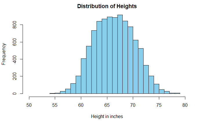
Histograms are a powerful means of understanding the spread of data. Sometimes the shape of the plot can mislead the analysis. A well-known example is the distribution of heights of adults.
The data is taken from Kaggle, but I suspect it comes from simulations and not actual measurements. A casual look at the data suggests a broad dispersion of heights in the centre, with a mean of 66.4 inches (168.6 cm) and a standard deviation of 3.9 inches (9.8 cm).
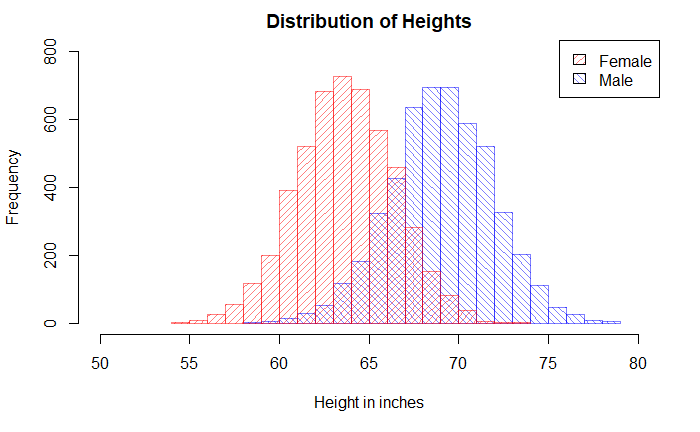
But look what happens when we replace the single plot with two sub-plots based on the key categorical variable, gender.
Pop_data_male <- Pop_data %>% filter(Gender == "Male")
Pop_data_female <- Pop_data %>% filter(Gender == "Female")

hist(Pop_data_male$Height, breaks = 20, col = rgb(0,0,1,1/2), xlim = c(50,80), ylim = c(0,800), density = 20, angle = 135, main = "Distribution of Heights", xlab = "Height in inches", ylab = "Frequency")

hist(Pop_data_female$Height, breaks = 20, add = T, col = rgb(1,0,0,1/2), density = 20,angle = 45)

legend("topright", c("Female", "Male"), fill = c(rgb(1,0,0,1/2), rgb(0,0,1,1/2)),  density = 20, angle = c(45, 135))
I have an apple weighing 150 g. and an orange weighing 145 g. Which fruit is unusually heavier? One would argue that, based on the absolute weight of the fruits, the apple is heavier. But then you are comparing apples with oranges!
A proper comparison is only possible if you standardise the weights and bring them to the same page. In other words, we use Z-score and compare them on a standard normal distribution. If X is the measurement, mu is the mean of the population where the sample belongs, and sigma is the standard deviation.
Once the Z-scores are estimated, one can place it over a standard normal distribution. Note that we have made the assumption that the weights of apples and oranges follow normal distributions.
Suppose the following are the parameters of those fruits.
Can a smoker advise another one about the benefits of quitting smoking? Or can a leader insist on masking without wearing a mask?
It is the essence of the Tu Quoque (“you too”) fallacy. It involves treating an argument as invalid because you retort that the person who made the affirmation herself doesn’t follow it.
You may recognise the well-known idiom, “practice what you preach.” Hypocrisy may indeed be called out, but that does not make facts incorrect.
Another logical fallacy that is closer to this is Whataboutism. The key difference here is that the person who receives the criticism points to someone else who is not necessarily the person who delivered the original criticism. It is like saying, ” But the other group also did something similar” to justify one’s own mistake.
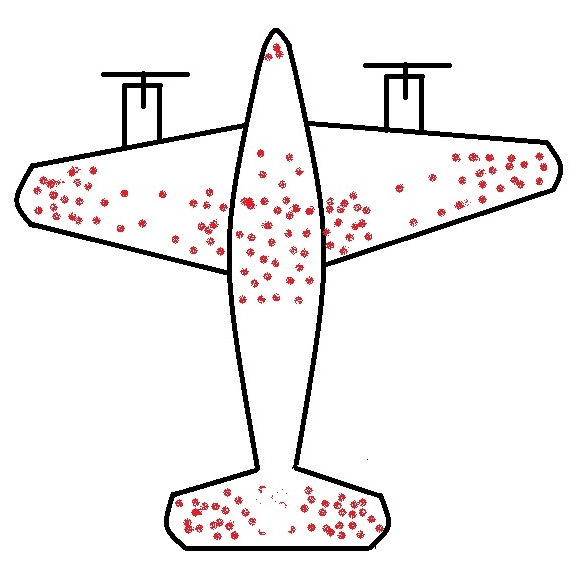
The story of returning warplanes from world war II presents the finest example of understanding survivorship bias. Here it goes.
When the US military had a chance to look at the fighter planes that came back from the battlefield, they observed some patterns. They found that the bullet marks on the planes were not uniform. Instead, it had denser patches on the fuselage and fewer spots on, say, engines, cockpit or some of the weaker parts – roughly what you see on the sketch below.
The idea was to use the data to optimise armouring the planes to sufficiently make the aircraft safer without adding too much weight that reduces the range.
So the statistical Research Group (SRG) was assembled to devise the strategy. Abraham Wald was the leading statistician who came up with this counterintuitive advice: the armour will not be where the holes are, but it will be where there are none. Because the planes with holes in those spots were shot down and never came back!
Survivors will mislead you
This is the classical survivorship bias. In the field, the planes were shot all over. The surviving ones presented one pattern; the unlucky ones would have shown the opposite.
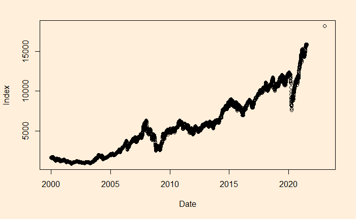
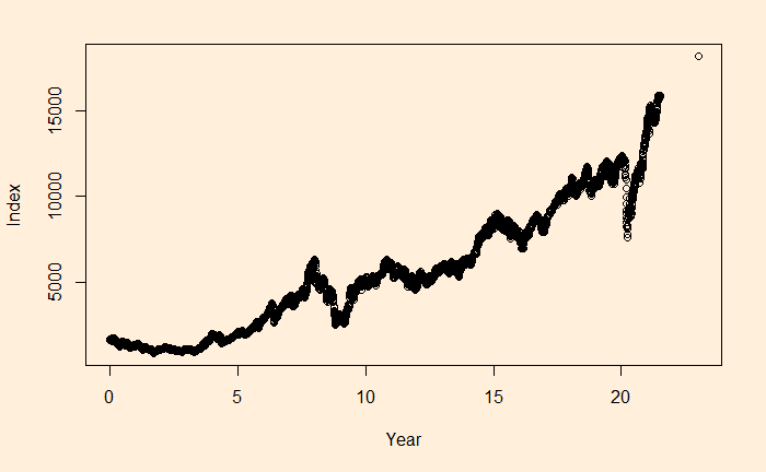
We will continue the regression, and this time, we’ll apply it to stock market performance. Below is the weighted average performance of the top 50 stocks listed in India’s National Stock Exchange, known as the NIFTY 50 benchmark index.
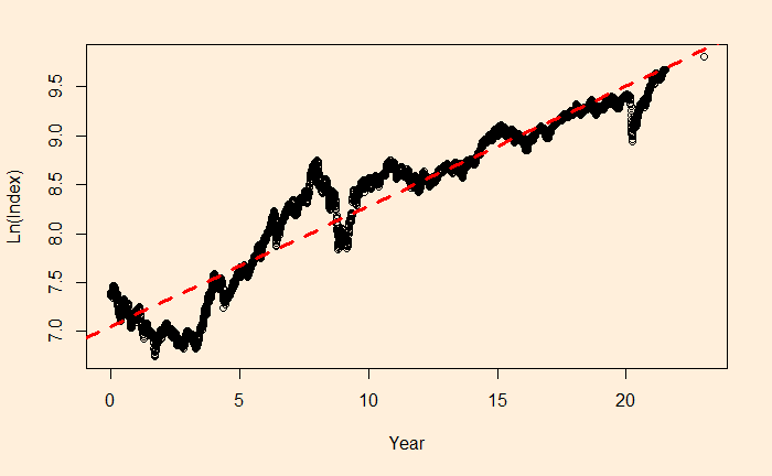
We want to perform regression of the data using a power law approximation of the following form.
There is a reason to write the function in the above format, as the constant r value can represent the underlying stocks’ average CAGR (compound annual growth rate). Before we proceed, let’s convert the x-axis to time (in years) using the following R code.
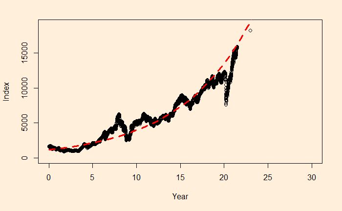
The main reason for such a discrepancy (a 2% difference is a big deal for long-term compounding) between the two estimates is the less accurate intercept of regression. The actual intercept or index0 is 1592.20, which is so different from the estimated value of 1150.181.
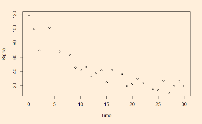
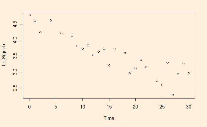
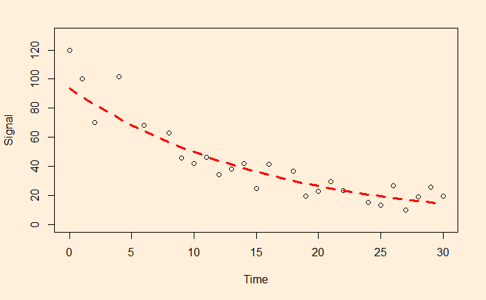
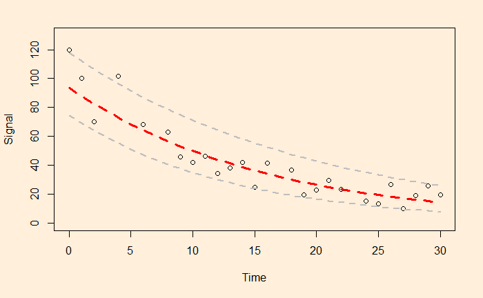
We have seen linear and non-linear regressions in the past. One type of non-linear function is exponential. A familiar example is the decay of a signal with time.
The easy way to perform the curve-fitting is to convert the exponential function to linear and perform an ordinary least square (OLS).
This is a linear function with slope = b and intercept = ln(a).
Let’s run a regression with these transformed variables.
df$ln <- log(df$Signal)
fit <- lm(ln ~ Time, data=df)
summary(fit)
Gives the output as
Call:
lm(formula = ln ~ Time, data = df)

Residuals:
     Min       1Q   Median       3Q      Max
-0.55119 -0.17134  0.03271  0.19116  0.54713

Coefficients:
             Estimate Std. Error t value Pr(>|t|)
(Intercept)  4.540757   0.110923   40.94  < 2e-16 ***
Time        -0.063229   0.006115  -10.34 2.55e-10 ***
---
Signif. codes:  0 ‘***’ 0.001 ‘**’ 0.01 ‘*’ 0.05 ‘.’ 0.1 ‘ ’ 1

Residual standard error: 0.2795 on 24 degrees of freedom
Multiple R-squared:  0.8167,	Adjusted R-squared:  0.809
F-statistic: 106.9 on 1 and 24 DF,  p-value: 2.552e-10
a = e4.540757 and b = -0.063229 and here is the plot of data along with the fitted curve.