November 2022

Motivated Reasoning

When there are scientific data, why do people still debate? This was one fundamental question that attracted the attention of scientists and sociologists.

From education levels to ideology

There are multiple hypotheses on this topic. One suggests that the ability to interpret data, such as numerical abilities, is a predictor of people’s understanding of scientific studies. The other was about the ideological biases of people.

One study was carried out by Kahan et al., who selected 1111 US adults from diverse backgrounds. Their composition was summarised in the following tables. Two sets of problems are used – one was ideologically neutral (the skin rash problem), and the other was sensitive (the gun possession problem).

The skin cream problem

Rash got
worse
Rash got
better
Patients who
used cream
22375
Patients who
did not use cream
10721

Rash got
better
Rash got
worse
Patients who
used cream
22375
Patients who
did not use cream
10721

The hypothesis formed here was that the individuals holding higher numeracy to score right results in the skin care problem. It turned out to be true – the people with higher cognitive abilities interpreted the results correctly. There was no real pattern suggesting a dependence on whether the subject was a Democrat or a Republican.

The gun control problem

Increase
in Crime
Decrease
in Crime
Cities that banned
concealed
guns in public
22375
Cities that banned
concealed
guns in public
10721

Decrease
in Crime
Increase
in Crime
Cities that banned
concealed
guns in public
22375
Cities that banned
concealed
guns in public
10721

But the pattern of gun control was different. It was not the numeracy that dominated the outcome but the ideology. The liberals increasingly corrected identified results that supported their view – crime decreases with gun control. And almost a complete shun to the crime increases scenario.

Conservatives, on the other hand, increasingly ‘understood’ (as a function of their numeracy) the crime-increased-by-gun-control data but ignored the opposite results.

Motivated Reasoning Read More »
LNN for Pareto Distribution

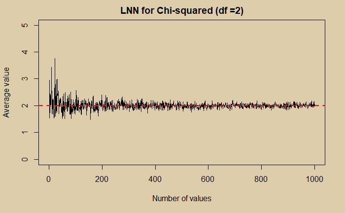
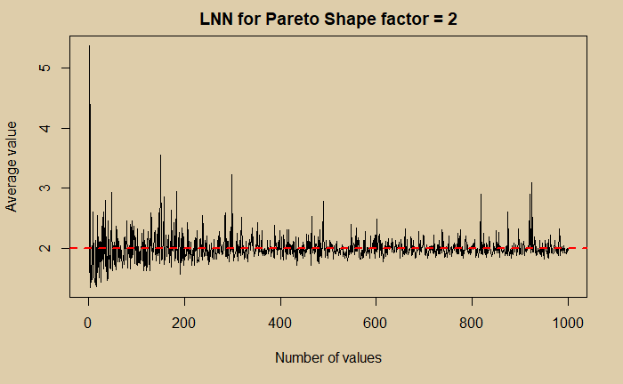
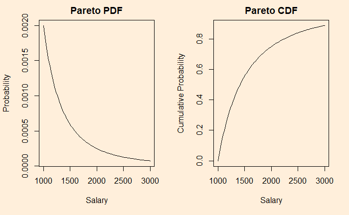
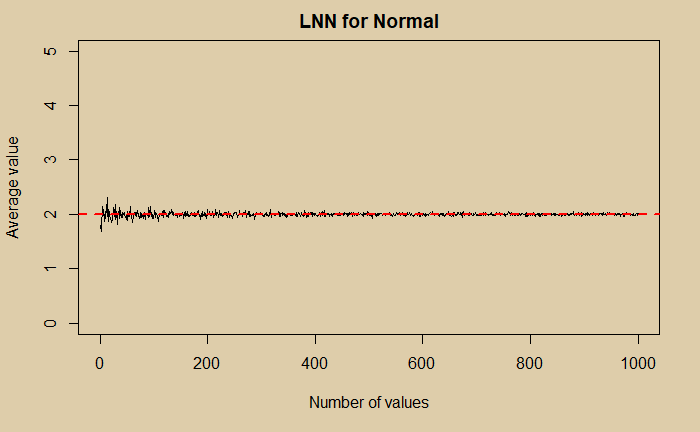
We have seen how different distributions converge to Gaussian, which is one fundamental property of statistics known as the central limit theorem (CLT). The second all-important property is the Law of Large Numbers (LNN). The following three plots show how that happens.

LNN for Pareto Distribution Read More »

Illusion of Correlation

We have seen how samples from almost any distribution, provided you collected enough for the average, eventually make Gaussian, which is the Central Limit Theorem (CLT). We also see the futility of that assumption when dealing with asymmetric distributions such as the Pareto; ‘enough for the average‘ never happens with any practical numbers of sampling.

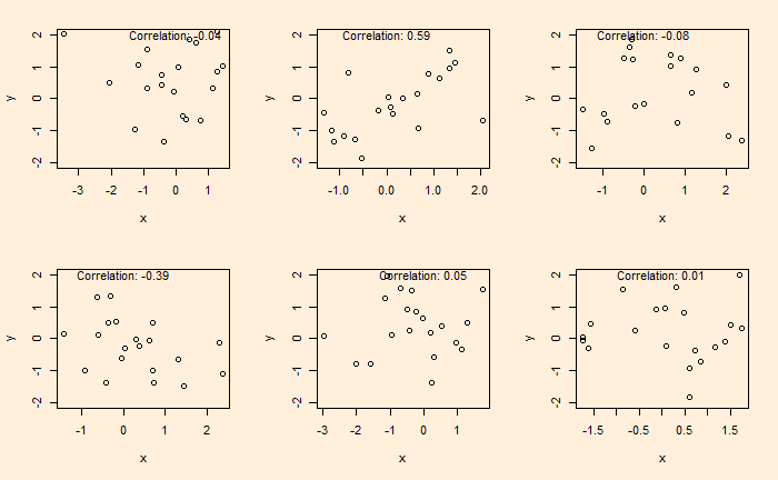
Once we assume that all samples obey CLT (which is already not a correct assumption), we start collecting data and finding out relationships. One of the pitfalls many researchers fall into is inadequate quality assurance and mistaking randomness as correlations. Here is an example. Following are six plots obtained by running two sets of standard normal distributions for random numbers (20 each) and plotting them on each other.

The plots are generated by running the following codes a few times.

x <- rnorm(20)
y <- rnorm(20)
plot(x,y, ylim = c(-2,2))
text(paste("Correlation:", round(cor(x, y), 2)), x = 0, y = 2)

A nice video on this topic by Nassim Taleb is in the reference. Note that I do not support his views on sociologists and psychologists, but I do acknowledge the fact that a lot of results generated by investigators are dubious.

Fooled by Metrics: Taleb

Illusion of Correlation Read More »

The Central Limit Theorem – Pareto

Pareto is an asymmetric distribution; useful in describing practical applications such as uncertainties in business and economics. An example is the 80:20 rule, which suggests that 80% of the outcome (wealth) is caused (controlled) by 20%. It’s a special case of Pareto distribution with a shape factor = 1.16.

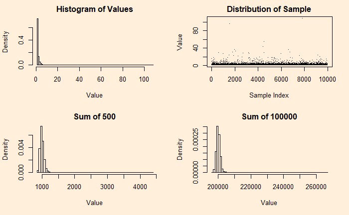
Let’s see how they appear for shape factor = 2.

Even after 100,000 additions, the distribution has not become a Gaussian. Recall that a coin with a 95% bias is close to a bell curve after 500 additions.

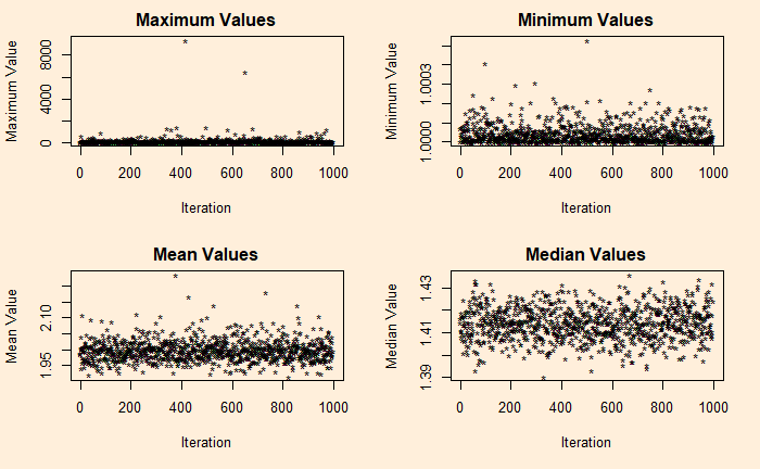
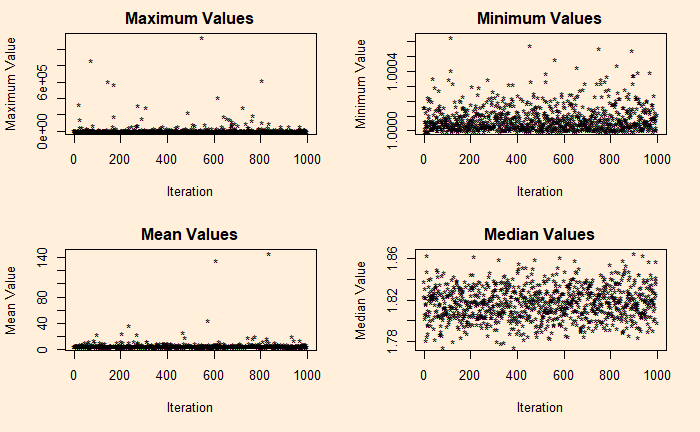
If you want to understand the asymmetry of Pareto, see the following four plots describing the maximum, minimum, mean and median of 10,000 samples collected from the distribution, repeated about 1000 times (Monte Carlo) for the plot.

It’s a total terror for shape factor = 1.16 (the 80:20) – a median of 1.8 and a maximum close to a million!

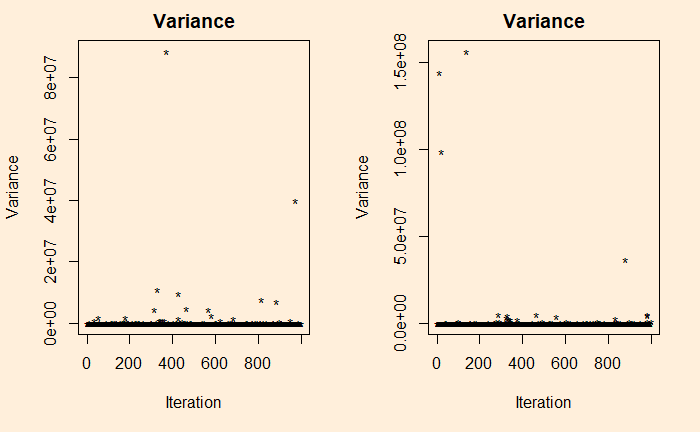
Want to see the variance?

var(rpareto(10000, shape = 1.16, scale = 1))

References

Pareto distribution: Wiki
The 80-20 Rule: Investopedia

The Central Limit Theorem – Pareto Read More »

The Central Limit Theorem for Non-Symmetric

We have seen a demonstration of CLT using uniform distribution as the underlying scheme. But a uniform distribution is symmetric, so what about nonsymmetric?

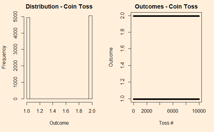
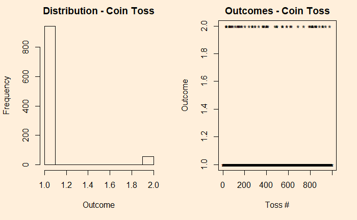
It is more intuitive, to begin with, discrete before getting into continuous. So, let’s build the case from a simple experiment set – the tossing of coins. We start with the fair coin, toss it 10000 times and collect the distribution.

par(bg = "antiquewhite1", mfrow = c(1,2))
h1 <-  sample(c(1,2), 10000, replace = TRUE, prob = c(0.5,0.5))
hist(h1, freq = TRUE, main = "Distribution - Coin Toss", xlab = "Outcome", ylab = "Frequency")
plot(h1, pch = "*", main = "Outcomes - Coin Toss", xlab = "Toss #", ylab = "Outcome" )

We denote the outcomes 1 for heads and 2 for tails. In the plot on the right-hand side, you see those 10,000 points distributed between the two. Now, introduce a bias to the coin – 95% heads (1) and 5% tails (2) and reduce the experiments to 1000 for better visualisation of the low probability state.

h11 <- sample(c(1,2), 1000, replace = TRUE, prob = c(0.95,0.05))
 hist(h11, freq = TRUE, main = "Distribution - Coin Toss", xlab = "Outcome", ylab = "Frequency")
 plot(h11, pch = "*", main = "Outcomes - Coin Toss", xlab = "Toss #", ylab = "Outcome" )

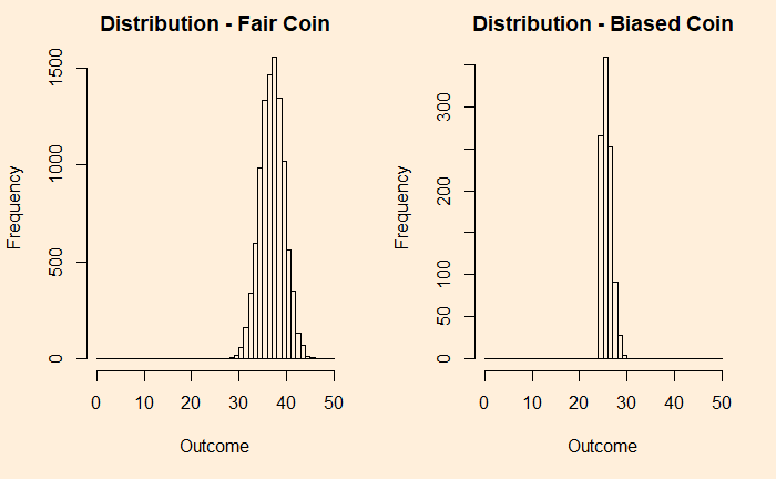
Now, add each distribution 25 times and check what happens.

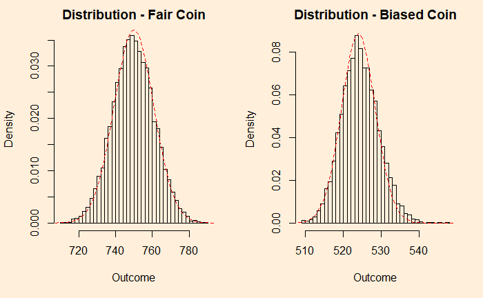
You can see that the fair coin has already started converging to a Gaussian, whereas the biased one has a long way to go. We repeat the exercise for 500 additions before we get a decent fit to a normal distribution (below).

You can still see a bit of a tail protruding outside the reference line. So it didn’t matter what distribution you started with; as long as you got an adequate number of samples, the sums are normally distributed.

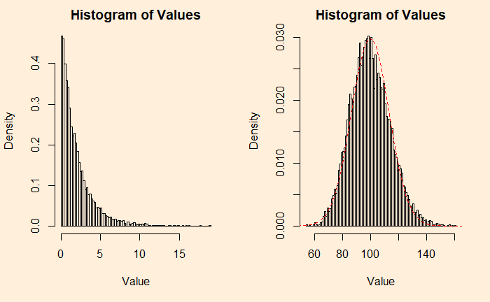
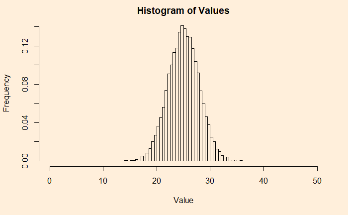
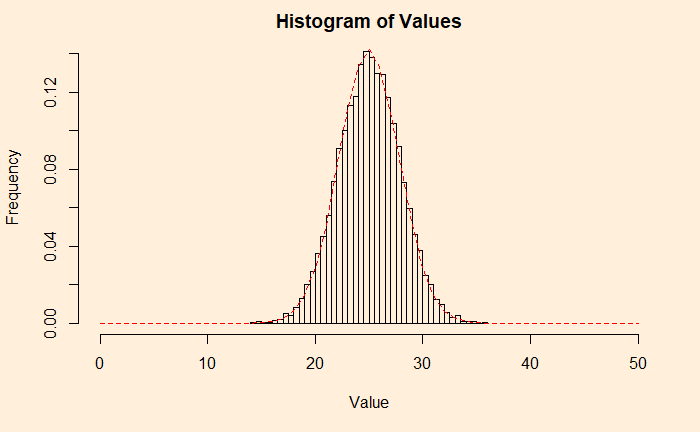
An example from the continuous family is the chi2 distribution with the degrees of freedom (df) 2. Following are two plots – the one on the left is the original chi2, and the right is adding 50 such distributions.

plots <- 1
plot_holder <- replicate(1,0)
for (i in 1:plots){
 add_plot1 <- plot_holder + rchisq(10000, df=2)
 plot_holder <- add_plot1
}

par(bg = "antiquewhite1", mfrow = c(1,2))

hist(add_plot1, breaks = 100, main = 'Histogram of Values', xlab = "Value", ylab = "Density", freq = FALSE)

plots <- 50
plot_holder <- replicate(1,0)
for (i in 1:plots){
 add_plot2 <- plot_holder + rchisq(10000, df=2)
 plot_holder <- add_plot2
}

hist(add_plot2, breaks = 100, main = 'Histogram of Values', xlab = "Value", ylab = "Density", freq = FALSE)
lines(seq(0,200), dnorm(seq(0,200), mean = 99.8, sd = 13.4), col = "red",lty= 2)

Tailpiece

Although we have used additions (of samples) to prove the point, the averages, which are of more practical importance, will behave the same way; after all, averages are nothing but additions divided by a constant (total number of samples).

The Central Limit Theorem for Non-Symmetric Read More »

The Central Limit Theorem Reloaded

Today, we will redo something we did cover in an earlier post – the sum of distributions. It directly demonstrates what we know as the central limit theorem (CLT). We will use R codes for this purpose.

We start with a uniform distribution. But what is that? As its name suggests, it is a class of continuous distribution and can take any value between the bounds with equal probabilities. Or the values are uniformly distributed between the boundaries.

There are many real-life examples of uniform distribution but of the discrete type, e.g., coin toss, dice rolling, and drawing cards. The resting direction of a spinner, perhaps, is an example of a continuous uniform.

figdet-spinner, spinner, fidget-2579499.jpg

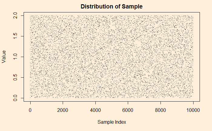
As an illustration, see what happens if I collect 1000 observations from a uniform distribution set between 0 and 2.

uni_dist <-  runif(n = 10000, min = 0, max = 2) # or simply,  runif(10000,0,2)

plot(uni_dist, main = 'Distribution of Sample', xlab = "Sample Index", ylab = "Value", breaks = 100)

Look closely; can you see patterns in the plot? Well, that is just an illusion caused by randomness. Historically, such observations confused the public. The famous one is the story of flying bombs in the Second World War.

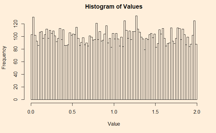
Some people like a different representation of the same plot – the histogram. A histogram provides each value and its contributions (frequencies, densities, etc.).

uni_dist <-  runif(n = 10000, min = 0, max = 2)
hist(uni_dist, main = 'Histogram of Values', xlab = "Value", ylab = "Frequency", breaks = 100)

Now, you will appreciate why it is a uniform distribution. I have 100 bins (or bars), and each carries more or less 100 (frequency) values, making it 100000 overall.

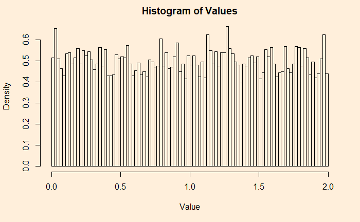
If you don’t like frequencies on the Y-axis, switch it off, and you get densities.

hist(uni_dist, main = 'Histogram of Values', xlab = "Value", ylab = "Density", breaks = 100, freq =  FALSE)

Start of CLT

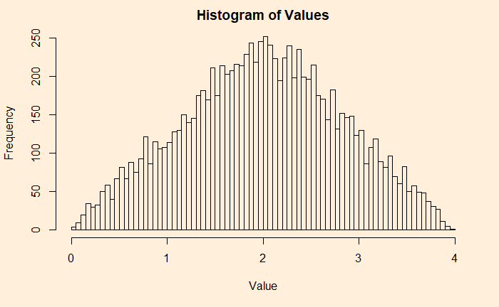
Adding two such independent sample data is the start of the CLT.

uni_dist1 <-  runif(n = 10000, min = 0, max = 2)
uni_dist2 <-  runif(n = 10000, min = 0, max = 2)

hist(uni_dist1+uni_dist2, main = 'Histogram of Values', xlab = "Value", ylab = "Frequency", breaks = 100)

Let’s make a code and automate the addition by placing the calculation into a loop.

plots <- 25
plot_holder <- replicate(1,0)

for (i in 1:plots){
 add_plot <- plot_holder + runif(10000,0,2)
 plot_holder <- add_plot
}

his_ar <- hist(plot_holder, xlim = c(0, 2*plots), breaks = 2*plots, main = 'Histogram of Values', xlab = "Value", ylab = "Frequency", freq = FALSE)

Here is a Gaussian, and hence the CLT. Verify it by adding a line from a uniform distribution and match.

lines(seq(0,2*plots), dnorm(seq(0,2*plots), mean = plots, sd = 2.8), col = "red",lty= 2)

We will check some not-so-uniform distributions next.

Watch the Lecture by Nassim Taleb

The Central Limit Theorem Reloaded Read More »

Pareto Distribution

You may have heard about the Pareto principle or the 80:20 rule. It is used in several fields and sounds like: 80% of actions come due to 20% of reasons or 80% returns from 20% of efforts etc.

Pareto distribution is a form of power-law probability distribution used to describe several phenomena. In R, dpareto describes the probability density function and ppareto, the cumulative distribution function.

Let’s work out an example. Suppose the salaries of workers obey a Pareto distribution with a minimum wage of 1000 and the so-called shape factor, alpha = 3. What is the mean salary, and what is the percentage of people who earn more than 2000?

The Median is when the cumulative probability hits 0.5. So, applying the function for solving x such that ppareto(x, shape=3, scale=1000) = 0.5. x comes out to be 1260. For the answer to the other question, you find out the inverse of CDF (or 1 – CDF), i.e., 1 – ppareto(2000, shape=3, scale=1000) = 0.125 = 12.5%.

Pareto Distribution Read More »

Narwhal Curve

The Narwhal curve shows the gap between the actual progress (for the US) on renewables and what it takes to get under 2 oC. It is called Narwhal as the shape of the graph resembles the toothed whale. The term is associated with Professor Leah Stokes, who plotted the progress of the top two emitters (electricity and transportation) to become carbon-free in the US until now (about 1- 2% growth rate) to the rate that is required to meet the target of carbon-free electricity and transportation by 2035, which is more than 10%.

narwhal, whale, fish-153618.jpg

Narwhal Curve Read More »

Bayesian inference – Probabilistic View

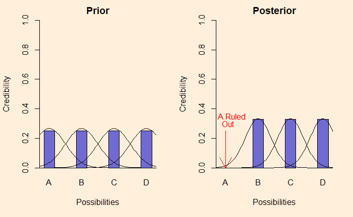
Last time, we made the analogy between Bayesian inference and selection by elimination. We have used definitive data and, therefore, bar plots. But in reality, data are far more messy and probabilistic. Like this:

If these were describing productions from a factory, the distribution happens because of random variations of the product quality, variations of measurement etc.

Reference

Doing Bayesian Data Analysis by John K. Kruschke

Bayesian inference – Probabilistic View Read More »

Solar Power and Capacity Factor

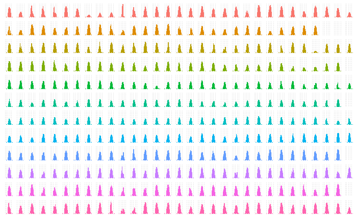
Solar Photo Voltaic (PV) is the most direct pathway for converting solar energy to use, say, electricity. While sunlight is available everywhere, they don’t fall at the same rate in different parts of the world, in different months of the year. The rates are described as irradiance or the energy that hits a unit area every second (W/m2).

The following plot presents annual sunlight in one such location in Australia – irradiance against the hours of the day.

The plot also demonstrates one of the cool functions of R, factet_grid in ggplot. The code is presented below.

sol_plot <- sol_data %>% ggplot(aes(x = Time, y = Irradiance, colour = factor(Month)))+
  geom_bar(aes(), stat="identity", width=.5) + 
  facet_grid(Month~Day) + 

theme(strip.background = element_blank(), strip.text = element_blank(), axis.title.x = element_blank(), axis.title.y = element_blank(), axis.ticks.x = element_blank(), axis.text.x = element_blank(), axis.ticks.y = element_blank(), axis.text.y = element_blank())  + 
theme(legend.position="none")

sol_plot

The capacity factor is one handy parameter to remember while estimating the solar energy potential of a place. It is the actual amount of energy obtained (in MWh) in an average hour of the year if you install a one MW plant. You can get it by dividing the actual electricity output by the maximum possible output. The number typically varies between 10% – 30%.

Solar Power and Capacity Factor Read More »