Survival Plots – Kaplan-Meier Analysis
We will see how to make survival plots using the Kaplan-Meier (KM) method. The KM method is the cumulative probability of survival at regular intervals or whenever data is collected. Let’s go step by step to understand this. First, look at a data-collection table and familiarise yourself with a few terms.
The table describes the first few rows of 42 data points collected over 35 weeks (Data courtesy: reference 1). Week number represents the time, and the group describes if the person is treated with the drug or part of the control (placebo).
| Week # | Group | Ill | Healthy |
| 6 | Treated | 3 | 1 |
| 7 | Treated | 1 | 0 |
| 9 | Treated | 0 | 1 |
| 10 | Treated | 1 | 1 |
| 11 | Treated | 0 | 1 |
| 13 | Treated | 1 | 0 |
| 16 | Treated | 1 | 0 |
| 1 | Control | 2 | 0 |
| 2 | Control | 2 | 0 |
| 3 | Control | 1 | 0 |
| 4 | Control | 2 | 0 |
| 5 | Control | 2 | 0 |
Time
In our case, it is the week number. We have a start of the study and an end of the study. Also, there are specific points in time for collecting data.
Event
The event, in this case, is the occurrence of illness.
Censoring
From the point of view of the study, there are people who have not yet experienced the event, i.e. remained healthy or were somehow left out of it at the time of data collection. These are people who are considered censored.
Survival plot
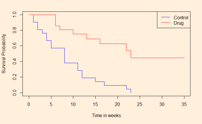
Here is the survival plot we obtained based on the Kaplan-Meier analysis. As you can see below, the graph shows the number of people who escaped the event (illness) at the end of the time frame. We’ll see how we got it using R next.

References
1) Generalized Linear Models: Germán Rodríguez
2) Kaplan–Meier estimator: Wiki
3) The Kaplan-Meier Method: karger
Survival Plots – Kaplan-Meier Analysis Read More »

