March 2022

The Framing of the Risk in Decision Making

We have seen three questions and the public response to those in the last post. While the expected value theory provides a decent conceptual basis, real-life decisions are typically taken based on risk perception, sometimes collected in the utility functions. Let’s analyse options and the popular answers to the three questions.

80% preference for sure $30 vs 80% chance for $45 is a clear case of risk aversion in all forms. People were willing to ignore that 8 out of 10 would get $45 had they given up the $30 in the bank.

Understanding the response to the second question was easy. The first stage was mandatory for the participants to play, and the options in the second stage were identical to the first question.

The intriguing response was the third one. In reality, the second and third questions are the same. Yet, almost half of people who went for the sure-shot $30 are now willing to bet for $45!

Tversky, A.; Kahneman, D., Science, 1981, 211, 453

The Framing of the Risk in Decision Making Read More »
Utility Model in practice

We have seen how a rational decision-maker may operate using either the expected value or the expected utility theory. Real-life, however, is not so straightforward about these kinds of outcomes. In a famous Tversky-Kahneman experiment, three groups were presented with three situations.

1: Which of the following do you prefer?
A. a sure win of $30
B. 80% chance to win $45

2: There is a two-stage game with a 25% chance to advance to the second stage. After reaching the second, you get the following choices, but you must give the preference before the first stage. If you fail in the first, you get nothing.
C. a sure win of $30
D. 80% chance to win $45

3: Which of the following do you prefer?
E. 25% chance to win $30
F. 20% chance to win $45

Expected Values

We will look at the expected values of each of the options. You will argue that it’s not how people make decisions in real-life. But, keep it as a reference. Remember: EV = value x chance, summed over.

CaseEV
A$30
B$36 ($45 x 0.8)
C$7.5 (0.25 x $30)
D$9 (0.25 x $45 x 0.8)
E$7.5 (0.25 x $30)
F$9 (0.2 x $45)
I have highlighted the higher EVs (of the choices) in bold.

What did people say?

In the first group, 78% of the participants chose option A. In the second, it was 74% in favour of option C. It was almost a tie (42% for E and 58% for F) for the final group.

These three problems are, in one way, similar to each other. We will see that next.

Tversky, A.; Kahneman, D., Science, 1981, 211, 453

Utility Model in practice Read More »

Expected Utility Model

To understand the expected utility theory, you first need to know the expected value theory. Suppose I give you this choice. If there is a 100% chance of getting 100 dollars vs a 20% chance of getting 1000 dollars, which one will you choose?

The expected value (EV), which comes from statistics, is the value multiplied by its respective probability and summed over all possible outcomes. So, for the first choice it is: 100 (dollars) x 1 (sure chance) + 0 (dollars) x 0 (no chance). For the second choice, it is 1000 x 0.2 + 0 x 0.8 = 200. Therefore the expected value of the second is double. So shall I go for the second?

That decision depends on risk and utility

The answer is no more straightforward. EV has given you the limit in terms of statistics, that the second choice yields twice the cash, but your decision follows your risk appetite. It is where the expected utility model comes in. The formula now is slightly different: instead of value, we use utility. So what is utility? The utility is the usefulness of the value.

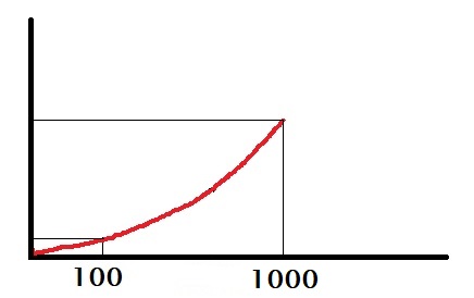
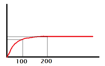
Suppose you badly need 100 dollars, and anything higher is ok but not going to make a difference. Your utility of money might look the following plot.

You may call her someone who desperately needs 100 bucks or a risk-averse person.

On the other hand, imagine she desperately needs 1000 dollars. In such a case, the person will gamble for 1000 bucks even when the chance of winning is only 20%. She is either a risk-lover or has no use for anything short of 1000.

Expected utility model

The expected utility (EU) of the first and the second choices are respectively:
EU1 = U(100) x 1 + U(0) x 0
EU2 = U(1000) x 0.2 + U(0) x 0

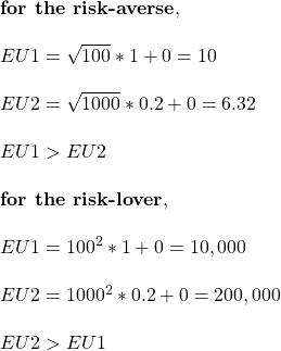
In other words, the utility function depends on the person. Suppose, for a risk-averse, it is a square root, and for a risk-lover, it could be a square. Let’s see what they mean.

\\ \text{\bf{for the risk-averse}}, \\ \\ EU1 = \sqrt{100} * 1 + 0 = 10\\ \\ EU2 = \sqrt{1000} * 0.2 + 0 = 6.32\\ \\ EU1 > EU2 \\ \\ \text{\bf{for the risk-lover}}, \\ \\ EU1 = 100^2 * 1 + 0 = 10,000\\ \\ EU2 = 1000^2 * 0.2 + 0 = 200,000\\ \\  EU2 > EU1

Expected Utility Model Read More »

Framing the Risk

We are back with Tversky and Kahneman. This time, it is about decision making based on how the risk appears to you. There is one problem statement with two choices. Two groups of participants were selected and given this but in two different formats.

Here is the question in the first format: imagine that the country is bracing for a disease that can kill 600 people. Two programs have been proposed to deal with the illness – program 1 can save 200 people, and program 2 gives 1/3 probability to save all and 2/3 chance to save none. Which of the two do you prefer? 72% of the people chose program 1.

The second group of participants was given the same problem with different framing. Program 3 will lead to 400 people dying, and program 4 has a 1/3 probability that none will die and 2/3 probability that all will die. 78% of the respondents chose program 4!

Risk aversion and risk taking

Identical problems, but the choices are the opposite! The first case sounded like saving lives, and the players chose what appears to be a risk-averse solution. In the second case, the options sounded like losing lives, and people were willing to take the risk and went for the probabilistic solution.

Tversky, A.; Kahneman, D., Science, 1981, 211, 453

Framing the Risk Read More »

MtDNA Knows It All

You may know that our cell nuclei contain genomic DNA – parts of it possess the codes (genes) that determine all the traits. We obtain this from our parents through some combination.

Enter mitochondrial DNA (mtDNA). It is not your usual type. First, it lies inside mitochondria and not the cell nucleus. Second, it is inherited from the mother alone; fathers do not contribute. Third, it does not recombine. What is so special about this? Well, mtDNA has become the tracer molecule to study relationships between one individual to another.

The absence of recombination and bi-parenting inheritance made these molecules scientists’ pet for tracing the maternal ancestry of human beings. And they traced back thousands and thousands of years and ended up at a single mother who lived ca. 200,000 in Africa. She is called the Mitochondrial Eve. She was not the first human but became the meeting point (common ancestor) when human mtDNAs were all traced back.

MtDNA Knows It All Read More »

The Myth of Benevolent Dictator

The gulf between what we all like to believe and what happens can be wide. We have seen this before in the one-child policy of China. We called it the claim instinct. Because it contained the perfect recipe – a mighty leader, an intervention and results that fitted a narrative.

We look at a similar one today – that of benevolent dictator. The phrase may sound like an oxymoron for anybody who lives in the modern world. The benevolent autocrat is a school of thought on leadership, and its proponents take examples from countries such as Singapore as their test case. As per this school, these well-intended rulers bring higher economic prosperity to their countries.

The paper written by Rizio and Skali examined this claim by collecting data from 133 countries over 150 years starting from 1858. Their mathematical analysis consisted of three variables – rulers (taken from Archigos database), political regime (Polity IV dataset), and GDP per capita (Maddison dataset).

Misguided belief in dictators

The results showed that good dictators brought prosperity no different from what chance would have made. At the same time, bad dictatorships showed a clear negative impact on the economy.

References

S.M. Rizio and A. Skali, The Leadership Quarterly 31 (2020) 101302
Introducing Archigos: A Dataset of Political Leaders
Polity IV Individual Country Regime Trends
Maddison Project Database 2013

The Myth of Benevolent Dictator Read More »

Tiktaalik, the Ancestor that Came out of the Water

If our great grandmother Lucy was the bridge between non-hominins and hominins, Tiktaalik was that extraordinary life that acted as the connection between fishes and four-legged animals. I know it’s not easy to digest that we had fish as our common ancestor!

On the one hand, it was a fish with scales and fins. Unlike the other fishes, Tiktaalik’s fins had bones (corresponds to an upper arm, forearm and wrist) that could enable them to come out from the water and walk. And it had lungs and grills. Above all, Tiktaalik was a fish with a neck.

In his book, the Inner Fish, Neil Shubin, the American palaeontologist and evolutionary biologist, narrates the journey to unearth nature’s best-kept secret for a long time (about 375 million years!) – discovering the missing transitional piece from the life in water to life on land. The possibility of transitional creatures was something Charles Darwin had predicted some 130 years before!

Lucy: wiki
Tiktaalik: wiki
How fins became limbs: nature
A Devonian tetrapod-like fish and the evolution of the tetrapod body plan: nature

Tiktaalik, the Ancestor that Came out of the Water Read More »

Top Risks Lead to Top Priorities

What should be our top priority in life? Well, it depends on the top risks in life. Depending on whom you ask this question, the answer may vary.

Top priorities

I suspect risk to life comes first. What else can come closer or even be ranked higher? To a large section of the world, it could simply be getting out of poverty. It can be so powerful that individuals may even risk their lives to achieve it for their families and future generations at least. Here, I assume that, at least for the people who read this post, the risk to life is the top one.

Top risks to life

What is the top risk to life? It could be diseases, accidents, extreme weather events, wars, terrorist attacks, etc. Let’s explore this further. According to the World Health Organization (WHO), diseases are the top 10 causes of death and are responsible for 32 out of the 56 million deaths in a year. That is about 60%, according to the 2019 data. And what are they?

Noncommunicable diseases occupied the top seven spots in 2019. Yes, that will change in 2020 and 21, thanks to the COVID-19 pandemic. Deaths due to the current pandemic can reach the top three in 2021, but getting into the top spot is unlikely, at least based on the official records.

The Oscar goes to

The unrivalled winner is cardiovascular diseases (CVDs) – heart attacks and strokes – which cost 18 mln lives in 2019. The risk factors include unhealthy diets, physical inactivity, smoking, and the harmful use of alcohol. And an early warning to watch out for is high blood pressure.

There are three ways to manage the top risk: 1) medication for blood pressure management, 2) regular exercise, and 3) getting into the habit of a healthy diet.

Top 10 causes of death: WHO

Cardiovascular diseases: WHO

Top Risks Lead to Top Priorities Read More »

Anscombe’s Trap

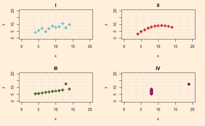
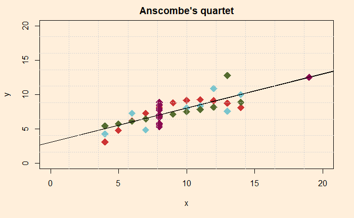
What is so special about the following four scatter plots? Do you see any similarities between them?

Well, all four look different from each other. The first is a scatter plot with a linear trend, the second is a curve, the third represents a straight line with one outlier, and the fourth is a collection of points in a cluster with an extreme outlier. And you are right; they represent four different behaviours or x and y.

Beware of statistical summary

Imagine you don’t get to see how they are organised in the x-y plane, but instead, only the summary statistics, and here they are:

PropertyValue
Mean x 9.0
Mean y 7.5
Sample variance of x11
Sample variance of x4.12
Correlation between x and y0.816
By the way, the numbers above represent all four sets!

Not over yet!

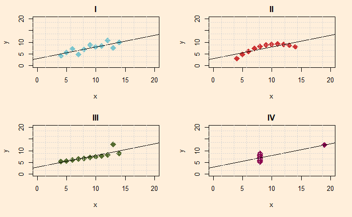
Now put linear regression lines to all.

And if you don’t believe me, see all four in one plot with the common linear regression line.

Following is the complete dataset in an R data frame.

Q1 <- data.frame("x" = c(10, 8, 13, 9.0, 11.0, 14.0, 6.0, 4.0, 12.0, 7.0, 5.0), "y" = c(8.04, 6.95, 7.58, 8.81, 8.33, 9.96, 7.24, 4.26, 10.84, 4.82, 5.68))
Q2 <- data.frame("x" = c(10, 8, 13, 9.0, 11.0, 14.0, 6.0, 4.0, 12.0, 7.0, 5.0), "y" = c(9.14, 8.14, 8.74, 8.77, 9.26, 8.10, 6.13, 3.10, 9.13, 7.26, 4.74))
Q3 <- data.frame("x" = c(10, 8, 13, 9.0, 11.0, 14.0, 6.0, 4.0, 12.0, 7.0, 5.0), "y" = c(7.46, 6.77, 12.74, 7.11, 7.81, 8.84, 6.08, 5.39, 8.15, 6.42, 5.73))
Q4 <- data.frame("x" = c(8, 8, 8, 8, 8, 8, 8, 19, 8, 8, 8), "y" = c(6.58, 5.76, 7.71, 8.84, 8.47, 7.04, 5.25, 12.50, 5.56, 7.91, 6.89))

The moral of the story is

Summary statistics are great ways to communicate trends. But, as the reviewer, you must exercise the utmost care in understanding the actual data points.

Anscombe’s quartet: wiki

Anscombe’s Trap Read More »

Normal – Normal Sensitivity

In this fourth and final episode on the Bayesian inference with normal-normal conjugate pair, we find out how important is the choice for the prior and data collection in arriving at the answer. We will start from the previous set of inputs. But the relationship between the prior and the posterior first.

\\ \mu_{posterior} = \frac{\tau_0 \mu_0 + \tau \Sigma_{i=1}^{n} x_i}{\tau_0 + n*\tau} \\ \tau_{posterior} = \tau_0 + n*\tau  \\ \sigma_{posterior} = \sqrt{\frac{1}{\tau_{posterior} }}

The parameters used in the first example are:

\\ \mu = \text {variable}; \sigma = 2 \text { (hypothesis)}  \\ \mu_0 = 15; \sigma_0 = 4 \text { (prior)} \\ x = 9 \text{ (data)}

And the output is plotted below. The green curve is the prior probability distribution, blue represents the posterior in case of one data and red for 5 data (same value of 9). The vertical dotted line points at the data (or the average of the data).

It shows that (multiple) data at nine is pulling the distribution to come closer to it. Now let’s change the prior further right, mu0 = 25.

You see that the posterior distributions did not change much. Next, we will make the distribution narrower by defining sigma0 to be 2 and keeping mu0 at 25.

Things are now beginning to separate from the data. This suggests that if you want to be conservative with the estimation of posterior, it is better to keep the prior distribution narrower.

Finally, we check the impact of the standard deviation of the hypothesis. We change the value from 2 to 4, while keeping the original parameters as they are (mu_0 = 15; sigma_0 = 4):

Compare this with the first plot: you will see that making the hypothesis broader did not impact the mean value of the posterior.

Previous Posts on Normal-Normal

Normal-Normal conjugate
Normal-Normal and height distribution
Normal-Normal continued

Normal – Normal Sensitivity Read More »