March 2022

SSP in CMIP6

A key feature of the climate report is the abundance of acronyms, and the title for today’s post is a deliberate attempt to introduce a couple of them!

One of the goals for establishing a model framework is to forecast. And the prerequisite for reliable forecasting is a good fit with the historical data. We have seen in the previous post the importance of CMIP and the role of climate models to match the historical trends as much as possible.

SSPs

This projection of future scenarios is based on fives pathways, called Socioeconomic Pathways (SSP) – SSP1 through SSP5. These range from the mildest (impact to climate change) SSP1 (sustainable development) to the harshest SSP5 (high energy demand, fossil fuel development). These pathways are then combined with the global effective radiative forcing (ERF) values (W/m2) envisaged in 2100 to get the SSP matrix.

Representation of SSP scenarios

An SSP scenario is represented by the SSP pathway number followed by the 2100 forcing value. For example, the sustainable pathway at 1.9 W/m2 ERF is SSP1-1.9. Chapter 4 of the WG1 report of AR6 focusses on 5 scenarios SSP1-1.9, SSP1-2.6, SSP2-4.5, SSP3-7.0, and SSP5-8.5.

As per these scenarios, a 1.5 C increase of global mean surface air temperature (GSAT) is highly likely to occur in SSP5-8.5, likely to occur in SSP2-4.5, SSP3-7.0 and more likely than not in SSP1-1.9, SSP1-2.6 in the next 20 years!

Climate Reports: IPCC

Introduction to Climate Models, CMIP
SSP in CMIP6 Read More »

Climate Models

The backbone of the IPCC climate assessment is the Coupled Model Intercomparison Project (CMIP). The term coupled means that the model can evaluate the whole system, i.e., atmosphere and ocean. Intercomparison suggests that climate models, developed by various groups at different points in time, are harmonised using the same set of inputs (provided by CMIP). This way, if there are differences between models’ predictions, it can be assured that it was not due to variations in experimental design but due to the difference in physics or the mathematical treatments.

Climate models are mathematical representations of complex geo-chemical-physical aspects and relate various inputs to the observed features of global warming. It gives better control over the underlying science but more importantly, it serves as a framework for forecasting.

The tool, currently at version 6, is a collaborative framework aiming to improve the understanding of climate changes related to global warming. The tool compares climate models, developed by various groups, with the experimental data and to each other.

The multi-model mean captured by CMIP6 closely matches the Global Mean Surface Temperature (GMST), although there can be differences in the predictions of individual models with the observed data.

Climate Reports: IPCC

 Introduction to Climate Models, CMIP
Climate Models Read More »

Many Indicators, One Message

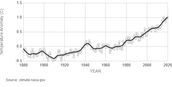
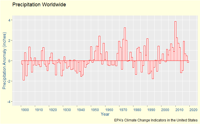
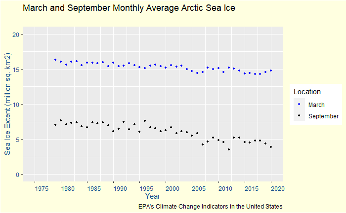
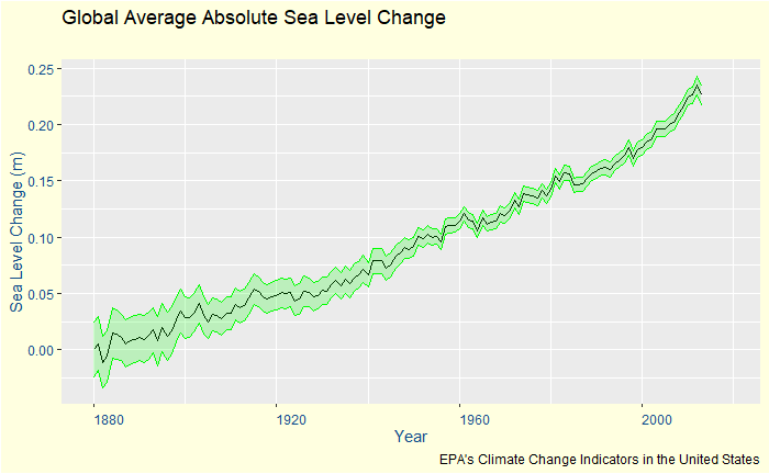
We may divide the ecological system we reside in into four parts viz., atmosphere, biosphere, cryosphere and oceans. The climate report makes an exhaustive list of evidence of changes in these sub-systems. Some of them, such as the rise in sea levels and the increased frequency of floods, prove direct evidence for a changing climate, whereas the others, e.g. temperature rise or elevated levels of greenhouse gases in the atmosphere, are evidence of its root causes.

Data from atmosphere

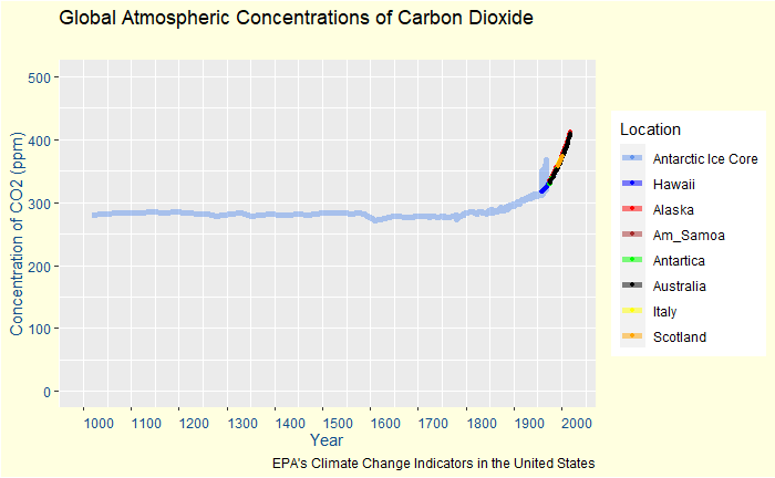
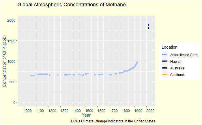
The first and foremost is the carbon dioxide (CO2) in the atmosphere. Its concentration had reached 409.9 (+/- 0.4) ppm in 2019. Similar values for the other greenhouse gases (GHG) were methane 1866.3 +/- 3.3 ppb and nitrous oxide 332.1 (+/-0.4) ppb. This level of CO2 is the highest in the last two million years! These molecules are ominous for the system because of their power to influence the so-called Effective Radiative Forcing (ERF); the subsequent increase of energy causes warming in the system.

Data from biosphere

Global Mean Surface Temperature (GMST), the poster boy of climate change crisis, has increased by over 1.09 oC [0.95 – 1.20] since industrialisation; 1.59 oC for land and 0.88 oC for oceans.

Global land-precipitation has increased since 1950, and its pace has further picked up since the 1980s.

Data from cryosphere

The annual mean and the late-summer values of Arctic ice coverage are the lowest since 1850. The decadal means of Arctic sea ice area has decreased from 6.23 million km2 in the 1980s to 3.76 million km2 in the last decade for September and from 14.52 to 13.42 million km2 for March.

Data from oceans

The global mean sea level (GMSL) has risen by 0.2 m since 1901, and the rate is accelerating. On the other hand, the ocean heat content has increased, pH and oxygen contents have decreased.

Climate Change Indicators: US EPA

Climate Reports: IPCC

Many Indicators, One Message Read More »

AR6 is getting Ready

The first two Working Group (WG) reports of the sixth assessment (AR6) of the Intergovernmental Panel on Climate Change (IPCC) is now available for public view. Two more reports – the third working group (WGIII) and final synthesis report (SYR) – are due later this year.

IPCC and working groups

IPCC, formed in 1988 by World Meteorological Organization (WMO) and United Nations Environment Programme (UNEP), is the United Nations (UN) body for assessing the science related to climate change. The body has done an honourable job for more than 30 years in providing policymakers with scientific information about climate change. While IPCC does not conduct its research, it gathers input from thousands of scientists and mathematicians working in this field globally and facilitates expert review.

It has three working groups and a task force. WGI deals with the science of climate change, WGII its impact and the third group, WGIII, concerns the mitigation plans.

Assessment cycles

The current assessment cycle, the sixth, started from where the fifth had ended (2013-14) and has its first report (AR6-WGI) released in 2021.

WGI: physical science basis of climate change

Through its 12 chapters spread over 4000 pages, the report summarises the current state of knowledge about climate information and human-induced climate change. We’ll go through some of its findings in the next post.

AR6 is getting Ready Read More »

Endowment Effect

The endowment effect is an emotional attachment to an object in possession whereby the individual asks for a higher value than what they would be willing to pay for it. In other words, an individual’s willingness to accept (WTA) compensation to sell a good exceeds her willingness to pay (WTP) a similar good.

The root of the endowment effect can be similar to status quo bias – the loss aversion.

In the famous experiment carried out by Kahneman et al., students of Simon Fraser University were randomly grouped into three – sellers, buyers and choosers. Sellers were handed coffee mugs that they could sell for prices between $0.25 – $9.25. Buyer groups have the option to buy them at those sets of prices. The people in the chooser group have no mugs but can choose between mugs or that amount of money at the selling prices.

You may notice that the chooser group is equivalent to the seller but without possession of the good, and therefore, the ideal control of the experiment. The results were startling: the average asking price for the sellers was twice ($7.12) than what the chooser ($3.12) and buyer ($2.87) would have settled for.

Kahneman; Knetsch; Thaler, “The Endowment Effect, Loss Aversion, and Status Quo Bias”, Journal of Economic Perspectives, 5(1), 1991

Endowment Effect Read More »

Loss Aversion and Status Quo

Does rational decision-making exist? Well, that depends on how you define it. We have seen the expected value and expected utility theories. The expected value is a straightforward multiplication between the value of an option and its probability to be realised. In this scheme, a 20% chance for $600 (0.2 x $600 = $120) is a clear winner over a sure $100. But we know that is not an automatic choice for people. If one finds more utility for $100, a sure chance is worth more than the possibility of $600; remember, if you are among the lucky 20%, you get $600, not $120. At the same time, a gambler may go for not just %600 but even $400!

These two rules are still not enough to categorise all choices. There is another principle that governs choice, known as the reference-dependent model. i.e. an individual’s preference is dependent on the asset she already possesses. Driven by psychology, a sort of inertia creeps in such situations.

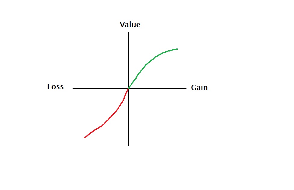
Loss aversion is one such instance. It means that the perceived downside appears heavier than the potential upsides for someone possessing a material (reference point). As a result, you decide to stay where you are – a case of status quo bias. Tversky and Kahneman sketch this value function in the following form.

There is data available from field studies on the choice of medical plans. The researchers found that a new medical scheme is more likely chosen by a new employee than someone hired before that plan was available.

Tversky and Kahneman, “Loss Aversion and Riskless Choice: A Reference Dependent Model,” Quarterly Journal of
Economics, 1991

Loss Aversion and Status Quo Read More »

Biases in Decision Making

Be it massive industrial projects or simple personal decisions – good, quality decisions are essential for success. We have seen the value and utility models helps in understanding how a rational (or real) decision-maker operates.

Biases are one of the big blockers against rational decision making. Let’s see some of the most common types.

Optimism bias

It refers to an individual’s anticipation for positive future outcomes than what could occur in reality. The decision-maker gets the overconfidence that prevents her from thinking about a negative outcome. It is also sometimes called the illusion of invulnerability. While for individuals, this may bring a few benefits (happier life), for critical decision making, say for a business, this is a major cause of alarm. Imagine you launching a product ignoring your competition.

Status quo bias

The preference for the current state of affairs is a type of decision making based on what comes naturally rather than what is important or what the evidence suggests. In politics, conservative ideologies, as their name suggests, favour the status quo, often thwarting progressive changes to society.

Confirmation bias

Confirmation bias ignores contradictory evidence and is desperate to deliver what they are committed to. We all have it to certain degrees, and it is so difficult to get rid of completely.

Sunk cost bias

It happens you continue progressing a project long after you should have abandoned it. And the reason? Well, I have spent a lot already. Call it emotional attachment, overoptimism, or just faith, businesses and individuals throwing good money after bad happens all the time.

Not invented here (NIH) bias

Typical for well-established corporates – hesitance to adopt outsider technologies, and the insistence to develop own, while it is sufficient to replicate existing solutions. A notable exception who reaped rich rewards is Microsoft Corporation.

Anchoring

We have seen anchoring before. This happens when the decision-maker depends heavily on the initial piece of information. Discount sales in shops are a good example. Rather than analysing the merit of that particular (final) price tag, the buyer gets hooked to the anchor, i.e. the original (often inflated) higher price.

Groupthink

It’s about supporting the consensus and ignoring divergent alternatives. Such a tendency could originate from our tendency to harmonise with the rest (especially the superiors), the overconfidence in the judgement of the crowd (argumentum ad populum), or merely the feel of comfort for sharing the blame, in case the decision fails!

The Intelligence Trap

Beware of this automatic assumption that smarter, reactive, quick answers mean an effective thinking process has taken place.

Biases in Decision Making Read More »

Covid 19 Excess Death – 2

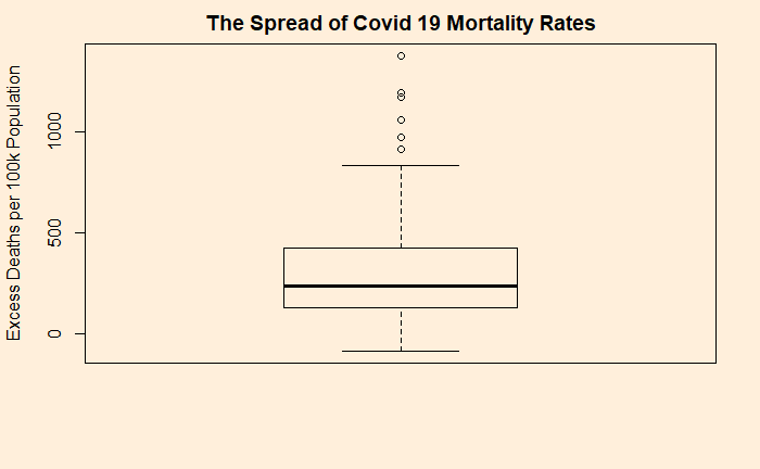
We have already seen how the excess death rates (deaths per 100,000 population) due to covid distributed. The 25th percentile stands at 130 and 75th at 423 (as of 31st December 2021). The statistics of death rates is represented using a box plot.

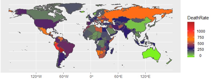
The global distribution of excess death is sketched below:

Case of missed opportunity?

With all the support from hindsight knowledge, let us explore how much of these deaths could have been avoided (perhaps in the next pandemic!). Start with the top performers (the countries in green). These are true outliers and let us not fancy replicating their model. Australia, Newzealand, China, Singapore, Brunei are countries that opted for zero-covid policies, at least until a significant portion of their population received vaccines. They have closed down the countries and regions for the entire 2020 and the majority of 2021.

Bolivia tops the list in terms of excess deaths per million population, at 1376. The numbers have been bad from the beginning, and inadequate restriction measures, thanks to the chaotic political establishment, after the ouster of then-president, Evo Morales, did not help its course. Even today, Bolivia is far behind in vaccination rates.

While the exact reasons why Bulgaria is second in the global death charts is not known, I suppose it was not a coincidence that the country was the least vaccinated in Europe – just 27% by December 2021. For Peru, for instance, the story was poverty, lack of medical supplies, and oxygen. Delta variant and slow vaccinations are cited as the major reasons for the death toll in Russia.

The magenta counties

Brazil may be the model case of what not to do in a pandemic. The pandemic response was lax, and most of the deaths had happened in the first two waves, before the large-scale vaccination programs.

The US is an intriguing example. On the one hand, one can argue that the death rate of around 300 per 100,000 is the limit of what this disease can do with moderate barriers of disease control and a reasonable rate of vaccination. But the question will remain why the country can’t do what its neighbour Canada had managed (115). Spain too belongs to this category and is one of the countries that got battered in the first wave. The reason: no real preparedness as one of the earliest countries (after China and Italy) to hit the virus.

Final word for the country that topped the list of excess death – with about 4 million! India started with one of the most stringent covid measures in the world (shut down of March-May 2020). The country could not cope with the tides of the two waves, one starting from June 2020 and then the delta of 2021, with decent vaccination levels were so far away.

Reference

Estimating excess mortality due to the COVID-19 pandemic: a systematic analysis of COVID-19-related mortality, 2020–21: The Lancet

Covid Response: Bolivia

Covid Response: Peru

Covid Case: Spain

Covid 19 Excess Death – 2 Read More »

Utility and Psychology of Sunk Cost

We have already seen that human decision making is complex and is not always related to the value or the utility of a material (or money). Tversky and Kahneman describe another survey on two groups of people, about 200 people each.

To group #1:
Imagine you paid $10 for a ticket to a play. You reached the theatre and discovered that you had lost the ticket. Will you spend $10 on another ticket?

54% of the people said NO to that question. Apparently, half of the people thought $20 was too expensive for a ticket.

To group #2:
Imagine you went for a play where admission is $10 per ticket. You reached the theatre and discovered that you had lost a $10 bill. Will you spend $10 on a ticket?
88% of the respondents said YES to the purchase.

Same loss, different feelings

The main difference is that, in the second case, the lost dollar was not accounted for the ticket purchase. And $10 on the ticket was a different event unconnected to the loss of $10. I lost a 10 dollar bill due to negligence, but that doesn’t deprive me of watching the play (or it is a good distraction to forget my loss)!.

On the other hand, the re-purchase of the ticket is a painful decision; spending double on a ticket that happened due to my carelessness!

Tversky, A.; Kahneman, D., Science, 1981, 211, 453

Utility and Psychology of Sunk Cost Read More »

Excess Deaths Due to Covid-19

The risk of dying due to Covid was something that we discussed in the past. We observed (in October last year) that the absolute risk of death from covid was about 0.2 – 0.3%. Note that this is not the case-fatality ratio but the chance to die from Covid in a population. These values come from countries that are known for robust death registration systems. Also, the nations that were fully cut off from the rest of the world (e.g. New Zealand, Australia, China) during the first few phases of the pandemic were not considered.

This week The Lancet has published, by far, the most expensive data analysis on excess mortality attributed to Covid 19. Excess mortality is the difference between the number of deaths (all-cause mortality) during the pandemic (observed or estimated) and those expected from the past trends. The data used in the study included all-cause mortality data from various databases (global, regional and country-level) and empirical assessments.

18 million deaths in 2 years

The study reports that 18 million people had lost their life due to Covid in the first two years of the pandemic. That is about three times the official figures. There are about 56 million deaths occur in a year. Therefore, 18 mln in two years represents about 16%.

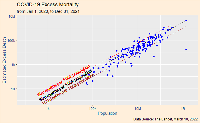
You can see from the plot that the 100-600 (deaths per 100,000 population) band enclosed most of the countries. The most notable outlier is China which, as per reports, have taken extreme measures to control the disease from spreading. The global average death rate is ca. 290 (without including China).

Another way of expressing the statistics of death rates is using a box plot.

Reference

Estimating excess mortality due to the COVID-19 pandemic: a systematic analysis of COVID-19-related mortality, 2020–21: The Lancet

Excess Deaths Due to Covid-19 Read More »