Last time we saw the statistics on police violence and death rates. The data may have given you a false impression that most of the homicides in the US are caused by the police. The number of homicides in the US ranged from 15,000 (5 in 100,000) to 24,000 (7.5 in 100,000) annually in the last 20 years. The total number of deaths from police violence was 30,800 but spread over 40 years – in the range of 4-5% of the annual homicides.
Here are a few more statistics. About 70% of the murders were caused by the use of firearms, based on the 2019 and 2020 data. Does that mean guns are used mostly to kill others? Well, 60% of gun-related deaths were suicides!
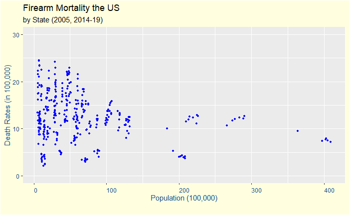
Before we close this gloomy topic: the CDC publishes firearm-related deaths for various states in the US. Alaska tops the rate in 2019 with 24.4 deaths per 100,000 people. Following is a plot of death rates vs the population (7 years of combined data).
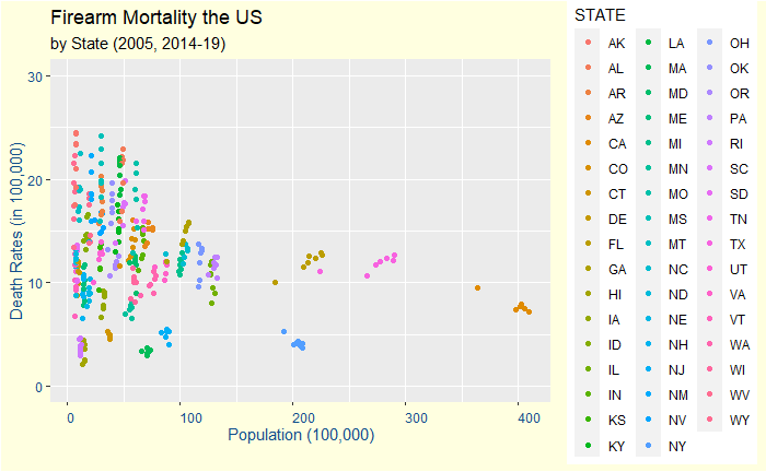
At first, it reminded me of an older post on life in a funnel. Is it an artefact of randomness in small population sizes? We need to check further. Let us differentiate states with colour.
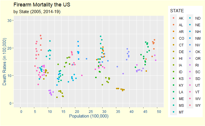
Zoom in to the lower 29 states.
It’s a mixed bag!
As is the case with a lot of things in life – there are randomness and clear patterns. There are fluctuations in the data at lower population states. But there are also definite clusters among those states.
We continue the earlier post on interpreting data from an asymmetric sample space.
An estimated 9540 non-Hispanic black people died from police violence during 1980-2018, says a study published in The Lancet last year. In the same period, the number of non-Hispanic White people who met the same fate was 15,200. So, whites are more likely to die from police violence in the US. Right?
Yes, if the population of non-Hispanic blacks and non-Hispanic Whites in the US are equal. But that is not true. As per Wikipedia, the former accounts for 12.3% of the US population and the latter 61.5%. If there is no correlation between death and race, you would expect around 12.3% of deaths for blacks and 61.5% for whites. As that is not apparent from the numbers, we will calculate the odds.
The easier way to do this is to divide 9540 with 12.3 and 15,200 with 61.5 and take ratios. The numbers are 775.6 : 247.2 = 3.1 : 1. In plain English, a non-Hispanic black has a 3.1 times more chance to die from police violence than a non-Hispanic White.
Here we only considered how the mind works while interpreting data when the representation of groups is not symmetric. Studying the reason behind the disparity of either behaviour of people of certain races or the reaction of police in response was not the topic. Statistics rarely tell the cause, but it may suggest a problem that requires a solution.
Weather reports are perhaps the most commonly encountered examples of probability in our daily life. For instance, the chance of precipitation for tomorrow is 40%. We know that there is only one chance of tomorrow happening, and only two possibilities – it rains or doesn’t. Then what does this 40% mean?
Let us start with what it is not. 40% rain does not mean it will rain 40% of the time or on 40% of the area!
One interpretation is that it rained 40 out of 100 days of similar weather patterns like tomorrow in the past. This interpretation relates closely to the climatology method of weather prediction, where past weather statistics guide the future. But whether predictions of today are far more advanced.
These days, weather forecasters run advanced mathematical models that take into account wind velocity, humidity, temperature, pressure, density etc. Even tiny errors in some of these variables can make the prediction off by a mile. Therefore, different models with several modes of sensitivities are solved to get an ensemble of outcomes. In the end, the Meteorologist looks at how many of them predicted rain. Suppose 20 out of a total of 50 realisations (model outcomes) predicted rain; the forecast becomes 40%.
Asymmetry causes chaos in our brains; lack of data helplessness. Start with this news headline.
So what does this mean? The simple answer is – nothing! Because the percentage quoted in the headline (and the subsequent text) is the death of unvaccinated in the total deaths. It makes an implicit assumption that in the system, an unvaccinated can get serious illness in about 70 – 30 compared to vaccinated. That does not give the right picture about the vaccine.
Take a location with 1000 people, 100 deaths and create three scenarios. Scenario 1
Vaccinated
Unvaccinated
% of population
90%
10%
number of people
900
100
breakup of death
30%
70%
number of death
30
70
risk of dying
(30/900) = 0.033
(70/100) = 0.7
risk ratio
0.047
Scenario 1
Take the second scenario:
Vaccinated
Unvaccinated
% of population
50%
50%
number of people
500
500
breakup of death
30%
70%
number of death
30
70
risk of dying
(30/500) = 0.06
(70/500) = 0.14
risk ratio
0.43
Scenario 2
A third scenario
Vaccinated
Unvaccinated
% of population
10%
90%
number of people
100
900
breakup of death
30%
70%
number of death
30
70
risk of dying
(30/100) = 0.3
(70/900) = 0.077
risk ratio
3.9
Scenario 3
Discussion
Three scenarios using the same death-break up among vaccinated and unvaccinated tell three different stories. Scenario 1 shows a highly effective vaccine, the second is very modest, and the third is likely a substance to avoid! If you are not convinced, change the population from 1000 to any other number; you should get the same answer.
I agree journalists have a role in bringing information to the public. They also have a duty to provide data that enables the public to understand something. I doubt the news had any such intentions.
Finally
So, what is the big picture in Maharashtra? It’s difficult to say without details. But, assuming the number of deaths is more likely among adults, and its vaccination rates (at least one dose) are closer to 90%, the vaccine seems to protect as it promised.
Linda is 31 years old, single, outspoken, and very bright. She majored in philosophy. As a student, she was deeply concerned with issues of discrimination and social justice, and also participated in anti-nuclear demonstrations.
Tversky and Kahneman, Psycological Review (1983)
As part of their study, Tversky and Kahneman gave this problem to 142 UBC undergrads to determine which of the two alternative options was more probable.
Linda is a bank teller.
Linda is a bank teller and is active in the feminist movement.
What is your answer?
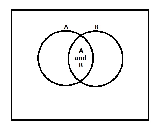
The AND rule
Remember the AND rule? You did not need my post to know the rule; we have accepted it happily at school. 1) it appeared logical. 2) since the probability values are always less than or equal to 1, a product of P(A) and some other probability can never be more than P(A) because that other shall always be one or less. 3) Our teacher explained it graphically using Venn diagrams.
None of us had issues with any of these.
Judgements rooted deep
Yet, 85% of the students selected the second option as the more probable!
Resemblance wins over Extensional
The scientists went to another group of students and asked to choose one statement from the following (far more explicit) options.
Argument 1 Linda is more likely to be a bank teller than a feminist bank teller as every feminist bank teller is a bank teller and some bank tellers are not feminists.
Argument 2 Linda is more likely to be a feminist bank teller than a bank teller because she resembles an active feminist more than she resembles a bank teller.
The students chose the second (65%) in the majority!
There are more examples of conjunction fallacy in our day-to-day lives. Who knows better to exploit this vulnerability of mind than your insurance agent, who can sell you the life insurance that covers deaths from terrorist attacks when you didn’t want to buy the normal one?
Interestingly, this fallacy is not restricted to stories that use rare but appealing words that trigger our imagination. Students were asked to bet on one of three sequences if a six-sided die, with four green faces and two red faces, is rolled 20 times. 1) RGRRR 2) GRGRRR 3) GRRRRR Students overwhelmingly chose option 2, forgetting that option 1 is a subset of option 2!
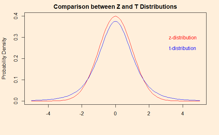
T-test closely resembles Z-test; both follow normal distributions. The t-test is relevant when the population standard deviation is unknown; instead, the sample standard deviation is used. After finding the test statistic, the t-test refers to the t-distribution for significance and p-values instead of the standard normal distribution.
T-distribution, unlike standard normal, is dependent on the sample size and is more spread for smaller values. A key term to remember is the degrees of freedom (df) = sample size – 1. A comparison between the two for a sample size of 5 (df = 4) is below.
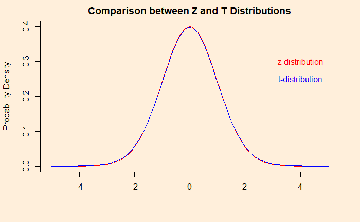
The difference soon disappears as the number of samples goes beyond a few. The plot below compares a sample size of 50.
Coffee Drinking
A researcher studies the coffee drinking habits of people and found that in her city, people drink 14 ml of extra coffee on Mondays (standard deviation of 8.5 ml). Can her results reject the existing average of 10 ml more on Mondays at a 5% significance level?
Let’s set up the null hypothesis: The average extra coffee consumed on Mondays is less than or equal to 10 ml. The alternative hypothesis is: The average extra coffee consumed on Mondays is more than 10 ml. No standard deviation is known for the population; therefore, we take sample standard deviation and t-statistic. t = (14-10)/(8.5 x sqrt(50)) = 3.327. The critical value for 0.05 significance level in a t-distribution with degrees of freedom (df) = 49 is 1.68 [qt(0.95,49) in R]. Since the t-statistic value (3.327) is greater than the t-critical value (1.68), we reject the null hypothesis. The p-value is 0.000838 [pt(3.327, 49, lower.tail = FALSE) in R].
The claim on weight reduction
T-tests can be used to validate claims of interventions by taking statistical differences of the same population between two conditions or time points. Company X claim success for its weight loss drug by showing the following data. You’ll test whether there’s any statistical evidence for the claim (at a 5% significance level).
Before
After
120
114
94
95
86
80
111
116
99
93
78
83
78
74
96
91
132
136
108
109
94
90
88
91
101
100
93
90
121
120
115
110
102
103
94
93
82
81
84
80
The steps are: 1) start with a null hypothesis: the average weight change (after medicine – before medicine) is zero. 2) calculate the weight difference by subtracting before from after (for 20 samples) 3) estimate the mean and standard deviation of the differences 4) population mean (for the null hypothesis) for weight difference is 0. 5) apply the formula for t-statistic 6) compare with critical t-value = -1.72 for 5% significance level 7) estimate the p-value
Difference = After – Before
-6
1
-6
5
-6
5
-4
-5
4
1
-4
3
-1
-3
-1
-5
1
-1
-1
-4
Mean = -1.35, standard deviation = 3.7, t-value = -1.63, critical t = -1.73 (for 5%), p-value = 0.0597 > 0.05
The test shows no evidence to prove the effectiveness, and therefore, the null hypothesis is not rejected. The above treatment is called a paired t-test.
We have seen sample and population statistics in an earlier post. We continue developing from there, but this time using the concepts for hypothesis testing. Suppose we have an established population mean and standard deviation. To that, a new sampling statistic is introduced. The task is to test if the understanding (a.k.a. the null hypothesis) needs an update.
By the way, the resemblance of the equation with the story of constructing the confidence interval is not coincidental. They are both related.
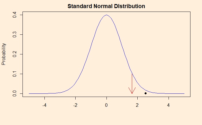
Take an example: A farmer shows sample results (mean = 58 g. from a sample of 40 eggs) and claims eggs from her farm weigh more than the national average. The national average is 54 g. and has a standard deviation of 10 g. How do you test her claim?
First, create the null hypothesis: the farmer’s eggs are within the national average. The alternative hypothesis is that they are heavier than the national. We set a 5% significance level.
As per the formula, Z = (58-54)/(10 x sqrt(40))= 2.53. Now compare the position of 2.53 in a standard normal distribution, the assumption we made for the Z-statistic. The location of 2.53 is marked as a black dot in the plot below, and the start of the critical region (> 95% or <5%), by the red arrow.
So what is the p-value here? The probability that we observe a z-statistic 2.53 and above, given the null hypothesis. In other words, p is the area under the curve above the value 2.53. You can get that using the R function, pnorm (The function pnorm returns the integral from -infinity to q of the normal distribution where q is a Z-score.) and subtracting it from 1 (the total integral from -infy to +infy). The value of p is 1 – pnorm(2.53) = 1 – 0.9943 = 0.0057.
Farmer’s data has only a 0.57% chance to stand with the null hypothesis. So we reject the null hypothesis and accept the notion that the farmer’s eggs are heavier than the national average.
The concept of p-value is one complicated setting in statistics. As per the renowned writer, cognitive psychologist, and intellectual Steven Pinker, 90% of psychology professors get it wrong! Where did he get this 90%? Well, my default position (the null hypothesis) is that Steven Pinker is a no-nonsense writer. So, I confidently take 90% as my prior. I also find it super confusing (how is it relevant in a statistical setting?).
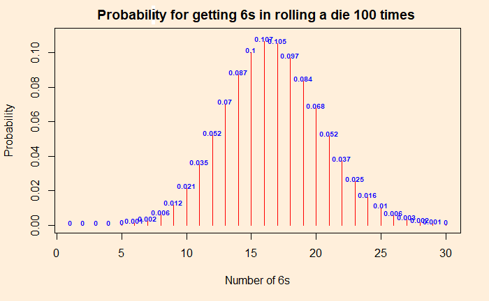
Two people are playing a game of rolling dice. One person suspects that the die was faulty, and the other (as always!) is getting too many 6s. To test the assumption, they decide to roll it 100 times. The result was 22 sixes. Since the probability of getting a six is (1/6), and the number of rolls was 100, she argues, the expected number of sizes was 16.6. Since they got 22 sixes, the die is defective.
By now, we know that the above argument was wrong. It is not how probability and randomness work. The experiment is equivalent to independent Bernoulli trials with the following distribution of chances for each number of sixes. Let the force of “dbinom” be with you and get the probability distribution. Probabilities for the “dbinom” are (1/6) for success and (5/6) for failure (not a 6).
The probability of getting precisely 22 sixes is 4%, but 22 or more is ca. 11%.
The proper way
You got to start with a hypothesis. Since statisticians are statisticians and wanted to maintain a scientific temper, they created a concept called the null hypothesis as the default. Here the null hypothesis is: that the die is fair and will follow the binomial distribution as shown in the plot above. If you want to prove the die is defective, you need to demonstrate the null hypothesis to be invalid and reject it.
Proving beyond doubt
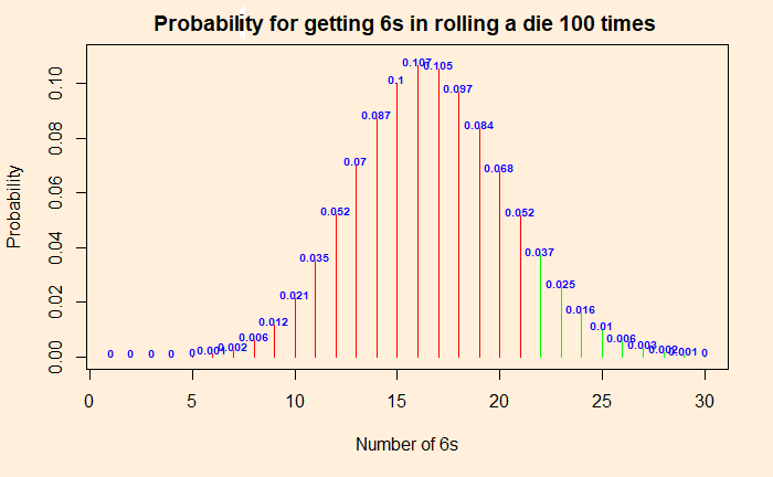
We have to prove that getting 22 sixes is within 5% of the most extreme values the dice can give in 100 rolls. Why 5%? It is just a convention and is called the significance level. We define the p-value and have to prove that it is smaller than or equal to the significance level to reject the null hypothesis (or prove your point). Else accept the null hypothesis (and acknowledge that you are unsuccessful).
Enter p-value
The p-value is the probability of getting numbers at least as extreme as 22. At least as extreme as 22 means: chance of getting 22 + chances of getting anything more extreme than 22! So it is the sum of 0.037 + 0.025 + 0.016 + 0.01 + 0.006 + 0.003 + 0.002 + 0.001 = 0.1 = 10%. The p-value is 10%. This is more than the significance level of 5%, and therefore we can’t reject the null hypothesis that the die is good. No evidence. To repeat, if you do the same experiment 100 times over and over, you may get 22 or more 6s one out of 10 times. To prove the die is faulty, it must reduce to one in 20 (or lower).
P for Posterior
The significance test through p has a twisted logic. p is the probability for my data given the (null) hypothesis. In other words, while you intend to prove your point, the world (or science) wants to compare it with its default, null hypothesis. The smaller the chance, you win, and the prior gives way to the posterior. My theory wins because the data collected was unlikely if the null hypothesis is true.
Tailpiece
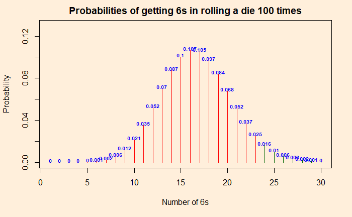
Going to more extreme values, you will see that the probability of getting 24 or more times 6 is less than 5%. So if you throw 6s 24 or more times, you are in the critical region, and you can prove the die is faulty.
The critical region is in dark green
Typically, a p-value below 0.01 signifies strong evidence, 0.05 – 0.01 is moderate, and 0.05 – 0.1 is weak evidence against the null hypothesis in favour of the alternative. p greater than 0.1 is considered as no evidence against the null hypothesis.
Steven Pinker: Rationality: What It Is, Why It Seems Scarce, Why It Matters
Was the Challenger disaster an avoidable incident, or it’s just a hindsight bias?
On January 28, 1986, seven crew members of the United States space shuttle Challenger were killed when O-rings responsible for sealing the joints of the rocket booster failed and caused a catastrophic explosion.
Machine Learning with R by Brett Lantz
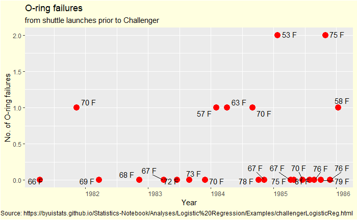
First, look at what data would have been available to the project.
A few scattered points spread over five years, covering 23 previous examples. You don’t need to search for many patterns in this plot; check for any long-term improvements in incident rate (learning over the years). I see none; therefore, the data from 1981 was not outdated for 1986!
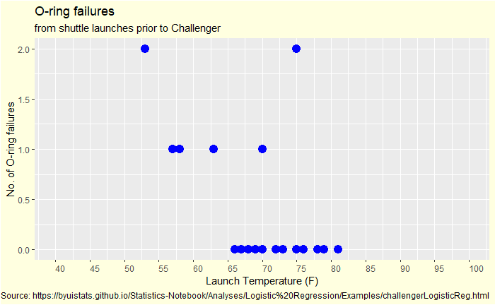
Now we plot it differently – failed O-rings vs outside temperature.
Outside-the-box problem
First observation: no data is available below 50 oF, and the outside temperature at the time of launch tomorrow is 30 oF. You have seen up to 2 out of 6 O-ring failures in the past. How do you know if everything will be alright if you operate so far outside the data limits?
But, how do I know?
A material scientist may have predicted increased brittleness (for the elastomer) with the drop in outside temperature. I would not call it hindsight wisdom as it was science and they have field data (from previous launches) to support it.
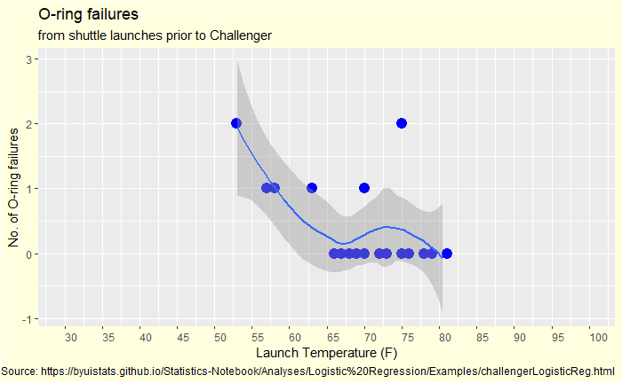
A statistician may guess it using Bayesian thinking by choosing the data from the nearest temperature as the prior. That data is at 53 oF, which resulted in 2 O-ring failures.
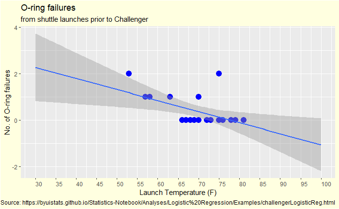
A data analyst would have done an extrapolation starting with a linear fit. And how would that look?
A line that went northwest as the temperature decreased. Or another type of data fit.
What was the real issue?
The Challenger incident was not about data analysis but quality assurance and decision-making. The project leaders had all the necessary information to make the decision and stop the launch, still went ahead and blasted (literally!) the space shuttle, killing all the crew members. It was irrationality of mind. Irrationality fuelled the emotional forces of pride, stubbornness, close-mindedness, and bravado.
Conflicting reports on the health benefits of drinking coffee is a topic of debate and confusion, often made science and scientists subjects of jokes. Over the years, several researchers have tried to establish associations between consuming coffee and a bunch of outcomes such as hypertension, cancer, gastrointestinal diseases – you name it.
Why these discrepancies?
Many of these studies are observational and not interventional. To make the distinction, cohort studies are observational, whereas randomised controlled trials (RCTs) are interventional. Establishing causations from observational studies is problematic.
In addition, coffee contains over 2000 active components, and theorising their impact on physiology, with all possible synergistic and antagonistic effects, is next to impossible. See these observations: taking caffeine as a tablet causes four times the elevation of blood pressure compared to drinking caffeinated coffee. There is an association of elevated BP with caffeinated drinks but none with coffee. So, accept this is complex.
Jumping to a conclusion is another issue. Researchers are often under tremendous pressure to publish. And like journalists, they too get carried away by results with sensation content. As a result, the authors (and readers) advertise relative risks as absolute risks, forget confidence intervals, shun the law of large numbers (or the absence of the law of small numbers) or ignore confounding factors!
Confounders
How will you respond when you hear a study in the UK that found an association between coffee drinking and elevated BP? First, who are those coffee drinkers in the land traditionally of tea lovers? If it was the cosmopolitan crowd, are there lifestyle factors that can have a confounding effect on the outcome of the study: working late hours, lack of exercise, higher stress levels, skipping regular meals, smoking?
The same goes for the beneficial effect of coffee on Parkinson’s disease. What if I argue that people with a tendency to develop the disease are less interested in developing such addictions due to the presence or absence of certain life chemicals? In that case, it is not the coffee that reduced Parkinson’s, but a third factor that controlled both.
Absolute or Relative
The risk of lymphoma is 1.29 for coffee drinkers, with a confidence interval ranging from 0.92 to 1.8. What does that mean? 30% of people who drink coffee get lymphoma? Or a relative risk with a wide enough interval that enclosed one inside it? If it is a relative risk, what is the baseline incident rate of lymphoma? More questions than answers.
Meta-analysis
Meta-analysis is a statistical technique that combines data from several already published studies to derive meaning. A meta-analysis, if done correctly, can bring the big picture from the multitudes of individual findings. The BMJ publication in 2017 is one such effort. They collected more than 140 articles published on coffee and its associated effects that provided them with more than 200 meta-analyses, including results from a few randomised controlled studies.
The outcome of the study
Overall, coffee consumption seems to suggest more benefits than harm!
4% (relative risk)[0.85-0.96] reduction in all-cause mortality.
A relative risk reduction of 19% [0.72-0.90] for cardiovascular diseases.
Same story for several types of cancers, except for lung cancer. But then, the association of a higher tendency for lung cancer was reduced when adjusted for smoking. For non-smokers, on the other hand, there is a bit of benefit, like in the case of other cancers.
Consumption of coffee leads to lower risks for liver and gastrointestinal outcomes—similar association for renal, metabolic, and neurological diseases such as Parkinson’s.
Finally, something bad: harmful associations are seen for pregnancy, including low birth weight, pregnancy loss, and preterm birth.
Many of these associations are marginal, and also the domination of observational data reduces the overall quality of conclusions. These results would benefit from more randomised controlled trials before formalising.