Here is another time series, namely, the air passengers.
A key task of the time series analysis is to break down the data into signal and noise. In R, there is a function called decompose to do the job.
decom_AP <- decompose(AP, type = "additive")
plot(decom_AP)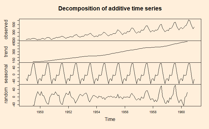
Note that the data is already in a time series format. If it is a regular data frame, use function ‘ts’ first before attempting the decompose function.
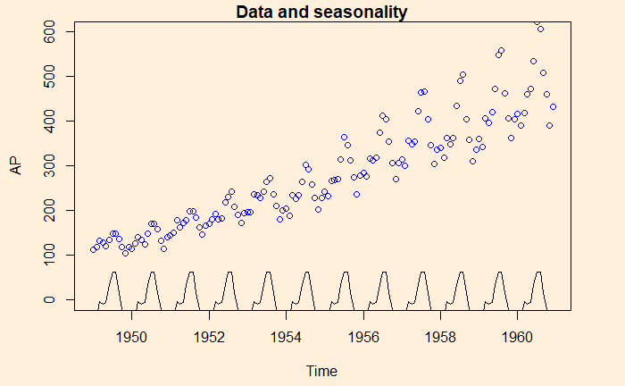
Here is the illustration – the data (blue circle), compared with the seasonality.
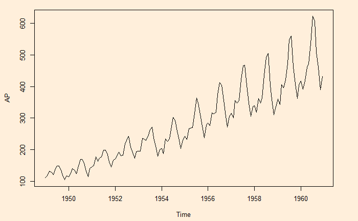
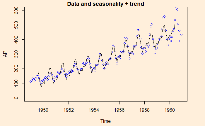
Here is data with seasonality + trend
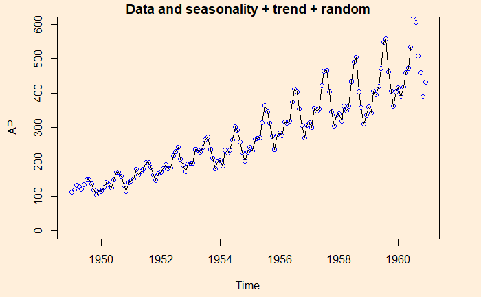
And finally, data is compared with the sum of all three, seasonality + trend + random