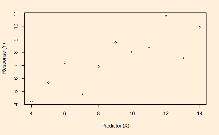
Regression models are a potential pathway to finding the relationship between dependent variables (response variable) and independent variables (predictor variables). And we have seen linear regression in the previous post. We will continue from there, focussing on a measure of the goodness of fit – the R-squared. Start with a scatter plot of an X vs Y.
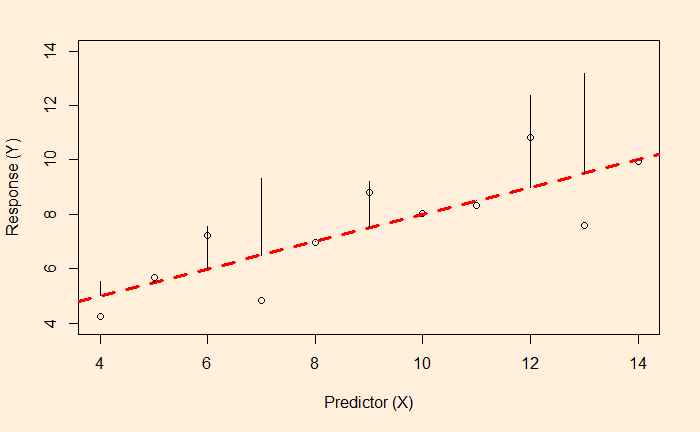
The most convenient way to think about linear regression is the broken red line – which represents the best fit – on the plot. The equation of that line is the model for predicting Y from X.
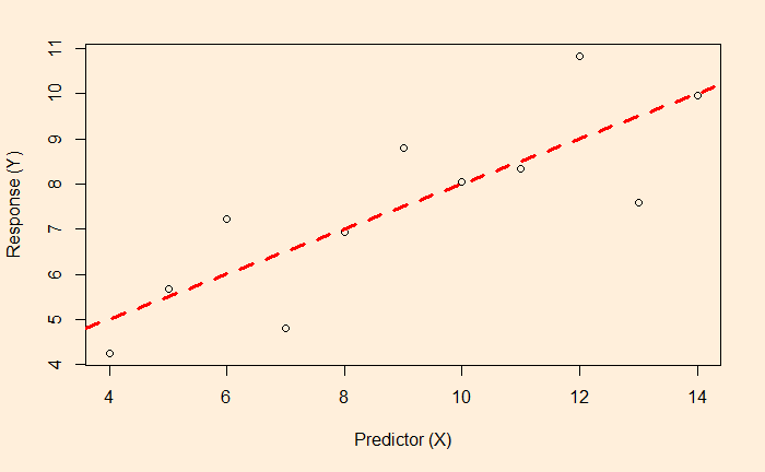
In our case, we shall see soon; the formula is Y = 3 + 0.5 x X.
For the time being, you may consider that that line is drawn to balance between the dots of the scatter.
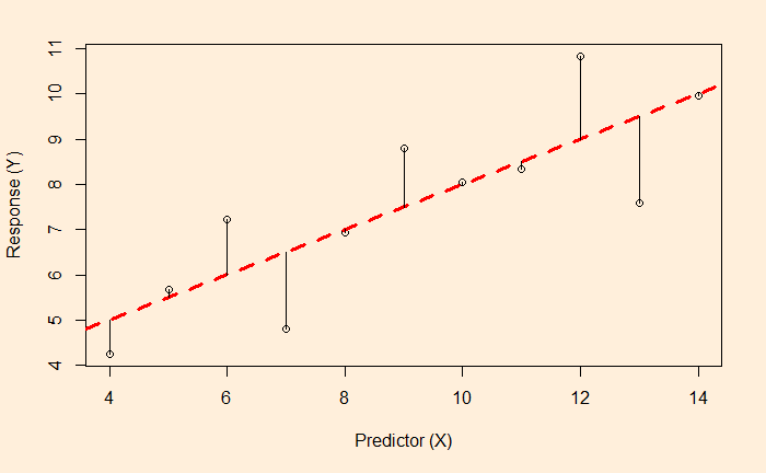
The lengths of the lines are the residuals of each data from the regression line. Remember, if the data are purely random and independent, the histogram of the residual forms a normal distribution with a mean equal to zero.
While the line is a result of a balancing act between the residuals, it is not by minimising the distances (as in the figure above) but by minimising the sum of squares of them (the figure below).
So, the line is drawn at which the sum of the squares of the errors is minimum.
