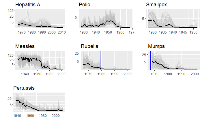
We will end this series on vaccine data with this final post. We will use the whole dataset and map how disease rates changed after introducing the corresponding vaccines. The function, ‘ggarrange’ from the library ‘ggpubr‘ helps to combine the individual plots into one.
library(dslabs)
library(tidyverse)
library(ggpubr)
We have used years corresponding to the introduction of vaccines or sometimes the year of licencing. In Rubella and Mumps, lines corresponding to two different years are provided to coincide with the starting point and the start of nationwide campaigns.

