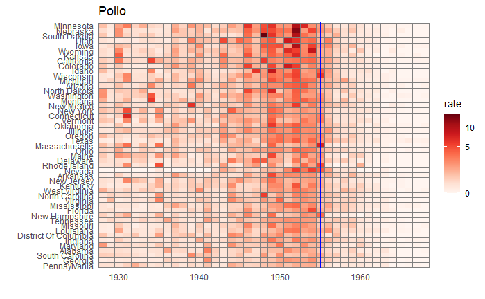
Vaccination is a cheap and effective way of combating many infectious diseases. While it has saved millions of people around the world, vaccine sceptics also emerged, often using unscientific claims or conspiracy theories. This calls for extra efforts from the scientific community in fighting against misinformation. Today, we use a few R-based visualisation techniques to communicate the impact of vaccination programs in the US in the fight against diseases.
We use data compiled by the Tycho project on the US states available with the dslabs package.
library(dslabs)
library(tidyverse)
library(RColorBrewer)

vac_data <- us_contagious_diseases

the_disease = "Polio"
vac_data <- vac_data %>%  filter(disease == the_disease & !state%in%c("Hawaii","Alaska")) %>%
  mutate(rate = count / population * 10000) %>%
  mutate(state = reorder(state, rate))


vac_data %>% ggplot(aes(year, state, fill = rate)) +
  geom_tile(color = "grey50") +
  scale_x_continuous(expand=c(0,0)) +
  scale_fill_gradientn(colors = brewer.pal(9, "Reds"), trans = "sqrt") +
  geom_vline(xintercept = 1955, col ="blue") +
  theme_minimal() +
  theme(panel.grid = element_blank()) +
  ggtitle(the_disease) +
  ylab("") +
  xlab("")
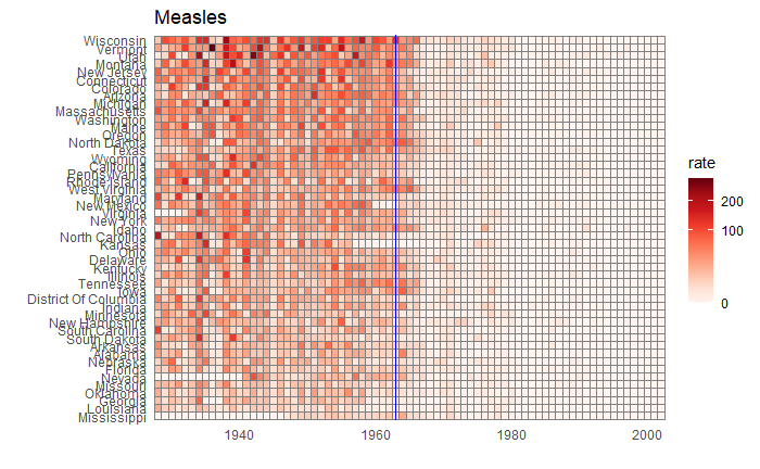
Now, changing the disease to measles and the start of vaccination to 1963, we get the following plot.


