Today, we will redo something we did cover in an earlier post – the sum of distributions. It directly demonstrates what we know as the central limit theorem (CLT). We will use R codes for this purpose.
We start with a uniform distribution. But what is that? As its name suggests, it is a class of continuous distribution and can take any value between the bounds with equal probabilities. Or the values are uniformly distributed between the boundaries.
There are many real-life examples of uniform distribution but of the discrete type, e.g., coin toss, dice rolling, and drawing cards. The resting direction of a spinner, perhaps, is an example of a continuous uniform.

As an illustration, see what happens if I collect 1000 observations from a uniform distribution set between 0 and 2.
uni_dist <-  runif(n = 10000, min = 0, max = 2) # or simply,  runif(10000,0,2)

plot(uni_dist, main = 'Distribution of Sample', xlab = "Sample Index", ylab = "Value", breaks = 100)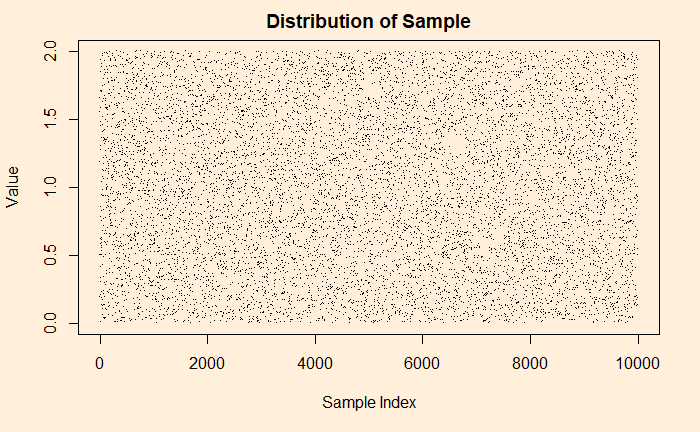
Look closely; can you see patterns in the plot? Well, that is just an illusion caused by randomness. Historically, such observations confused the public. The famous one is the story of flying bombs in the Second World War.
Some people like a different representation of the same plot – the histogram. A histogram provides each value and its contributions (frequencies, densities, etc.).
uni_dist <-  runif(n = 10000, min = 0, max = 2)
hist(uni_dist, main = 'Histogram of Values', xlab = "Value", ylab = "Frequency", breaks = 100)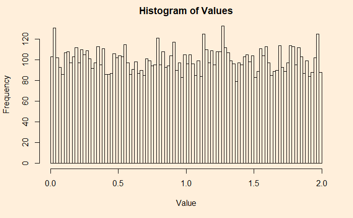
Now, you will appreciate why it is a uniform distribution. I have 100 bins (or bars), and each carries more or less 100 (frequency) values, making it 100000 overall.
If you don’t like frequencies on the Y-axis, switch it off, and you get densities.
hist(uni_dist, main = 'Histogram of Values', xlab = "Value", ylab = "Density", breaks = 100, freq = FALSE)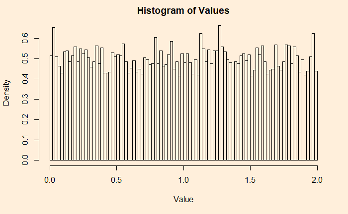
Start of CLT
Adding two such independent sample data is the start of the CLT.
uni_dist1 <-  runif(n = 10000, min = 0, max = 2)
uni_dist2 <-  runif(n = 10000, min = 0, max = 2)

hist(uni_dist1+uni_dist2, main = 'Histogram of Values', xlab = "Value", ylab = "Frequency", breaks = 100)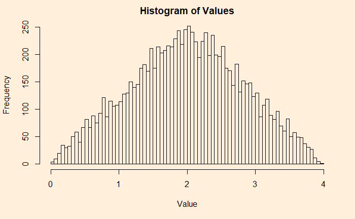
Let’s make a code and automate the addition by placing the calculation into a loop.
plots <- 25
plot_holder <- replicate(1,0)

for (i in 1:plots){
 add_plot <- plot_holder + runif(10000,0,2)
 plot_holder <- add_plot
}

his_ar <- hist(plot_holder, xlim = c(0, 2*plots), breaks = 2*plots, main = 'Histogram of Values', xlab = "Value", ylab = "Frequency", freq = FALSE)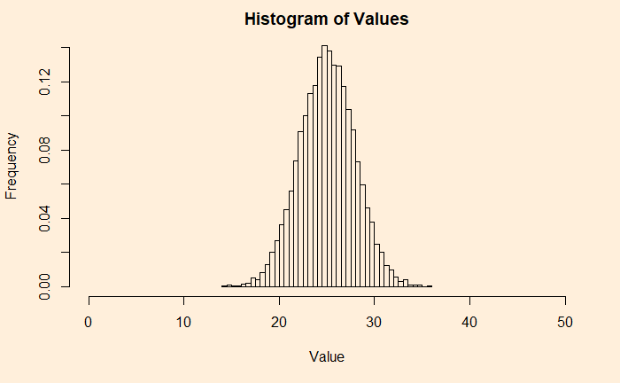
Here is a Gaussian, and hence the CLT. Verify it by adding a line from a uniform distribution and match.
lines(seq(0,2*plots), dnorm(seq(0,2*plots), mean = plots, sd = 2.8), col = "red",lty= 2)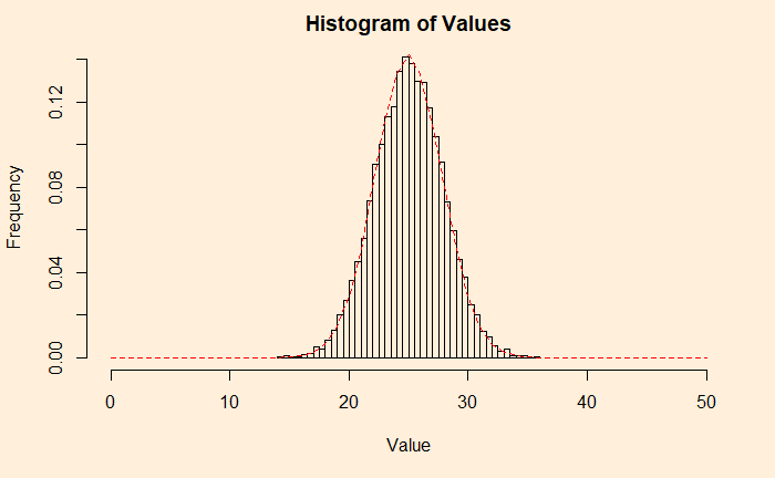
We will check some not-so-uniform distributions next.
Watch the Lecture by Nassim Taleb

