We have seen a demonstration of CLT using uniform distribution as the underlying scheme. But a uniform distribution is symmetric, so what about nonsymmetric?
It is more intuitive, to begin with, discrete before getting into continuous. So, let’s build the case from a simple experiment set – the tossing of coins. We start with the fair coin, toss it 10000 times and collect the distribution.
par(bg = "antiquewhite1", mfrow = c(1,2))
h1 <-  sample(c(1,2), 10000, replace = TRUE, prob = c(0.5,0.5))
hist(h1, freq = TRUE, main = "Distribution - Coin Toss", xlab = "Outcome", ylab = "Frequency")
plot(h1, pch = "*", main = "Outcomes - Coin Toss", xlab = "Toss #", ylab = "Outcome" )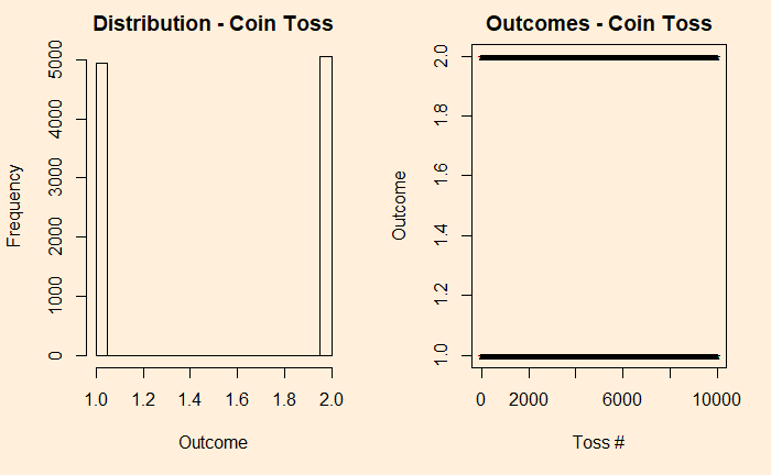
We denote the outcomes 1 for heads and 2 for tails. In the plot on the right-hand side, you see those 10,000 points distributed between the two. Now, introduce a bias to the coin – 95% heads (1) and 5% tails (2) and reduce the experiments to 1000 for better visualisation of the low probability state.
h11 <- sample(c(1,2), 1000, replace = TRUE, prob = c(0.95,0.05))
 hist(h11, freq = TRUE, main = "Distribution - Coin Toss", xlab = "Outcome", ylab = "Frequency")
 plot(h11, pch = "*", main = "Outcomes - Coin Toss", xlab = "Toss #", ylab = "Outcome" )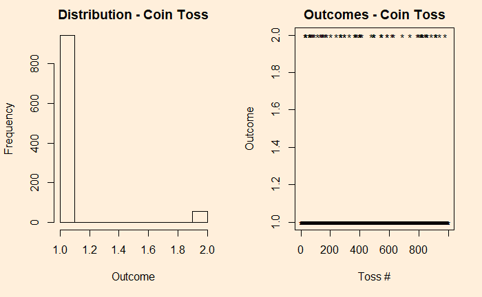
Now, add each distribution 25 times and check what happens.
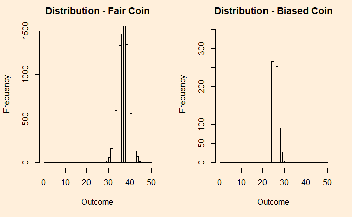
You can see that the fair coin has already started converging to a Gaussian, whereas the biased one has a long way to go. We repeat the exercise for 500 additions before we get a decent fit to a normal distribution (below).
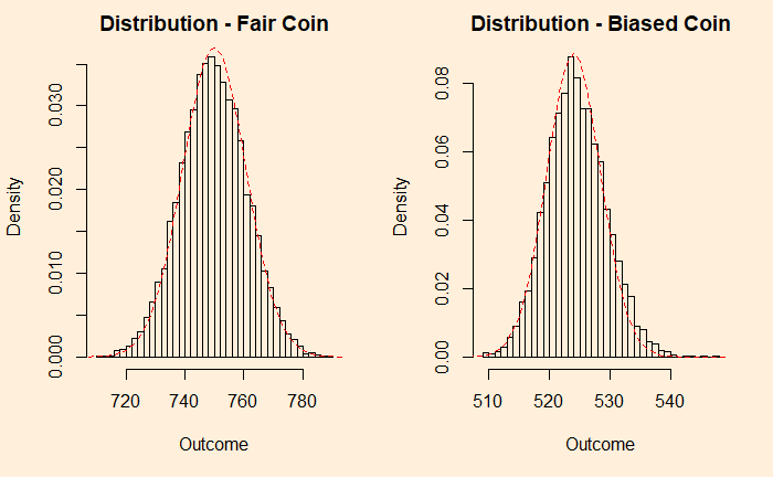
You can still see a bit of a tail protruding outside the reference line. So it didn’t matter what distribution you started with; as long as you got an adequate number of samples, the sums are normally distributed.
An example from the continuous family is the chi2 distribution with the degrees of freedom (df) 2. Following are two plots – the one on the left is the original chi2, and the right is adding 50 such distributions.
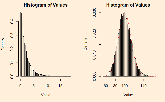
plots <- 1
plot_holder <- replicate(1,0)
for (i in 1:plots){
 add_plot1 <- plot_holder + rchisq(10000, df=2)
 plot_holder <- add_plot1
}

par(bg = "antiquewhite1", mfrow = c(1,2))

hist(add_plot1, breaks = 100, main = 'Histogram of Values', xlab = "Value", ylab = "Density", freq = FALSE)

plots <- 50
plot_holder <- replicate(1,0)
for (i in 1:plots){
 add_plot2 <- plot_holder + rchisq(10000, df=2)
 plot_holder <- add_plot2
}

hist(add_plot2, breaks = 100, main = 'Histogram of Values', xlab = "Value", ylab = "Density", freq = FALSE)
lines(seq(0,200), dnorm(seq(0,200), mean = 99.8, sd = 13.4), col = "red",lty= 2)
Tailpiece
Although we have used additions (of samples) to prove the point, the averages, which are of more practical importance, will behave the same way; after all, averages are nothing but additions divided by a constant (total number of samples).

