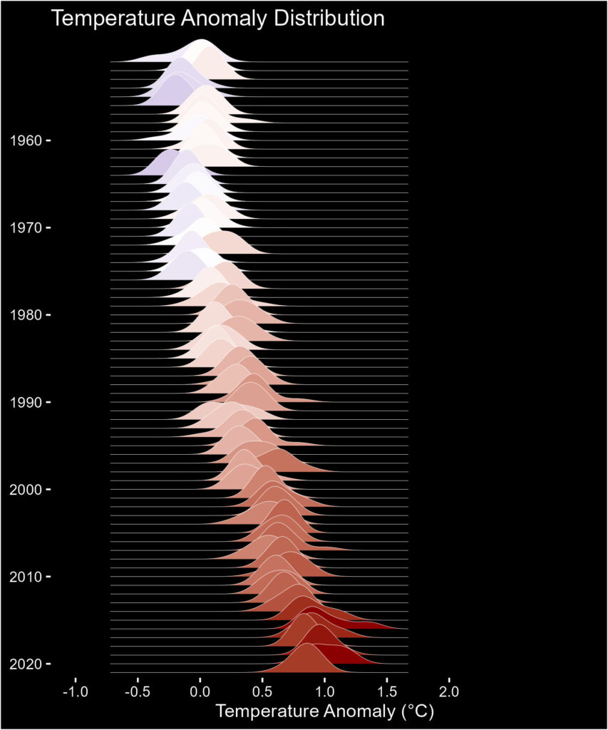
We have seen the temperature anomaly distribution visualised through a spiral plot. This time it’s another cool one – the ridge plot.

library(tidyverse)
library(ggridges)

c1_data <- c_data %>% group_by(Year) %>% mutate(T_av = mean(T_diff))

c1_data %>% filter(Year > 1950 & Year < 2022) %>%
  ggplot(aes(x = T_diff, y = factor(Year, levels = seq(2021, 1950, -1)), fill = T_av )) +
  geom_density_ridges(bandwidth = 0.1, scale = 4, size = 0.1, color = "white") +
  scale_fill_gradient2(low = "darkblue", mid = "white", high = "darkred", midpoint = 0, guide = "none") +
  coord_cartesian(xlim = c(-1, 3)) +
  scale_x_continuous(breaks = seq(-1, 2, 0.5)) +
  scale_y_discrete(breaks = seq(1950, 2020, 10)) +
  labs(y = NULL, x = "Temperature Anomaly (\u00B0C)", title = "Temperature Anomaly Distribution") +
  theme(text = element_text(color = "white"),
        panel.background = element_rect(fill = "black"),
        plot.background = element_rect(fill = "black"),
        panel.grid = element_blank(),
        axis.text = element_text(color = "white"),
        axis.ticks = element_line(color = "white"))
For the data and clean-up, see the earlier post.
Ridgeline plot in R with ggridges: Riffomonas Project

