We have seen Berkeley data in the previous post and refreshed the concept of Simpson’s paradox. Here we introduce a handy visualisation of such data using mosaic plots.
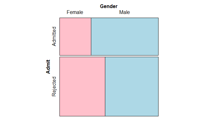
The following R code generates the mosaic plot for the overall admission. The code requires the ‘vcd’ package.
mosaic( ~   Gender + Admit, data = berk_data,
       highlighting = "Gender", highlighting_fill = c("pink", "lightblue"),
       direction = c("v","h"))
The lower width of the pink panel on the admission (top) suggests a smaller number of females (89) compared to males (512). The smaller width of the top pink panel compared to the bottom pink panel indicates lower admission rates for females (proportional to the application rate). Smaller heights of pannels indicate more rejection than admission.
Once the data is stratified to include the department, the picture changes to the following.
mosaic( ~ Dept  + Gender + Admit, data  = berk_data,
       highlighting = "Gender", highlighting_fill = c("pink", "lightblue"),
       direction = c("v","v","h"))
Most of the pink panels on the top are more than or equal to the ones on the bottom, suggesting better admission rates for females. You can check the last table of the previous post and recognise that the admission rates of departments A and B are more than 50%, and the rest are lower. Lastly, the number of male applicants is much more in those two departments (width of the blue panel compared to pink).

